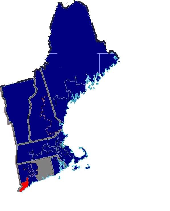
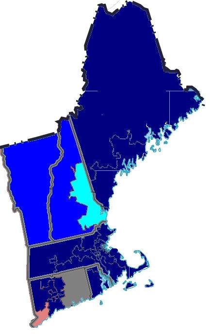
his is the eight in a series of diaries depicting the Democratic victory in this year’s midterm elections. Other diaries in this series can be seen here.
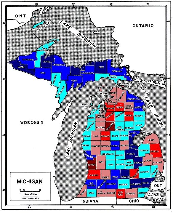
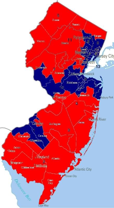
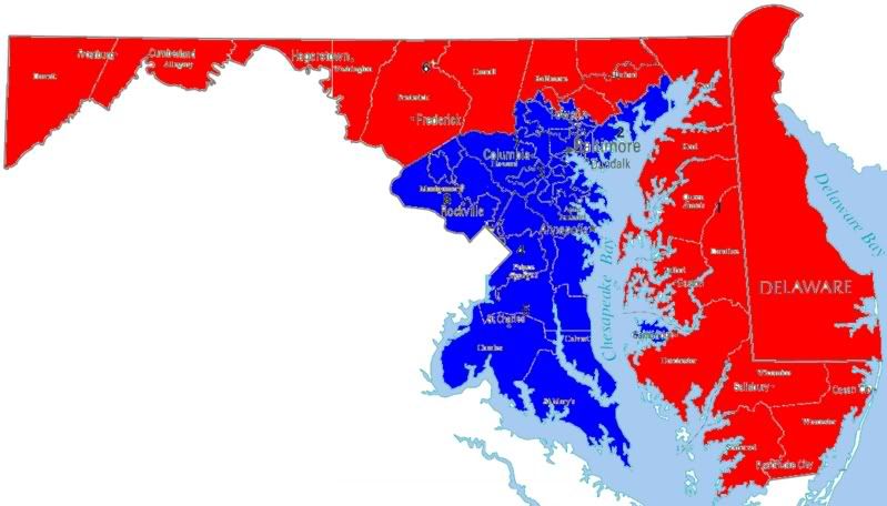
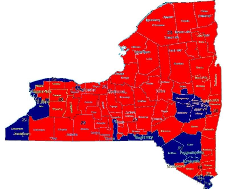
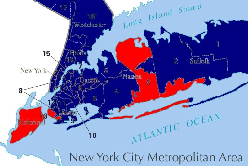
Already covered have been New England, NY, NJ, MD, and DE, PA, OH, IN, MI, and Wisconsin.
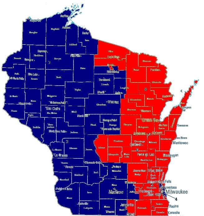
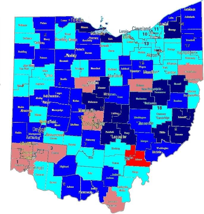
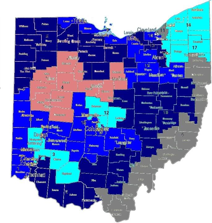
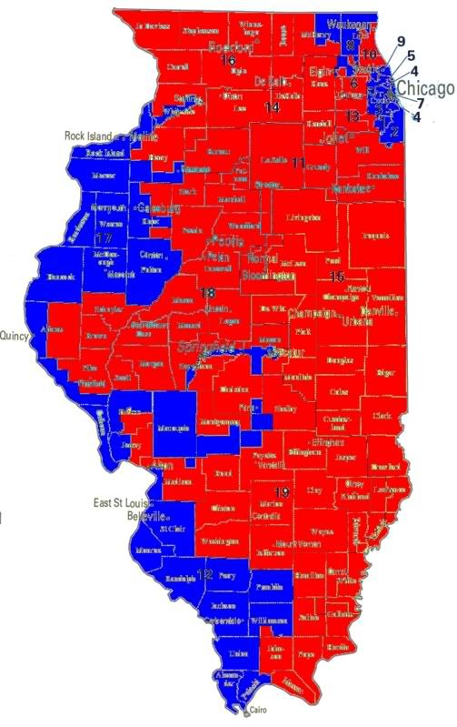
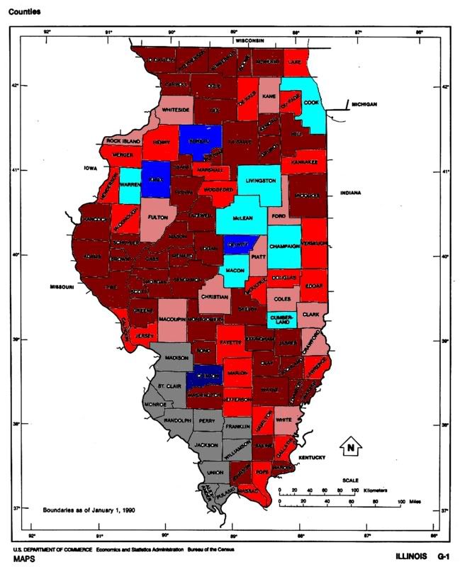
Today’s diary will focus on Illinois. As always first up are the seat control maps, no seats changed hands in Illinois.
Illinois
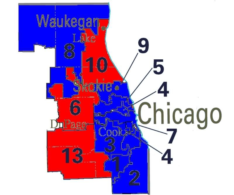
Chicago Metro Area
Of the 3,453,132 votes cast in the 2006 US House races in
Wisconsin, 1,986,431 votes (57.5%) were cast for Democratic candidates, while 1,443,076 votes (41.8%) were cast for Republicans. Including unopposed races that Democrats had an 15.7% vote total advantage, a 3.9% improvement over 2004.
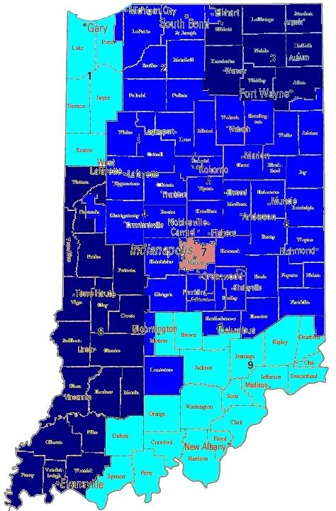
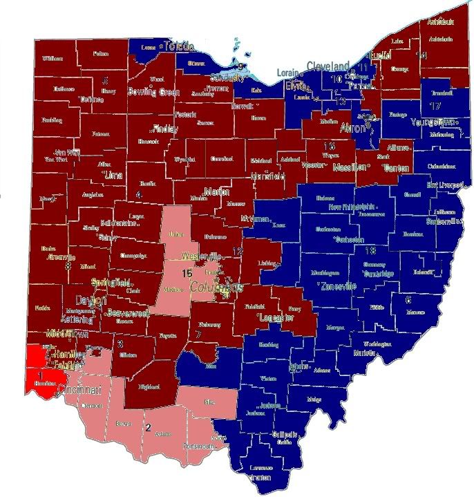
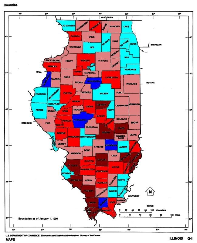
2006 Vote Margins
The deepest blue indicates a Democratic vote share over 60%, medium blue 55-60%, light blue 50-55%, pink 45-50%, medium red 40-45%, deep red 40% or less.
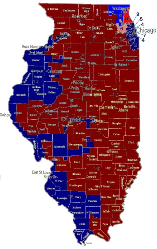
As is clear from the map Cook county (Chicago) is both a Democratic powerhouse, and is not clear Cook County is by far the most populous county in the state. With 2,710,118 registered voters, Cook County is home to over 1/3rd (36.7%) of registred voters in Illinois. Expanding to the full Chicago MSA (Metropolitan Statistical Area, includes Cook, DeKalb, DuPage, Grundy, Kane, Kendall, Lake, McHenry, and Will counties) the Chicago area is home to 4,530,906 voters, or 61.4% of the state’s
registered voters. Excluding the Chicago area, Illinois bears a strong resemblance to Ohio and Indiana, with Republican areas in the center of the state, and ancestral Democratic districts in the southern part of the state.
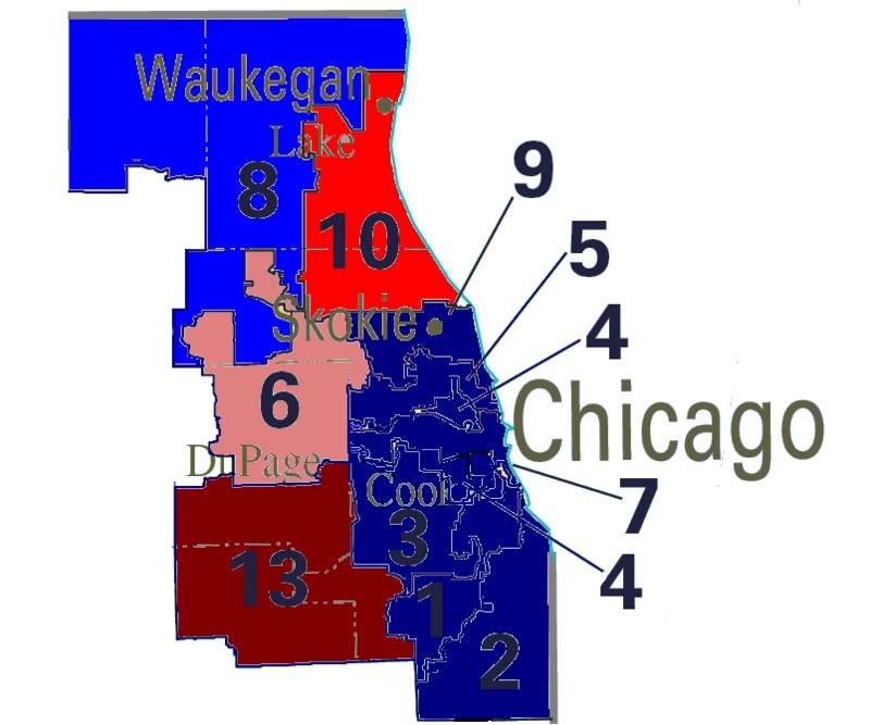
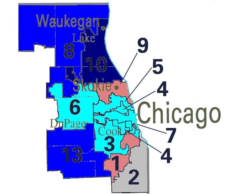
The two closest races in the state were located in Chicago’s northwestern suburbs. In the closest race, the IL-06, Republican Peter Roskam scored a narrow 4,810 vote margin (2.7% ) over Iraq war vet Tammy Duckworth. In the IL-10, Democrat Dan Seals was defeated by Republican incumbent Mark Kirk by 14,731 vote margin (6.8%).
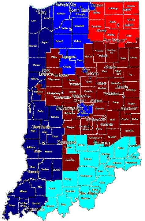
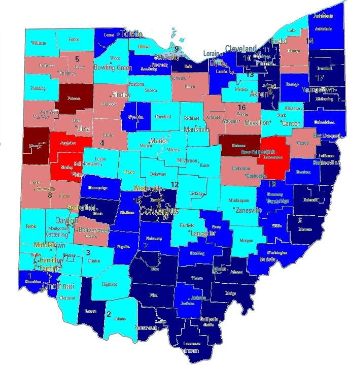
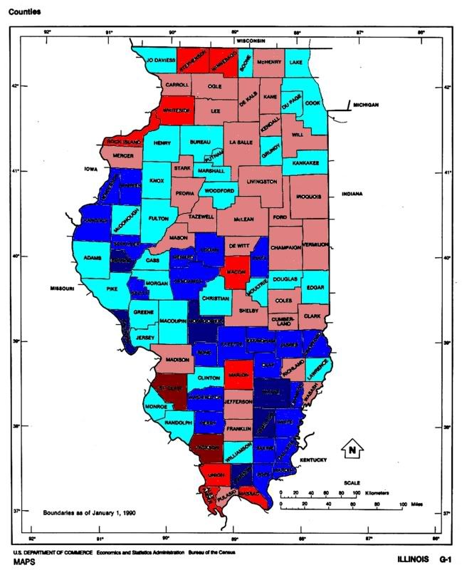
Turning to vote shar gainse between the 2004 and 2006 elections, the IL-10 saw the Democratic vote share surge.
2006 Vote Gains
The deepest blue indicates a Democratic vote gain of over 10%, medium blue 5-10%, light blue 0-5%, pink 0 to -5%, medium red -5 to -10%, deep red -10% or less.
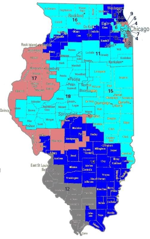
The IL-02 and IL-12 are both grayed out because in one of the two years the district was uncontested. Again, the most impressive Democratic vote gain was in the IL-10 where the Democratic vote share rose from 35.7% in 2004 to 46.6%. As well, Democrats in both the IL-14 and IL-18 saw the Democratic vote share rise by 6.8%, with Democratic candidates raising vote totals from the low
30’s in 2004 to just around 40% this year. In general, while the Chicago area is largely a static area as Democratic vote shares top out as the area has been transformed to a Democratic stronghold, downstate and in the river counties there is a still a large potential for growth.
As a result of this dynamic, further gains in the Chicago area will likely come from get out the vote campaigns, while downstate populist economic messages might offer the potential to convert rural Republicans worried about the exodus of factory jobs that have hit the state.
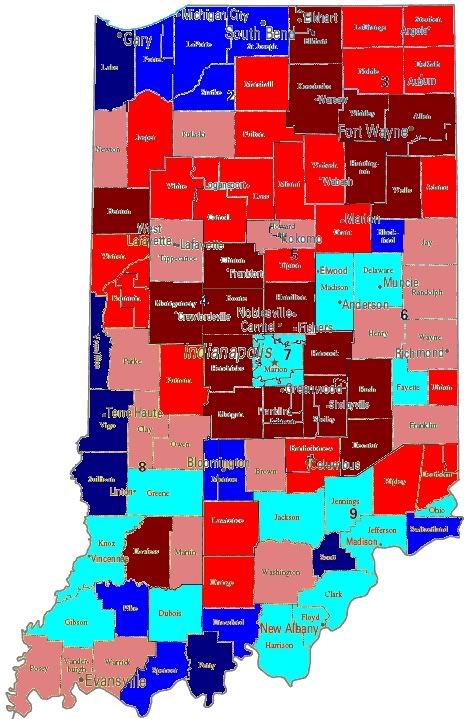
Looking at differences in turnout between 2004 and 2006, something very important about the Chicago area emerges.
2004
2006
These maps show deviation from statewide turnout. The deepest blue indicates a turnout of 10% or more over the state average, medium blue 5-10%, light blue 0-5%, pink 0 to-5%, medium red -5 to -10%, deep red -10% or less of the statewide turnout average.
Statewide turnout in the 2006 election was 48.6%, a 22.7% drop off from the 2004 turnout at 71.6%. The most obvious change between the two years comes in the Chicago area with turnout in Cook County and neighoring DuPage and Will counties turnout dropping by more than a quarter. With victory in the Chicago are largely falling to the effectiveness of campaigns in turning out the vote, this augurs well for Democratic opponents in the IL-06 and IL-10 in 2008. As turnout in these counties increases due to the presidential election in 2008, Democrats downticket in the Chicago area stand to benefit. Looking at this another way, below I’ve created a map that demonstrates the midterm dropoff.
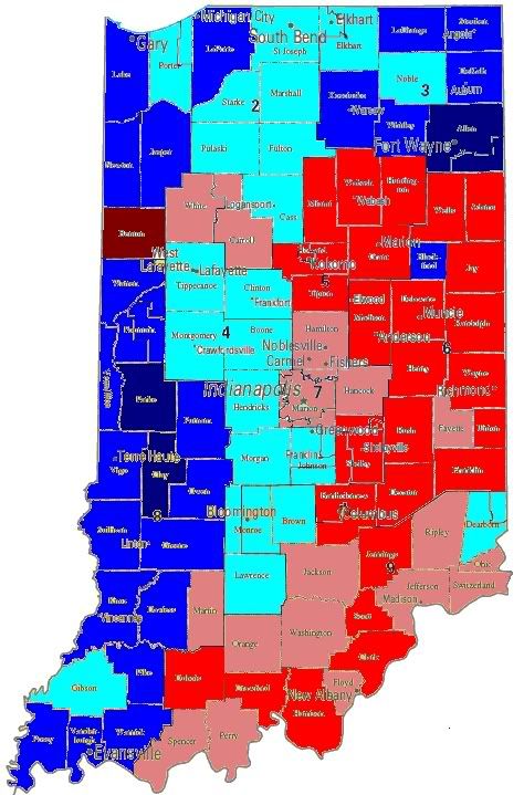
Midterm dropoff
Shading indicates deviation from 2006 statewide dropoff of 22.7% from 2004 election. The deepest blue indicates a dropoff of 10% or more over the state average, medium blue 5-10%, light blue 0-5%, pink 0 to-5%, medium red -5 to -10%, deep red -10% or less
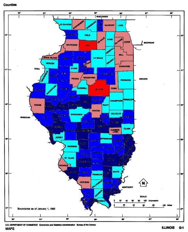
On this map, the more blue the county is shaded the less variation in turnout between 2004 and 2006. More so than the other maps this shows the magnitude of the midterm dropoff effect in the Chicago area. While turnout in Chicago are dropped by more than a quarter, downstate while turnout did drop, it did so only by about 10%. Thus, the biggest driver behind the midterm effect in Illinois was the Chicago region. Basically, what emerges is a divide between urban Chicago where turnout determines who wins elections, while downstate victory will depend on the ability of Democrats to win over enough Republican voters to overcome the slight Republican lean of much of the region. Using the vote share totals from the Comptroller, Secretary of State, and Treasurer races, I’ve created a measure of base Democratic performnace,which I’ve mapped below.
The deepest blue indicates a base Democratic vote share over 60%, medium blue 55-60%, light blue 50-55%, pink 45-50%, medium red 40-45%, deep red 40% or less.
Top 5 Democrat Counties
County % DEM Region
Cook 74.6% Chicago
Gallatin 68.0% Southern
Calhoun 65.0% Western
Rock Island 64.5% Western
Alexander 64.1% SouthernBottom 5 Democrat Counties
County % DEM Region
Ford 31.5% Central
Iroquios 33.4% Central
Livingston 34.2% Central
Woodford 35.0% Central
McClean 39.6% Central
Again, Cook County emerges as the deepest blue part of the state. Other areas of Democratic strenght can be found in the Rock Island, East St Louis, and Cairo areas. Republican strenth is concentrated in the east central area of the state, with most of the red areas of the state being competitive. Slightly more than 5% of Illinois voters live in counties where Republicans, as measured by base partisanship, constitute more than 55% of the electorate. While Democrats have grown incredildly strong in the Chicago area, for the most part in the rest of the state Democratic congressional candidates significantly underperformed the base partisanship.
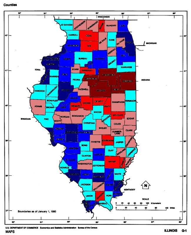
Congressional Democratic Performance
The deepest blue indicates a Democratic congressional vote share over 10% or more over the base, medium blue 5-10%, light blue 0-5%, pink 0-5%, medium red -5-10%, deep red -10% or less.
Counties included in the IL-12 are grayed out because the Democrat in that district ran unopposed. Looking at the state, it’s clear that Democratic candidates have significant room for growth throughout the state. The measure of base partisanship I’ve constructed is the mean of three low profile state races where voters most often vote for the party rather than the person. While many people use the Presidential or Governor vote share as a measure of partisanship, that is misleading. Because the purpose of a measure of base partisanship is measure the effect of party cues on voters, yet in those high profile races party cues play very little role in determining vote choice. In low profile state races party cues constitute the principal way in which voters choose who to vote for.
Looking back on what we’ve covered today, two themes emerge.
1. Chicago is a mature electorate. In Cook County, Democrats are dominant, and the large dropoff in midterm elections augurs well for 2008.
2. In the rest of the state, Democrats are underperforming by a large margin. Voters who lean Democratic, voting for Democratic candidate for Secretary of State, Comptroller, and Treasurer, are not voting for Congressional Democrats. Democrats took 57.8% of the state’s congressional vote, and constitute 60.3% of the state’s electorate when using base partisanship measures. If Democrats succeed in breaking through to rural voters who choose Democrats for low profile races, but give their vote to Republicans for Congress 2-3 seats above and beyond those identified earlier could come into play.
In this series I have created a race tier system that is I will explain in the next few sentences. Tier 0 races are those where the Democratic candidate won by a margin of less than 5%, the presumption being that incumbency grants an advantage of 5-10% that with the fundraising advantage that comes with holding office should be sufficient for these candidates to defend their seats without funding from the party. The assumption that incumbency gives a 5-10% advantage drives the classification of the pickup categories. Tier 1 races are those where the incumbent won by less than 5% in 2006, while tier 2 races are those where Republicans won by less than 10%. Looking at Illinois there is one Tier 1 race, and one Tier 2 race.
Tier 0
Race D% R% Margin 2006 D Cand.
No races meet the criteria for this tier.
Tier 1
Race D% R% Margin 2006 D Cand.
IL-06 48.6 51.4 2.7% Tammy Duckworth
Tier 2
Race D% R% Margin 2006 D Cand.
IL-10 46.6 53.4 6.8% Dan Seals
And finally the running totals for the series.
Tier 0 (5)
CT-02, NY-19, NH-1, IN-09, WI-08
Tier 1 (10)
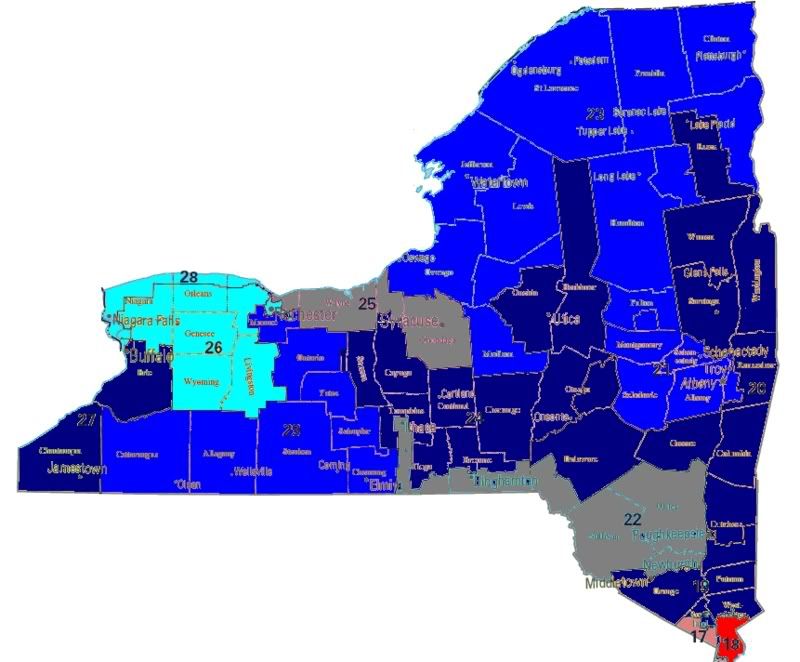
CT-04, IL-06, NJ-07, NY-25, NY-26, NY-29, OH-2, OH-15, PA-06, MI-07
Tier 2 (5)
OH-01, PA-15, IL-10, IN-03, MI-09
States Covered
CT, IL,IN, MA, MD,ME, MI, NH, NJ, NY, OH,PA, RI, WI, VT