Analyzing Ukrainian Elections, Part 1

This is the first part of two posts analyzing Ukrainian elections. This first part will focus upon the 2004 presidential election, which showed a remarkable degree of regional polarization. The second part can be found here.


The 2004 Presidential Election, Version Ukraine

In the last months of 2004, Ukraine held a total of three elections. In the first round, candidates Viktor Yanukovych and Viktor Yushchenko received the greatest share of votes. The two then competed in what turned out to be a rigged run-off, with Mr. Yanukovych supposedly winning. After prolonged protests, cumulating in the Orange Revolution, another run-off was held. Pro-western candidate Viktor Yushchenko ended up as the victor of this fair run-off, beginning what would prove to be a troubled presidential term.

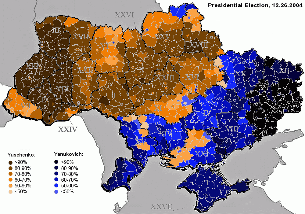
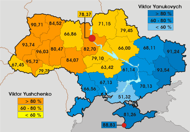
This post will analyze the third, and possibly the only unrigged, election. Here is a map of the results:

Photobucket

(Note: This map is taken from the site ElectoralGeography. It’s analysis of the 2004 Ukrainian election can be found here.)

More below.

In this third round, Mr. Yushchenko ended up with 51.2% of the vote, compared to the 44.2% support earned by his opponent (the rest voted “informal” or “against all”).

The first thing one notices is the overwhelming degree of polarization. It is almost as if Ukraine is two separate nations happening to inhabit the same name. In the western and central Ukraine, Mr. Yushchenko is a rock star; he wins greater than 60% of the vote in every single province. But in eastern Ukraine and the Black Sea coast, Mr. Yushchenko is deeply, deeply unpopular – winning less than 40% of the vote in all but one province.

Indeed, there does not seem to be much of a middle ground. Mr. Yushchenko either wins by a landslide, or he loses by a landslide. He either gets more than 60% of the vote or less than 40%. This analysis still holds true as one looks at the results at a more detailed level:

Analyzing Ukrainian Elections

(Image Courtesy of ElectoralGeography.)

The regional borders constitute an almost perfect dividing line between Yushchenko-land and Yanukovych-land. There is some lessening in polarization as one approaches the “border,” but not much. One often goes straight from 60+% Yushchenko support to 60+% Yanukovych support.

This phenomenon was not just unique to the 2004. In election after election, Ukraine is divided into two camps: the northwest votes pro-West; the southeast votes pro-Russian.

Here is the 2010 presidential election:

Ukraine 2010 Presidential Election

This map indicates Mr. Yanukovych’s support in the 2010 presidential election, by province. This time he won – in a fair election – claiming 49.0% of the vote to the 45.5% polled by his opponent Yulia Tymoshenko. Compared to 2004, polarization has gone slightly down; this time only four provinces gave more than 90% of the vote to one candidate, instead of six.

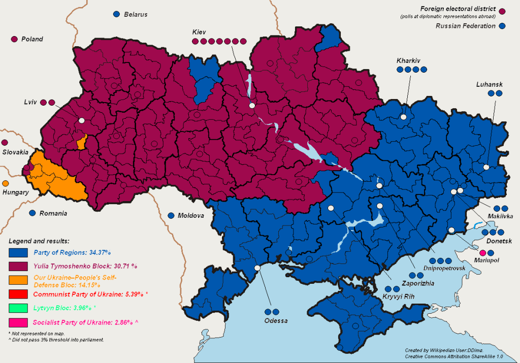
Or take the 2007 parliamentary elections:

Analyzing Ukrainian Elections

Guess which part of Ukraine voted for Mr. Yanukovych’s party.

This type of regional polarization did not occur by chance or luck. Rather, Ukraine’s electoral divide has long-standing historical and linguistic roots. Modern Ukraine itself contains two almost separate identities, which elections simply happen to reflect. The next section will analyze how differences came into being.

–Inoljt, http://mypolitikal.com/
Polarization: Past and Present

A number of commentators have lamented increasing polarization in Washington. Conventional wisdom has it that America is as divided and partisan as it ever has been. Sectional divisions are tearing this country apart and preventing problems such as the deficit from being addressed; the differences between blue America and red America, in this view, are rapidly approaching crisis point.

There is some justice to this view. Polarization has probably increased, by a number of metrics, over the past few elections. Indeed, I previously noted something to this exact effect.

Let’s take another look, however, at the hypothesis, using a different type of measurement. Do blue states elect Republican representatives, and vice versa? In a polarized nation, this would probably not be the case.

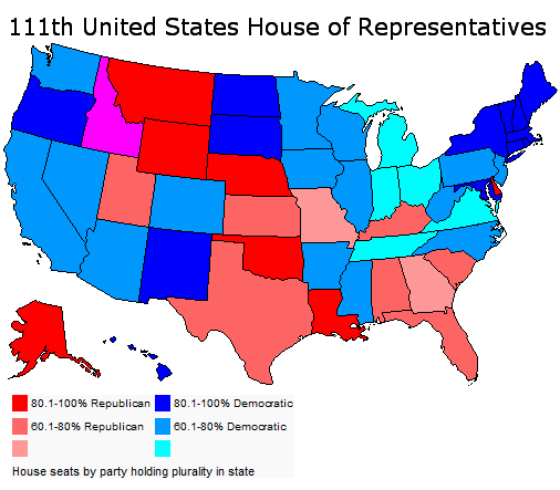
Here is the House today:

Polarization: Past and Present

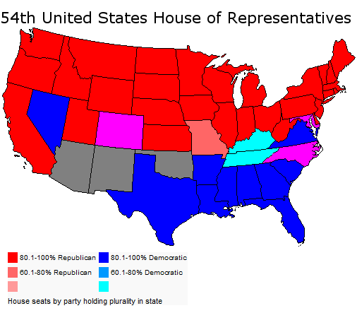
Here is 1894:

Polarization: Past and Present

As this stark contrast illustrates, perhaps polarization ain’t so bad as it used to be.

More below.

The 2008 image is a fascinating map in that it almost perfectly matches the 2008 electoral college. One sees the Republican corridor of strength in the South and Mountain West. Most of the map is blue since Democrats have a 255-178 majority, the result of two previous Democratic landslides.

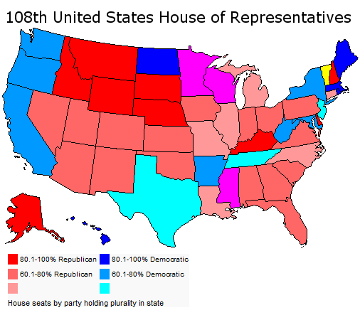
Here is a map of a House with a Republican majority:

Polarization: Past and Present

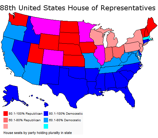
This House was the result of 2002 congressional elections. Republicans had done well in the wake of 9/11, and they had a 232-201 majority.

In the map there are relatively few states with 80-100% of representatives from one party. Blue states elect Republicans; red states elect Democrats. Moreover; for some states (e.g. Delaware, the Dakotas) it is mathematically impossible to be less than 100% Democratic or Republican.

Let’s move back several decades:

Polarization: Past and Present

The date is 1960; President John Kennedy has just been elected. Democrats hold a 258-177 majority, almost identical to that today.

There are a lot more “one-party states” compared to the current map. Sectional division is far more pronounced; there is a line between North and South that simply does not exist in today’s House. In 1960 – especially in the still-standing Solid South – blue states generally did not elect Republicans, and vice versa.

Polarization grows even worse if one goes back further. Here is 2002, once again:

Polarization: Past and Present

Here is 1894:

Polarization: Past and Present

Republicans have just won 130(!) seats. They hold a 254 to 93 majority.

In this incredible map, there are only six states with congressional delegations less than 80-100% from one party. In it one can literally trace the battlefields of the Civil War.

This is real polarization, the results of a nation so divided it had literally torn itself in two. This is the type of polarization that results from scars so deep that they took more than a century to heal.

Perhaps today America is indeed growing more polarized, more divided into red states and blue states. But when one compares the present situation to past ones, there is literally no comparison. The United States has a long way to go before it gets as polarized as it did during the latter half of the 19th century.

–Inoljt, http://mypolitikal.com/
Electoral Polarization

By: Inoljt, http://mypolitikal.com/
In my previous post, I noted that almost all the counties President Barack Obama won have become more Democratic since 1992, while almost all the counties Senator John McCain won have become more Republican since 1992.

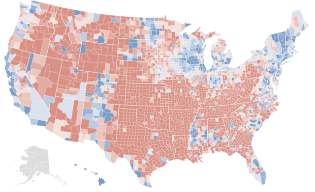
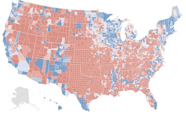
In fact, comparing maps of the 2008 presidential election and the county changes from 1992 indicates a striking correlation.

Here is the 2008 presidential election:

Photobucket

Here are the changes from the 1992 presidential election:

Photobucket

This hints at a disturbing picture of electoral polarization. More analysis below.

On the one hand, all this is somewhat intuitive. If a Democratic candidate does well in a specific place, he or she probably improved on a previous Democrat’s performance there – and vice versa. Moreover, these maps do not imply that all blue regions became more Democratic (nor the opposite); rural Appalachia, in the most famous instance, has trended sharply Republican, while much of suburban American has gone in the opposite direction.

On the other hand, this phenomenon does not constitute a mathematical rule. If a Democratic candidate wins a county, that doesn’t necessarily imply that he or she improved upon a previous Democrat’s performance. He or she could have done worse but still won; the previous Democrat might have overperformed, or the Republican might have encouraged cross-over voting.

Yet by and large, this has not been the case. Obama practically always outperformed former President Bill Clinton in today’s Democratic counties. Mr. McCain practically always overperformed former President George H. W. Bush in today’s Republican counties.

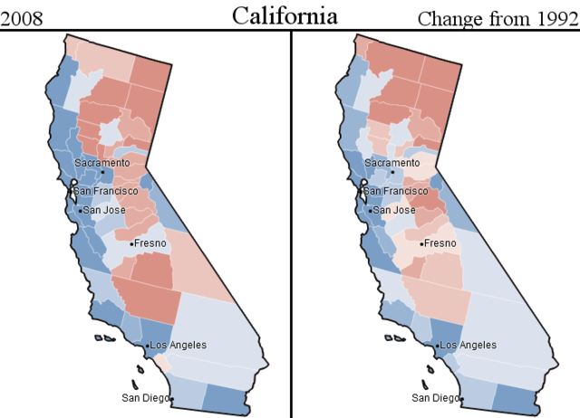
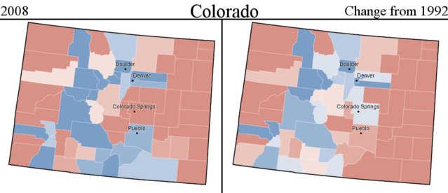
Taking a look at selected states provides a powerful illustration of this fact.

Here is California:

Photobucket

Here is Colorado:

Photobucket

All this implies something rather disturbing: electoral polarization has been steadily increasing. Obama only improved on Mr. Clinton’s performance in the counties Obama won. McCain only improved on Mr. Bush’s performance in the counties McCain won. The almost total lack of cross-over gain suggests that each party has come to depend on deepening their base, rather than widening the electorate and appealing to moderates.

That America is getting more divided has, of course, been known for a fairly long time. In some ways the maps exaggerate the polarization: 1992 Clinton appealed to many Republicans, while Obama’s strength lay amongst the Democratic base. Then there is the Ross Perot effect, which lowered margins in both party strongholds (e.g. New England, the Plains states).

But perhaps a bit of exaggeration is needed. Polarization has rarely been good for any country, and its increasing prevalence bodes poorly for the future of the United States. A map like this provides a potent illustration of polarization in action; indeed, I have never encountered a more striking image of its increase. Such a picture might do us some good.

(Note: Credit for all maps is given to the NYT; some images have been modified.)

Analyzing Afghanistan’s Election

By: Inoljt, http://thepolitikalblog.wordpress.com/

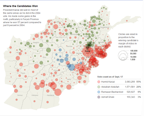
The New York Times posted a very interesting map of Afghanistan’s recent election.

Photobucket

Before continuing, I must note that my purpose is not to question whether irregularities or fraud might have denied Abdullah Abdullah victory; I am simply analyzing the data as it appears.

There’s a lot of data here, and interpreting it is fairly difficult; few people know much about Afghan politics and demographics. This map indicates the margins each candidate won. Kabul is the big red circle. In total, Karzai won 55% of the vote, essentially doubling the vote of the second-closest candidate.

Compared to a similar maps of U.S. elections, several things stand out. The first is the extent to which polarization is apparent. Afghani society is very clan-based, and elections can reveal polarization like nothing else.

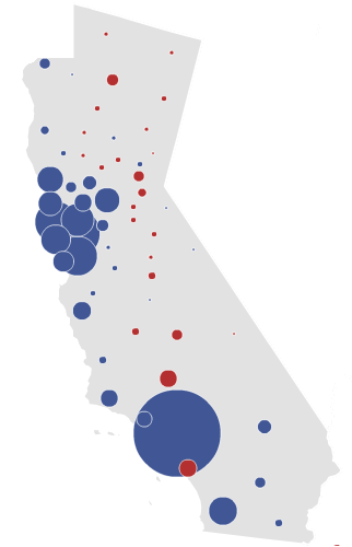
At the point most politicians win an election by more than 20%, maps like the one above tend to consist of something like below:

Photobucket

This is Barack Obama’s 24.03% landslide in California. Compare it to Karzai’s 27% victory: one might be forgiven for concluding that out of the two elections, Karzai did worse.

(Many) more maps below the fold.

Notice too that Ramazan Bashardost, who won only 9% of the vote, shows up as a presence on the map. This indicates a very regional candidacy, like that of William Wallace. Candidates who win 9% of the vote nearly never show up on any type of election map; Ross Perot, for instance, won less than a dozen counties with his 18.9% of the vote.

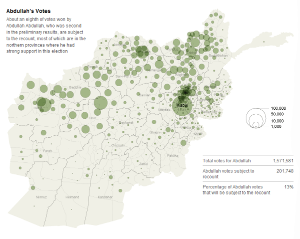
Abdullah Abdullah was also a regional candidate, as the following map reveals:

Photobucket

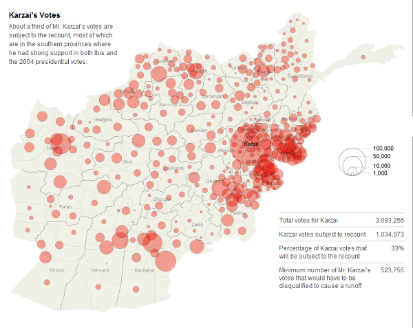
Mr. Abdullah  is almost entirely limited in support to the north; very few Pashtuns in the south seem willing to vote for him. This was not the case with Karzai; his total vote looks far more homogeneous:

Photobucket

There are several American states that the results Afghanistan’s election can be comparable to. The victor wins the one major city along with a number of more rural areas, although the opposing candidate summons strong support in one region. In this respect, Karzai’s victory resembles the coalition Bill Clinton assembled in many Appalachian states, such as Missouri and Tennessee (his loss in Oklahoma also bears similarities to Afghanistan). Recent presidential elections, on the other hand, generally do not follow this pattern; cities and rural areas rarely vote together (and cities never vote Republican). After Bill Clinton, only Obama’s Iowa victory comes to mind as a state with a “Karzai” coalition. Note that in all this states, the winner’s margin was far less than Karzai’s 27%.

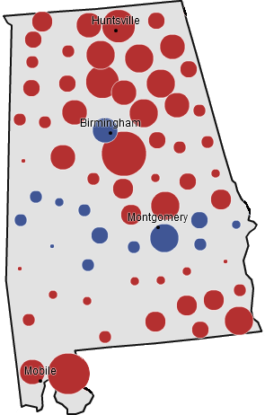
The place that Afghanistan’s election calls most to mind, however, is Alabama. Both are extremely polarized: Afghanistan by tribe, Alabama by race. Republicans regularly win landslides in Alabama, yet always lose a particular region – the Black Belt – just as Karzai lost many Afghan areas despite his strong performance. Accusations of fraud have severely tainted the Karzai “landslide,” just as fraud of a different type was practiced in Alabama for many decades. Finally, both areas are extremely poor and will likely remain so during the forseeable future.

To end this post, here is McCain’s performance in Alabama.

Photobucket