By: Inoljt, http://mypolitikal.com/
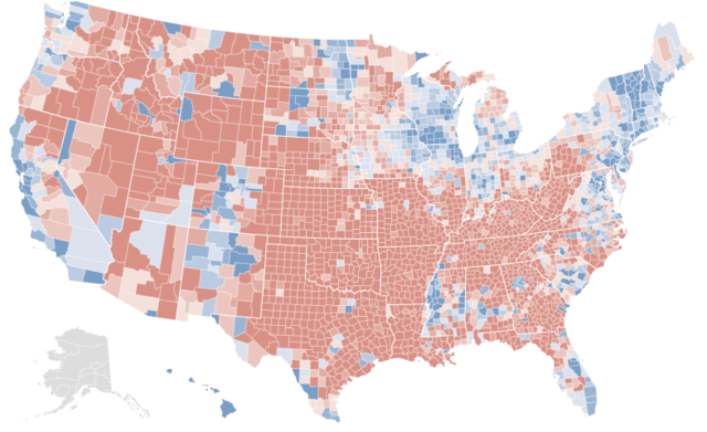
This map is not what you think it is. Take a moment to guess what it represents.
The answer below the flip.
At first glance, it looks a lot like the results of the 2008 presidential election. The northeast and midwest are all blue. Then there’s the west coast – a long line of blue counties. One could be quite easily forgiven if one took this map for a county-by-county map of the 2008 presidential election.
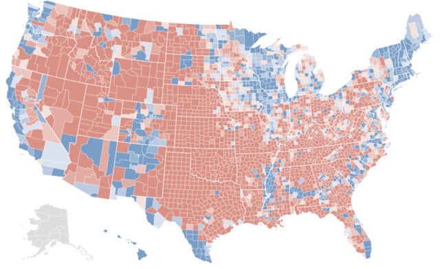
In fact, here are the real election results:
[Note: If you want to better compare the two maps, open two tabs of this (the first map) and
this (the actual results). Then switch between them.]
There is an extremely strong correlation between the two maps. Almost all the same counties are blue or red. Peering closer only cements this impression. Nevada has three blue counties – the exact three Democrats won. In Texas, only the cities and the Hispanic southwest are blue – a precise replication of the real results. One can go on and on, spotting these types of similarities.
Yet there are minor anomalies. Central Indiana and southern Florida are uniformly blue; President Barack Obama generally lost these areas. More significantly, the vast majority of Minnesota shows up red – strange, given that Democrats won the state by double-digits.
Minnesota should provide a clue of what the first map represents. Although the Democratic candidate won the state, it has been trending red for several elections. Before reading more, take a minute to refine your first guess.
.
.
.
If you haven’t figured out what the first map represents by now, here’s a bigger hint: look at Arkansas. Notice how uniformly red it appears in the first map, despite the several counties Mr. Obama won. Try to guess again – you probably can figure it out now.
.
.
.
Here’s the answer: the first map represents voting shifts between the 1992 presidential election and the 2008 presidential election.
As you have seen, there is quite a startling correlation between the two maps. Over the past four elections, the vast majority of counties President Barack Obama won have become more Democratic, while the vast majority of counties Senator John McCain won have become more Republican.
In the next post, I will attempt to analyze the meaning of this.

