(Phenomenal work. The graphs and analysis below the fold are a must-read. – promoted by James L.)
Crisitunity compiled a whole lot of data, and wrote a diary about the PVI-Voting Pattern Index. It’s a great piece. But I thought some graphics would be nice. And some more statistics. First, go read that diary. When you get back, I’ll be below the fold.
First, let’s look at all 435 representatives. I’ve plotted each rep’s Progressive Punch score against their district’s Cook PVI.
Repubs in red, Dems in blue
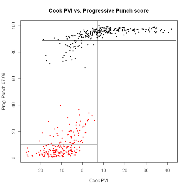
the first point is clear: ALL Democrats are more progressive than ALL Republicans. We are ALWAYS better. All the talk about how bad the blue dogs are is….well, wrong. Democrats are better than Republicans. Period.
Next, look at the lines that divide the plot into boxes. Here, the point is that, above about Cook PVI of D + 8, every Democrat gets a good PP score. Every Democrat who got a PP score under 89 came from a district with a Cook score of under D+8. If we want better Democrats, we need better voters. Move the population, the reps will follow.
A somewhat different picture comes from using National Journal’s ratings.
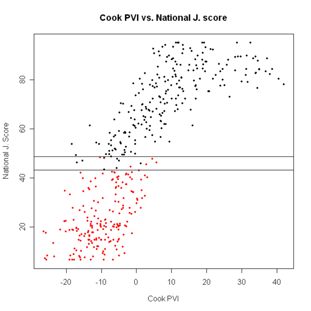
There are actually some Democrats who are less liberal than the most liberal Republicans, and vice versa. They’re between the two vertical lines in the plot; there are 12 such districts:
CT-04 R Shays
DE-AL R Castle
GA-12 D Barrow
IL-10 R Kirk
IN-02 D Donnelly
IN-08 D Ellsworth
LA-03 D Melancon
MD-01 R Gilchrest
MS-04 D Taylor
NJ-04 R Smith
OK-02 D Boren
TX-22 D Lampson
7 Democrats out of 234 are less liberal than the most liberal Republican.
So, which should we use? If we went just by better statistical properties, we’d pick the National Journal rankings. But substance should always trump method. If we look at the graph below, we can see the difference in the two ratings: There are no PP scores between about 40 and 60. Is this reasonable? Well, for our purposes, I don’t think it is. If our aim is particularly to identify the most conservative Democrats and the least conservative Republicans, we want a measure that is sensitive exactly in that middle region. So, from here, we’ll use NJ ratings
Now, let’s just look at the Democrats
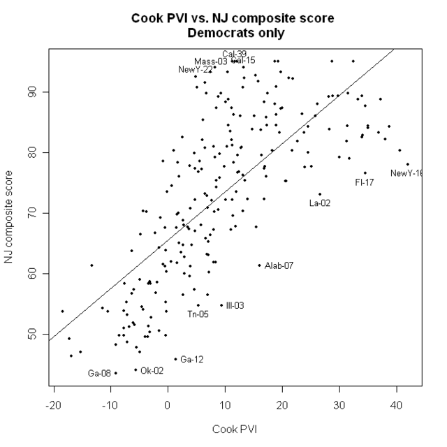
Here, the straight line is not a bad fit.
I’ve identified some of the best and worst, compared to their district’s PVI numbers
What else can we do? Well, region is always regarded as important. The census bureau divides the nation into 9 regions. I’m not saying it’s the greatest division (I may do a diary sometime on other ways to make regions) but it’s not horrible, and it’s standard, if only because the Census says so. here is one map of the regions.
If we attempt to fit a linear model for all 435 districts to NJ numbers from region, we get this:
Coefficients:
Estimate Std. Error t value Pr(>|t|)
(Intercept) 48.9848 3.1517 15.543 < 2e-16 ***
regionE. Sou Cent - 11.8008 6.0130 - 1.963 0.05037 .
regionMid Atl 12.9774 4.5475 2.854 0.00454 **
regionMountain - 11.4815 5.6379 - 2.037 0.04234 *
regionNew Eng 31.0437 6.4149 4.839 1.84e-06 ***
regionPacific 10.1898 4.4405 2.295 0.02225 *
regionSouth Atl - 4.5797 4.2823 - 1.069 0.28549
regionW. North Cen - 0.5241 5.7746 - 0.091 0.92772
regionW. Sou Cen - 13.3131 4.9178 - 2.707 0.00707 **
---
Signif. codes: 0 '***' 0.001 '**' 0.01 '*' 0.05 '.' 0.1 ' ' 1
One thing this tells us is the average NJ score from each region. Across all regions, it’s 48.98 (that’s the intercept). For East South Central it’s 48.98 – 11.80 = 37.18; for the mid Atlantic, it’s 48.98 + 12.98 = 61.96; and so on. The most liberal region (no surprise) is New England, where the average representative gets a 48.98 + 31.04 = 80.02; it would be even higher, except for Shays (CT-04), who is the only Republican in the region, and who got a 47.7.
I’m a little surprised that Mountain is just as conservative as East South Central.
Another interesting thing is that region, by itself, only accounts for about 17% of the variance in NJ score.
But what if we combine region and Cook PVI? Do we do better at predicting NJ scores? We sure do. That model accounts for 70% of the variance in NJ scores. And, if we add party to the model? That model accounts for 89% of the variation in PP scores…. which is pretty amazing.
Here is a summary of that model
Coefficients:
Estimate Std. Error t value Pr(>|t|)
(Intercept) 65.21028 1.33998 48.665 < 2e-16 ***
regionE. Sou Cent - 3.79987 2.20085 - 1.727 0.085000 .
regionMid Atl 1.40556 1.65805 0.848 0.397087
regionMountain - 1.35274 2.05635 - 0.658 0.511012
regionNew Eng 8.95746 2.35363 3.806 0.000163 ***
regionPacific 2.52476 1.60749 1.571 0.117041
regionSouth Atl - 0.68440 1.55044 - 0.441 0.659138
regionW. North Cen - 0.29151 2.10166 - 0.139 0.889753
regionW. Sou Cen - 3.68887 1.81898 - 2.028 0.043206 *
repdata$Actual.PVI 0.74017 0.04772 15.512 < 2e-16 ***
partyR - 34.16677 1.25862 - 27.146 < 2e-16 ***
what’s interesting here is that, after accounting for party and Cook PVI, region doesn’t make much difference. The region that’s the most different is New England, and that is 8.96 points more liberal on average, than would be predicted from just party and Cook PVI. But, other than New England, all the regions are just about where the model would predict.
Next is a graph of the predicted values from that model, and the actual NJ ratings
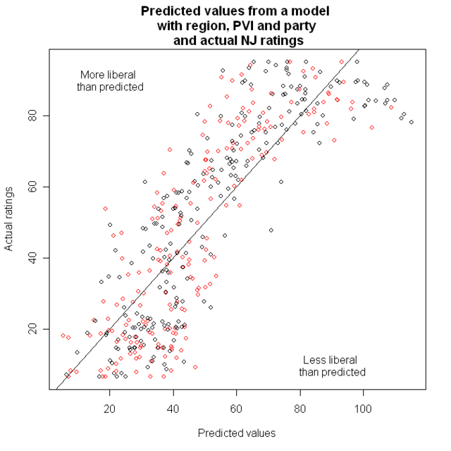
Now, we want to look at points that are far from that line; but it’s easier for people to judge distance from a horizontal line than a diagonal one. That leads to the Tukey Mean Difference plot. On the X-axis, we have the average of what was on the X and Y axes before: That is, the predicted value and the actual value. On the y axis, we now have the difference between them.
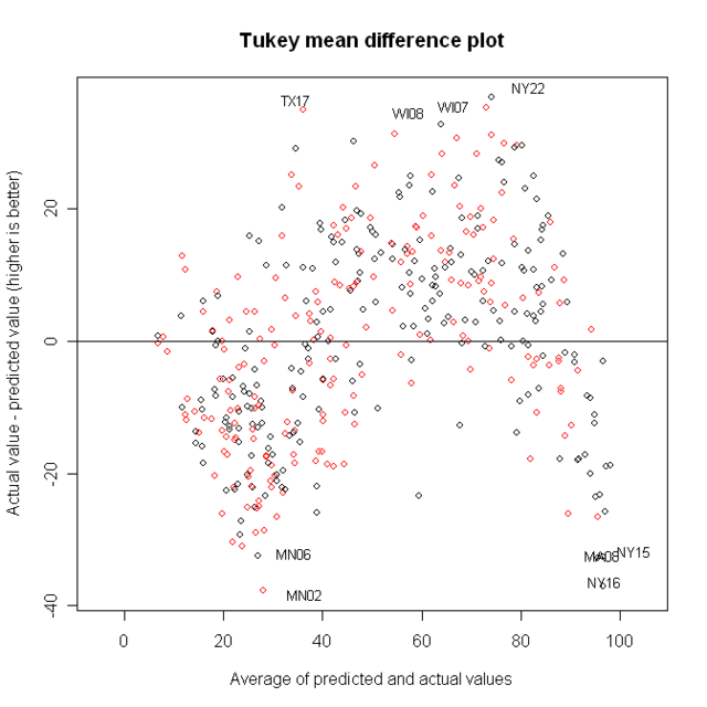
I’ve identified four of the best and worst districts.
But if we want to identify good and bad Democrats, we should go back to looking at just Democrats.
A model with region and CookPVI looks like this
Estimate Std. Error t value Pr(>|t|)
(Intercept) 63.3242 1.6443 38.512 < 2e-16 ***
democrats$Actual.PVI 0.7410 0.0502 14.762 < 2e-16 ***
region[party == "D"]E. Sou Cent - 5.2676 3.1070 - 1.695 0.091432 .
region[party == "D"]Mid Atl 1.8968 2.0786 0.913 0.362482
region[party == "D"]Mountain 1.8168 3.0926 0.587 0.557487
region[party == "D"]New Eng 10.6171 2.5004 4.246 3.22e-05 ***
region[party == "D"]Pacific 7.5039 2.0499 3.661 0.000316 ***
region[party == "D"]South Atl 1.5945 2.1492 0.742 0.458941
region[party == "D"]W. North Cen 3.8981 2.7225 1.432 0.153630
region[party == "D"]W. Sou Cen - 3.9359 2.5680 - 1.533 0.126810
---
Signif. codes: 0 '***' 0.001 '**' 0.01 '*' 0.05 '.' 0.1 ' ' 1
Residual standard error: 8.772 on 218 degrees of freedom
(6 observations deleted due to missingness)
Multiple R-Squared: 0.6116, Adjusted R-squared: 0.5956
A couple interesting things here. The average Democrat has a NJ score of 63. Cook PVI score is clearly important: For each point increase in Cook PVI, the predicted NJ score goes up by .74 points. And New England and the Pacific region are more liberal than the model predicts.
Now, here’s the TMD plot for this model
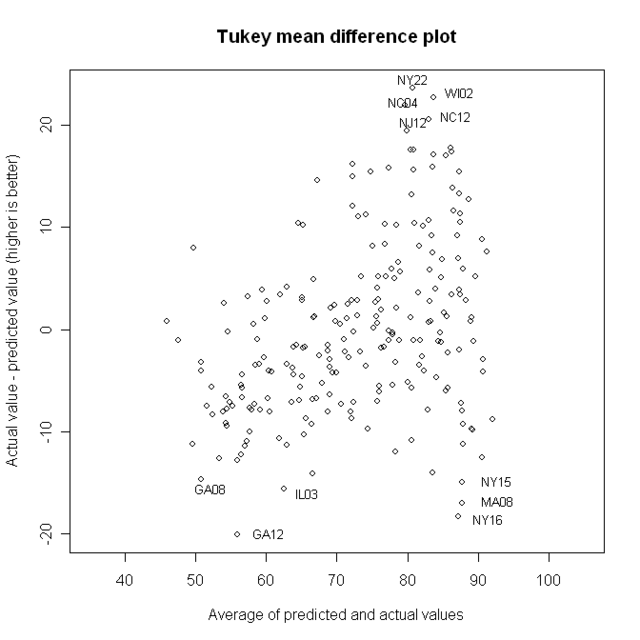
I’ve identified the best and worst. Here are their names and districts:
Best:
NY22 Maurice Hinchey – A strong liberal from a district that is D + 6
WI02 Tammy Baldwin – This district is D + 13, but her NJ score is 95
NC04 David Price – NJ score of 91, district is D+6
NC12 Melvin Watt – The district is D +11, NJ score is 93
NJ12 Rush Holt – D + 8, NJ score of 90
notice that the most liberal Democrats, from the most liberal districts, can’t appear here, because the scale simply doesn’t go that high
Worst
GA12 John Barrow. D +2, NJ = 46
NY16 Jose Serrano D +43, NJ = 78…this is the most Democratic district in the USA
MA08 Michael Capuano D +33, NJ = 83.5
IL03 Daniel Lipinski D +10, NJ = 55
NY15 Charles Rangel D +43, NJ = 80, the second most Democratic district
I’d be glad to answer questions….if not tonight, then tomorrow.
Looks like the blogosphere was dead on in picking Dan Lipinski as a target. IIRC, Barrow has gotten a lot of local opposition in Georgia for being too conservative.
The other names that were frequently mentioned were Al Wynn, Jim Costa, and Leonard Boswell. Boswell and Wynn had more conservative records in the past but voted more liberally so far this session. It did not save Wynn but Boswell is still to be determined. My personal bete noire was Rob Andrews, who seems to have taken himself out of consideration by up and running for the US Senate seat of Frank Lautenberg.
I wonder if Serrano and Capuano can be nudged left-ward much as Ellen Tauscher was by either a primary or the threat of a primary.
One or two wins a cycle through primaries is likely to have a powerful effect similar to the Club For Growth. Three wins would do it for sure.
is it possible to take folks like Rangel and Serrano and have more liberal people in those seats due to how blue they are to begin with?
How much more liberal can we potentially get out of these things?
Not like we can even really try with Rangel, Appropriations Chairman and all.
Having graduated from Binghamton University, I have long been proud of the fine Representative from NY’s Southern Tier and Ithaca. God bless Maurice Hinchey!
One caveat, of course, is that the PVI of this district is an average. I think the reality is that this is a district composed of very liberal college-town democrats and typical upstate NY rural conservatives. So the Democrats that elected Hinchey are more more liberal than the PVI suggests. That doesn’t change the fact that Hinchey does a great job of connecting with his constituents across the spectrum, of course.
I love this number-crunchy stuff.
Since NJ is based on percentiles, those in blue seats are always going to suffer. Serrano and Rangel could certainly afford to be more liberal, but it’s not like they’re actively illiberal, they’re merely in the middle of the Democratic pack rather than right at the head.
I’d also add that whilst this kind of analysis is a useful tool, it’s obviously not the only criteria for considering the liberalism of representatives. At least as important is when they cave (and I’d be interested to see a graph using PP’s Chips are Down scores) and what they lead on. Murtha, for example, tends to get a lot of slack because he’s made himself a leader on Iraq. Those who lead in the wrong way or don’t lead at all are those who most need to be taken down and they’re also likely to be the easiest targets.
The twelve House members “in the middle” by NJ ratings have an interesting pattern. The Republicans come from districts with a Democratic lean with the exception of Wayne Gilchrest who just lost his primary (Chris Smith is R+0.9, the others are from solidly but not overwhelmingly D districts of D+4, D+5, and D+7). The Democrats with the exception of John Barrow (D+2) come from Republican districts with Gene Taylor (R+16) and Nick Lampson (R+15) coming from strongly Republican districts.
Donnelly (R+4) is a freshman as is Ellsworh (R+9). Melancon was absolutely outstanding on Katrina and gets a lot of slack in my book for that.
If Shays and Kirk are taken out this cycle, certainly a good possibliity, the Republicans in the middle will be reduced to Chris Smith and Mike Castle. Nobody wants to take a run at these guys but the time of the free pass is rapidly running out.
A disproportionate share of GOP moderates went down or retired in 2006 and retirements alone hit their ranks extra heavy once again. New Democrats included at least 10 conservative/moderates. None of the 13 new Republicans is a moderate.
Thanks for the interesting analysis and discussion.
I’m wondering what the model predicts for Republicans who are wrong for their districts. Curious whether this provides new targets, or at least new Dem challengers to learn more about and perhaps send funds.
Nick Lampson, who has been ranking at the bottom of the pack, is actually more progressive than this current record shows. Why? He was out for a few months for a Heart Bypass surgery, and Progressive Punch and NJ both penalize for missing votes. While it’s true that Lampson has moved to the right now that he’s in a much more conservative district than before, he doesn’t quite deserve to be considered the most conservative Democrat of 2007-2008 based on missing a month or two.
CQ’s party unity scores. However, these also have a lot of ties, as most folks tend to be over 70 or 80 percent.
1) Which metric do you ultimately like the best?
2) Do you have a chart ranking all MoCs by that metric?
I had a feeling that a plot would show the problem Dems more clearly than a simple table. In my head, prior to doing this project, I was visualizing John Barrow and Jim Cooper as being some of the worst outliers. I was a little dismayed to see them on the list but buried under a lot of CBC members mixed in there, so the graph lets them stand out a lot more clearly (along with the more centrist members of the CBC, like Artur Davis and Kendrick Meek). Thanks for taking my work to the next level.
possible. Rangel is not going to be primaried, and it’s hard to define oneself as more liberal than he.
That’s one reason that what I’ve got here is not a measure of vulnerability.
But this might be used to show that these guys could move a bit to the left.
Rangel chairs Ways and Means, not Appropriations. I suspect his somewhat lower score results from his trying to be at least a little responsive to Wall Street concerns. In his defense, I should note that he is much better in this regard than Senator Schumer.
in my previous diary, ADA ratings just created too many ties, which is why I didn’t include it. It’s less of an issue when you’re doing it as graphs instead of in tables with discrete rankings, though, so you might want to do a plot based on ADA. The advantage to ADA is that it doesn’t get bogged down with a lot of procedural votes, focusing on the meat. One disadvantage: you essentially get penalized for missing a vote, so this takes the records of a few fairly progressive reps who were out sick for a while and makes them look like Blue Dogs.
Another disadvantage: they only use 20 votes per year and some of the choices seem odd (I know there are a lot of different FISA votes to choose from and they did include a couple, but they didn’t include HR 863, which was sort of the real root of the whole FISA debacle, and if I recall correctly was the impetus for the whole ‘Bush Dog’ concept over at Open Left) (same problem with Iraq votes… there are so many, so depending on what you choose, cherry-picking 2 or 3 Iraq votes could makes someone with a nuanced position look either like a total hawk or dove). But ADA did get it right with, say, ENDA and the Peru FTA, plus the basics like minimum wage, stem cells, and SCHIP.
Love the work, but have one objection to methodology. The scatter plots of Cook PVI and NJ ratings (for all of congress, or for just Dems) clearly show a flattening out of the curve at high PVI. This suggests that the fitted curve should not be a line, but rather a logarithmic function, i.e. one with diminishing returns. Diminishing returns with high PVI occur because the limit of the NJ ratings is reached long before the limit of the PVI is reached. Or, you already start to get the best possible Dems by the time you reach D+10, making it impossible for Dems at D+20 or D+30 to outperform them. Or, put one final way, you hit the ceiling for Dem quality at D+10. Everyone after that should be mashed up against that ceiling too, but there’s no way they can be higher the way a linear trend would suggest.
Your second to last plot (prediction errors) should also make clear that the data is not linear. If a linear fitting was appropriate, the errors should be random. We can see clearly that they are not (first negative, then positive, then negative), thus making the case for a more complex fitting function. Again, I believe something of the form y = A + B*log(x) would work well.
Despite my objection however, I love the thorough quantitative approach you’ve taken, and hope to see more diaries like this one.