By: Inoljt, http://mypolitikal.com/
Several days ago Great Britain held a general election to decide the country’s government over the next few years. Facing discontent and a nation thirsty for change, Prime Minister Gordon Brown and the governing Labor Party were soundly defeated. The challenging Conservative Party, led by David Cameroon, gained 97 seats but failed to take a majority in Parliament. Meanwhile the Liberal Democrats, who had surged after a strong performance in the first debate by their leader Nick Clegg, badly underperformed their expectations.
This election offers a useful study of a political system outside of the United States. While more similar to the United States than most countries, Great Britain’s electorate also offers a number of intriguing differences.
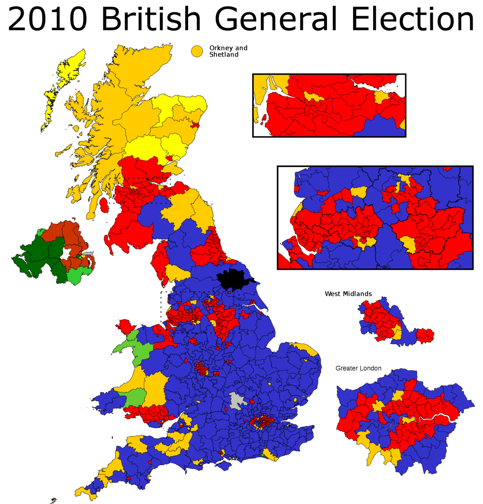
A map of the results illustrates several aspects of this system:
Note: In Britain and most of the world, the party of the left – Labour – is traditionally represented by the color red (symbolizing the revolution and the so-called blood of the workers). The Conservatives are represented by blue; the Liberal Democrats by yellow.
More below.
At first, it seems that the Tories swept the board. One can’t help but notice the sheer landmass covered by conservative-won seats.
Indeed, the Conservative Party did do quite well; with 36.1% of the vote, they won 306 out of 650 seats. Labour dropped to 29.0% and 258 seats; the Liberal Democrats took 57 seats on 23.0% of the vote.
Yet the map overstates Tory strength. Like the Republican Party of the United States, the Conservative Party does best in rural areas. Winning these seats looks good on a map but doesn’t guarantee winning an election.
The Labour Party, on the other hand, has traditionally dominated Great Britain’s densely populated cities – much like the Democrats in the United States. Much of its base lies among cities such as Sunderland, Birmingham, Manchester, Liverpool, and – of course – London. These places look small on maps but elect quite a lot of MPs.
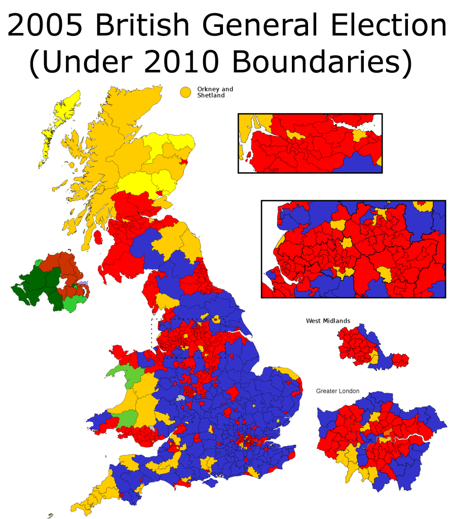
To illustrate this point, here is a map of the 2005 general election under redrawn boundaries for 2010:
Labour did quite a bit better in 2005, as this map indicates. Yet one might be inclined to guess, by the geographic spread of Conservative seats, that they lost the election. In reality, Prime Minister Tony Blair had led his party to win 35.3% of the vote and 356 seats – a governing majority.
Interestingly, Labour majorities in cities tend to be somewhat thinner than Tory majorities in the countryside. This constitutes the opposite of the situation in the United States – where Democrats often win cities by 75-25 margins and Republicans win rural regions by 60-40 margins.
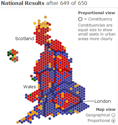
A proportional map, therefore, offers a more accurate visualization:
One sees another interesting pattern emerge here; the electorate exhibits a coherent North-South divide. In the poorer North Labour does quite well, winning a good majority of seats. In the wealthier South the Conservatives are dominant. With the exception of London, Labour wins almost no seats in southern Great Britain.
There is also a substantial difference between England, Scotland, and Wales. While England votes strongly Conservative, the latter two remain Labour strongholds. In Scotland the Tories actually come in fourth, winning only one seat – a legacy of Prime Minister Margaret Thatcher, who to this day remains extraordinarily unpopular in Scotland. Labour Prime Minister Gordon Brown’s Scottish heritage also probably also helped Labour and hurt the Tories. While the Conservatives do better in Wales, winning eight seats, they still run ten points behind Labour.
It is in South England where the Conservatives do best. Labour runs in third place in the Southwest, Southeast, and East regions. In the Southeast region, for instance, Labour wins a mere 16.2% of the vote; the Tories win 49.9% of it.
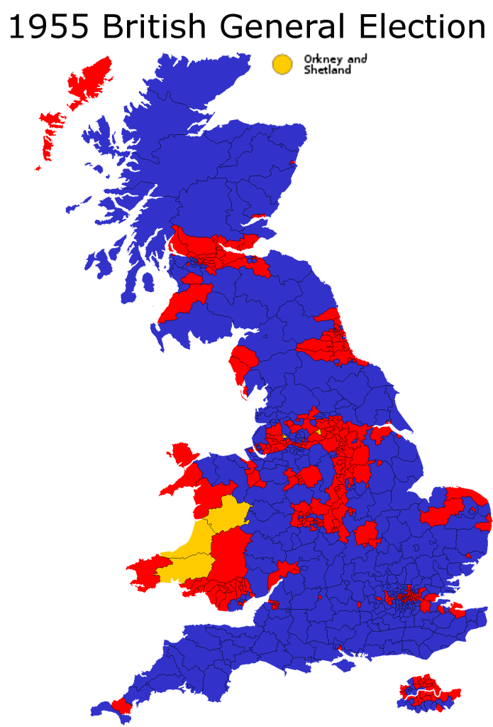
These patterns go back for a long time. Take the 1955 general election:
There are some differences, for sure. In 1955 Conservatives had a base in rural Scotland; that has vanished today. The strength of third parties is noticeably less.
Yet what strikes the eye is the degree of similarity between 1955 and 2010. By and large, the bases of the Labour and Conservative Parties remain the same as they were half a century ago. Britain’s regions exhibit a remarkable degree of stability in which party they support – something which can not be said for the United States.
Finally, perhaps the most interesting difference between the United States and the United Kingdom is the strength of third parties in the latter. Both countries follow a first-past-the-post system, which makes the presence of a non-regional third party almost impossible. Yet in Great Britain the Liberal Democrats have somehow managed to gain legitimacy and a respectable amount of seats, through careful targeting. In the aftermath of this election, with a hung parliament, there has even been substantial discussion about changing the electoral system. Meanwhile the two-party system remains iron strong in America. Despite all their similarities, cultural and systemic, the electorates of the United States and the United Kingdom are following sharply divergent paths.


Looks like the traditional swing region between Labour and Conservative is sort of in the middle of England. The LibDem gains in the SW were spreading in ’05.
I wonder if there’s a map where each of the three parties are not competitive, e.g. the Conservatives in the North, and Labour in the SW/South.
Is that, despite hearing how Cameron got the most seats and should be entitled to live at Downing Street, no one seems to be saying that Labour and the Liberal Democrats collectively got a majority of the vote. Add in the other left parties: the Greens, for example, and it’s even bigger.
I’m amazed at how the Conservatives perform so well in central London and Westminster. I know these are wealthy areas, but still, the thought of a Republican holding, say, Jerry Nadler’s NY-08 is just bizarre.