I made these maps to help us determine who’s really at advantage for redistricting and the 2012 elections. So here they are
A map showing what party is in control of the state houses
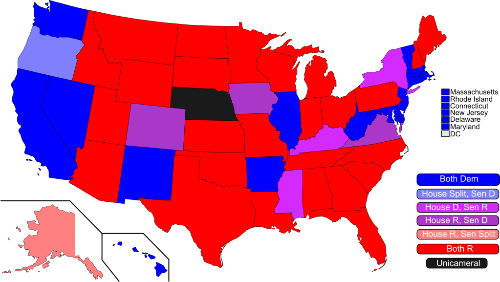
A map showing what each party’s strengths in the state lower houses
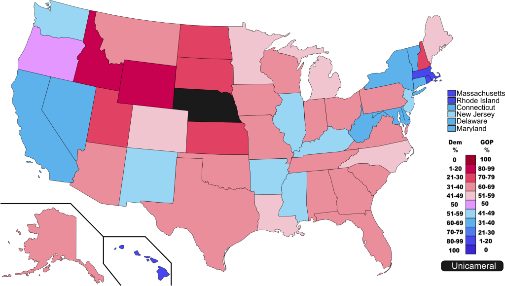
A map showing what each party’s strengths in the state upper houses
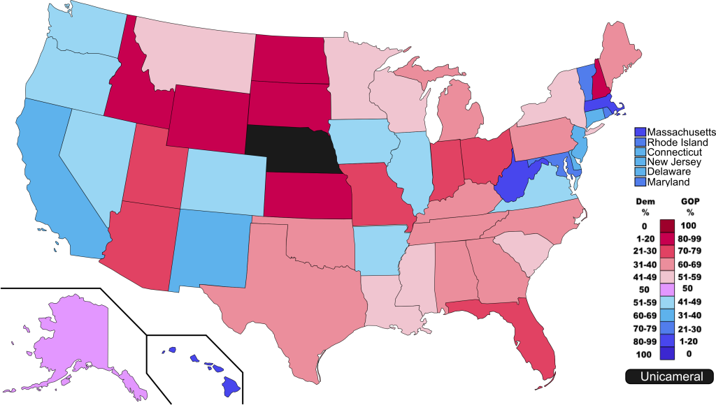
A map showing what each state’s US Senate delegation looks like
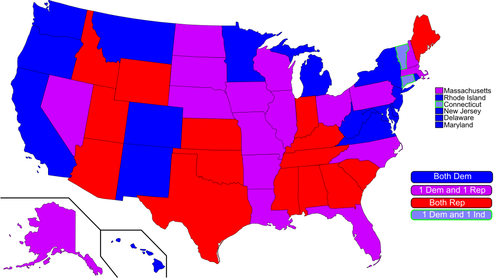
A map showing what each state’s US House delegation looks like
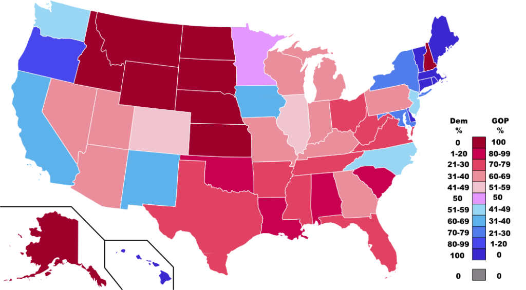
A map showing what party controls the Governor’s mansions
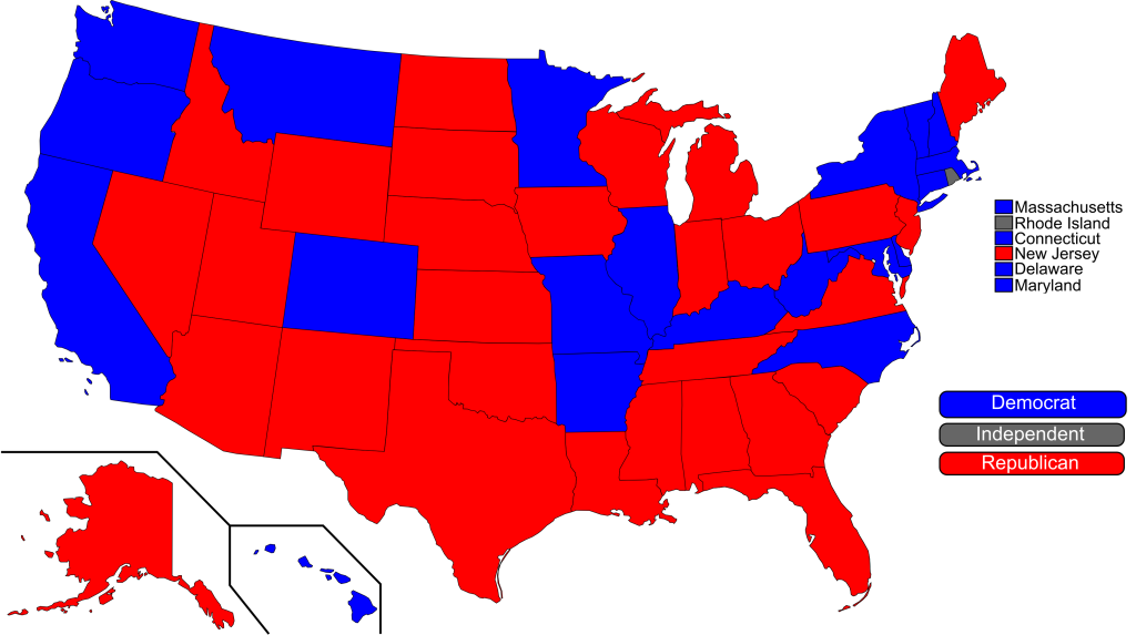
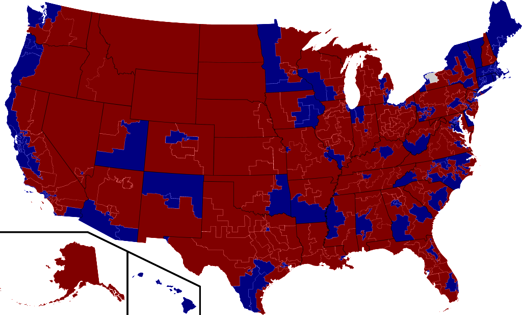
A map of the US House as it stands now
Who’s up in 2011 (excuse the spelling error)
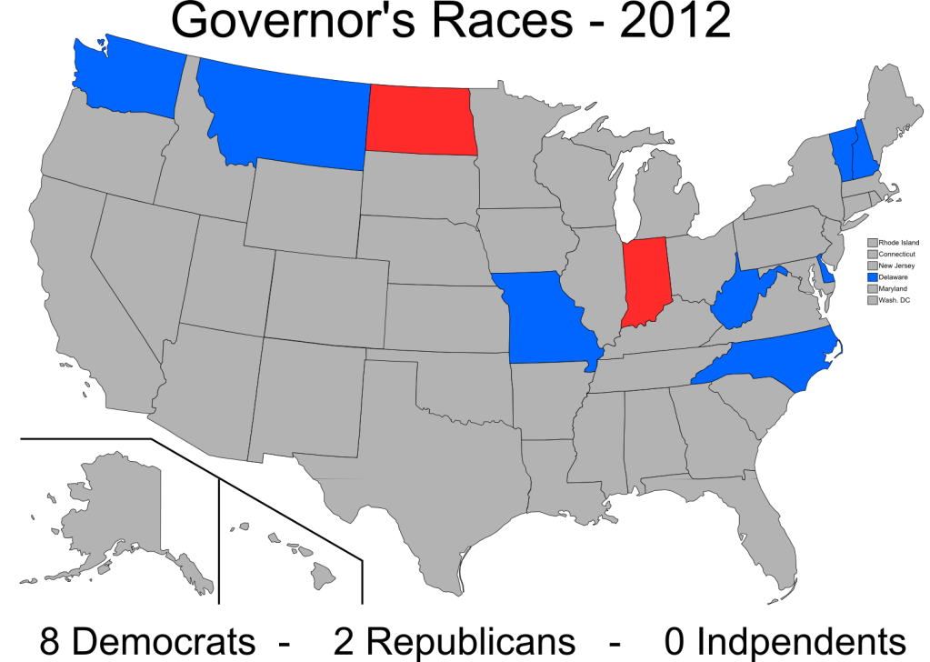
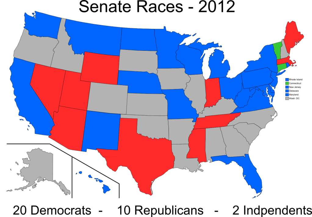
Who’s up in 2012 (excuse the spelling error)
And to be honest, painful to look at. Especially given how things stood just a year go.
We have plenty of ground to make up. New Hampshire seems like one great place to start.
MN-08, the northeastern district, should be colored red.
has 24 districts that are the wrong color by my count.
west virginia gov is up this year (special election)