cross posted from daily Kos…
my first diary here
This is part of a series based on analysis of data based on Congressional Districts. This one is the first that is really analytical.
A word of warning: Do not infer anything about individuals from any analysis at the district level. That would be the ecological fallacy.
Today, I look at the relationship between the racial/ethnic makeup of districts, and whom the district supports in presidential elections.
More below the fold
The Almanac of American Politics, where I got the data used below, classifies race/ethnicity into a large number of categories. I combined some of these into “other” and have the following: non-Hispanic White, non-Hispanic Black, Hispanic, and other.
For each congressional district, I recorded the percent of the population in each category, and the Cook PVI number, which is, essentially, an indication of how much more Democratic or Republican the district was than the nation in the last two presidential elections. E.g., a rating of R + 9 would indicate that the district gave Bush an average 9% more than the nation in 2000 and 2004 (it’s a little more complex, because they adjust for third party vote, but that’s the general idea).
Then, I graphed Cook PVI and each of the four racial/ethnic groups, and added a loess line (loess is a nonparametric curve fitting mechanism….you can think of it as a more sophisticated moving average).
So, first %Black and Cook PVI

As we might expect, districts with a lot of Black tend to be very Democratic. But I didn’t suspect the nonlinearity of this relationship. That is, there isn’t much difference between districts with almost no Blacks (mostly the rural north) and districts with 15% Blacks: they all have average Cook PVI about 0 (that is, close to the national average). Districts with a great many Blacks (mostly gerrymandered districts in the South and in central cities) are very Democratic. Among the 33 districts with more than 35% Blacks, none favored Republicans
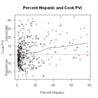
Next, %Hispanic and Cook PVI

A couple things to note: First, although (as with the graph above) the relationship is positive (i.e. districts with more Latinos tend to vote more Democratic) the slope of the line isn’t as steep, and it is less nonlinear. I will get into reasons for this in a diary on interactions, but the basic reason is that Hispanic districts in different parts of the country varied a lot. A lot of the highly Latino districts were in Texas, which is, of course, Bush-country. The highest concentration of Latinos in any districts are in TX15 and TX28 (each has just over 3/4 Latino) and these districts had Cook PVI of R+1 and D+3, respectively.
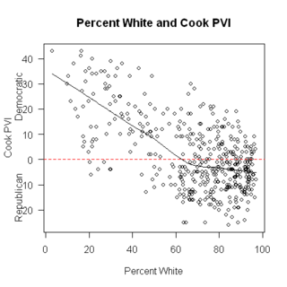
Next, % White and Cook PVI

As we might expect, the direction of the slope is the opposite of both of the above. But, even among districts with nearly all White populations, the Cook PVI varied. By the way, the district with the lowest percent White is NY-16, which is the South Bronx. It’s tied for most Democratic district in the country (D + 43), has the lowest median income ($19,300), has the highest percent in poverty (42.2%), and has the second lowest percentage of veteran (3.9%).
Finally, other race/ethnicity. Here, I’ve deleted the two Hawaiian districts from the graph, because they are outliers – by far the highest percentage nonWhite is in these districts.

Again, as % ‘other race/ethnicity’ increases, so does Democratic vote. By the way, and not surprisingly, the four districts (other than HI) with the highest percent ‘other race’ were all in coastal CA.
What to make of all this?
I’m not sure. But I find it interesting