Introducing PBI (Party Brand Index)

I have been working on (with some much appreciated help from pl515) a concept I’m calling PBI or Party Brand Index, as a replacement for PVI.  PVI (Partisan Voting Index), which is measured by averaging voting percentage from the last two presidential elections in each house district, and comparing it to how the nation as a whole voted, is a useful shorthand for understanding the liberal v. conservative dynamics of a district. But in my opinion it falls short in a number of areas. First it doesn’t explain states like Arkansas or West Virginia. These states have districts who’s PVI indicates a Democrat would be in a hard position to win, never the less Democrats (outside of the presidency) win quite handily. Secondly why is that the case in Arkansas but not Oklahoma with similar PVI rated districts?

Secondly PVI can miss trends as it takes 4 years to readjust. The main purpose of Party Brand Index is to give a better idea of how a candidate does not relative to how the presidential candidate did, but rather compared to how their generic PARTY would be expected to perform. I’m calling this Party Brand Index.

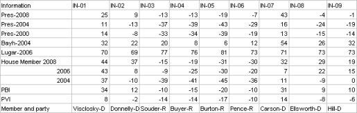
My best case for arguing against PVI is Indiana.  Bush won Indiana quite easily in 2000 and 2004. The PVI of a number of it’s districts showed them to be quite Red. Yet in 2006 democrats won several districts despite their PVI’s. Also Obama won Indiana in 2008 a state, which based on the make up of the districts PVIs, made little sense. I therefor chose Indiana as my first test case for PBI.

Indiana also had a number of other oddity that made it an interesting test case. Indiana has Senators from opposite parties that each won election by large blowouts. Lugar’s in particular was enormous as he was essentially unopposed. Indiana also had a number of districts that flipped in the 3 election cycle expanse that I’m examining. Finally it makes the best case for why PVI can be misleading.

To compute PBI I basically did the following. I weighed the last 3 presidential elections by a factor of 0.45. Presidential preference is the most indicative vote since it’s the one politician people follow the most. The POTUS is the elected official people identify with or despise the most, thus illuminating their own ideological identification. I then weighed each house seat by 0.35. House seats are gerrymandered and the local leader can most closely match their districts make up in a way the POTUS can’t. So even though they have a lower profile I still gave them a heavy weight. Lastly I gave the last two Senate elections a weight of 0.2. Senatorial preference can make a difference, although I think it’s less than that of the President or the House members. Also (more practically) because I have to back calculate (estimate) Senate result totals from county results, a smaller number helps lessen the “noise” caused by any errors I may make.

I was then left with this chart:

I now began to look at the results. Under my system Democratic leaning have a positive number, the GOP has a negative number. Donnelly in the Indiana 2nd is a perfect example of my issues with PVI. Under PVI Donnelly is in a Republican district with a PVI of -2. But look at how democrats have recently performed in this district. In 2008 Donnelly won reelection by 37%! Obama won this ditrict by 9 points, and Bayh won it by 22%! Does this sound like a lean GOP district? Under PVI it is, under PBI it’s not it’s a +11 democratic district.

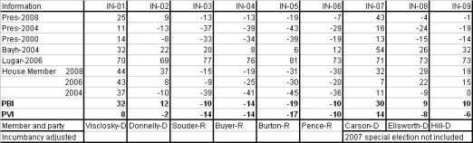
I then decided to go all Nate Silvaish and gave more recent elections a greater weight. I gave an addition 5% weight to each election as it got closer to the most recent election. To be honest I pulled 5% out of my dairy air but Nate gave a similar weighting to poll results as fresher ones came in 2008, so I copied this formula. This resulted in the following:

The next issue I decided to tackle was to develop a way to weight for incumbents.  The reelection numbers for incumbants is so high it would be a mistake to weight a district soley on the fact that an incumbat continues to get elected. There is a long list of districts that have PVI that devate from their incumbant members, whom none the less keep getting elected. These disticts then change parties as soon as the incumbant member retires. This is evidence that incumbancy can disguise the ideology of voters in a district.

I decided on a weight of about 7% for House members. I remember reading that incumbency is worth about 5-10%. Also Nate wrote in a 538.com article that a VP pick from a small state was worth about a 7% swing, a house seat could in fact be thought of as a small state, that seems as good a number as any to start from. Conversely I will deduct 7% from an incumbents win. I think this will score them closer to the natural weight of a district. By the way I’m weighting the win 7% less, not actually subtracting 7% from the number.  Open seat races will be considered “pure” events and will remain neutral as far as weighting goes.  A seat switching parties will also be considered a neutral event. The 1st defense of a seat by a freshman house member will be given a weighting of 2%. The toughest race for any incumbant is their 1st defense. I decided to adjust for this fact. Note: Indiana’s bloddy 9th was a tough call a case could be made that when a seat keeps flipping, and the same two guys run 4 straight times in a row each election should be a neutral event.

Senate weighting will be as follows. In state with a single House seat the Senate seat will be weighted the same as a house. In states with mutiple seat, the Senate will get a wighting of 2%. Nate Silva stated that a VP pick in a large state is worth this amount. An argument could be made for a sliding scale of Senate weighting from 2-7%, this added complexity may be added at a later date. I will give incumbant presidents a 2% weighting, until I get better data on how powerful a “pull” being the sitting POTUS is, I will give them the same weighting as a senator.

The main purpose of Party Brand Index is to give a better idea of how a candidate does not relative to how the presidential candidate did, but rather compared to how their generic PARTY would be expected to perform. I’m calling this Party Brand Index.

______________________________________

The last major issue is how to deal with the “wingnut” factor. Sometimes a politician like Bill Sali (R-Idaho) or Marylin Musgrove (R-CO)lose because their voting record is outside of the mainstream of their district. I decided to try and factor this in.

First I had to take a brief refresher on statistics. I developed a formula based on standard deviations. Basically I can figure out how much the average rep deviates from their district.  If I then compare where a reps voting pattern falls (in what percentile) and compare it to their district’s PVI, I can develop a “standard deviation factor”. Inside the standard deviation will get a bonus, outside a negative.

For example, if Rep X is the 42 most conservative rep, that would place her in the 90th percentile. But if her district’s PVI was “only” the in the 60th, their is a good chance her margins would be effected. Using a few random samples I found most reps lie within 12% of their district’s PVI.

Using these dummy numbers I then came up with this.  


   SQRT[(30-12)^2 /2] = about 13%

    Her factor would then be 100 – 13 = 0.87.

So her victory margin would be weighted by 0.87 because she is more than 12% beyond her acceptable percentile range it making the victories in her district approximate 13% less “representative”.

    My theory yields the following formula:

        If rep’s voting record is > PVI then

            100 – SQRT[({Record percentile – PVI} – Standard PVI Sigma)^2 /2] = factor

        else if rep’s voting record < PVI

             100 + SQRT[({Record percentile – PVI} – Standard PVI Sigma)^2 /2] = factor

To really do this I need to compute the standard deviation for all 435 reps, which is a pretty large undertaking. Instead  I will do a google search  to see if anyone has already done this. If not well it will take some time. But this would deal with the wingnut factor. Since politician tend to vote relatively close to their districts interest (even changing voting patterns over time) this may not be a major issue. But developing this factor may eventually allow the creation of a “reelection predictor”, so I am still going to work on it.

One last note, the corruption factor (for example Rep. Cao (R-LA) beating former Rep. Jefferson) is outside of any formula I can think of. The only saving grace here is that because my formula uses several elections, the “noise” from a single event will eventually be reduced.

Next Up: Colorado ( have the data done already) and Virginia

Comparing ways of rating congresspeople

There are a variety of ways to rate congresspeople, and I will cover several, but I’ll spend most of my time on the method I think best.  It’s seriously geeky, but I give a nongeeky summary, and then I give links to the geeky parts.

Many organizations rank congresspeople.  In the Almanac of American Politics, they include ranks from mny.  Each of these organizations looks at votes on their particular issues, and sees how each congress person votes (for their position or against it).  I am not going to talk more about these individual organizations.  

I will discuss three ways of ranking or rating congresspeople, they are used by a) National Journal  b) Progressive Punch  and c) Keith Poole and his associates.  I think the last is the best.

National Journal ratings does the following for the House, and similar for the Senate:

House members are assigned separate scores for their roll-call votes on key economic, social and foreign-policy issues during 2008. The members are rated in each of the three issue categories on both liberal and conservative scales, with the scores on each scale given as percentiles. An economic score of 78 on the liberal scale, for example, means that the member was more liberal than 78 percent of his or her House colleagues on the key votes in that issue area during 2008. A blank in any cell in the table below means that the member missed more than half the rated votes in an issue area. Composite scores are an average of the six issue-based scores. Members with the same composite scores are tied in rank. (C) indicates a conservative score; (L) indicates a liberal score.

If you sort on “composite”, you’ll see one issue: There are a lot of ties.  The top 12 representatives are all tied.  In the senate there are fewer ties.  But how does Bernie Sanders rank as tied for 13th most liberal, and with almost the same rating as Clinton?

The details of how they rated the congresspeople are for subscribers only, but they do have this snippet:

A panel of National Journal editors and reporters initially compiled a list of 167 key congressional roll-call votes for 2008 — 79 votes for the Senate and 88 for the House — and classified them as relating to economic, …

So it seems like they averaged a bunch of votes.

Progressive Punch rates people on the percentage of correct votes, and it offers ranks based on all voeertes, crucial votes, and votes on particular issues.  It is kept up to date, which is a major plus.  This has some advantages and disadvantages.  According to their methods, the three most progressive senators are: Roland Burris, Kirsten Gillibrand, and Edward Kaufman.  Huh?  Well, all 3 have 100% ratings.  Even for Senators that have been in for a while, there are anomalies: Is Sherrod Brown really as liberal as Bernie Sanders?  One problem is revealed when we see that Ted Kennedy has a very low rating for 2009-10: They don’t deal properly with missed votes.  If we look at “Crucial Votes” for “lifetime” Jack Reed is rated as the most progressive senator among those who have been in the Senate for at least one full session.  

The way they came up with scores is summarized here. Briefly, they first identified a few “hardcore progressives” in the Senate and the House.  The ‘overall’ ratings are based on votes in which a majority of those progressives voted against a majority of the Republicans.  The problem here is that all votes are weighted equally, and this isn’t right (see below).  


The crucial votes are a subset of those, specifically:

The votes used to calculate the scores in the “Crucial Votes ’09-’10” column are a subset of the overall votes that qualify according to the Progressive Punch algorithm described above. They show the impact that even a small number of Democrats have when they defect from the progressive position. These are votes where EITHER progressives lost OR where the progressive victory was narrow and could have been changed by a small group of Democrats voting differently.

 This is better, but it’s not as good as more sophisticated methods.

Why not? Well, the good people at Progressive Punch recognize the problem: Not all votes are equal, even among those that are ideological.  Some are easy wins, some are lost by a lot.  But they dichotomize this into “crucial” and “noncrucial” when there is really a continuum.

The site is great for looking into past votes of congresspeople, and it’s great that they keep it up to date, but there is one better method.

That is the method used by the people at voteview.  The software and methods are the best, but it’s not the most user friendly site in the world.  They describe two methods of rating congresspeople: NOMINATE and Optical Classification.  Both are based on using every vote and attempting to place legislators in a way that maximizes the ability to predict how they will vote.  Both work really well: Optimal classification works a bit better, but takes more computer time; NOMINATE (if I understand it correctly) allows placement of issues as well as politicians.  With a single number for each congressperson, you can predict, with 95% accuracy, how they will vote on any bill.

One question is whether a single dimension (liberal to conservative) is enough to accurately classify people.  For most periods in American history, it is.  In the 1960s, a second dimension (racial attitudes) added a lot to the accuracy, but, right now, one dimension does very well.  You can see how OC works in one dimension.  It predicts 95% of the vote correctly.  Note that the things that look like fancy script L (or the old sign for pound) are supposed to be less than or equal to signs.

I am not going to duplicate the example in that link, but I’ll try to explain it a bit more (you might want to open it in another window).  The diamonds are legislators, the spades are ‘cutting points’ for nine votes, each with a different number of “ayes” and “nays”.  The Ace of Spades is a vote with only one “aye”, the two of spades has two “ayes” and so on.  Now, we attempt (first iteration) to place legislators correctly per the votes.  That gives the diagram listed after 2.  Then we re-order the cutpoints, as shown in step 3, and repeat the process.  

(end geekiness)

How do these methods compare?  I am not going to compare all the senators and reps, simply because I can’t figure out an easy way to copy the data into a spreadsheet.  But let’s take 5 well-known Senators from the 110th Senate:  Feingold, Schumer, Bayh, Specter and Coburn.

             OC rank                PP lifetime    NJ 2008 comp.      

Feingold -     most liberal           20th           37th

Schumer -      16th most liberal      16th            7th

Bayh  -        51st most liberal      45th           51st

Specter -      56th most liberal      59th           53rd

Coburn -       101st most liberal     71st           92nd


(there are 102 ranks in OC because of senators getting replaced …e.g. WY has Enzi, Barasso and Thomas).  I couldn’t find Progressive Punch for the 110th, so I gave lifetime ratings.

Which do you think is most accurate?

By what margin will Bob Shamansky win?

View Results

Loading ... Loading ...

Responses to requests from yesterday

Continuing from yesterday’s diary here , I’m going to try to meet some of the requests

People were interested in the various measures, and how they related.  Here is what’s known as a scatterplot matrix of the various measures:

Photobucket

Each little panel is a scatterplot, consisting of the variable listed in the row, and the column.  All are highly correlated, all show that Republicans are lousy.  But they are different in interesting ways:  The PP Chips are down scale shows a lot of variation within the Democratic part, and little within the Republican.  Let’s take a closer look:

Photobucket

that’s a boxplot of the chips are down scores, by party, and my guess was right: There’s a lot of spread among the Democrats.  Fortunately, there are no outliers at the top – that means that a lot of Democrats get 100 on this measure.  But unfortunately, quite a few get fairly low scores: A quarter or so get under about 70, and more than 10 get under 50. (Note, though, that the lowest Democratic score is about where the highest Republican score is).

So, that PPCAD might be a good measure to use.  Let’s see how it relates to Cook PVI, among Democrats:

Photobucket

Again, there’s a ceiling effect: You can’t have a PPCAD score over 100.  But, given that, I’ve identified some of the best and worst.

Other people were interested in Republicans who were too conservative for their districts.  Here, we want a measure that shows good spread among the Republicans.  Two stand out: ADA rating and NJ rating.  Since we’ve used NJ rating before, let’s do it again.  Among Republicans, region made very little difference, so using just PVI is okay.  

Here are the 17 Republicans who are 15 or more points more conservative than the model predicts

Here are the ones who are more than 12.5 points too conservative


   District Actual.PVI          Rep. NJ.Comp.2007

10      AZ02    -9.3076    R (Franks)          6.7

11      AZ03    -6.5867   R (Shadegg)          6.7

44      CA24    -5.3747  R (Gallegly)         14.0

77      CO04    -8.8633  R (Musgrave)         11.0

93      FL07    -4.8761      R (Mica)          8.3

98      FL12    -6.0349    R (Putnam)         12.3

110     FL24    -3.8316    R (Feeney)         12.0

161     IA05    -8.9516      R (King)          8.8

215     MN02    -3.3538     R (Kline)          9.3

219     MN06    -5.6477  R (Bachmann)         10.8

227     MO02    -9.4356      R (Akin)         10.0

248     NJ05    -5.0601   R (Garrett)         14.7

303     OH01    -1.2364    R (Chabot)         17.5

310     OH08   -13.0170   R (Boehner)          6.7

353     SC02    -9.4804    R (Wilson)          9.3

365     TN07   -12.3217 R (Blackburn)          8.0

This is fun!  I get to do the analysis, and didn’t have to enter the data

Biplots of congress

When we look at large amounts of data, it’s hard to grasp all the relationships just from numbers.  If we just have lots of subjects but not a lot of variables there are some fairly common graphs to help show the data (see graphics: the good, the bad, and the ugly for some methods).  

But if we have a lot of variables, as well, then even those plots aren’t a complete solution.  One attempt to model data like this, with lots of subjects and lots of variables, is the biplot.  More below the fold

There are various types of biplots; we’re only going to be talking about the most common kind: The principal component biplot.  There are a few steps to making one of these.  You can get all math-y, but I’m not going to.  I’ll try to keep it as simple as possible, but if you hate math, and want to get to the politics…. well, look at the figure and then skip down to where I have the phrase “Interpreting the biplot”

This type of biplot works with variables that are continuous, or nearly so.  That is,  variables that can take on any value, not just a few.  Things like weight, height, and so on, rather than things like religion, or hair color, that can only take certain values.  

I had data on various demographic aspects of each of 435 congressional districts:  

% White non-Latino, % Black non-Latino, % Latino, % other

Median income, % in poverty

% Rural

% Veterans

Cook PVI

and whether the Rep was a Democrat or Republican

Except for the last, all these are continuous, or nearly so.  I changed Cook PVI a little, giving negative values to those that were R and positive to those that were D.

How can we represent all these data on one graph:

(it’s a little bigger here )

wow…. what’s that?

Well, the first thing I did was a principal components analysis (PCA) .  Skipping a lot of possibly important information — Get a correlation matrix of the data.  The goal of PCA is to find new variables that are linear combinations of the original variables.  The first PC should represent as much of the variance in the table as possible.  The second PC should represent as much of the remaining variance as possible, subject to being orthogonal to the first PC (you can think of orthogonal as meaning ‘unrelated’, although that isn’t exactly right).

In the figure above, note that the x-axis (that’s the horizontal one) is labeled Dimension 1: Proportion of variance .46.  That means that one variable, a linear combination of all the other variables, represents about half the variance in all those variables.  In other words, if you wanted to predict all of the original variables using only one number, this new number (the PC) would account for about half the variance in all those other numbers.  The y-axis (the vertical one) says that dimension 2 represents .24 of the variance.  So, together, this plot represents about 70% of the variance in all the original variables.

Next, each district gets a score on each of the PCs.  Those are the dots.  I’ve labeled some of them (more below).

Next, each variable gets whats called a loading on the PCs (never mind the details).  These are represented by lines.  

Interpreting the biplot.

OK, no more math (well…. I hope not!)

How to interpret the biplot?  First, note that the two proportions add to .7.  This biplot leaves out a lot (more below).  But it can still be useful.  Next, look at the lines. For example, poverty goes to the lower left.  So the variable poverty is low on PC1 and low on PC2.  Both Cook and Latino are off to the left, so they are low on PC1 and moderate on PC2.  White is off to the right.  

The CDs in the lower left (AL07, MS02, SC06, GA02) are high on poverty and high on Black….indeed, these are all “Black districts”.  The ones all the way on the left (NY07, FL18, 21, 25) are highly Latino districts, that aren’t Republican (more later).  The ones on the lower right have a lot of veterans.  And so on.

Now, we can use this biplot to find districts that might be vulnerable.  When there’s a black dot (Democratic rep) in a sea of red dots (Republicans) or vice versa, that might be a seat that’s vulnerable.

Vulnerable Republican seats include FL18, FL21, FL25, CA42, NM02, CA25, CA21 (that’s the red dot near NY28).

More signs of Democratic gains to come

(will be posted on daily Kos on Tuesday)

A big hat tip to Benawu for gathering a lot of this info.

One truism is that you can’t win an election if you aren’t in an election.  In the upcoming congressional elections, Democrats are contesting a lot more Republican seats than vice versa.  That’s good.  But it’s only the beginning.

More below the fold

The current House has 230 Democrats and 204 Republicans (one seat is open).

Of the 204 R seats, there are confirmed challengers in 119 (58%), with 2 more Democrats expected to run, and 24 where there are rumors. Only 59 (29%) have no challengers or rumors.

Of the 230 D seats, on the other hand, there are confirmed challengers in only 72 (31%) and there are 134 with no challengers or rumors.

Let’s make a little table (sorry for the formatting, HTML tables are rough, and then dailyKos seems to add its own stuff)


Current party     Confirmed    Expected   Rumored   None   Total

Democratic            72          4         20       134    230

Republican           119          2         24        59    203

But that’s just the beginning!

Where are the ‘unchallenged’ seats?

I’m all for the 50 state, 435 district strategy, but there are seats that are more or less likely to switch.  So…

Of the 59 Republican seats with no challengers or rumors, not one has a Cook PVI favoring Democrats.  14 of the 59 have Cook PVI of R + 15 or more.  These are districts where we are unlikely to win.

But of the 134 Democratic seats with no challengers or rumors, 19 have Cook PVI favoring Republicans.

Not only are they running in fewer places, they’re choosing those places badly!

Let’s redo the above table, counting only ‘competitive’ districts, which I arbitrarily say are those with Cook of less than 15, one way or the other.

In competitve districts:


Current party     Confirmed    Expected   Rumored   None   Total

Democratic            57          3         13        80    143

Republican           102          1         14        45    162  

Not only are more Republican districts competitive (despite the fact that there are fewer overall) but there are a lot more challengers.

What about a tighter definition?  Let’s re-do it for those with Cook PVI under 5


Current party     Confirmed    Expected   Rumored   None   Total

Democratic            23          2          6        22     53

Republican            40          0          8         4     52

That is, in almost 80% of the the Republican held hyper-competitive districts, there is a confirmed Democratic challenger, but this is so in only about 43% of Democratic districts.

And I haven’t yet looked at retirements!  Take a look at DCpolitical report.  Although there are 33 possible open Democratic seats, and only 32 possible open Republican seats, that’s misleading.  Of the 33 Democrats listed, only 7 are definitely retiring.  16 Republicans are listed that way.  Where are they?

Definite Democratic retirements:  CO-02 (D +8)    

                                 IN-07 (D +9)     confirmed challenger

                                 LA-02 (D +28),

                                 ME-01 (D +6)     confirmed challenger

                                 NM-03 (D +6)

                                 NY-21 (D + 9)

                                 OH-10 (D + 8)    confirmed challenger  

Definite Republican retirements:  AL-02 (R + 13)

                                 AZ-01 (R + 2)    confirmed challenger

                                 CO-06 (R + 10)   confirmed challenger

                                 IL-14 (R + 5)    confirmed challenger

                                 IL-18 (R + 5)    confirmed challenger

                                 MN-03 (R + 1)    confirmed challenger

                                 MS-03 (R + 14)

                                 NJ-03 (D + 3)    confirmed challenger

                                 NJ-07 (R + 1)    confirmed challenger

                                 NM-01 (D + 2)    confirmed challenger  

                                 NM-02 (R + 6)    confirmed challenger  

                                 OH-07 (R + 6)    confirmed challenger

                                 OH-15 (R + 1)    confirmed challenger

                                 OH-16 (R + 4)    confirmed challenger

                                 TX-14 (R + 14)

                                 WY-AL (R + 19)   confirmed challenger  

Notice that no* Democrat is retiring in a district that has less than D + 6; but *nine Republicans are.  

So, where does that leave the big picture?

I’ll guess we win 5 districts where a Repub is retiring, and they win none where a D is.  That’s +5.  Of the 23 highly competitive, Democratic-held districts with a confirmed  challenger…. let’s say the Repubs take a quarter, rounding up to 6.  That’s -1.  Of the 34 highly competitive, Republican-held districts with a confirmed  challenger……well, let’s give the Democrats a quarter, rounding up, or 9.  That’s +8.  Of the somewhat competitive districts with a confirmed challenger let’s say 10% switch each way, so the Republicans gain 3 and the Democrats 6.  So the net is +11.

But that’s without counting the Democrats’ fundraising edge, or the coattails of the president….  

Congressional District Analysis: Median Income, Rural vs. Urban, and Democratic vs. Republican

This is the second in a series of analysis of congressional districts.

Note that one should not use these analyses to make statements about individuals. That’s called the ecological fallacy, and it can lead you very far astray, very quickly.

Also, please ask questions.  Don’t look at the graphs and equations and run away…..ask.  There are no dumb questions*.  I will *not tell you you are stupid for asking.  Statistics is confusing to lots of people, not just you!  So ASK!

Today, I started off by looking at median income and Cook PVI.  That led to other things.  More below the fold

(cross posted from DailyKos)

My suspicion, before looking at the relationship between median income and Cook PVI was that higher median income districts would be more Republican.  I did know that some high income districts were quite Democratic, but I thought these were exceptions.  Well, one reason to explore the data is to see whether your suspicions are correct.   Here’s a graph of median income and Cook PVI across 435 districts:

My favorite professor in grad school used to say “If you’re not surprised, you haven’t learned anything”.  I’m surprised, but what can we learn?

The very poorest districts are, indeed, very Democratic. At the extreme, the poorest district (NY16) is also the most Democratic (Cook PVI is D + 43).  But above a median income of about 30,000, there is only a modest relationship, and, what there is points to wealthier districts being more Democratic….. hmmm.

When results surprise you in this way, one thing that may be going on is that there is some third variable that is affecting the relationship.  I know that people in rural areas have different views than those in urban areas….

The language I used to draw these plots R offers a tool called conditioning plots, that lets you look at three variables in an interesting way.  You divide the third variable into groups, and then plot the first two in each group.   Easier to show than tell:

Each panel of the graph is congressional districts of a certain level of urban-ness.  The lower left is less than 50% urban, lower right is 50-75%, upper left is 75-90% and upper right is over 90% urban.  (Note, it is probably better to think of ‘urban’ as ‘urban or suburban’ or, perhaps ‘rural’).  This is interesting!  

First thing that strikes me is that there is almost no relationship between median income and Cook PVI except in the highly urban districts, where it is strong and in the expected direction: Higher median income = more Republican.  

Next, we can see that more urban districts are, generally, more Democratic: All but one of the districts with Cook PVI over D+20 are over 90% urban.  

Third, all the high income districts are mostly urban.  Of districts with median income above $60,000 or so, none were mostly rural, and most were 90%+ Urban.

Graphs are good for exploration, now let’s look at a model.  In specific, let’s look at several regression models, with the dependent variable being Cook PVI and the IVs being different combinations of urban and median income.

First, Cook PVI as a function of median income (I measured median income in thousands of dollars):

The resulting equation is:

CookPVI = 3.69 – .051*MedInc.

What this means is that the predicted PVI for a district with a median income of 0 is D+4, and that it declines by .05 for each thousand dollar increase in median income.  This difference wasn’t significant, and the R^2 for this model was only 0.0001, meaning that almost none of the variation in CookPVI is accounted for by median income.

Second, Cook PVI as a function of %Urban

This gives:

CookPVI = -29.45 + 0.39*Urban

that is, when urban = 0, the predicted CookPVI is R + 29, and it gets more Democratic by 0.39 points for each percent increase in Urban.  So, for a 50% urban district the predicted Cook value would be -29 + 50*.39 = R+9, and for a district that’s 100% urban, it would be D + 10.

R^2 here was 0.29 indicating that urban-ness accounted for 29% of the variation in Cook PVI

Finally, a model with both urban and median income:

Cook PVI = – 18.8 – 0.41*Median Income + 0.48*Urban

that is, for a district with median income = 0 and urban = 0, the predicted Cook PVI was R + 19, and this got more Republican by 0.41 units for each thousand dollar increase in median income, but got more Democratic by .48 units for each unit increase in Urban.

Both urban and median income were very significant, and this model had R^2 of 0.38.