(Phenomenal work. The graphs and analysis below the fold are a must-read. – promoted by James L.)
Crisitunity compiled a whole lot of data, and wrote a diary about the PVI-Voting Pattern Index. It’s a great piece. But I thought some graphics would be nice. And some more statistics. First, go read that diary. When you get back, I’ll be below the fold.
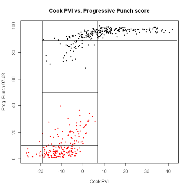
First, let’s look at all 435 representatives. I’ve plotted each rep’s Progressive Punch score against their district’s Cook PVI.
Repubs in red, Dems in blue

the first point is clear: ALL Democrats are more progressive than ALL Republicans. We are ALWAYS better. All the talk about how bad the blue dogs are is….well, wrong. Democrats are better than Republicans. Period.
Next, look at the lines that divide the plot into boxes. Here, the point is that, above about Cook PVI of D + 8, every Democrat gets a good PP score. Every Democrat who got a PP score under 89 came from a district with a Cook score of under D+8. If we want better Democrats, we need better voters. Move the population, the reps will follow.
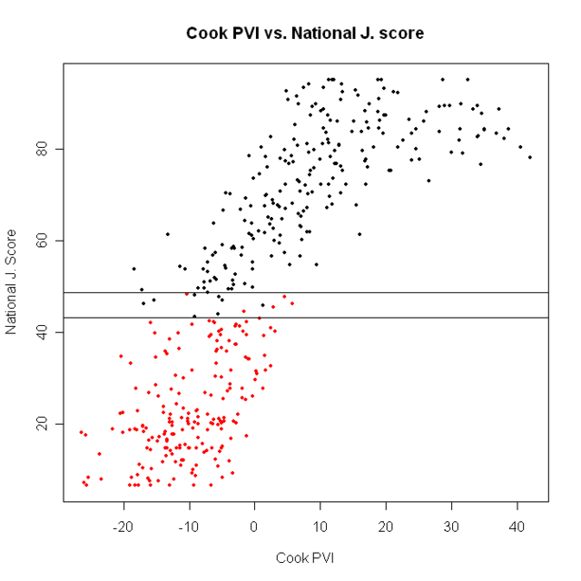
A somewhat different picture comes from using National Journal’s ratings.

There are actually some Democrats who are less liberal than the most liberal Republicans, and vice versa. They’re between the two vertical lines in the plot; there are 12 such districts:
CT-04 R Shays
DE-AL R Castle
GA-12 D Barrow
IL-10 R Kirk
IN-02 D Donnelly
IN-08 D Ellsworth
LA-03 D Melancon
MD-01 R Gilchrest
MS-04 D Taylor
NJ-04 R Smith
OK-02 D Boren
TX-22 D Lampson
7 Democrats out of 234 are less liberal than the most liberal Republican.
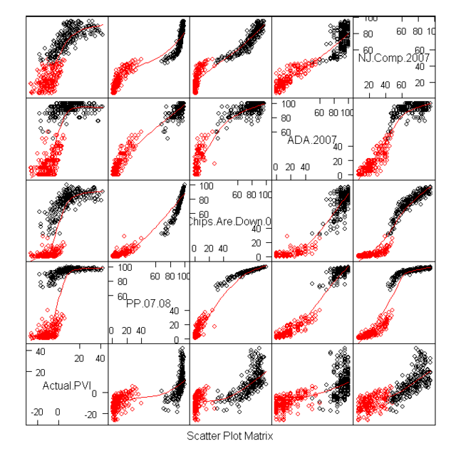
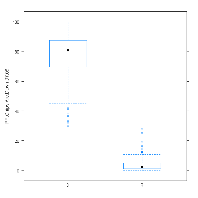
So, which should we use? If we went just by better statistical properties, we’d pick the National Journal rankings. But substance should always trump method. If we look at the graph below, we can see the difference in the two ratings: There are no PP scores between about 40 and 60. Is this reasonable? Well, for our purposes, I don’t think it is. If our aim is particularly to identify the most conservative Democrats and the least conservative Republicans, we want a measure that is sensitive exactly in that middle region. So, from here, we’ll use NJ ratings
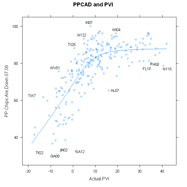
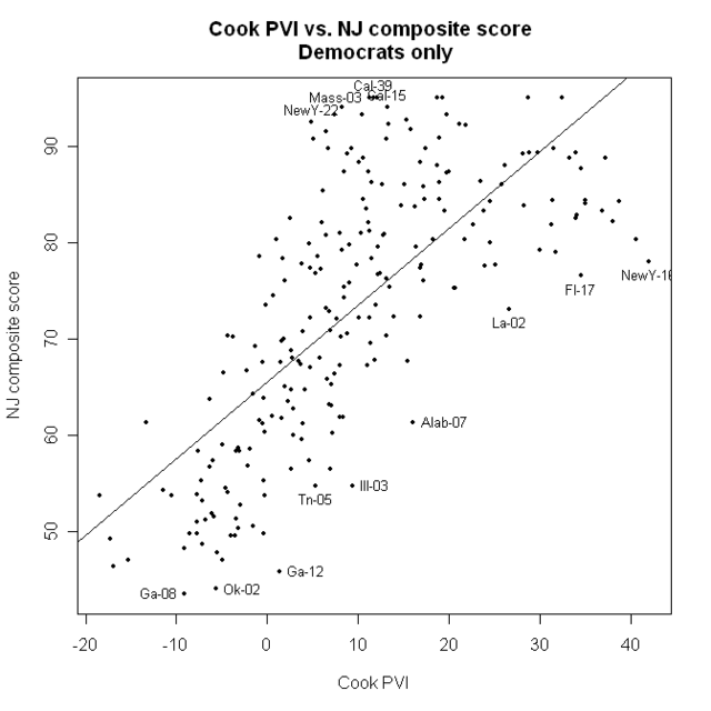
Now, let’s just look at the Democrats

Here, the straight line is not a bad fit.
I’ve identified some of the best and worst, compared to their district’s PVI numbers
What else can we do? Well, region is always regarded as important. The census bureau divides the nation into 9 regions. I’m not saying it’s the greatest division (I may do a diary sometime on other ways to make regions) but it’s not horrible, and it’s standard, if only because the Census says so. here is one map of the regions.
If we attempt to fit a linear model for all 435 districts to NJ numbers from region, we get this:
Coefficients:
Estimate Std. Error t value Pr(>|t|)
(Intercept) 48.9848 3.1517 15.543 < 2e-16 ***
regionE. Sou Cent - 11.8008 6.0130 - 1.963 0.05037 .
regionMid Atl 12.9774 4.5475 2.854 0.00454 **
regionMountain - 11.4815 5.6379 - 2.037 0.04234 *
regionNew Eng 31.0437 6.4149 4.839 1.84e-06 ***
regionPacific 10.1898 4.4405 2.295 0.02225 *
regionSouth Atl - 4.5797 4.2823 - 1.069 0.28549
regionW. North Cen - 0.5241 5.7746 - 0.091 0.92772
regionW. Sou Cen - 13.3131 4.9178 - 2.707 0.00707 **
---
Signif. codes: 0 '***' 0.001 '**' 0.01 '*' 0.05 '.' 0.1 ' ' 1
One thing this tells us is the average NJ score from each region. Across all regions, it’s 48.98 (that’s the intercept). For East South Central it’s 48.98 – 11.80 = 37.18; for the mid Atlantic, it’s 48.98 + 12.98 = 61.96; and so on. The most liberal region (no surprise) is New England, where the average representative gets a 48.98 + 31.04 = 80.02; it would be even higher, except for Shays (CT-04), who is the only Republican in the region, and who got a 47.7.
I’m a little surprised that Mountain is just as conservative as East South Central.
Another interesting thing is that region, by itself, only accounts for about 17% of the variance in NJ score.
But what if we combine region and Cook PVI? Do we do better at predicting NJ scores? We sure do. That model accounts for 70% of the variance in NJ scores. And, if we add party to the model? That model accounts for 89% of the variation in PP scores…. which is pretty amazing.
Here is a summary of that model
Coefficients:
Estimate Std. Error t value Pr(>|t|)
(Intercept) 65.21028 1.33998 48.665 < 2e-16 ***
regionE. Sou Cent - 3.79987 2.20085 - 1.727 0.085000 .
regionMid Atl 1.40556 1.65805 0.848 0.397087
regionMountain - 1.35274 2.05635 - 0.658 0.511012
regionNew Eng 8.95746 2.35363 3.806 0.000163 ***
regionPacific 2.52476 1.60749 1.571 0.117041
regionSouth Atl - 0.68440 1.55044 - 0.441 0.659138
regionW. North Cen - 0.29151 2.10166 - 0.139 0.889753
regionW. Sou Cen - 3.68887 1.81898 - 2.028 0.043206 *
repdata$Actual.PVI 0.74017 0.04772 15.512 < 2e-16 ***
partyR - 34.16677 1.25862 - 27.146 < 2e-16 ***
what’s interesting here is that, after accounting for party and Cook PVI, region doesn’t make much difference. The region that’s the most different is New England, and that is 8.96 points more liberal on average, than would be predicted from just party and Cook PVI. But, other than New England, all the regions are just about where the model would predict.
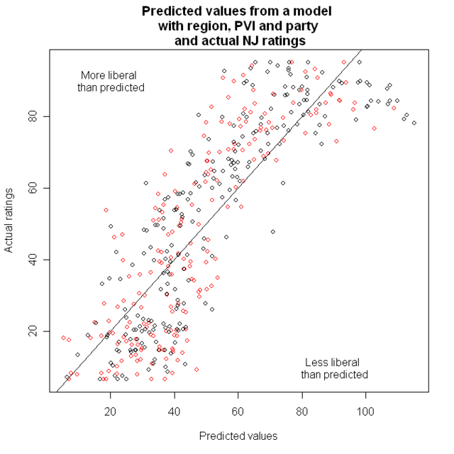
Next is a graph of the predicted values from that model, and the actual NJ ratings

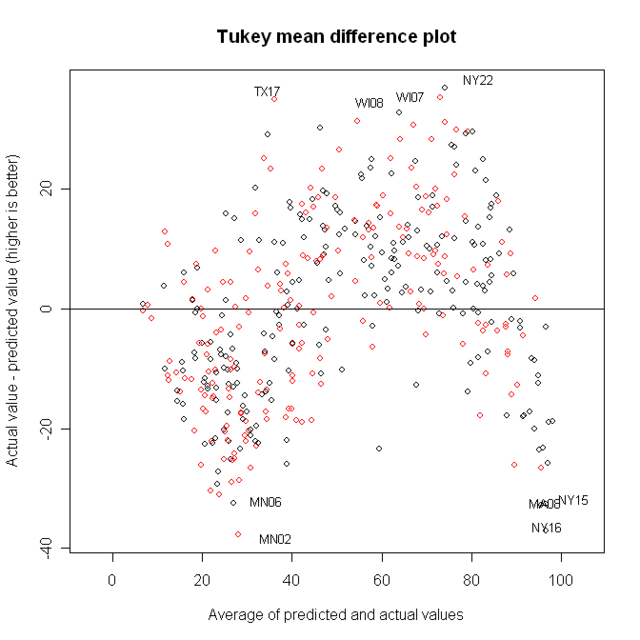
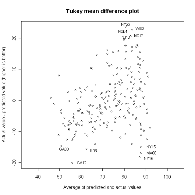
Now, we want to look at points that are far from that line; but it’s easier for people to judge distance from a horizontal line than a diagonal one. That leads to the Tukey Mean Difference plot. On the X-axis, we have the average of what was on the X and Y axes before: That is, the predicted value and the actual value. On the y axis, we now have the difference between them.

I’ve identified four of the best and worst districts.
But if we want to identify good and bad Democrats, we should go back to looking at just Democrats.
A model with region and CookPVI looks like this
Estimate Std. Error t value Pr(>|t|)
(Intercept) 63.3242 1.6443 38.512 < 2e-16 ***
democrats$Actual.PVI 0.7410 0.0502 14.762 < 2e-16 ***
region[party == "D"]E. Sou Cent - 5.2676 3.1070 - 1.695 0.091432 .
region[party == "D"]Mid Atl 1.8968 2.0786 0.913 0.362482
region[party == "D"]Mountain 1.8168 3.0926 0.587 0.557487
region[party == "D"]New Eng 10.6171 2.5004 4.246 3.22e-05 ***
region[party == "D"]Pacific 7.5039 2.0499 3.661 0.000316 ***
region[party == "D"]South Atl 1.5945 2.1492 0.742 0.458941
region[party == "D"]W. North Cen 3.8981 2.7225 1.432 0.153630
region[party == "D"]W. Sou Cen - 3.9359 2.5680 - 1.533 0.126810
---
Signif. codes: 0 '***' 0.001 '**' 0.01 '*' 0.05 '.' 0.1 ' ' 1
Residual standard error: 8.772 on 218 degrees of freedom
(6 observations deleted due to missingness)
Multiple R-Squared: 0.6116, Adjusted R-squared: 0.5956
A couple interesting things here. The average Democrat has a NJ score of 63. Cook PVI score is clearly important: For each point increase in Cook PVI, the predicted NJ score goes up by .74 points. And New England and the Pacific region are more liberal than the model predicts.
Now, here’s the TMD plot for this model

I’ve identified the best and worst. Here are their names and districts:
Best:
NY22 Maurice Hinchey – A strong liberal from a district that is D + 6
WI02 Tammy Baldwin – This district is D + 13, but her NJ score is 95
NC04 David Price – NJ score of 91, district is D+6
NC12 Melvin Watt – The district is D +11, NJ score is 93
NJ12 Rush Holt – D + 8, NJ score of 90
notice that the most liberal Democrats, from the most liberal districts, can’t appear here, because the scale simply doesn’t go that high
Worst
GA12 John Barrow. D +2, NJ = 46
NY16 Jose Serrano D +43, NJ = 78…this is the most Democratic district in the USA
MA08 Michael Capuano D +33, NJ = 83.5
IL03 Daniel Lipinski D +10, NJ = 55
NY15 Charles Rangel D +43, NJ = 80, the second most Democratic district
