By: Inoljt, http://mypolitikal.com/
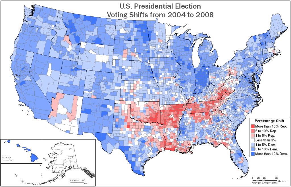
In the aftermath of the 2008 presidential election, the New York Times famously posted a map depicting county-by-county changes from the 2004 election. A different version of this map is below:
What is remarkable about this map is the evenness of the Democratic movement – a 9.72% shift to them from 2004. With the exception of a diagonal patch of Appalachia, President Barack Obama improved throughout the country. It did not matter if a county was located in Utah or California, whether it belonged to a dense city or a thinly populated farm, or whether it was poor or rich – almost every county still voted more Democratic than it did in 2004.
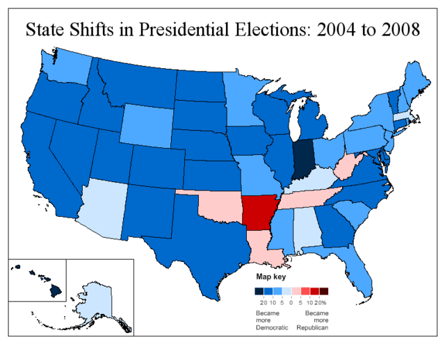
If one moves to a statewide basis, the shift is still fairly uniform.
Compared to the county-by-county map, this map lends itself more easily to analysis.
More maps below.
Once again, Mr. Obama does well everywhere except for Appalachia. His improvement, however, is noticeably less in the traditionally Democratic Northeast. The South is strangely divided between the friendly Atlantic coast and the hostile inland states (with the exception of Texas). There is also a fairly apparent split between east and west: in the latter, Obama’s improvements are almost uniformly strong. The movement east is far more variable.
In addition, the color of several states can be explained through local factors. Clinton-loving Arkansas appears dark red, while Senator John McCain’s home state Arizona stands out amidst its dark blue neighbors. Obama’s home states Hawaii and Illinois also appear dark blue, but Governor Sarah Palin’s Alaska stays more Republican. Massachusetts, home state of Senator John Kerry, does not shift Democratic by much; Indiana, where Obama’s campaign led a massive turn-out effort, shifts massively.
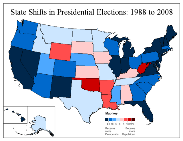
In playing around with these maps I also took a look at the 1988 presidential election. In that election, Democratic candidate Mike Dukakis lost by 7.73% to Vice President George W. Bush. Because Mr. Obama won by 7.26%, the nation voted 14.99% more Democratic than in 1988. Here is Obama’s performance compared to that of Mr. Dukakis:
What this map reveals is far less uniformity. Compared to the previous ones, this is much more a depiction of structural political changes.
Perhaps most obviously, much of South Central America swings against Obama, illustrating the decades-long Republican shift of this region. Dukakis still was able to win a number of white Democratic counties in places like Louisiana and Oklahoma. Today those places have largely abandoned the party.
There are other patterns. A number of Plains states, such as Kansas and the Dakotas, have very little or no movement to Obama. He actually does worse in Iowa. This reflects a relatively strong Dukakis performance in rural America, which was in the midst of an agricultural crisis in 1988.
Most interestingly, one can see the 2008 electoral map in the map; the dark blue states almost all voted Democratic in 2008. Democratic-voting states today tended to shift most to Obama; Republican-voting states today tended to move less. Only two states that voted for Obama haven’t shifted strongly Democratic since 1988: Iowa and Minnesota. Out of all the states John McCain won, on the other hand, only Arizona, Georgia, and South Carolina shifted strongly Democratic – and Democrats came quite close in Georgia. A similar trend has been observed in previous posts.
I am not certain if this pattern suggests electoral polarization: Democrats improve greatly in a number of 1988 Republican-leaning states (such as New Jersey or North Carolina), and Republicans do the opposite in places like West Virginia or Iowa. Instead, it appears to make sense for a candidate to win a state he or she does best in. Thus, this pattern seems to illustrate the electoral coalition Democrats have carved since 1988.
The farther one looks back, it seems, the more a map reveals.


