What If Mexico Was Part of the United States?

The previous two posts in this serious dealt with what would happen if Canada’s electoral votes were added to the United States. This post will examine what would happen if the same occurred with Mexico.

A note to all Mexican readers: this post was written for serious political analysis along with it. It is not meant to offend, and sincere apologies are offered if any offense at all is taken.

More below.

Mexico is a lot bigger than Canada. Canada has a population of 34 million; Mexico has a population of 112 million. Indeed, it’s one of the most populous countries in the world. The effect of adding Mexico to the United States would have far more of an impact than adding Canada.

One can calculate the number of electoral votes Mexico has this way. The first post in this series noted that:

A state’s electoral vote is based off the number of representatives and senators it has in Congress. For instance, California has 53 representatives and 2 senators, making for 55 electoral votes.

The United States Census estimates its population at approximately 308,745,538 individuals. The House of Representatives has 435 individuals, each of whom represents – on average – approximately 709,760 people. If Canada was part of the United States, this would imply Canada adding 48 (rounding down from 48.47) representatives in the House.

This is a simplified version of things; the process of apportionment is quite actually somewhat more complicated than this. But at most Canada would have a couple more or less representatives than this. It would also have two senators, adding two more electoral votes to its 48 representatives.

Mexico’s population in 2010 was found to be exactly 112,322,757 individuals. Using the same estimates as above, one would estimate Mexico to have 158.25 House representatives. Adding the two senators, one gets about 160 electoral votes in total:

Photobucket

This is obviously a lot of votes. For the sake of simplification let’s also not consider Mexico’s powerful political parties in this hypothetical.

How would Mexico vote?

Well, it would probably go for the Democratic Party (funny how that tends to happen in these scenarios). This is not something many people would disagree with. Most Mexican-Americans tend vote Democratic. The Democratic platform of helping the poor would probably be well-received by Mexicans, who are poorer than Americans. Moreover, the Republican emphasis on deporting illegals (often an euphemism for Mexican immigrants, although some Republicans make things clearer by just stating something like “kick out the Mexicans”) would probably not go well in Mexico.

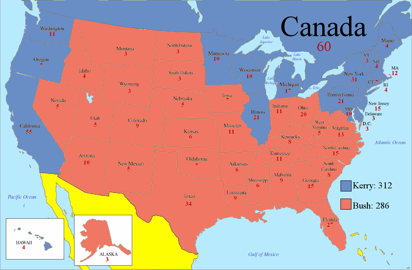
Here’s what would happen in the 2004 presidential election, which President George W. Bush won:

Photobucket

Senator John Kerry wins a pretty clear victory in the electoral vote. He gains 409 electoral votes to Mr. Bush’s 286 and is easily elected president.

What states would Mr. Bush need to flip to win?

In the previous post, where Canada was added to the United States, Mr. Bush would merely have needed to flip one: Wisconsin. Given his 0.4% loss in the state, this would require convincing only 6,000 voters to switch.

Mexico is a lot harder. In order to win, Mr. Bush needs to shift the national vote 4.2% more Republican. This flips six states: Wisconsin, New Hampshire, Pennsylvania, Michigan, Minnesota, and finally Oregon (which he lost by 4.2%). They go in order of the margin of Mr. Bush’s defeat to Mr. Kerry:

Photobucket

But there’s a caveat here: in this scenario the entirety of Mexico is assumed to only have two senators. The fifty states have 435 representatives and 100 senators, making for 535 electoral votes in total (plus Washington D.C.’s three). Mexico, on the other hand, has 158 representatives and two senators, making for only 160 electoral votes. Obviously, Mexico’s influence is strongly diluted.

Mexico itself is organized into 31 states and one federal district. Assume that instead of the entire country voting as one unit, Mexico is divided in the electoral college into these districts. Each Mexican state (and Mexico City) would receive two senators, giving Mexico 222 electoral votes instead of 160.

But that’s not all. There are several states in America – Wyoming, for instance – whose influence is magnified due to their low population. The “Wyomings” of Mexico are Baja California Sur, Colima, and Compeche – which each have less than a million residents. Overall, this would probably add three more electoral votes to Mexico.

This means that Mr. Bush has to flip three more states to win:

Photobucket

New Jersey, Washington, and Delaware go Republican under this scenario. To do this, Mr. Bush would have to shift the national vote 7.59% more Republican (the margin by which he lost Delaware).

One can see that Mexico has a far more powerful effect than Canada; a double-digit Republican landslide has turned into a tie here. That’s what happens when one adds a country of more than one hundred million individuals.

Before Democrats start celebrating however, one should note that this the hypothetical to this point has been in no way realistic. It assumes that the residents of America will not alter their voting habits in response to an extremely fundamental change.

The next post explores some conclusions about what the typical election would look like if the United States became part of Mexico.

–Inoljt

Part 2: What If Canada Was Part of the United States?

This is the second (more serious) part of two posts exploring the political consequences that would happen if Canada became part of the United States. The previous part can be found here.

A note to all Canadian readers: this post was written for the intent of a good laugh, and some serious political analysis along with it. It is not meant to offend, and sincere apologies are offered if any offense at all is taken.

More below.

How Important Would Canada Be?

The previous post looked at what would have happened in the 2004 presidential election if Canada had been part of the United States:

Photobucket

Democratic candidate John Kerry wins, but barely so. If 6,000 votes had shifted in Wisconsin, here is what would have happened:

Photobucket

Suddenly President George W. Bush is re-elected again.

This example probably overstates the importance of Canada. Canada’s Democratic vote would probably have sent Vice President Al Gore to the White House. But before that, one has to go all the way back to 1876 to find an election when the result would have been changed by Canada voting Democratic. Indeed, before 2000 the last time it matters which way Canada votes comes in 1916.

America’s presidents would mostly have been the same with or without Canada.

Here is another way to look at the picture. In the 2008 presidential election, a total of 131.2 million Americans voted. In the same year Canada held federal elections, in which 13.8 million Canadians voted. If one assumes that the same number of Canadians would vote in an American presidential election, one can make the table below:

If Canada Votes… Then Barack Obama Gains:
100% Democratic 9.53%
90% Democratic 7.70%
80% Democratic 5.83%
70% Democratic 3.93%
65% Democratic 2.96%
60% Democratic 1.98%
55% Democratic 1.00%

To be fair, these are not bad figures for Democrats. An increase of three percent in one’s popular vote is nothing to sniff at. At the same time, however, it is nothing world-altering.

Let’s take a look at the 2010 midterm elections. 87.8 million Americans voted for a congressional representative, and Republicans won that vote nationally by 6.8%. One can run the same numbers with Canada’s 2008 federal elections to get:

If Canada Votes… Then Republicans Win By:
100% Democratic -6.81%
90% Democratic -4.24%
80% Democratic -1.60%
70% Democratic 1.12%
65% Democratic 2.51
60% Democratic 3.92%
55% Democratic 5.35%

This indicates that Democrats would have needed around about three-fourths of the Canadian vote to tie in the 2010 popular vote.

Conclusions

A Canadian 51st state of the United States would not change American politics enormously. Ultimately Canada is just not populated enough to fundamentally alter the status quo.

To be sure, the Democratic Party would probably do a bit better initially. Liberal policies would be a bit more popular; conservative policies a bit less so. Canada would help Democrats in the House of Representatives, probably giving them around two dozen extra representatives (although Democratic strength would probably be diluted by the Quebec independence vote). On the presidential level, Democrats would need the Midwest a bit less. They could win with the John Kerry coalition – but barely so.

The beauty of the two-party system, however, is that the Republican Party would eventually adjust. It would move leftwards, much as it did after the New Deal or Democrats moved rightwards after the Reagan years. Eventually, after adopting more liberal policies, the two parties would again approach equilibrium.

Now…it’s a whole different story if Mexico was part of the United States (and not necessarily one that Democrats would like).

–Inoljt

Part 1: What If Canada Was Part of the United States?

This is the first part of two posts exploring the political consequences that would happen if Canada became part of the United States. The second part can be found here.

A note to all Canadian readers: this post was written for the intent of a good laugh, and some serious political analysis along with it. It is not meant to offend, and sincere apologies are offered if any offense at all is taken.

Now…onto the post.

More below.

Part 1: What If Canada Was Part of the United States?

Photobucket

It is November 2nd, 2004. Election night. Incumbent president George W. Bush is nervously watching election returns, joined by his family. Early exit polls showed him losing massively, but the actual results are far more favorable to him.

As the night goes on, Mr. Bush begins to feel more comfortable. He’s ahead in the key swing states. Florida is going for him far more strongly than anybody expected, and things are also looking good in Ohio. It also looks like Mr. Bush has picked up a couple of states from 2000.

Although opponent Senator John Kerry has yet to concede, the celebration at party headquarters has already started. Drinks are opened. People begin cheering.

Then chief strategist Karl Rove comes in, ashen-faced. He turns to the president. “We’re in big trouble. Canada and California are just about to report, and I don’t think that we have the electoral votes to overcome them.”

Mr. Bush is befuddled. “What? Canada’s part of the United States? I always thought it was a different country.”

Mr. Rove looks puzzled. “No,” he says extremely slowly. “It became part of the United States after the War of 1812.  Are you all right, sir?”

Mr. Bush laughs. “Of course I’m fine. Just wasn’t thinking for a moment. Of course Canada’s part of the United States. Always has been.”

Unfortunately, Mr. Bush’s presidency is not fine. Deep into the night, as the Arctic territory of Yukon finishes voting, Canada reports. Mr. Bush loses badly, gaining only 35% of the vote. Canada’s 50 electoral votes go to Mr. Kerry. Early next morning Mr. Bush telephones his opponent, conceding defeat. Senator John Kerry has just been elected president of the United States.

Canada in the Electoral College

How likely is this scenario?

Well, of course Canada will not probably not become part of the United States anytime soon. Most Canadians are perfectly happy being separate from America. There is little to suggest that this will ever change.

Nevertheless, it is still quite fun to think about the possibilities.

A state’s electoral vote is based off the number of representatives and senators it has in Congress. For instance, California has 53 representatives and 2 senators, making for 55 electoral votes.

According to Canada’s population clock, the nation has an estimated 34,400,000 people (as of March 2010). This is slightly less than California.

The United States Census estimates its population at approximately 308,745,538 individuals. The House of Representatives has 435 individuals, each of whom represents – on average – approximately 709,760 people. If Canada was part of the United States, this would imply Canada adding 48 (rounding down from 48.47) representatives in the House.

This is a simplified version of things; the process of apportionment is quite actually somewhat more complicated than this. But at most Canada would have a couple more or less representatives than this. It would also have two senators, adding two more electoral votes to its 48 representatives.

Canada would thus add around 50 electoral votes in the electoral college:

Photobucket

These votes would almost certainly be Democratic ones. Most people would agree that Canada is a more liberal place than the United States. This is fairly apparent in the policies Canada pursues; it has universal health care and is less skeptical of climate change than the United States. It would not be too unreasonable to suggest, therefore, that Canada would vote for the more liberal party.

Canada’s Importance

Adding another California to the United States would definitely be a good thing for the Democratic Party. Nevertheless, one should not overemphasize Canada’s importance. After all, it’s population is barely one-tenth that of the United States.

Indeed, Mr. Kerry would have barely squeaked to victory with Canada’s electoral votes. In this hypothetical scenario, Mr. Bush would have just needed nine more electoral votes to win.

Here is one such scenario:

Photobucket

Here Mr. Kerry loses Wisconsin – and suddenly George W. Bush is president again.

This is an entirely possible scenario. Mr. Bush lost Wisconsin by 0.4%. A shift of less than 10,000 votes would have given Mr. Bush the state.

While the addition of Canada would shift America leftward, it is easy to overstate the degree of this. The next post will explore this topic more.

–Inoljt

Analyzing the 2011 Wisconsin Supreme Court Election

On April 5th, 2011 Wisconsin held an election to choose a Wisconsin Supreme Court nominee. The supposedly non-partisan election turned into a referendum on Republican Governor Scott Walker’s controversial policies against unions. Mr. Walker’s new law will probably be headed to the Wisconsin Supreme Court, and since the Supreme Court is elected by the voters Democrats saw one last chance to defeat his law.

The frontrunner was the incumbent justice, Republican David Prosser. The Democratic favorite was relatively unknown JoAnne Kloppenburg. The two candidates essentially tied each other, although Mr. Prosser has taken the lead following the discovery of 14,315 votes in a strongly Republican city.

Here are the results of the election:

Photobucket

More below.

For a supposedly non-partisan election, the counties that Mr. Prosser won were almost identical to the counties that Republicans win in close races. There was essentially no difference.

A good illustration of this similarity is provided by comparing the results to those of the 2004 presidential election in Wisconsin. In that election Senator John Kerry beat President George W. Bush by less than 12,000 votes:

Photobucket

It is pretty clear that this non-partisan election became a very partisan battle between Democrats and Republicans.

Nevertheless, there were several differences between this election and the 2004 presidential election.

Here is a map of how Mr. Prosser did compared to Mr. Bush:

Photobucket

In most places Mr. Prosser is on the defence. He improves in his areas of strength by less than Ms. Kloppenburg does in her areas of strength. More Bush counties move leftward; fewer Kerry counties move rightward.

The great exception, however, is Milwaukee. In that Democratic stronghold Mr. Prosser improved by double-digits over Mr. Bush. Ms. Kloppenburg almost makes up the difference through a massive improvement in Madison (Dane County), the other Democratic stronghold, along with a respectable performance outside Milwaukee and its suburbs. But she doesn’t quite make it.

Here is a good illustration of the importance of Milwaukee:

Photobucket

As one can see, the two great reservoirs of Democratic votes belong in Madison and Milwaukee. Ms. Kloppenberg got all the votes she needed and more in Madison; she got far fewer than hoped for in Milwaukee.

Much of Mr. Prosser’s improvement was due to poor minority turn-out.

Milwaukee is the type of Democratic stronghold based off support from poor minorities (Madison is based off wealthy white liberals and college students). Unfortunately for Ms. Kloppenberg, minority turn-out is generally low in off-year elections such as these.

Another example of this pattern is in Menominee County, a Native American reservation that usually goes strongly Democratic. In 2011 Menominee County voted Democratic as usual (along with Milwaukee), but low turn-out enabled Mr. Prosser to strongly improve on Mr. Bush’s 2004 performance.

All in all, this election provides an interesting example of a Democratic vote depending heavily upon white liberals and the white working class (descendants of non-German European immigrants), and far less upon minorities.

–Inoljt, http://mypolitikal.com/

The Land of Lincoln: The Land of Huge Swings; or why I doubt a 14-4 is at all realistic

Illinois is one of the few prizes for Democrats going into the 2010 round of redistricting.  Republicans currently control the delegation, having swung four sitting Democratic congressmen out of office in 2010.  There are only eight Democrats currently to 11 Republicans in the delegation, which must shrink by one.  But as luck would have it, Governor Quinn managed to narrowly become elected to a full first term, and Democrats managed to hold onto their majorities in both chambers of the state legislature.  Thus, Democrats get to draw the map and it will likely be a savage map toward the GOP.

Okay this much is known, and many people have drawn Democratic gerrymanders; indeed I am currently working on a 12-5-1 map myself that will be posted in a week or two once I tabulate all the precinct data (which is taking forever!).  

This, however, is a more focused diary.  It argues that Illinois is a land of massive swings between 2004, 2008, and 2010 and that only by drawing a map that survives these three cycles can one be really sure that they are drawing a Democratic map versus a dummymander.  Our base got energized in 2008 but did not turn out in 2010, and that was most pronounced in the suburbs where many of us want to draw new Democratic seats.  It is not that the GOP vote went up much, but rather that our vote plummeted, and plummeted more than probably elsewhere in the country given the home-state effect in 2008.  Kerry’s vote in 2004, although dated, shows us a neutral year and it should be read also as cautionary regarding the vote pluralities a Democratic candidate can expect.

One more thing: although I include Alexi numbers here, Illinois is a state without party registration and a state full of moderates and independents.  Really to be truly safe in a 2010 style election, I believe you must look in the weeds and look down-ballot at which lever voters were pulling for Congress rather than which one they were pulling for governor or senator.  Certainly I would imagine that politicians who have to win elections are doing just this thing right now as they contemplate how they want to carve up the state.  

To make these points, I look into the weeds of one district in my budding map, a new Democratic-leaning 14th to elect Bill Foster back into Congress, connecting Aurora, and Joliet along with Elgin and Dekalb.  I imagine that Lake County/northern Cook will show a similar pattern when I get there, as will Rockford, Peoria, Springfield, etc.  But for now let’s look at the new 14th that I am hoping will get drawn.

Photobucket

New District 14th (Hultgren is being drawn, along with Roskam and Biggert, into a super Republican vote sink starting in Republican areas of Kane and snaking through Dupage and ending in super Republican areas of Will).  Foster lives in Batavia so this would be “his” district unless a Joliet politician primaried him.

Racial data: 49.3% white, 33.5% Hispanic, 11.1% Black, 4.4% Asian, thus technically “majority-minority” which was unintended but fortuitous all the same.  Illinois just amended its redistricting statute to emphasize, wherever possible and consistent with the VRA, the creation of coalition districts.  Also, the more I think it through, and the politics of it, I find it hard to convince myself that Democrats in Springfield will actually draw a second Hispanic seat, or that doing so would be required.  Hispanics still don’t vote in any sizable numbers in Chicago (look at the wards that Gutierrez has now if you doubt this), so would 65% and 57% districts really give Hispanics sufficient VRA protection to be able to select a candidate of their choice?  I am increasingly dubious.  So, draw a coalition district like this, plus one probably for Lipinski and you have something that is a compromise.

2010 congressional ballot (aggregating Foster, Harper, and Halvorson votes for areas pulled from the current 14th, 13th, and 11th, assuming for the sake of argument that a Democratic vote for congressman/woman in one district is a generic Democratic vote in another).

Generic Dem-Generic Rep: 80,538-67,285 (54.48%)

Some notable areas:

Aurora: 11,932-6,691

Elgin: 10,220-8,767

Dekalb: 5906-4004

Joliet: 12,461-6,331

Alexi does a bit worse but still carries this district slightly 50.74% to 49.26%, so it suggests to me that it would have withstood the 2010 GOP tidal wave (just).  Without knowing at all what the next ten years will bring, but being a bit cautious-minded, this might model well for what a 2014 2nd Obama midterm election (assuming his reelection) might look like, or for that matter 2018.  Our voters are more prone not to show up in off-year elections whereas the GOP’s are; it is a huge problem, and one that that we ought to be very realistic about when we draw our maps.

Okay, let’s look at two years earlier when Obama romped to his 25 point landslide in his home state.

Obama 161,485 – McCain 85,174 (65.47%… look at the swing between the two years)

Notable areas:

Aurora: 21,472-7,444

Elgin: 20,394-9,858

DeKalb: 12,456-4,333

Joliet: 22,748-6,023

Notice an alarming pattern here?  While we carried all four of these reliably Democratic cities in both cycles, the all-crucial pluralities coming out of them simply plummeted.  The less Democratic areas in the seat used to connect the cities did swing from Obama to generic Republican between 2008 and 2010 but this doesn’t account for the swing so much as our voters simply not showing up.  

Now, finally, let’s look at what a 2016 election without an Illinoian at the top of the ticket might look like.  We know what this probably looks like because we have Kerry 2004 to look at.  Again, Kerry would have carried my district, and by a healthy 54-46% margin.  But the Obama 2008 turnout numbers were historic and probably cannot be counted on across an entire decade worth of political cycles.

(Caveat: Will County doesn’t have publicly-available precinct data going back before 2005, much to my annoyance.  What I did, therefore, was estimate what the likely vote share would have been for the part of Will in this district by extrapolating its 2008 numbers back onto 2004…. E.g., if 60% of Obama’s total 2008 vote came from this portion alone, I am assuming that 60% of Kerry’s county-wide total came from this portion as well.  A bit of an if given likely greater turnout in Joliet than elsewhere, but probably not affecting the topline total much).

119,000 Kerry – 101,000 Bush (~54%)

Notable areas:

Aurora: 17,249-13,057

Elgin: 14,359-14,486

DeKalb: 10,118-6,957

Joliet: probably 16-17,000 Kerry, 8-9,000 Bush

Having eyeballed the data for the rest of the state but not actually tallied it up precinct-by-precinct yet beyond some of the Chicagoland seats, I can vouch for this being repeated in loads of other places in the state other than Chicago.  Chicago turned out fine in 2010; it is why Governor Quinn was re-elected.  The rest of the coalition that adds up with Chicago to form 55-57% of the electorate most neutral years did not, and that is why we have Republicans representing Joliet, the Fox Valley, and Rock Island of all places.

The Rise and Fall of the South Carolina Democratic Party

In my research on South Carolina’s 2010 gubernatorial election, I came upon a fascinating chart. The chart describes the number of Democrats and Republican in South Carolina’s State House of Representatives from the Civil War to the present day. The data offers a fascinating story of the Democratic Party in South Carolina, and the Deep South in general.

Here is the story:

Most individuals familiar with politics know the history of the Deep South: it seceded from the Union after President Abraham Lincoln was elected. In the resulting Civil War, it fought the hardest and suffered the most against Union forces.

Victorious Union forces were identified with the hated Republican Party, founded with the explicit goal of destroying the southern way of life by ending slavery.

Under military Union rule, the Republican Party flourished in South Carolina:

Photobucket

The Republican Party was the dominant political force during the Reconstruction era, as the graph above shows. During its reign in power, it enjoyed large majorities in the State House of Representatives. Its political base was the black vote, and it attempted to systemically ensure racial equality for blacks and whites. A number of blacks were elected to state and federal office; it’s probable that many of the Republicans in the State House of Representatives were black.

This enraged whites in South Carolina. When President Rutherford Hayes ended Reconstruction and withdrew federal troops, they quickly gained control of South Carolina politics. The black vote was systemically crushed, and along with it the Republican Party.

This is reflected in the graph above. In 1874 there were 91 Republicans in the State House of Representatives. By 1878 there were only three left.

This led to the next stage of South Carolina politics, the Solid South:

Photobucket

Unfortunately, Wikipedia does not have data after 1880 and before 1902. After 1902, however, Democrats enjoyed literally absolute control of the State House of Representatives. For more than half-a-century, not a single Republican in South Carolina was elected to the State House of Representatives. Democrats regularly won over 95% of the popular vote in presidential elections.

That’s a record on par with that of the Communist Party in the Soviet Union.

There are several reasons why this occurred. Democrats in South Carolina were strongest of all the Deep South states, because blacks were the majority of the population. Only Mississippi at the time also had a black-majority population.

This meant that in free and fair elections, blacks would actually have control of South Carolina politics. If a free and fair election took place in another Southern states, the Democratic Party would still probably have maintained power – since whites were a majority of the population. In fact, this is what happens in the South today, except that the roles of the two parties are switched.

This was not the case with South Carolina, and party elites were profoundly aware and afraid of this. Therefore the grip of the Democratic Party was tightest in South Carolina, of all the Solid South (South Carolina was the first state to secede from the Union for the same reason). Other Solid South states had more than zero Republicans in the state legislature. Republican presidential candidates might gain 20-40% of the vote, rather than less than 5%.

In black-majority South Carolina, the Republican Party was a far greater potential threat – and so the Democratic Party was extraordinarily judicious in repressing it.

Racism was a useful tool for South Carolina Democrats, and they were very proud racists. Controversial South Carolina Governor and Senator Benjamin Tillman, for instance, once stated that:

I have three daughters, but, so help me God, I had rather find either one of them killed by a tiger or a bear and gather up her bones and bury them, conscious that she had died in the purity of her maidenhood by a black fiend. The wild beast would only obey the instinct of nature, and we would hunt him down and kill him just as soon as possible.

Another time he commented:

Great God, that this proud government, the richest, most powerful on the  globe, should have been brought to so low a pass that a London Jew  should have been appointed its receiver to have charge of the treasury.

This was the Democratic Party of South Carolina during the Solid South.

At the end of the graph, notice that there is a little dip, just after the year 1962. This was in 1964, when the first Republican in more than half-a-century was elected to the South Carolina State House of Representatives.

He was not the last:

Photobucket

The year 1964 marked the day that Democratic President Lyndon B. Johnson pushed through the 1964 Civil Rights Act, against enormous Southern Democratic opposition.

It also marked the beginning of the end of the South Carolina Democratic Party. The Democratic Party underwent a monumental shift, from a party of white elites to a party representing black interests. In the process South Carolina whites steadily began abandoning it.

At first the decline was gradual, as the graph shows. In 1980 there were 110 Democrats in the State House of Representatives and 14 Republicans. Throughout the 80s the Democratic majority steadily declined, but in 1992 there were still 84 Democrats to 40 Republicans.

Then came 1994 and the Gingrich Revolution. The seemingly large Democratic majority collapsed like the house-of-cards it was, as South Carolina whites finally started voting for Republican statewide candidates, decades after they started doing so for Republican presidential candidates. Republicans have retained control of the state chamber ever since.

Since then the Democratic Party has declined further in the State House of Representatives. As of 2010 the number of Democratic representatives is at a 134-year low. And the floor may not have been reached. There are still probably some conservative whites who vote Democratic statewide, when their political philosophy has far more in common with the Republican Party.

Nevertheless, the modern era in South Carolina politics is still shorter than the Solid South era. Here is the entire history of the State House of Representatives:

Photobucket

It’s a fascinating graph, and it tells a lot about South Carolina and Deep South politics.

–Inoljt, http://mypolitikal.com/

Analyzing the South Carolina Gubernatorial Election, Part 3

This is part of three posts analyzing the 2010 South Carolina  gubernatorial election, in which Republican Nikki Haley won a  closer-than-expected victory over Democrat Vincent Sheheen. The main  focus of these posts will be to explore whether a racial effect  accounted for Ms. Haley’s unexpected poor performance.

(Note: This is also part of a series of posts analyzing the 2010 midterm elections.)

Photobucket

More below.

The previous post mapped out the relationship between Democratic shifts in 2010 and white registration numbers. Here is the relevant map reposted:

Photobucket

The post ended by noting that “So far this analysis has been relatively light on the statistical side of things.” It included a number of maps, but did not use any raw numbers.

This post aims to draw conclusions based on those numbers.

Let’s begin by translating the picture above into a graph:

Photobucket

This graph maps the relationship between how white a county in South Carolina is, and how much it shifted against non-white Republican candidate Nikki Haley in 2010.

If normally-Republican whites moved against Ms. Haley due to her race, one would expect the dots to be graphed in a roughly 45-degree diagonal line; the whiter a county, the more Democratic it would shift in 2010.

Clearly this is not the case in the graph above. There are a lot of very white counties that shifted strongly against Ms. Haley – but there are also a lot of very white counties that supported her more than they did Senator John McCain.

Indeed, the whitest counties seem to spread out into two groups; one group moves strongly against Ms. Haley, another actually shifts for her. One might speculate that the former group is composed of lower-income, rural whites and the latter is composed of higher-income, metropolitan whites.

To test this theory, the previous post adjusted for income by eliminating all the counties with a median household income greater than the state median (i.e. it got rid of the rich whites). Here is what the result looked like:

Photobucket

There seems to be a correlation here, as the previous post noted.

Here is how the relationship looks on a graph:

Photobucket

The group of white counties which shifted towards Ms. Haley has disappeared. Instead, one sees a much stronger trend: the whiter the county, the more strongly it moved against non-white Republican Governor Nikki Haley.

This only happens once high-income white counties are tossed out of the analysis. High-income Republican whites were very comfortable voting for non-white Republicans; low income Republican whites were less willing.

Interestingly, this pattern is not unique to South Carolina. In Louisiana, Republican Governor Bobby Jindal – a non-white individual of Indian descent – did extremely poorly amongst rural, low-income (Republican) whites while winning landslide support amongst high-income, suburban (Republican) whites. This caused Mr. Jindal to lose in his first attempt to run for governor.

Finally, one can test whether the effect above is statistically significant, or just the result of randomness.

Here is a regression analysis run on the 2010 South Carolina gubernatorial race:

Photobucket

Regression analysis is something I am still not fully comfortable with, so bear this in mind as the analysis continues.

The regression attempted to use two variables – race and income – to predict whether voters would vote more Democratic in 2010. Specifically, it used the percent of white registered voters in a county and said county’s median household income.

The model states that every 10% increase in white registered voters results in a 3.65% greater Democratic shift against Ms. Haley (this is the Coefficient column at the bottom left).

More importantly, whiteness and income were statistically significant when placed together; there was a 0.1% chance that the effect of whiteness was random, and a 0.4% chance that the effect of income was random (this is the P>|t| column at the bottom center).

So the evidence is fairly strong that racially-based voting by low-income whites hurt non-white Republican Ms. Haley in 2010.

There is, however, a caveat. The above regression only explains 20% of the variance between the different degrees of Democratic shifts between different counties (this is the Adj R-Squared line at the top right). This means that 80% of the variance is not explained by race and income.

Racism probably hurt Ms. Haley in 2010, but it was far from the only factor.

–Inoljt

.

.

.

P.S. Here is the relevant data used to built this analysis:

County % Change   Democratic % White   Registered Median   Household Income
Abbeville 21.31% 69.08% 33,995
Aiken -1.30% 75.02% 43,845
Allendale 1.65% 25.09% 23,942
Anderson 15.75% 83.40% 41,399
Bamberg -1.54% 37.56% 28,266
Barnwell 0.40% 55.31% 30,549
Beaufort -8.27% 79.47% 54,085
Berkeley -1.32% 68.74% 49,609
Calhoun 4.72% 54.90% 39,537
Charleston -5.41% 69.36% 46,145
Cherokee 14.40% 77.45% 35,807
Chester 4.69% 59.40% 33,640
Chesterfield 15.82% 64.00% 32,267
Clarendon 2.28% 48.66% 29,840
Colleton 1.83% 58.16% 35,935
Darlington 6.87% 56.31% 34,577
Dillon 7.62% 49.11% 28,653
Dorchester -2.37% 72.07% 52,443
Edgefield 0.86% 62.79% 38,885
Fairfield 4.28% 42.02% 32,694
Florence 6.49% 58.12% 39,919
Georgetown -2.40% 66.73% 40,573
Greenville 4.41% 78.49% 45,917
Greenwood 12.18% 68.35% 39,586
Hampton 3.50% 42.67% 32,253
Horry -5.72% 85.98% 41,163
Jasper -4.05% 47.30% 35,163
Kershaw 33.41% 72.24% 45,268
Lancaster 9.10% 75.12% 40,286
Laurens 10.15% 71.81% 36,910
Lee 7.02% 37.11% 28,041
Lexington 15.99% 84.74% 52,062
Marion 5.55% 41.82% 28,437
Marlboro 9.87% 44.75% 26,799
McCormick -7.63% 57.41% 35,557
Newberry 13.21% 69.01% 37,263
Oconee 17.25% 91.39% 39,840
Orangeburg 2.19% 34.54% 33,567
Pickens 15.13% 91.76% 40,357
Richland 7.18% 49.90% 45,643
Saluda 15.99% 70.11% 40,819
Spartanburg 7.39% 76.07% 40,278
Sumter -0.65% 48.08% 37,113
Union 21.54% 67.31% 32,361
Williamsburg 1.43% 31.59% 26,639
York -5.13% 78.89% 50,644
Total 4.52% 69.66% 42,580

Choices in Washington Redistricting

At the Washington State Democratic Central Committee meeting this past January, over lunch the delegates discussed the ramifications of the addition of a 10th Congressional District in the State. The goals discussed in the meeting was to ensure that a Democrat would be elected in the new 10th. There was general recognition that the 3rd would go from Vancouver to the outskirts of Yakama (along the Columbia River).

With three districts generally accounted for (the 3rd, 4th and 5th), the main question becomes how the Puget Sound area is divided. In Washington, the redistricting law states that plans should consider electoral competition and not purposefully favor or discriminate against any political party (among all of the normal provisions).

In practice, this means that the bipartisan redistricting commission gets the sign-off by the elected representatives (encouraging little change in the composition in the district, both geographic and partisan). For 2011, this means that Representative Dicks will want a more Democratic district (especially if he loses parts of Tacoma), and Representative Reichart wants a more rural, and Republican district.

With the addition of a 10th District in Washington, the choice facing the redistricting commission is to create 6-8 safe districts (3 safe Democratic 3 safe Republican) or to create a map with 4 safe districts (2 D – 2 R) and another 4 districts that are likely Democratic. (The difference really is should Democrats want to lock in a third safe Republican district in eastern King, Pierce, and Thurston counties or draw a map that is 7-3 in most years [including 2010]).

Photobucket

If the goal is to create 7 Democratic (or competitive) districts west of the Cascades (creating a 7-3 [or in the worst years a 6-4] split), then the existing Representatives should be willing to trade a bit of comfort and security for the potential for more Democratic representatives from Washington.

Some basic rules for redistricting in Washington:

1) While it may be the dream of many Democrats to split Seattle, it is not going to happen. The commission respects geographic cohesiveness, and sending a spur from Seattle to a) the Olympic Peninsula, or b) to Kirkland or Bellevue is not going to happen.

2) The redistricting commission likes to create competitive districts.

3) Two and a half districts will be in Eastern Washington.

Photobucket

Photobucket

Photobucket

Redistricting Washington

So, 6 districts left to draw. Two districts will have their roots in Whatcom, Skagit and Snohomish County. Representative Larson lives in Lake Stevens, west east of Everett. However, if Representative Inslee runs for Governor, then Larson could either run in the 1st or 2nd (and could be happy either way, since he would want more of Everett anyway).

For me, the key to redistricting Washington lies with not where the new 10th District goes, but what will the 6th District go? And, what does Representative Norm Dicks want from this round of redistricting?

The current 6th District includes Bremerton, Representative Dicks' residence, most of the Olympic Peninsula, and extends into Pierce County and has to shed 37,000 people.

If Representative Dicks gets anxious and wants a district that a) resembles his current district and b) becomes more Democratic, then the Democrats lose the redistricting game (and likely all decade). Either the 10th or the 8th District will be a Solid Republican district. If he is a team player, and accepts a Democratic leaning district that has lots of new constituents, Democrats win (or have a better chance of winning). Then, the 8th and 10th will be lean Democratic seats (or better).

The following maps present two options for a 10th CD and the competitiveness of each district (again, the 3rd, 4th, and 5th stay the same).

Option 1: Dicks remains concerned about his reelection

In this scenario, the 6th CD is the entire Olympic Peninsula, the Washington Coast, and most of Cowlitz County and the cities of Olympia, Tumwater and Lacey. While losing his portion of Tacoma, Dicks gains the remainder of Democratic-leaning Kitsap County, and Democratic leaning Olympia. While Dicks is secure about his reelection, the population of the state mean that a Republican-leaning district must be created.

Photobucket

With the Olympic Peninsula off the map, the 1st and 2nd become located entirely in Whatcom, Skagit, and Snohomish County. The 2nd adds Everett, making Larson happy. The 1st (open) becomes southwestern Snohomish counties and several King county cities – Shoreline, Lake Forest Park, Kenmore, Redmond, Bothell and Woodinville.

Photobucket

Photobucket

Up to this point – good for the Democrats – 3 stronger seats.

South of Seattle, Representative Smith's (Tacoma) district can also be strengthened – include all of Tacoma and western Pierce County, and include the cities of Kent, Renton, Federal Way, and the other cities immediately South of Seattle not part of the 7th.

Photobucket

So, 4 stronger seats for the Democrats (and all geographically compact).

Now the rub. there are few Democratic areas left in the State to draw two more competitive districts (or better). The 10th ends up in Eastern King County centered around Bellevue. This is the area where Democrats have done well in 2006, 2008, and 2010.

Photobucket

The elusive 8th district becomes the remainder of the State – Auburn, Eastern Pierce County, Lewis County, and rural portions of Thurston County.

Photobucket

So, the end result of Western Washington is 1 SR seat and 4 safer Democratic seats. In essence, this is the status quo and Washington's delegation would be 6-4 for the majority of the decade (with the slim possibility of winning back the 3rd).

But Democrats could do better.

Option 2: Dicks accepts a district with more new constituents

The 6th CD includes Bremerton and other Democratic portions of Kitsap county (Bainbridge Island), Olympia and all of Thurston County, and Pacific, Wahkiakum counties (as well as Lewis County). Every county (or portion of) the county is Lean D (or better) except for Lewis County. While the District would be lean D, and potentially competitive, it would still likely be a Democratic seat the entire decade.

Photobucket

With 2 counties and portions of Kitsap on the Olympic Peninsula not part of the 6th, you then draw a district across the Sound to Whatcom County (via Island and San Juan Counties). The 2nd CD can be all of Snohomish (with a portion of Democratic Shoreline).

Photobucket

Photobucket

So, here we have 2 likely Democratic district and 1 safe Democratic districts.

The 8th CD becomes a Democratic leaning district by adding the King County cities of Federal Way, Kent, Renton, Tukwila, Newcastle and SeaTac. While Representative Reichert still lives in the district, he has lots of new Democratic cities to deal with.

Photobucket

The 9th is a Pierce County district centered around Tacoma.

Photobucket

Again, this is two additional lean/likely Democratic districts.

The new 10th is now exclusively an Eastern King County district.

Photobucket

In this scenario, each district would be competitive (at worse for the Democrats), but likely, year in and year out, sending 7 Democrats to DC.

And, did I say from the outset that the commission likes competitive districts?

To summarize:

Option 1 (max deviation 174):

3 safe Democratic seats, 3 lean/likely Democratic seats, 3 safe Republican seats, 1 likely/lean Republican seat.

Option 2 (max deviation 140):

2 safe Democratic seats, 2 safe Republican seats, 4 lean/likely Democratic seats, 1 likely/lean Republican seat.

Bonus – State Legislature Map (max deviation 590):

Photobucket

Snohomish County

Photobucket

King County

Photobucket

Pierce County

Photobucket

Thurston County

Photobucket

Kitsap County

Photobucket

Clark County

Photobucket

Benton County

Photobucket

Spokane County

Photobucket


By what margin will Bob Shamansky win?

View Results

Loading ... Loading ...

Analyzing the South Carolina Gubernatorial Election, Part 2

This is the second part of three posts analyzing the 2010 South Carolina  gubernatorial election, in which Republican Nikki Haley won a  closer-than-expected victory over Democrat Vincent Sheheen. The main focus of these posts will be to explore whether a racial effect  accounted for Ms. Haley’s unexpected poor performance.

The previous post can be found here, and the next post can be found here.

(Note: This is also part of a series of posts analyzing the 2010 midterm elections.)

Photobucket

More below.

How to Find a Racial Effect

The purpose of this series of posts is to determine whether or not Ms. Haley’s relatively weak performance was due to a racial effect.

In order to due this, it’s necessary to define what to look for. In this case, it would be normally Republican voters abandoning Ms. Haley due to her race.

Now, South Carolina is a state in which less than 5% of the population is neither white nor black; minorities other than blacks play a negligible role in the state’s politics. It is also a very racially polarized state, like most places in the  Deep South. Blacks vote Democratic; whites vote Republican.

There is one final factor to take into account. When Republican Bobby Jindal ran for governor in 2003 and faced racially-based opposition by (white) Republicans, such opposition was not evenly distributed. The Republicans who abandoned Mr. Jindal tended to be predominantly from rural, relatively lower income areas. This is something that is not especially surprising, although it conforms to some unfortunate stereotypes.

For these reasons, an examination of Republicans who abandoned  Ms. Haley for racial reasons would look specifically at areas with lower-income whites. These areas would be expected to shift more Democratic than the norm.

Democratic Shifts

To begin this post, let’s examine the places where Republicans improved upon their 2008 performance, and the places where Democrats improved upon 2008.

Naturally, given that Ms. Haley did worse than Mr. Sheheen, one would expect Democrats to have relatively more improvement.

This turns out to be the case:

Photobucket

Here one sees a very interesting regional pattern, a pattern that I did not expect when making this map.

The northern parts of South Carolina moved strongly Democratic in 2010. The sole exception is York County, which for whatever reason shifted Republican (there is, strangely enough, very little that differentiates this county with others in the region; nor did either Ms. Haley or Mr. Sheheen represent the county as politicians before 2010).

On the other hand, the coastal regions actually supported Ms. Haley more than they did Senator John McCain.

This is a very interesting regional divide; it is something that is entirely hidden by normal partisan patterns.

Whites

Now, let’s take a look at white registration figures:

Photobucket

This map shows what percent of South Carolina’s registered voters are white. The information is mandated by the Voting Rights Act, given South Carolina’s history of preventing minorities from voting, and can be found at this website. It is also quite useful for the purposes of this analysis. (For fun: compare this map to President Barack Obama’s performance).

In order to make comparisons easier, the same color scale was used in this map as in the previous map. The whiter a county’s voter population, the bluer the county on the map.

If white Republican voters rejected Ms. Haley due to her race, then the whitest counties here would also have the strongest Democratic shift (i.e. the colors in each map would roughly match).

Let’s compare the maps:

Photobucket

There is a bit of a match, but not much. A lot of very white counties shift strongly against Ms. Haley, but a lot of them also shift strongly for her (especially along the coast).

One can reasonably conclude that a lot of white voters – i.e. Republicans – remained loyal to Ms. Haley despite her Indian heritage.

This is not entirely unexpected. Mr. Jindal also retained a large amount of white support, mainly amongst suburban and wealthy whites.

Adjusting For Income

Where Mr. Jindal did especially poorly – and why he lost the 2003 gubernatorial election – was amongst rural, lower income whites in Louisiana.

Let’s therefore shift this analysis by adjusting for income; in other words, by focusing upon lower-income counties in South Carolina.

South Carolina’s median household income was $42,580 as of 2009, according to Census Data (which can be accessed here).

One can therefore adjust for income by restricting the analysis only to those counties in which median household income was below the state median.

This is what happens:

Photobucket

This looks like a far stronger relationship. In the poorer parts of South Carolina, it appears that the whiter the county, the more against Ms. Haley it shifted.

It seems that we have found something here.

So far this analysis has been relatively light on the statistical side of things; it kind of looks like there is a pattern in the map above, but perhaps there isn’t one. How likely is it that this could have occurred by chance?

The next post will answer this question.

–Inoljt

Analyzing the South Carolina Gubernatorial Election, Part 1

This is the first part of three posts analyzing the 2010 South Carolina gubernatorial election, in which Republican Nikki Haley won a closer-than-expected victory over Democrat Vincent Sheheen. The main focus of these posts will be to explore whether a racial effect accounted for Ms. Haley’s unexpected poor performance.

The next post can be found here.

(Note: This is also part of a series of posts analyzing the 2010 midterm elections.)

Photobucket

More below.

It was the October, 2010 in South Carolina. Nikki Haley, Republican candidate for South Carolina governor, was cruising. She was a conservative candidate – endorsed by none other than Sarah Palin herself – running in a conservative state, in the best Republican year in a generation.

Opinion polls showed the Republican politician leading by double-digits. Even the most pessimistic gave Ms. Haley a high single digit lead.

On election day, however, Ms. Haley won by only 4.5%:

Photobucket

(Note: Edited NYT Image)

What could have accounted for Ms. Haley’s poor performance?

Several factors come to mind. Ms. Haley was not an uncontroversial candidate; her positions were conservative even for South Carolina. The Democratic candidate, Vincent Sheheen, might have been an unnaturally talented campaigner. And there is always the factor of randomness to take into account. There were hundreds of races in November; the polls would inevitably be inaccurate on one or two, and this race just happened to be one of them.

Or perhaps there is another explanation – a particularly ugly one, but one that lurks at the back of everybody’s head. Ms. Haley was an woman of Indian heritage running to govern South Carolina, a state with not exactly the most innocent racial history. Throughout the campaign, Ms. Haley was subject to attacks that implicitly played up the racial angle: she had had affairs with white men (unfortunately for the accusers, this attack doesn’t work as well against women), she wasn’t Christian or was only pretending to be one, and so on.

It is not unimaginable that a sort of Bradley effect took place in South Carolina, that a number of normally steadfast Republicans balked at voting for the first non-white and female governor in history.

This is a serious accusation, and therefore needs serious evidence. The next post will therefore begin an extensive examination of whether Ms. Haley’s race undermined her performance.

–Inoljt