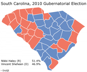
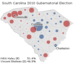
This is part of three posts analyzing the 2010 South Carolina gubernatorial election, in which Republican Nikki Haley won a closer-than-expected victory over Democrat Vincent Sheheen. The main focus of these posts will be to explore whether a racial effect accounted for Ms. Haley’s unexpected poor performance.
(Note: This is also part of a series of posts analyzing the 2010 midterm elections.)
More below.
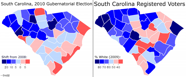
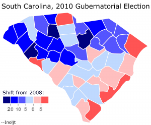
The previous post mapped out the relationship between Democratic shifts in 2010 and white registration numbers. Here is the relevant map reposted:
The post ended by noting that “So far this analysis has been relatively light on the statistical side of things.” It included a number of maps, but did not use any raw numbers.
This post aims to draw conclusions based on those numbers.
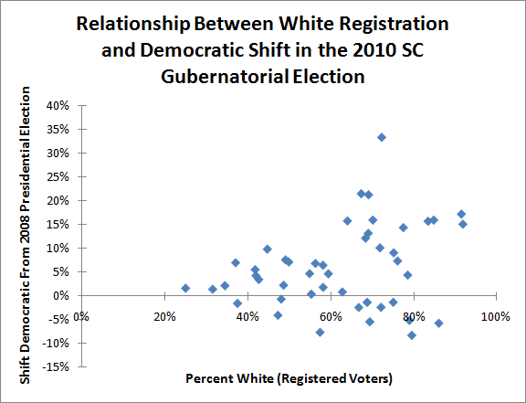
Let’s begin by translating the picture above into a graph:
This graph maps the relationship between how white a county in South Carolina is, and how much it shifted against non-white Republican candidate Nikki Haley in 2010.
If normally-Republican whites moved against Ms. Haley due to her race, one would expect the dots to be graphed in a roughly 45-degree diagonal line; the whiter a county, the more Democratic it would shift in 2010.
Clearly this is not the case in the graph above. There are a lot of very white counties that shifted strongly against Ms. Haley – but there are also a lot of very white counties that supported her more than they did Senator John McCain.
Indeed, the whitest counties seem to spread out into two groups; one group moves strongly against Ms. Haley, another actually shifts for her. One might speculate that the former group is composed of lower-income, rural whites and the latter is composed of higher-income, metropolitan whites.
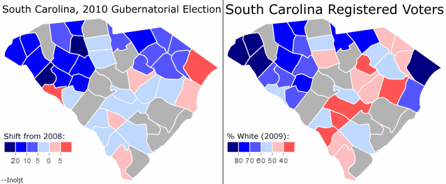
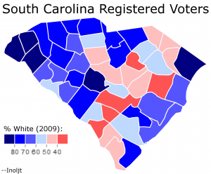
To test this theory, the previous post adjusted for income by eliminating all the counties with a median household income greater than the state median (i.e. it got rid of the rich whites). Here is what the result looked like:
There seems to be a correlation here, as the previous post noted.
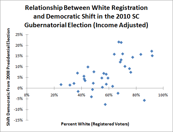
Here is how the relationship looks on a graph:
The group of white counties which shifted towards Ms. Haley has disappeared. Instead, one sees a much stronger trend: the whiter the county, the more strongly it moved against non-white Republican Governor Nikki Haley.
This only happens once high-income white counties are tossed out of the analysis. High-income Republican whites were very comfortable voting for non-white Republicans; low income Republican whites were less willing.
Interestingly, this pattern is not unique to South Carolina. In Louisiana, Republican Governor Bobby Jindal – a non-white individual of Indian descent – did extremely poorly amongst rural, low-income (Republican) whites while winning landslide support amongst high-income, suburban (Republican) whites. This caused Mr. Jindal to lose in his first attempt to run for governor.
Finally, one can test whether the effect above is statistically significant, or just the result of randomness.
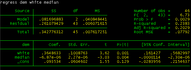
Here is a regression analysis run on the 2010 South Carolina gubernatorial race:
Regression analysis is something I am still not fully comfortable with, so bear this in mind as the analysis continues.
The regression attempted to use two variables – race and income – to predict whether voters would vote more Democratic in 2010. Specifically, it used the percent of white registered voters in a county and said county’s median household income.
The model states that every 10% increase in white registered voters results in a 3.65% greater Democratic shift against Ms. Haley (this is the Coefficient column at the bottom left).
More importantly, whiteness and income were statistically significant when placed together; there was a 0.1% chance that the effect of whiteness was random, and a 0.4% chance that the effect of income was random (this is the P>|t| column at the bottom center).
So the evidence is fairly strong that racially-based voting by low-income whites hurt non-white Republican Ms. Haley in 2010.
There is, however, a caveat. The above regression only explains 20% of the variance between the different degrees of Democratic shifts between different counties (this is the Adj R-Squared line at the top right). This means that 80% of the variance is not explained by race and income.
Racism probably hurt Ms. Haley in 2010, but it was far from the only factor.
–Inoljt
.
.
.
P.S. Here is the relevant data used to built this analysis:
| County | % Change Democratic | % White Registered | Median Household Income |
| Abbeville | 21.31% | 69.08% | 33,995 |
| Aiken | -1.30% | 75.02% | 43,845 |
| Allendale | 1.65% | 25.09% | 23,942 |
| Anderson | 15.75% | 83.40% | 41,399 |
| Bamberg | -1.54% | 37.56% | 28,266 |
| Barnwell | 0.40% | 55.31% | 30,549 |
| Beaufort | -8.27% | 79.47% | 54,085 |
| Berkeley | -1.32% | 68.74% | 49,609 |
| Calhoun | 4.72% | 54.90% | 39,537 |
| Charleston | -5.41% | 69.36% | 46,145 |
| Cherokee | 14.40% | 77.45% | 35,807 |
| Chester | 4.69% | 59.40% | 33,640 |
| Chesterfield | 15.82% | 64.00% | 32,267 |
| Clarendon | 2.28% | 48.66% | 29,840 |
| Colleton | 1.83% | 58.16% | 35,935 |
| Darlington | 6.87% | 56.31% | 34,577 |
| Dillon | 7.62% | 49.11% | 28,653 |
| Dorchester | -2.37% | 72.07% | 52,443 |
| Edgefield | 0.86% | 62.79% | 38,885 |
| Fairfield | 4.28% | 42.02% | 32,694 |
| Florence | 6.49% | 58.12% | 39,919 |
| Georgetown | -2.40% | 66.73% | 40,573 |
| Greenville | 4.41% | 78.49% | 45,917 |
| Greenwood | 12.18% | 68.35% | 39,586 |
| Hampton | 3.50% | 42.67% | 32,253 |
| Horry | -5.72% | 85.98% | 41,163 |
| Jasper | -4.05% | 47.30% | 35,163 |
| Kershaw | 33.41% | 72.24% | 45,268 |
| Lancaster | 9.10% | 75.12% | 40,286 |
| Laurens | 10.15% | 71.81% | 36,910 |
| Lee | 7.02% | 37.11% | 28,041 |
| Lexington | 15.99% | 84.74% | 52,062 |
| Marion | 5.55% | 41.82% | 28,437 |
| Marlboro | 9.87% | 44.75% | 26,799 |
| McCormick | -7.63% | 57.41% | 35,557 |
| Newberry | 13.21% | 69.01% | 37,263 |
| Oconee | 17.25% | 91.39% | 39,840 |
| Orangeburg | 2.19% | 34.54% | 33,567 |
| Pickens | 15.13% | 91.76% | 40,357 |
| Richland | 7.18% | 49.90% | 45,643 |
| Saluda | 15.99% | 70.11% | 40,819 |
| Spartanburg | 7.39% | 76.07% | 40,278 |
| Sumter | -0.65% | 48.08% | 37,113 |
| Union | 21.54% | 67.31% | 32,361 |
| Williamsburg | 1.43% | 31.59% | 26,639 |
| York | -5.13% | 78.89% | 50,644 |
| Total | 4.52% | 69.66% | 42,580 |
