Analyzing Obama’s Weak Spots – Part 3: Appalachia, South Central and the 2010 Midterms

This is the final part of three posts analyzing the congressional districts President Barack Obama underperformed in. It will focus on the movement in Appalachia and the South Central United States. The previous parts can be found starting here.


The 2010 Midterms

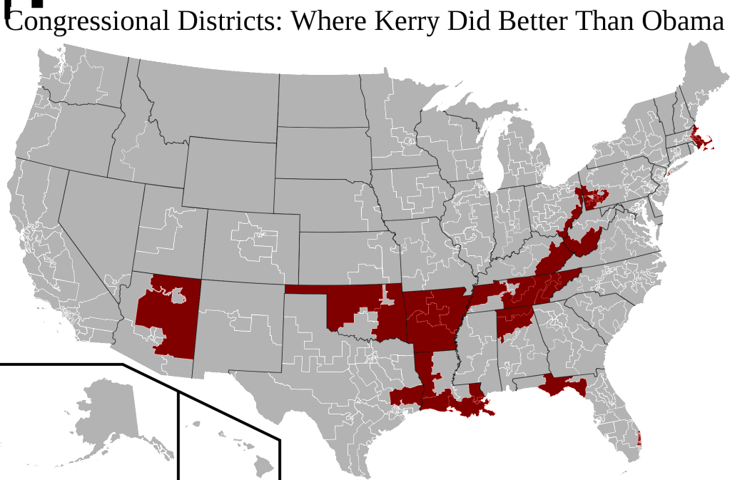
Let’s take one last look at those districts in which Mr. Obama did worse than Senator John Kerry:

Analyzing Obama's Weak Spots

One sees again, as clear as ever, the diagonal pattern of Republican movement in South Central America and the Appalachians.

These districts differ from the northeastern and Florida-based regions examined in the previous post. Unlike those congressional districts, the districts in South Central and Appalachia vote strongly Republican.

More below.

Many of them were never much loyal to the Democrats in the first place; those that did vote Democratic generally stopped doing so after President Bill Clinton left the ticket.

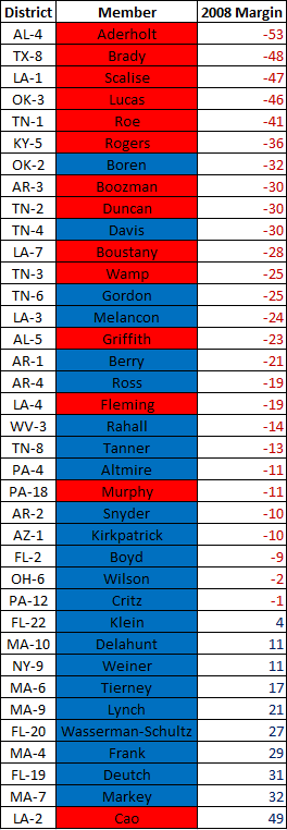
Nevertheless, a number of these South Central and Appalachian districts are still represented by Democratic congressmen. This is readily apparent if one looks at a list of congressional districts in which Mr. Obama underperformed Mr. Kerry:

South Central and the 2010 Midterms

There are a surprisingly high number of Democrats on this list.  As one might expect, the Democratic-voting districts all elect Democrats (except, ironically, for the most Democratic one). Yet more than half of the Republican-voting districts on the list also are represented by Democrats.

That is actually an amazing statistic. These are places in Appalachia and South Central which are already voting Republican, which are fast becoming even more Republican, and which are electing Democratic congressmen.

For Democrats, congressional districts like these constitute ticking time bombs. They will be the first to fall in a Republican wave. There is literally no way the party can continue holding the majority of seats in Arkansas, Tennessee, and West Virginia.

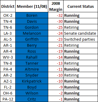
And 2010 looks like a Republican wave year. Democratic-controlled districts in Appalachia and South Central are in deep trouble already:

South Central and the 2010 Midterms

In congressional districts that vote Republican and are becoming Republican, only half the Democratic incumbents are running again. The open seats will likely elect Republican representatives this fall, even in the best forseeable Democratic environment.

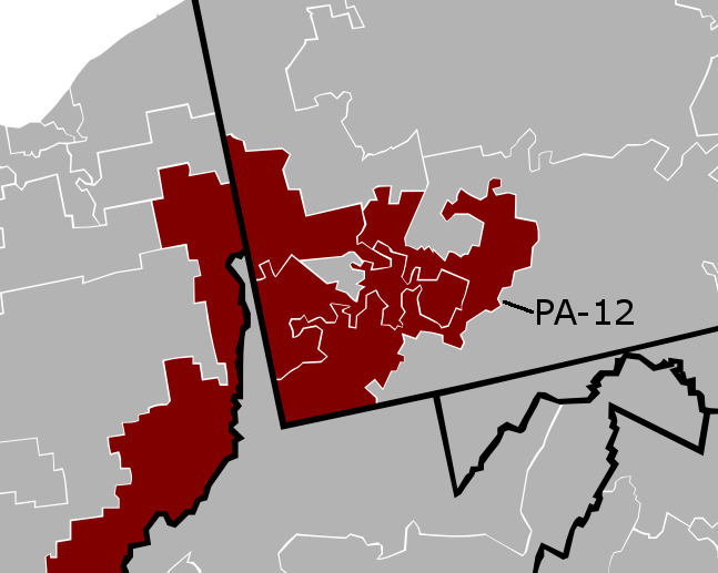
There is good news, however, judging from the PA-12 election results. On May 18th Pennsylvania held a special election for a new representative of the 12th congressional district, after incumbent John Murtha’s death:

South Central and the 2010 Midterms

Like many Democratic representatives in South Central and Appalachia, Mr. Murtha had constituted a relic of an earlier time – when southwest Pennsylvania voted Democratic. His continued re-elections were due to his personal popularity and the power of incumbency, even as his district moved more and more Republican.

It was a minor miracle that Democratic candidate Mark Critz won. Until then, no Democratic candidate had ever done better than Mr. Obama since his election. Mr. Critz did just that, given that the president lost PA-12 (the only seat in the nation to support Kerry and the McCain). In a district with double-digit disapproval ratings of Mr. Obama, this constituted an arduous task.

It is the same task that awaits more than a dozen Democrats in Appalachia and South Central America come November 2010.
Analyzing Obama’s Weak Spots – Part 1

This is the first part of three posts analyzing the congressional districts President Barack Obama underperformed in.

Congressional Districts

By most accounts, Senator Barack Obama dominated the 2008 presidential  election. He won an electoral landslide, winning Republican-leaning states such as Indiana and North Carolina which his campaign targeted. Compared to 2004, the nation shifted almost ten points more Democratic.

Mr. Obama improved from Senator John Kerry’s performance almost everywhere. More than 90% of congressional districts voted more Democratic than in 2004. Yet this means that at least several dozen congressional districts were more friendly to Mr. Kerry than the Illinois Senator. I have mapped these districts below:

Analyzing Obama's Weak Spots

More below.

(Click here for a much better view of the map).

There is a clear pattern here: Republican-shifting congressional districts are found along a diagonal line stretching from Louisiana and Oklahoma to southeastern Pennsylvania, roughly along the Appalachian mountains. This is not exactly startling news; ever since the primaries, Mr. Obama’s weakness in these regions has been well-noted. The five states that shifted Republican from 2004 – Arkansas, Louisiana, Oklahoma, Tennessee, and West Virginia – are all located here.

The exceptions to this pattern, however, constitute items of considerable interest. Some of these have fairly simple explanations. Arizona’s 1st district voted more Republican, for instance, mainly because Arizona was Senator John McCain’s home state.

Other districts, however, go against commonly-held political wisdom. Take LA-2: a black-majority, inner-city district located in New Orleans (represented, ironically, by Republican congressman Joseph Cao). While LA-2 strongly supported Mr. Obama, black depopulation in the aftermath of Katrina made this support less than that in 2004.

Another example can be found in the northeast:

Analyzing Obama's Weak Spots - Part 1

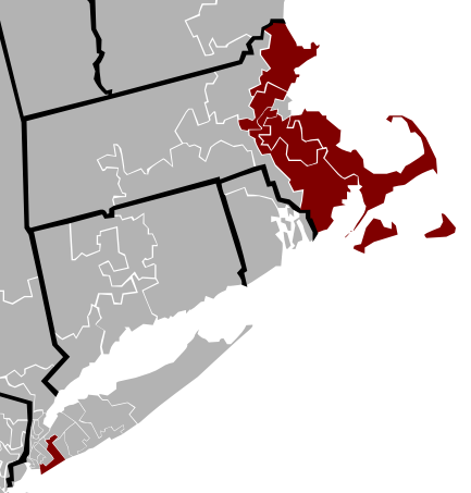
Republicans do better in five Massachusetts districts and one New York district.

This movement stands in contrast to the narrative of Democratic dominance in the northeast. Most in the beltway have ignored this trend, or dismissed it as simply the loss of Mr. Kerry’s home-state advantage. Whether this is true or not, there is quite a lot of interesting stuff to be said on these districts. The next post will be devoted solely to exploring this pattern.

–Inoljt, http://mypolitikal.com/

Comparing Barack Obama, John Kerry, and Mike Dukakis

By: Inoljt, http://mypolitikal.com/

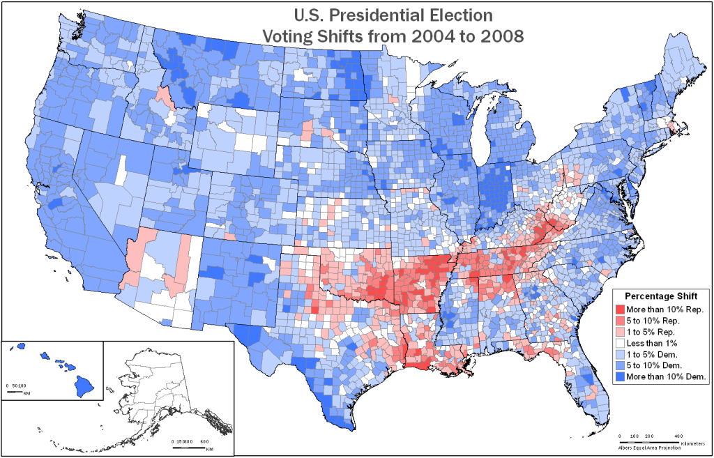
In the aftermath of the 2008 presidential election, the New York Times famously posted a map depicting county-by-county changes from the 2004 election. A different version of this map is below:

Comparing Barack Obama,John Kerry,and Mike Dukakis

What is remarkable about this map is the evenness of the Democratic movement – a 9.72% shift to them from 2004. With the exception of a diagonal patch of Appalachia, President Barack Obama improved throughout the country. It did not matter if a county was located in Utah or California, whether it belonged to a dense city or a thinly populated farm, or whether it was poor or rich – almost every county still voted more Democratic than it did in 2004.

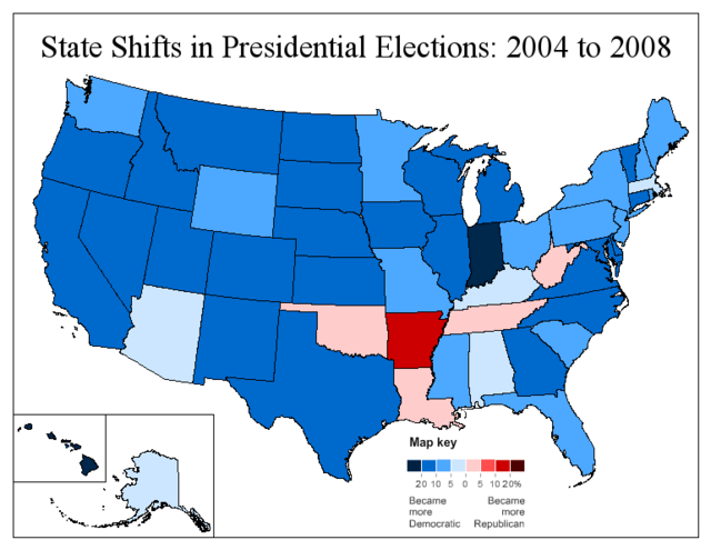
If one moves to a statewide basis, the shift is still fairly uniform.

Comparing Barack Obama,John Kerry,and Mike Dukakis

Compared to the county-by-county map, this map lends itself more easily to analysis.

More maps below.

Once again, Mr. Obama does well everywhere except for Appalachia. His improvement, however, is noticeably less in the traditionally Democratic Northeast. The South is strangely divided between the friendly Atlantic coast and the hostile inland states (with the exception of Texas). There is also a fairly apparent split between east and west: in the latter, Obama’s improvements are almost uniformly strong. The movement east is far more variable.

In addition, the color of several states can be explained through local factors. Clinton-loving Arkansas appears dark red, while Senator John McCain’s home state Arizona stands out amidst its dark blue neighbors. Obama’s home states Hawaii and Illinois also appear dark blue, but Governor Sarah Palin’s Alaska stays more Republican. Massachusetts, home state of Senator John Kerry, does not shift Democratic by much; Indiana, where Obama’s campaign led a massive turn-out effort, shifts massively.

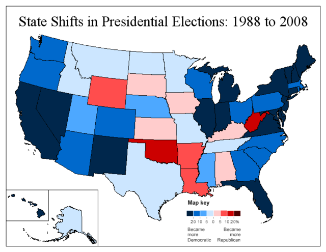
In playing around with these maps I also took a look at the 1988 presidential election. In that election, Democratic candidate Mike Dukakis lost by 7.73% to Vice President George W. Bush. Because Mr. Obama won by 7.26%, the nation voted 14.99% more Democratic than in 1988. Here is Obama’s performance compared to that of Mr. Dukakis:

Comparing Barack Obama,John Kerry,and Mike Dukakis

What this map reveals is far less uniformity. Compared to the previous ones, this is much more a depiction of structural political changes.

Perhaps most obviously, much of South Central America swings against Obama, illustrating the decades-long Republican shift of this region. Dukakis still was able to win a number of white Democratic counties in places like Louisiana and Oklahoma. Today those places have largely abandoned the party.

There are other patterns. A number of Plains states, such as Kansas and the Dakotas, have very little or no movement to Obama. He actually does worse in Iowa. This reflects a relatively strong Dukakis performance in rural America, which was in the midst of an agricultural crisis in 1988.

Most interestingly, one can see the 2008 electoral map in the map; the dark blue states almost all voted Democratic in 2008. Democratic-voting states today tended to shift most to Obama; Republican-voting states today tended to move less. Only two states that voted for Obama haven’t shifted strongly Democratic since 1988: Iowa and Minnesota. Out of all the states John McCain won, on the other hand, only Arizona, Georgia, and South Carolina shifted strongly Democratic – and Democrats came quite close in Georgia. A similar trend has been observed in previous posts.

I am not certain if this pattern suggests electoral polarization: Democrats improve greatly in a number of 1988 Republican-leaning states (such as New Jersey or North Carolina), and Republicans do the opposite in places like West Virginia or Iowa. Instead, it appears to make sense for a candidate to win a state he or she does best in. Thus, this pattern seems to illustrate the electoral coalition Democrats have carved since 1988.

The farther one looks back, it seems, the more a map reveals.

Analyzing Swing States: Pennsylvania, Part 2.5

This is part of an analysis of the swing state Pennsylvania. Part three can be found here.

(A note: There will be a lot of maps in this post.)

Philadelphia: Precinct Results

My first post on the swing state Pennsylvania focused on the city Philadelphia, an incredibly Democratic city. At the time, I looked for detailed ward and precinct results but was unable to find any. Recently, however, I have come across a website which maps Philadelphia precinct results across a whole range of elections; it is a literal gold mine. This offers the opportunity to substantially deepen the previous analysis.

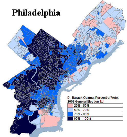
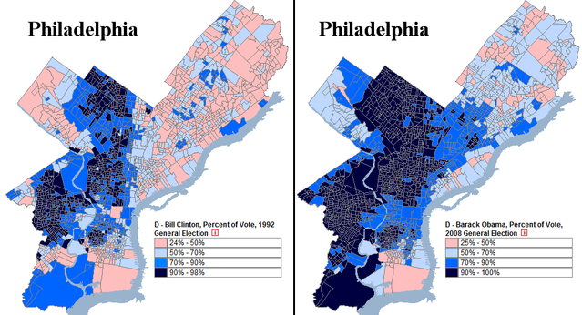
Below is a map, derived from the website, of the 2008 presidential election in Philadelphia (by precinct!)

Photobucket

An analysis of this result below.

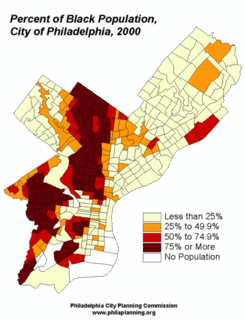
The legend ranges from President Barack Obama’s weakest precinct (25% of the vote) to his strongest (literally every single person voted for him). In total, Mr. Obama won 83.00% of the county’s vote – an amazingly high figure. For reference, below is a map of Philadelphia’s black population.

Photobucket

There is, of course, a distinct parallel between the two demographic maps; blacks vote heavily Democratic and will continue to do so in the foreseeable future.

For decades, the city Philadelphia has trended Democratic. In percentage terms, its Democratic vote has increased for the past seven consecutive elections. In 1992, for example, former President Bill Clinton won 68.16% of the county. A comparison to Obama’s performance is revealing:

Photobucket

If there is any consolation for Republicans in all this, it is northeast (and parts of south) Philadelphia. Notice that in both maps above, Mr. Clinton and Mr. Obama perform distinctly worse here. This area of the city is populated mostly by white Catholics and Jews, although white flight has weakened their numbers. Nevertheless, northeast Philadelphia remains far whiter than the rest of the city, and as assimilated Catholics lose their traditional Democratic loyalties, Republicans have been gradually improving their percentages. John McCain actually did better than Bush in parts Northeast Philadelphia, supported by voters uncomfortable with Barack Obama’s race.

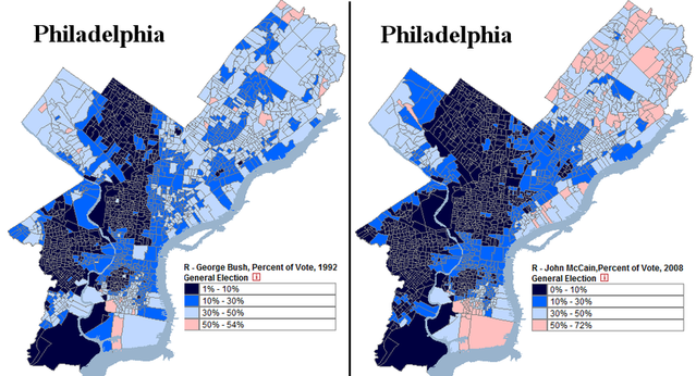
The above map hides this trend; many northeast Philadelphia voters cast their ballots for Ross Perot in 1992, so the Democratic percentage vote was artificially low that year (minority voters, on the other hand, generally did not vote for Mr. Perot). Comparing the Republican vote is more useful:

Photobucket

In general, Senator John McCain (who won 16.33% of the vote) does worse than former President George H.W. Bush (who won 20.19%). In the northeast, however, the opposite trend occurs. The shift is gradual and slow – not like West Virginia’s rapid red turn – but enough to be noticeable.

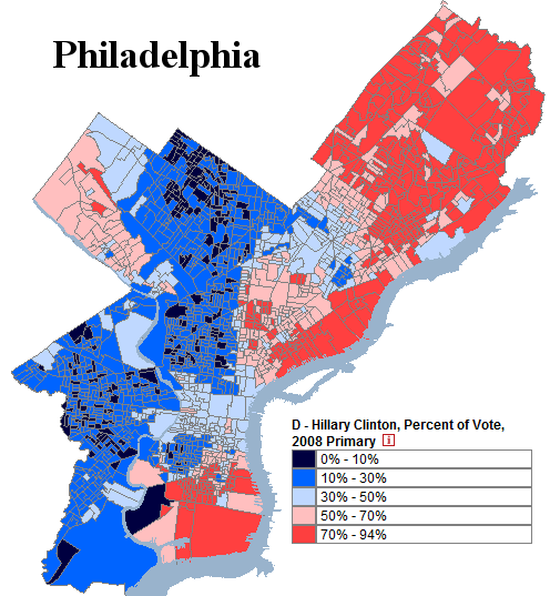
Under perfect conditions, growing Republican strength might result in something like this:

Photobucket

This is Secretary of State Hillary Clinton’s performance during the Pennsylvania primary. The senator won a respectable 34.80% of Philadelphia’s vote, fueled by support amongst white Catholics in the northeast. As evident in the map, the city contained extensive polarization; the majority of precincts gave over 70% of the vote to one candidate. In effect, Philadelphia split into two different blocs.

To be clear, Republicans will have a very difficult time achieving a result like this. It would take a momentous change for white Catholics to cast more than 70% of their ballots for Republicans. If this happened, moreover, winning Philadelphia would be the least of Democratic worries.

The other possibility would be for Republicans to improve their percentage amongst African-Americans. Statistically, 90+% support for any party seems untenable over a long period of time. Republicans, however, do not appear anywhere close to achieving this goal. The fact that they are more likely to reach 60% support amongst white Catholics than 15% support amongst blacks says a lot about the state of the Republican Party (and the state of America, too).

–Inoljt, http://mypolitikal.com/

What Is This Map?

By: Inoljt, http://mypolitikal.com/

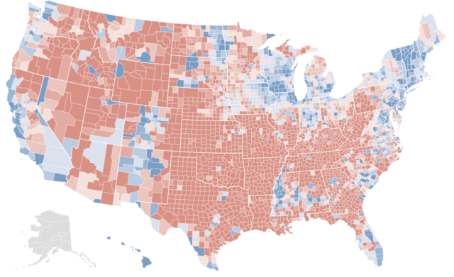
This map is not what you think it is. Take a moment to guess what it represents.

Photobucket

The answer below the flip.

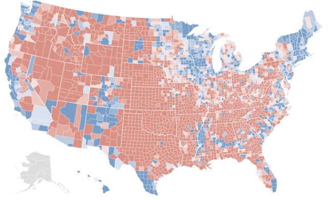
At first glance, it looks a lot like the results of the 2008 presidential election. The northeast and midwest are all blue. Then there’s the west coast – a long line of blue counties. One could be quite easily forgiven if one took this map for a county-by-county map of the 2008 presidential election.

In fact, here are the real election results:

Photobucket

[Note: If you want to better compare the two maps, open two tabs of this (the first map) and

this (the actual results). Then switch between them.]

There is an extremely strong correlation between the two maps. Almost all the same counties are blue or red. Peering closer only cements this impression. Nevada has three blue counties – the exact three Democrats won. In Texas, only the cities and the Hispanic southwest are blue – a precise replication of the real results. One can go on and on, spotting these types of similarities.

Yet there are minor anomalies. Central Indiana and southern Florida are uniformly blue; President Barack Obama generally lost these areas. More significantly, the vast majority of Minnesota shows up red – strange, given that Democrats won the state by double-digits.

Minnesota should provide a clue of what the first map represents. Although the Democratic candidate won the state, it has been trending red for several elections. Before reading more, take a minute to refine your first guess.

.

.

.

If you haven’t figured out what the first map represents by now, here’s a bigger hint: look at Arkansas. Notice how uniformly red it appears in the first map, despite the several counties Mr. Obama won. Try to guess again – you probably can figure it out now.

.

.

.

Here’s the answer: the first map represents voting shifts between the 1992 presidential election and the 2008 presidential election.

As you have seen, there is quite a startling correlation between the two maps. Over the past four elections, the vast majority of counties President Barack Obama won have become more Democratic, while the vast majority of counties Senator John McCain won have become more Republican.

In the next post, I will attempt to analyze the meaning of this.

Florida, Part 5

By: Inoljt, http://thepolitikalblog.wordpr…

This is the last part of an analysis on the swing state Florida.

Miami-Dade County

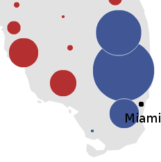
Here is how John Kerry did in south Florida:

Photobucket

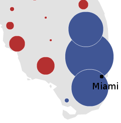
Here is how Barack Obama performed:

Photobucket

Broward and Palm Beach are marginally smaller, when compared to Obama’s performance. The big difference, however, is with Miami-Dade. Kerry won it by 6%; Obama won it by 16%.

There is no other place in Florida (and, perhaps, the country) like Miami-Dade. Palm Beach and Broward counties are retiree destinations; Miami is home to immigrants and refugees from all Latin America. More than 60% of the population is Latino – and only 3% of them come from Mexico. The Miami accent is unique compared with the nation. Local government is distinct from other counties in Florida.

One would expect Miami to be one of the most Democratic places in the nation, much like New York City or Chicago.

It is not.

Continued below the flip.

Obama won the five boroughs of New York City by 59%: a 4 to 1 margin. He won Cook County (Chicago) by 53%, with more than three-fourths of the vote. In contrast, Obama took 58% of Miami-Dade county – less than the amount by which he won New York City. The 2008 Democratic performance in Miami is comparable to their performance in cities such as Dallas (57% of the vote) and Sacramento (58% of the vote).

Much of this is due to the Cuban vote, the city’s largest demographic group. Refugees from Castro’s Cuba, staunchly anti-Communist, and faithful Republicans ever since the Bay of Pigs fiasco; Cubans vote as strongly Republican as Jews vote Democratic. In 2000, George W. Bush won about four out of five Cubans, helped by Cuban anger over Al Gore’s role in the Elian Gonzalez affair. In 2008 Obama won around 35% of their vote, based on exit polls. This was the best performance of a Democrat with Cubans in recent memory.

Their influence ensures that Miami remains a competitive, Democratic-leaning city. Democrats usually end up winning it, but their margins are severely cut. And occasionally it will turn up in the Republican column – as happened during the 2004 Senate race. There, Mel Martinez, a Bush ally, won Miami-Dade on his way to a one percent victory.

Photobucket

Democrats often hopefully comment that demographic shifts will slowly move Cubans leftward, as a new generation of Cubans, less concerned with Castro and communism, replaces their more militant elders. Perhaps. But that process will be the work of decades, not a single election cycle. For the moment the Cuban vote remains strongly Republican.

In 2008 the Democrats challenged two entrenched, Republican congressmen in south Florida: the Cuban Diaz-Balart brothers. The races were closely watched, so much that the New York Times Magazine aired an article dedicated to them. In the end, both Republicans won by margins larger than expected. Their continuing presence points to the steadfastness of the Cuban Republican vote.


Conclusion

Of the three most commonly cited swing states, Florida is the most conservative. The state can be divided into unique blocs, each of which has a distinct culture. The first, northern Florida, shares much/is part of the Deep South. Voting patterns reflect this. The populous I-4 corridor – Florida’s so-called swing-region – leans Republican, although Democrats perform well in Tampa Bay and Orlando. Finally, south Florida – diverse and populous – is the Democratic base, although the Cuban vote in Miami blunts their strength.

Whether Florida will remain this way is uncertain. Florida is an immense and diverse state. It is home to the Panhandle and Miami – two places opposite as night and day. Most every part of America can be found in the varied peoples that reside there. And certainly, it will continue to be an important swing state, sought after by both parties. Whoever ends up winning Florida is well on his or her way to becoming president.

Florida, Part 3

This is part three of a series on the political structure of the swing state Florida.

The I-4 Corridor

If there is a holy grail of Florida politics, it is winning the I-4 corridor. This refers to the Interstate 4 highway, which begins in Tampa Bay, travels though Orlando, and ends in Daytona Beach.

Quite a lot of people live in the I-4 corridor. It’s far more populated than northern Florida (and northern Florida itself is relatively dense compared to other parts of the South). While parts of south Florida are far more people-heavy, as an aggregate central Florida has a slightly greater population. The I-4 corridor can be compared to a gigantic suburb, with an unusually high number of retirees. Granted, there are cities, but they are more alike to Phoenix (which is really just a big suburb with skyscrapers) than New York.Photobucket

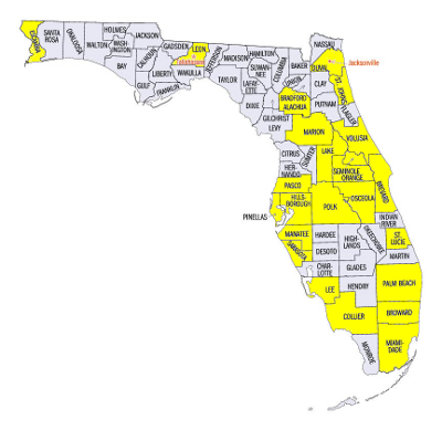
The picture above indicates counties in which more than 100,000 votes were cast in 2008; it is a rough indication of voting density. There are a scattering of counties with more than a hundred thousand voters in northern Florida; actually Obama does quite well in the highlighted counties. Most of south Florida is also yellow. Then there is an empty region – the Everglades. And above that is the I-4 corridor, which is nearly entirely highlighted. The center yellow counties are actually a rough definition of the I-4 corridor.

The I-4 corridor is often considered to be the “swing” region of Florida. The metropolitan areas that lie inside it are the heart of central Florida, and they have enormous importance. The percentage by which a politician wins the I-4 corridor often mirrors his overall performance in the state.

Continued below the flip.

For a so-called “swing” area, though, central Florida is quite conservative. It can be characterized, like Florida itself, as a Republican-dominated region with a few Democratic strongholds. The “average” county in central Florida leans Republican, with a few exceptions. And remember, the “average” county is quite populated.

What are the “exceptions,” the parts of I-4 that lean Democratic? They’re generally more populated than the mean. They have high levels of minorities. They’re places like Tampa Bay and Orlando. Osceola County has a large Puerto Rican community; it leans Democratic. Democrats sometimes do well in the communities north of Tampa. To be clear, “doing well” means winning these counties by ten percent or so; Democrats generally don’t pull off 60% or more of the vote anywhere in the I-4 corridor unless it’s a landslide.

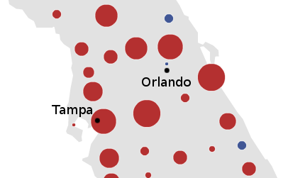
Here is the performance of a relatively weak Democrat, John Kerry, in the I-4 corridor:

Photobucket

John Kerry gets absolutely pummeled. There is a sea of red counties. This is the reason why John Kerry lost Florida.

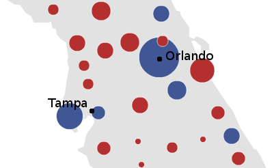
Here is the performance of a stronger Democrat, Barack Obama:

Photobucket

He does better. Obama’s probably winning the I-4 corridor, largely due to his landslide victory in Orlando – where he took 59% of the vote, the highest Democratic performance since 1944. Still, it’s a very very close thing (actually, Obama’s only leading by several thousand votes if one adds up all the counties pictured). Compared with how the Democrats did nationally, winning by 7.2%, that’s a very unimpressive result.

McCain and Obama essentially ran even in central Florida, or Florida’s “swing” region. They also ran even in Missouri, Indiana, and North Carolina. To say that the I-4 corridor is as conservative as North Carolina is an eye-opening statement. But the data backs it up.

There is hope for Democrats, nevertheless. The type of conservatism typified by central Florida seems like a softer, more suburban type of conservatism. Central Florida voters are probably more accepting of Democrats and willing to vote for them. Republicans won most counties in the I-4 corridor – but they did by 10 points, not by 40. Using an analogy earlier from this post, Central Florida Republicans are more akin to Phoenix Republicans than their northern Florida counterparts. While the I-4 corridor didn’t vote for Clinton in ’92, it did so in ’96. In contrast, the conservatism typified by northern Florida and the Deep South is deeply ingrained and rock-hard. Only a tidal wave can change voting patterns there.

Moreover, demographic change may shift central Florida leftward. This is especially evident in Orange County (Orlando) and Osceola County. In 1992, Orange County gave George H.W. Bush one of his largest margins in central Florida; he won it by double-digits. In 2008, it was Obama’s best-performing county in the region. The U.S. Census estimates that around 40% of the population is black or Latino, highly Democratic voting blocs. Rapid Puerto Rican immigration into Osceola County, too, has led to a nearly 30% voting shift since 1992, according to the Times.

For the moment, nevertheless, the I-4 corridor is roughly as conservative as North Carolina in terms of votes. To summarize so far: northern Florida, commonly considered the Republican base, is as red as the Deep South. Not parts of the Deep South; the Deep South as a whole. The I-4 corrider, which is called Florida’s “swing” region, swings blue just as much as Indiana, Missouri, and North Carolina did in 2008. Historically, it’s probably been closer to Missouri; to call central Florida as red as Indiana or North Carolina is probably an overstatement.

Miami, as we shall see, is about as liberal as Dallas and Sacamento.

–Inoljt, http://thepolitikalblog.wordpr…

Florida, Part 2

Photobucket

Florida can be considered as three regions distinct in culture, economics, and voting patterns. Northern Florida is deep red; the I-4 corridor is light red; and the Miami metropolis is moderately blue.

Until recently, Florida was far different from what it looks like today. It was the quintessential Southern state, and it was fairly empty in term of people. Florida’s voting record reflected its southern roots. Until Eisenhower won it twice, Florida was part of the Solid South. In 1964, LBJ ran well behind his national average, due to his support for civil rights. The next election, George Wallace took 29% of the vote. Then in 1976, Jimmy Carter resurrected the Solid South for the last time, winning Florida by 5%. That was also the last time a Democrat ran above the national average in Florida.

Northern Florida and the Panhandle

Florida still is a Southern state to some extent. This is especially true in northern Florida and the panhandle, which borders Alabama and Georgia. Northern Florida is very conservative; it is not uncommon to see a Republican taking 70% or more of the vote in a number of counties there.

Photobucket

As the picture indicates, northern Florida constituted the place in which McCain performed best. There were no counties in which Obama won over 70% of the vote, although he comes fairly close in majority-black Gadsden County (where he won 69.1% of the vote).

Gadsden County provides a neat encapsulation of all that makes northern Florida tough going for Democrats. Like much of the Deep South, voting is racially polarized. If a county is like Gadsden, it votes blue; if, on the other hand, a county does not have many blacks, it is usually deep red. There are not many independents in this region; voting habits are deeply entrenched. The “average” voter and the “average” county is a hard-core Republican.

The result is something like this:

Photobucket

This is northern Florida in the 2008 presidential election.

There are three noticeable blue areas (out of five Democratic counties). One is Gadsden County, which is majority black. The other two are homes of major public universities: Tallahassee hosts Florida A&M University and Florida State University, while Alachua County is home to the University of Florida.

This is the Democratic “base,” such as it is. Blacks and college students have historically been the most faithful Democrats, and in northern Florida they are the only Democrats.

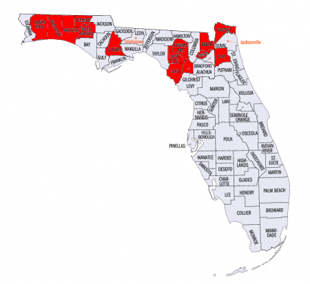
A final note before moving on to central Florida. Although Jacksonville most always votes Republican, there is a substantial black minority within it that, unfortunately, has had historically poor turn-out. A strong Democrat can mobilize these voters and essentially erase Republican margins in this county. Barack Obama was extremely successful at doing so, which is why the red circle is relatively small in the map. On the other hand, John Kerry was not as successful; he lost Jacksonville by 17 points, as the picture below indicates.

Photobucket

–Inoljt, http://thepolitikalblog.wordpr…

Vulnerability Index for House Elections

Over the holidays, SSP readers seemed to have a lot of fun with the vulnerable House Republicans and vulnerable House Democrats threads. This left me wondering, as so many things seem to do, “is there a way to quantify that?” In other words, is there a data-driven way to approach the question instead of just relying on perceptions (and also to make sure that potentially overlooked races don’t fall through the cracks)?

Here’s what I tried. It’s actually a bit reminiscent of my PVI/Vote Index, in that it measures representative performance against the district’s lean, except here performance is measured by the rep’s margin in the last election. (The data for many of the 2008 electoral margins is available in the recent “How’d We Do?” post, conveniently arranged in order from closest to least close.)

Look at the top 20 most vulnerable Republicans to see how it works. As pretty much everyone would expect, Anh Cao in LA-02 is the most vulnerable GOPer. He had the 5th weakest margin of any Republican who survived 2008 (beating Bill Jefferson by 2.7%, behind only Fleming (0.4%), McClintock (0.6%), Calvert (2.4%), and Luetkemeyer (2.5%). Needless to say, he’s in the GOP-held district with the least favorable PVI (D+28, using “old,” i.e. 00-04, PVI). At #2 is Jim Gerlach in PA-06; he had the 9th worst margin at 4.2%, and he’s in the 6th worst district for a GOPer at D+2. And so on…

District Rep. Margin
rating
PVI
rating
Total
LA-02 Cao 5 1 6
PA-06 Gerlach 9 6 15
IL-10 Kirk 13 4 17
WA-08 Reichert 16 5 21
MI-11 McCotter 17 16 33
MN-03 Paulsen 22 12 34
NJ-07 Lance 24 13 37
OH-12 Tiberi 34 14 48
CA-50 Bilbray 11 40 51
MN-06 Bachmann 6 46.5 52.5
FL-25 Diaz-Balart 18 37 55
CA-44 Calvert 3 55 58
AL-03 Rogers 25 34 59
LA-04 Fleming 1 60 61
FL-15 Posey 31 30.5 61.5
MN-02 Kline 39 23 62
CA-26 Dreier 33 30.5 63.5
MO-09 Luetkemeyer 4 60 64
NY-26 Lee 38 27 65
PA-15 Dent 58 8 66

Is this much different from SSP readers’ predictions? No, not much; it’s the wisdom of crowds at work. Still, I see a few names on there that didn’t get much of any mention in our prediction thread: especially Pat Tiberi in OH-12 (34th worst margin at 12.6%, 14th worst district at R+1) who seems to fly under the radar every single freakin’ election. Other names revealed by this list that wouldn’t necessarily be intuitive picks include Thad McCotter, John Kline, Mike Rogers (AL), and Bill Posey, who benefited from our big-time recruitment failure in the FL-15 open seat.

Here’s the flipside: the Democratic seats that seem likeliest to flip, based on 2008 numbers. Some of these may not be much cause for alarm; Chet Edwards, for instance, is probably not in any imminent danger except in case of a 1994-sized event, but he’s probably doomed to uncomfortable margins for all eternity. On the other hand, time will tell whether Walt Minnick can quickly fortify himself, or if we’re only renting ID-01 for a couple years.

District Rep. Margin
rating
PVI
rating
Total
ID-01 Minnick 5 1 6
AL-02 Bright 2 5 7
MD-01 Kratovil 4 10 14
TX-17 Edwards 19 2 21
VA-05 Perriello 1 26.5 27.5
AL-05 Griffith 10 20 30
MS-01 Childers 25.5 8.5 34
NY-29 Massa 6 29.5 35.5
VA-02 Nye 15.5 22 37.5
CO-04 Markey 34 11.5 45.5
PA-10 Carney 35 14 49
GA-08 Marshall 39 13 52
FL-08 Grayson 12.5 44 56.5
MI-07 Schauer 7 49.5 56.5
NM-02 Teague 33 23.5 56.5
WI-08 Kagen 20 38.5 58.5
OH-15 Kilroy 3 58 61
AZ-05 Mitchell 23 38.5 61.5
PA-03 Dahlkemper 8 54 62
OH-16 Boccieri 27.5 40 67.5

More over the flip…

In describing this method to DavidNYC, he quite rightly asked “Wait, does this thing actually work?” So, after a lot more data entry and some testing based on how well the 2006 numbers would have predicted the 2008 results, I can conclude it does work fairly well. Here is what the 2006 numbers would have predicted for GOP held seats in 2008.

District Rep. Margin
rating
PVI
rating
Total
NM-01 Wilson 3 7 10
NY-25 Walsh 9 5 14
PA-06 Gerlach 7 9 16
CT-04 Shays 16 2 18
WA-08 Reichert 14.5 8 22.5
NV-03 Porter 10 13 23
IL-10 Kirk 24 4 28
NJ-07 Ferguson 8 20.5 28.5
OH-15 Pryce 4.5 24.5 29
MI-09 Knollenberg 22 16 38
OH-01 Chabot 20 18.5 38.5
NC-08 Hayes 1.5 38.5 40
PA-15 Dent 33 11 44
FL-13 Buchanan 1.5 46.5 48
IL-06 Roskam 12.5 36.5 49
MI-07 Walberg 41 10 51
NY-03 King 17 34 51
AZ-01 Renzi 28 30.5 58.5
IL-11 Weller 34 24.5 58.5
NY-13 Fossella 45 14 59

One problem leapt out at me: the role of open seats, and the accompanying loss of the benefits of incumbency. So, I performed a tweak that took open seats into account (by taking out the margin, and just leaving the open seat’s strength based only on its PVI rating). That takes it a little closer to the way things actually shook out. 13 out of the top 20 were pickups, which seems like a good but not amazing rate of prediction.

Without doing a lot of putting your thumbs on the scales of individual races, I don’t know how you’d build a model that somehow predicted, say, Tom Feeney’s implosion, or the fizzle in the open seat in NM-02, or Dave Reichert’s confounding staying power, or Bob Roggio’s amazing lack of name recognition… or that Bill Sali was vulnerable (he was #106) if only because of sheer malice and stupidity. Any good prognostication has to include at least some kind of qualitative analysis of candidates’ levels of, well, suckiness.

By the way, in case you’re wondering what this formulation means would happen to Peter King’s seat if he bails out to run for NY-Sen, it would vault up to #2 on the list if it were open. (It’s the 7th most Dem PVI of any GOP-held seat, so for 2010 the score of 7 would slot an open NY-03 right before LA-02.) So, a year from now, once we have a sense of where seats will open up, I’ll have to revisit this project.

District Rep. Margin
rating
PVI
rating
Total
NY-25 Open 0 5 5
NJ-03 Open 0 6 6
NM-01 Open 0 7 7
NY-13 Open 0 14 14
PA-06 Gerlach 7 9 16
CT-04 Shays 16 2 18
MN-03 Open 0 18.5 18.5
NJ-07 Open 0 20.5 20.5
VA-11 Open 0 20.5 20.5
WA-08 Reichert 14.5 18 22.5
NV-03 Porter 10 13 23
IL-11 Open 0 24.5 24.5
OH-15 Open 0 24.5 24.5
IL-10 Kirk 24 4 28
AZ-01 Open 0 30.5 30.5
MI-09 Knollenberg 22 16 38
OH-01 Chabot 20 18.5 38.5
NC-08 Hayes 1.5 38.5 40
NY-26 Open 0 42 42
PA-15 Dent 33 11 44

Finally, here’s what the 2006 numbers would have predicted for the Democratic-held seats in 2008, including the tweak for open seats (of which we didn’t have many). Three of the top 10 did, in fact, fall. Plus, LA-06 isn’t on the list because it changed hands during a special election. However, my back-of-the-envelope calculation for Cazayoux based on his 3% margin in the special election and an R+6.5 would’ve given him a score around 24, good for 4th place. On the other hand, the fifth Dem seat to fall, LA-02, clocks in at #187!

District Rep. Margin
rating
PVI
rating
Total
GA-08 Marshall 4 9 13
AL-05 Open 0 17 17
KS-02 Boyda 11 11 22
IN-09 Hill 15 12.5 27.5
PA-10 Carney 18 10 28
TX-22 Lampson 29 4 33
NC-11 Shuler 23.5 12.5 36
WI-08 Kagen 6 30.5 36.5
TX-17 Edwards 39 1 40
FL-16 Mahoney 5 38.5 43.5
IL-08 Bean 21 23 44
AZ-05 Mitchell 14 30.5 44.5
UT-02 Matheson 43 2 45
NY-19 Hall 12.5 36 48.5
PA-04 Altmire 7.5 41 48.5
IN-02 Donnelly 25 26 51
IN-08 Ellsworth 44.5 8 52.5
CA-11 McNerney 20 33 53
TX-23 Rodriguez 26 27.5 53.5
OR-05 Open 0 55 55

Flip This House Delegation

It’s that time of the year when people start contemplating “Oh, no! What if there’s a tie in the Electoral College?” (It’s actually not that far-fetched. Take the Kerry states, add Iowa, Colorado, and New Mexico, subtract New Hampshire and you get 269 each.)

As you might or might not be aware, the 12th Amendment states that in the event of a tie (or no one getting a majority because of a 3rd party), the House of Representatives decides who becomes President. However… it’s not done by individual votes. Instead, each state delegation gets one vote. So, let’s assume there’s no horse trading going on behind the scenes, or strangely principled decisions to honor the will of the state’s voters rather than one’s party designation, and see which party controls which party delegation: the Dems control 27, the GOP controls 21, and there are 2 ties. (This is already a dramatic improvement over the situation going into the 2006 elections, when the GOP controlled 30, Dems controlled 17, and there were 3 ties.)

Dems: Arkansas (3-1), California (34-19), Colorado (4-3), Connecticut (4-1), Hawaii (2-0), Illinois (11-8), Indiana (5-4), Iowa (3-2), Maine (2-0), Maryland (6-2), Massachusetts (10-0), Minnesota (5-3), Mississippi (3-1), New Hampshire (2-0), New Jersey (7-6), New York (23-6), North Carolina (7-6), North Dakota (1-0), Oregon (4-1), Pennsylvania (11-8), Rhode Island (2-0), South Dakota (1-0), Tennessee (5-4), Vermont (1-0), Washington (6-3), West Virginia (2-1), and Wisconsin (5-3)

GOP: Alabama (5-2), Alaska (1-0), Delaware (1-0), Florida (16-9), Georgia (7-6), Idaho (2-0), Kentucky (4-2), Louisiana (4-3), Michigan (9-6), Missouri (5-4), Montana (1-0), Nebraska (3-0), Nevada (2-1), New Mexico (2-1), Ohio (11-7), Oklahoma (4-1), South Carolina (4-2), Texas (19-13), Utah (2-1), Virginia (8-3), and Wyoming (1-0)

Ties: Arizona (4-4) and Kansas (2-2)

So which are the likeliest delegations to flip? Turning to Swing State Project’s competitive House race ratings, I’ve tried to rank the likelihood of delegations moving from majority-R (or a tie) to majority-D. Ordinarily, I’d suggest this be the basis for some consideration as to how to allocate our House race resources… but considering that we’re already up 27-21 and looking to flip more delegations without a lot of strategic targeting, simply by virtue of how much the playing field is tilted in our direction this year, this serves more as a conversation piece this year. In short, we can move the margin to 30-19 by winning all our toss-ups, and we can move it as far as 35-14 by winning all our lean Rs as well.

Alaska: 1 to flip. AK-AL is a toss-up, previously rated Lean D. The biggest threat to our fortunes in this seat would be if Don Young doesn’t make it out of his primary.

Arizona: 1 to break tie. AZ-01 is an open scandal seat, rated toss-up.

New Mexico: 1 to flip. Rated toss-up, NM-01 is an open seat in a D+2 district, although the Republicans recruited a solid contender here. (Plus, NM-02 is a likely R.)

Nevada: 1 to flip. NV-03 is lean R. Although there was some weirdness with a candidate swap last month, Dina Titus may actually be an upgrade. NV-02 is also likely R.

Ohio: 2 to tie, 3 to flip. We’re getting into table-running territory here, but we can do it by picking up OH-15 (toss-up), OH-16 (toss-up), and one of OH-01 (lean R) and OH-02 (lean R). For good measure, there are OH-07 and OH-14 (races to watch).

Missouri: 1 to flip. MO-06 (lean R) looks promising, with a former Kansas City mayor on our side. MO-09 (likely R) presents another opportunity.

Louisiana: 1 to flip. LA-04 (lean R) doesn’t seem so out of reach given our special election victory in LA-06.

Michigan: 2 to flip. MI-07 and MI-09 are both rated lean R. (And MI-07 may actually be our best shot at an incumbent.)

Wyoming: 1 to flip. WY-AL is likely R, although we’d have better odds if we were facing the retiring incumbent instead of someone new.

Further down the list, there’s Virginia (3 to flip: VA-11 is toss-up, VA-02 and VA-10 are likely R, VA-05 is a race to watch), Florida (a herculean 4 to flip, but FL-08, FL-13, FL-15, FL-18, FL-21, FL-24, and FL-25 are all likely R), Idaho (1 to tie, 2 to flip: ID-01 is likely R), Alabama (2 to flip: AL-02 is likely R and AL-03 is a race to watch), Kentucky (1 to tie, 2 to flip: KY-02 is likely R), Montana (1 to flip: MT-AL is a race to watch), Kansas (1 to break tie: KS-04 is a race to watch), South Carolina (1 to tie, 2 to flip: SC-01 and SC-02 are races to watch), Nebraska (2 to flip: NE-02 is a race to watch), and Texas (3 to tie, 4 to flip: TX-07 and TX-10 are races to watch). There’s no action to speak of in Delaware (1 to flip), Georgia (1 to flip), Oklahoma (2 to flip), or Utah (1 to flip).

OK, what about worst case scenario time? I’m not sure what could make the Democratic brand more toxic than the spoiled dog food that the Republicans are currently peddling, but suppose it happens (and Obama wouldn’t be tying the electoral vote in the general under those circumstances anyway, so this is mostly academic). Suppose the Democrats pick nothing up, and also lose every toss-up? That still doesn’t flip a single delegation back to the Republicans. The Democrats would also have to lose every lean D seat in order for the Republicans to pick up a 25-21 edge (by flipping Indiana, Arizona, and Pennsylvania, breaking the tie in Kansas, and knocking Wisconsin, New Hampshire, and Mississippi back to ties).

Kansas: 1 to break tie. KS-02 is lean D, KS-03 is likely D.

Indiana: 1 to flip. IN-09 (the 4th Hill/Sodrel go-round) is ranked lean D, plus IN-02 and IN-08 aren’t out of the woods at likely D.

Arizona: 1 to break tie. AZ-05 and AZ-08 are both lean D.

Pennsylvania: 2 to flip. PA-04 and PA-10 are lean D, plus PA-08 and PA-11 are likely D.

Wisconsin: 1 to tie, 2 to flip. WI-08 is lean D.

New Hampshire: 1 to tie, 2 to flip. NH-01 is lean D, and NH-02 is likely D.

Mississippi: 1 to tie, 2 to flip. MS-01 is lean D.

Further down the list, there’s also Illinois (2 to flip: IL-14 is lean D and IL-08 is likely D), North Carolina (1 to flip: NC-11 is likely D), Minnesota (1 to tie, 2 to flip: MN-01 is likely D), Connecticut (2 to flip: CT-02 and CT-05 are likely D), and Tennessee (1 to flip: TN-04 is a race to watch). For the rest of the Dem states, there’s no path to a flip.