By: Inoljt, http://mypolitikal.com/
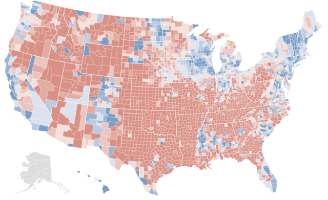
This map is not what you think it is. Take a moment to guess what it represents.
The answer below the flip.
At first glance, it looks a lot like the results of the 2008 presidential election. The northeast and midwest are all blue. Then there’s the west coast – a long line of blue counties. One could be quite easily forgiven if one took this map for a county-by-county map of the 2008 presidential election.
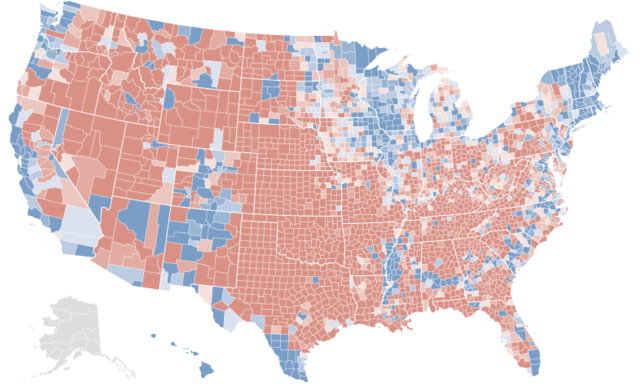
In fact, here are the real election results:
[Note: If you want to better compare the two maps, open two tabs of this (the first map) and
this (the actual results). Then switch between them.]
There is an extremely strong correlation between the two maps. Almost all the same counties are blue or red. Peering closer only cements this impression. Nevada has three blue counties – the exact three Democrats won. In Texas, only the cities and the Hispanic southwest are blue – a precise replication of the real results. One can go on and on, spotting these types of similarities.
Yet there are minor anomalies. Central Indiana and southern Florida are uniformly blue; President Barack Obama generally lost these areas. More significantly, the vast majority of Minnesota shows up red – strange, given that Democrats won the state by double-digits.
Minnesota should provide a clue of what the first map represents. Although the Democratic candidate won the state, it has been trending red for several elections. Before reading more, take a minute to refine your first guess.
.
.
.
If you haven’t figured out what the first map represents by now, here’s a bigger hint: look at Arkansas. Notice how uniformly red it appears in the first map, despite the several counties Mr. Obama won. Try to guess again – you probably can figure it out now.
.
.
.
Here’s the answer: the first map represents voting shifts between the 1992 presidential election and the 2008 presidential election.
As you have seen, there is quite a startling correlation between the two maps. Over the past four elections, the vast majority of counties President Barack Obama won have become more Democratic, while the vast majority of counties Senator John McCain won have become more Republican.
In the next post, I will attempt to analyze the meaning of this.


In Central Florida there is a big shift for Obama over Clinton, notably in Orange and Osceola counties. Both counties have booming population growth fueled by an influx of Hiapanics and highly educated whites. Orange county (Orlando) has basically gone from being a republican-leaning county to a strongly democratic county in less than two decades.
Also obvious is that the panhandle is the only region of Florida drifting the other way. That is to be expected since the region has more in common with the deep south than it does with central and south Florida.
Immigration, polarization, regional shifts. There were many more rural whites in Clinton’s ’92 coalition–especially in appalachia and the south.
Look at Metro Atlanta.
Is there any way you could make regional maps as it’s hard to see everything at this size. That and something to show population.
An interesting contrast is Eastern vs Western PA. How long until Lancaster County PA is more Democratic than Allegheny County PA?
Damn near every county is more blue than in 2004. The only real exceptions are Appalachia (especially Kentucky, Tennessee, Arkansas, and Oklahoma), Northern Florida, Southern Louisiana and Arizona. Reminds me of the 1964 Electoral College map.
Versus 2000 is even more interesting. Applachia is even more red and bigger (e.g. going further down into Alabama). Almost all of Louisiana is red.
You’d have to go all the way back to 1936 to find Orange County, California colored Democratic blue in a presidential race. And all 57 other counties were colored blue that year also.
And I love seeing all that blue in the first map, especially in California, especially-especially the dark blue in San Fran and L.A.! The red counties are all small population-wise save Fresno, Tulare, and Kern (Bakersfield). But those three even combined are still nowhere near big enough to counter the mighty blue shift in the populous coastal NorCal and SoCal counties, plus a growing Hispanic voter bloc may turn those counties blue later on; and in Fresno’s case bluer.
Later on I plan to do diaries of the population shifts in NorCal since 1900 and SoCal since 1950.
McCain carried 52 of 67 counties in the state and lose 51-48%.
Orange County was a killer. Obama carried it 59-40%.