By: Inoljt, http://thepolitikalblog.wordpr…
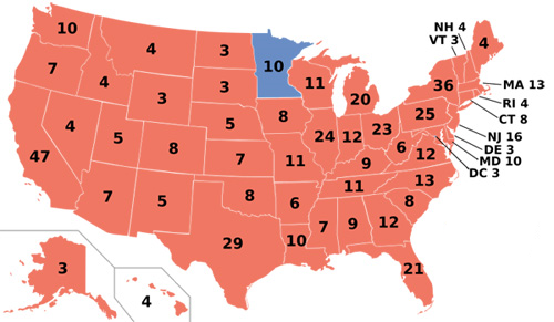
Some of you may recognize this map.

For those who don’t, this is Ronald Reagan’s landslide election over his hapless opponent Walter Mondale.
Unfortunately, for those who look for political trends, this map hides more than it reveals. For example, Reagan wins Massachusetts, but reasonable people would agree that Massachusetts is normally a Democratic state.
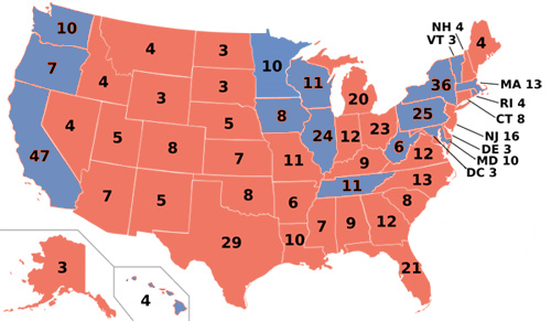
Here is a more revealing map.

You probably don’t recognize this map. There’s a good reason for that – there’s never been a presidential election with the above results.
More below the flip.
In fact, the previous electoral college is what would have happened if Walter Mondale and Ronald Reagan won an equal share of votes. The blue states are those in which Reagan won with less than 18.2%, the exact amount by which he beat Mondale.
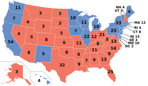
This map bears an eerie resemblance to today’s electoral maps. For example, here is the 2000 presidential election, in which Bush and Gore effectively ran to a dead heat.

There have been some changes since Reagan’s time. The Northeast has been turning blue; it is much harder today for Republicans to win a state like New Jersey or Maine. California has also been changing; Reagan would have lost it by only 2% in the hypothetical. To compensate, Appalachia has been moving the other direction; Democrats are hard-pressed to turn Tennessee and West Virginia blue nowadays. Places like Missouri and Kentucky were less than 3% redder than the nation in 1984. That was not the case last November.
By and large, however, what is striking is the degree to which the electoral maps look alike. For all the talk nowadays about blue states turning red and red states turning blue, much more has remained the same than has changed. Democrats do well in the Pacific Coast, the Midwest, and the Northeast; Republicans do well in the Mountain West, the Plains, and the South. The Democratic and Republican coalitions remain much the same as they were two decades ago.
For the biggest changes, we’re talking about comparing 1948 or 1960 with 1976 or 1988.