Polling: An introduction

A lot of people here read polls.  I’m a polling addict, myself.  

But a lot of what people think about polls is, well…. uninformed.  I’m a statistician.  

Before we jump below the fold, this is not going to be about any particular poll, or any particular race, or any particular anything.  It’s general

crossposted to docudharm and dailyKos

A poll is a type of survey, designed to estimate how people will vote.  That ‘estimate’ is key.  Even a perfect poll is not going to be exactly right.  There are two ways it can go wrong: It can be biased or it can be *inaccurate*.  Now, both of those are English words, but statisticians use them in a particular way, not exactly like ordinary usage.

Bias means that it is systematically wrong.

Inaccurate means that it is unsystematically wrong.  

Bias need not be deliberate, although it can be.  The ultimate in deliberate bias is the ‘push poll’: “Recent reports indicate that Joe Nogoodnik may have been indicted for rape in the past.  Are you  voting for Joe Nogoodnik, or his opponent, Sue Baddata?”  Somewhat more subtle (and less predictable) is the sort of question I once got asked “This is Bella Abzug for Mayor headquarters.  Are you voting for Bella Abzug, or her opponent, Ed Koch?”  That’s not a push poll, but it isn’t a very good one.

But there are much more subtle biases.  People answer differently when asked about Hillary Rodham Clinton vs. Hillary Clinton (the former is less popular, go figure).  In a fascinating result, it was found that people answer questions about racism differently if the person asking the question has a southern accent.  Could that affect results about, say Obama? Sure.

I’d bet more people say they’ll vote for Clinton if the person asking is female.

People are more likely to prefer the first candidate in a list.  Good pollsters rotate order.

Another way polls can be biased is in choosing a sample badly.  The most famous case of this is the famous Literary Digest poll that showed Alf Landon beating FDR in a landslide.  Oops.  FDR won.  Landon got only VT and ME.  The poll surveyed 10 million people, and they got 2 million replies.  What went wrong?  Bias.  The survey went to Literary Digest subscribers (most of whom were fairly wealthy), car owners (even now, not a proportional sample, and, in 1936, not remotely close), and telephone users (again, not a good sample now, and much worse in 1936).  

These days, no pollster makes quite that big an error.  But many come close.  All the internet polls are based on people who *volunteer*, one way or another, to be surveyed.  These are not a random sample.  And, while there are ways to correct for some biases (e.g. if your sample is more male than the population) there is no way to correct for this sort of thing.

Then there’s accuracy.  Polls with larger samples are more accurate.  The  Literary Digest poll was very, very accurate.  It was just accurate about the wrong thing.  As a famous statistician (George Box) once said:

An approximate answer to the right question is better than an exact answer to the wrong question


Poll results are typically reported with a margin of error.  This is widely misinterpreted.  It is an attempt to estimate how likely it is that the result shown is within a certain range.  (What a sentence!) But what we’re really interested in is something else: That is, if the true result is something, how likely are these results?  Now, let’s do some simulating.  Suppose that, the TRUTH is that 50% of everyone who will vote prefer Joe Shmo, and 50% prefer Jon Noone.

What will happen if we ask 100 people, properly chosen?  Let’s do it.  The first 10 times, I got a responses of

42, 55, 43, 53, 51, 52, 52, 56, 49

note that not one of them was right!  They were off by as much as 8 points.

Now, what if we asked 1000 people each time?

52.1, 48.1, 51.1, 49.8, 46.0, 48.4, 50.8, 53.3, 49.8, 47.5

notice that the numbers are closer to the right number.  Still, in one case we were off by 3.3 points, and in one case by 4.

That’s OK if there are two candidates, each at about 50%.  What about, say, the situation in IA on the Dem side, where it seems like we have 3 candidates (Barrack, Hillary, John) at about .33 each? (we’ll ignore the remaining candidates).  I did this 10 times with a sample of 100 each.  Proportions ranged from .24 to .41.  In other words, if there were ten polls done, each with 100 people, results might look like this


      1    2    3

1   0.34 0.33 0.33

2   0.27 0.34 0.39

3   0.35 0.30 0.35

4   0.25 0.34 0.41

5   0.36 0.32 0.32

6   0.32 0.37 0.31

7   0.31 0.28 0.41

8   0.32 0.36 0.32

9   0.36 0.35 0.29

10   0.24 0.36 0.40


where the rows are polls and the columns are candidates.

What if each had 1,000 people?


     1     2     3

1   0.307 0.319 0.374

2   0.329 0.324 0.347

3   0.327 0.321 0.352

4   0.306 0.351 0.343

5   0.317 0.354 0.329

6   0.332 0.360 0.308

7   0.314 0.336 0.350

8   0.308 0.324 0.368

9   0.343 0.312 0.345

10  0.334 0.312 0.354

much better

a typical poll has about 500 respondents, which looks like

      1     2     3

1   0.346 0.316 0.338

2   0.318 0.340 0.342

3   0.328 0.334 0.338

4   0.342 0.330 0.328

5   0.318 0.344 0.338

6   0.318 0.340 0.342

7   0.302 0.322 0.376

8   0.328 0.314 0.358

9   0.372 0.332 0.296

10  0.350 0.302 0.348

so, let’s say column 1 is Clinton, column 2 is Edwards, column 3 is Obama (alphabetical)

Is Hillary leading John by 4 and Barrack by 7? (row 9)

or

Is Barrack leading John by 5 and Hillary by 7? (row 7)

or

Is it very very close (row 3)?

Remember, we’re going to see only the rows.

One way around this is to look at sites like political arithmetik] and pollster.com that look at lots of polls and graph them.  The former site is updated less often, but offers lots of insight.

And one way to exacerbate this difficulty (without lying) is to only cite polls that favor your candidate.  Borderline lying, a candidate could sponsor five polls, and only release the one that favors him (or her) the most.  How would that affect things?

Let’s go back to the 3 candidates, with all about equal scenario.  Now, let’s say each candidate sponsors five polls, each with 500 respondents.  

So, candidate 1 gets these results

    1     2     3

1  0.310 0.326 0.364

2  0.294 0.338 0.368

3  0.370 0.308 0.322

4  0.292 0.348 0.360

5  0.322 0.312 0.366

and reports row 3.  He is leading by 5 points

candidate 2 gets these results

1   0.302 0.342 0.356

2   0.298 0.336 0.366

3   0.332 0.356 0.312

4   0.296 0.344 0.360

5   0.330 0.320 0.350

and reports row 3…. she is leading by 2 points

Candidate 3 gets

      1     2     3

1   0.322 0.332 0.346

2   0.322 0.332 0.346

3   0.368 0.322 0.310

4   0.310 0.326 0.364

5   0.374 0.286 0.340

and reports row 4, he is leading by 4

so, does that mean that polls are worthless? No.  It means they can be abused.  

Does it mean that results within the margin of error are the same? No.  Because, if the truth were that candidate 1 had 37%, candidate 2 29%, and candidate 3 had 34%, then results would look like this

     1     2     3

1   0.404 0.292 0.304

2   0.378 0.246 0.376

3   0.392 0.284 0.324

4   0.378 0.268 0.354

5   0.364 0.332 0.304

And all that is just about single polls!  If people are interested, I can do another one where I simulate trends
Vulnerable Republican representatives

(crossposted on dailyKos)

There are lots of ways of trying to figure out which congressmen are vulnerable.  Today, I’ll look at a few statistical ones, based on logistic regression.

Don’t run away, just go below the fold

Statistical background:  Regression is a set of techniques that can be used you have one dependent variable (DV) and one or more independent variables (IVs).  The DV is thought, in some way (we’ll leave that vague) to depend on the others.  If the DV is a continuous, the most popular technique is ordinary least squares regression – it’s so popular that if you just say ‘regression’ people will assume that’s what you mean.  When the DV is categorical, the OLS regression won’t work (if you want to know why, ask!).  The most common technique there is called *logistic regression*.  One of the things that any regression produces is a set of predicted values and residuals.  In logistic regression, the predicted values are probabilities, and the residuals are differences between the probability and either 1 or 0.  (Technical aside – yeah, I know there’s ordinal and multinomial, but let’s keep it simple, OK?)

Let’s put that into context.  If you want to model the probability that a district will elect a Democrat, then the predicted value is the probability of them electing a Democrat.  If they *do* elect one, then the residual is 1 – the probability.  If they elect a Republican, then the residual is the probability.  So, one way of looking at vulnerability is to see Republicans who have high residuals – that is, the district seems likely to elect a Democrat.  

For our first model, we’ll use Cook PVI as the IV.  Cook PVI is basically a measure of how the district voted in 2000 and 2004 presidential elections.

Not surprisingly, there’s a strong relationship between Cook PVI and congresperson’s party:  The mean Cook PVI in Republican represented districts was R + 9; in those represented by Democrats, it was D + 11.

There are 25 districts where the model predicts a Democrat, but there really is a Republican:

Now, let’s look at models of demographics:

If we model race (%Black, %Latino and %Other Race…. leaving out %White to avoid collinearity) we get the not surprising result that increases in any of these make the district more likely to elect a Democrat.

Based on this model, there are 70 vulnerable Republicans

TX02 AL01 AL03 AZ01 CA03 CA21 CA24 CA26 CA41 CA42 CA44 CA45 CA48 CA49 CA50

CA52 CT04 DEAL GA01 GA10 IL06 NC08 NJ07 NM01 NM02 NV03 NY13 OH01 OH12 OK05

TX03 TX07 TX10 TX26 TX31 TX32 VA01 VA05 VA10 VA11 WA08 SC04 AL02 FL21 GA07

MS03 NJ02 OK04 TX24 VA02 AKAL CA19 CA22 CA25 CA46 FL18 FL25 GA08 LA04 LA05

LA06 LA07 MS01 OK01 SC01 SC02 TX01 TX06 TX14 VA04

Next, I looked at income and urban-ness, and, again not surprisingly, districts that are higher income are more likely to be Republican, and those that are more Urban are more likely to be Democratic.  Based on this model there are 79 vulnerable Republican districts:

AZ02 AZ03 CA03 CA21 CA26 CA41 CA44 CA45 CA49 CA50 CA52 FL01 FL07 FL08

FL09 FL10 FL12 FL13 FL14 FL15 FL24 IL06 KS04 LA01 MI11 NJ03 NJ04 NM01 NM02

NV03 NY13 OH01 OH12 OH15 OK05 PA15 PA18 TX03 TX07 TX13 TX26 TX31 TX32 WA04

WI01 SC04 FL06 FL21 NE02 NJ02 OH03 TX11 TX24 UT03 VA02 AZ06 CA02 CA19 CA22

CA25 CA46 CO05 FL04 FL18 FL25 LA06 LA07 NV02 OH08 OK01 SC01 TN02 TX02 TX06 TX12 TX19 UT01 WA05

Finally, let’s put it all into one model.  This model worked somewhat better, and identified 20 hyper-vulnerable Republicans.

AL03 AZ01 CT04 DEAL FL10 KY05 MI07 NM01 NV03 NY13 NY23 PA03 PA15 WA08 NJ02

PA06 IA04 MI04 MI06 OH06

Who are the most vulnerable, according to the combined model:

Rick Renzi (AZ-01) is the most vulnerable, but really illustrates a weakness of the model: I had to lump all ‘Other races’ together. AZ-01 has the highest proportions of Native Americans of any district: 22.1%, and this is a somewhat different minority group

Michael Castle (DE-AL). Delaware gave Kerry 53% and Gore 55%.  It has a reasonably large Black population (18.9%), and a moderate median income ($47,000).  And Castle has a Kossack opponent!  Possum (Jerry Northington) is running. Read more here ] and show him some love and money at the Act Blue site

Another way to look is to look for people on all three partial models:

There are 5 on all three lists:

Heather Wilson (NM01). Ms. Wilson is going for the Senate, and will probably give up her seat (NM will be very busy!) There are a bunch of people running, and I don’t know who to support.  Read a little here

Jon Porter (NV03) won in 2006 by 4,000 votes out of 200,000 cast, despite outspending his opponent 2-1.  This year, he has at least two opponents, with others  considering running.  

Vito Fosella (NY13).  The only Republican rep in NYC (my hometown!).  It would be great to get him gone.  This district gave 55% to Bush in 2004, but 52% to Gore in 2000 (plus 3% to Nader).  Fosella has won easily, but has had only token opposition (in 2006, his opponent raised just over $100,000; Fossella raised 1.6 Million).  But that opponent (Stephen Harrison) is running again. You can see more and give more here .

Steve Chabot (OH01). Chabot won 52-48 in 2006.  This district gave Bush narrow victories in both 2000 and 2004, but it has a substantial Black population (27.4%), and quite a few people in poverty (13.9%).  His opponent this time is Steven Dreihaus

Pat Tiberi (OH12). Tiberi won fairly easily in 2006, and this district went narrowly for Bush in both 2000 and 2004.  But it also has a substantial Black population (21.7%) and is mostly urban (88.1%).

and

Frank LoBiondo (NJ02).  LoBiondo has won easily in the past, although his last two opponents raised almost no money.  This district went narrowly for Bush in 2004, but gave Gore 54% in 2000 (plus 3% to Nader).  It has a fair number of both Blacks (13.8%) and Latinos (10.3%) and is 79% urban.

More signs of Democratic gains to come

(will be posted on daily Kos on Tuesday)

A big hat tip to Benawu for gathering a lot of this info.

One truism is that you can’t win an election if you aren’t in an election.  In the upcoming congressional elections, Democrats are contesting a lot more Republican seats than vice versa.  That’s good.  But it’s only the beginning.

More below the fold

The current House has 230 Democrats and 204 Republicans (one seat is open).

Of the 204 R seats, there are confirmed challengers in 119 (58%), with 2 more Democrats expected to run, and 24 where there are rumors. Only 59 (29%) have no challengers or rumors.

Of the 230 D seats, on the other hand, there are confirmed challengers in only 72 (31%) and there are 134 with no challengers or rumors.

Let’s make a little table (sorry for the formatting, HTML tables are rough, and then dailyKos seems to add its own stuff)


Current party     Confirmed    Expected   Rumored   None   Total

Democratic            72          4         20       134    230

Republican           119          2         24        59    203

But that’s just the beginning!

Where are the ‘unchallenged’ seats?

I’m all for the 50 state, 435 district strategy, but there are seats that are more or less likely to switch.  So…

Of the 59 Republican seats with no challengers or rumors, not one has a Cook PVI favoring Democrats.  14 of the 59 have Cook PVI of R + 15 or more.  These are districts where we are unlikely to win.

But of the 134 Democratic seats with no challengers or rumors, 19 have Cook PVI favoring Republicans.

Not only are they running in fewer places, they’re choosing those places badly!

Let’s redo the above table, counting only ‘competitive’ districts, which I arbitrarily say are those with Cook of less than 15, one way or the other.

In competitve districts:


Current party     Confirmed    Expected   Rumored   None   Total

Democratic            57          3         13        80    143

Republican           102          1         14        45    162  

Not only are more Republican districts competitive (despite the fact that there are fewer overall) but there are a lot more challengers.

What about a tighter definition?  Let’s re-do it for those with Cook PVI under 5


Current party     Confirmed    Expected   Rumored   None   Total

Democratic            23          2          6        22     53

Republican            40          0          8         4     52

That is, in almost 80% of the the Republican held hyper-competitive districts, there is a confirmed Democratic challenger, but this is so in only about 43% of Democratic districts.

And I haven’t yet looked at retirements!  Take a look at DCpolitical report.  Although there are 33 possible open Democratic seats, and only 32 possible open Republican seats, that’s misleading.  Of the 33 Democrats listed, only 7 are definitely retiring.  16 Republicans are listed that way.  Where are they?

Definite Democratic retirements:  CO-02 (D +8)    

                                 IN-07 (D +9)     confirmed challenger

                                 LA-02 (D +28),

                                 ME-01 (D +6)     confirmed challenger

                                 NM-03 (D +6)

                                 NY-21 (D + 9)

                                 OH-10 (D + 8)    confirmed challenger  

Definite Republican retirements:  AL-02 (R + 13)

                                 AZ-01 (R + 2)    confirmed challenger

                                 CO-06 (R + 10)   confirmed challenger

                                 IL-14 (R + 5)    confirmed challenger

                                 IL-18 (R + 5)    confirmed challenger

                                 MN-03 (R + 1)    confirmed challenger

                                 MS-03 (R + 14)

                                 NJ-03 (D + 3)    confirmed challenger

                                 NJ-07 (R + 1)    confirmed challenger

                                 NM-01 (D + 2)    confirmed challenger  

                                 NM-02 (R + 6)    confirmed challenger  

                                 OH-07 (R + 6)    confirmed challenger

                                 OH-15 (R + 1)    confirmed challenger

                                 OH-16 (R + 4)    confirmed challenger

                                 TX-14 (R + 14)

                                 WY-AL (R + 19)   confirmed challenger  

Notice that no* Democrat is retiring in a district that has less than D + 6; but *nine Republicans are.  

So, where does that leave the big picture?

I’ll guess we win 5 districts where a Repub is retiring, and they win none where a D is.  That’s +5.  Of the 23 highly competitive, Democratic-held districts with a confirmed  challenger…. let’s say the Repubs take a quarter, rounding up to 6.  That’s -1.  Of the 34 highly competitive, Republican-held districts with a confirmed  challenger……well, let’s give the Democrats a quarter, rounding up, or 9.  That’s +8.  Of the somewhat competitive districts with a confirmed challenger let’s say 10% switch each way, so the Republicans gain 3 and the Democrats 6.  So the net is +11.

But that’s without counting the Democrats’ fundraising edge, or the coattails of the president….  

Congressional District Analysis: Median Income, Rural vs. Urban, and Democratic vs. Republican

This is the second in a series of analysis of congressional districts.

Note that one should not use these analyses to make statements about individuals. That’s called the ecological fallacy, and it can lead you very far astray, very quickly.

Also, please ask questions.  Don’t look at the graphs and equations and run away…..ask.  There are no dumb questions*.  I will *not tell you you are stupid for asking.  Statistics is confusing to lots of people, not just you!  So ASK!

Today, I started off by looking at median income and Cook PVI.  That led to other things.  More below the fold

(cross posted from DailyKos)

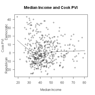
My suspicion, before looking at the relationship between median income and Cook PVI was that higher median income districts would be more Republican.  I did know that some high income districts were quite Democratic, but I thought these were exceptions.  Well, one reason to explore the data is to see whether your suspicions are correct.   Here’s a graph of median income and Cook PVI across 435 districts:

My favorite professor in grad school used to say “If you’re not surprised, you haven’t learned anything”.  I’m surprised, but what can we learn?

The very poorest districts are, indeed, very Democratic. At the extreme, the poorest district (NY16) is also the most Democratic (Cook PVI is D + 43).  But above a median income of about 30,000, there is only a modest relationship, and, what there is points to wealthier districts being more Democratic….. hmmm.

When results surprise you in this way, one thing that may be going on is that there is some third variable that is affecting the relationship.  I know that people in rural areas have different views than those in urban areas….

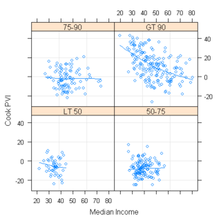
The language I used to draw these plots R offers a tool called conditioning plots, that lets you look at three variables in an interesting way.  You divide the third variable into groups, and then plot the first two in each group.   Easier to show than tell:

Each panel of the graph is congressional districts of a certain level of urban-ness.  The lower left is less than 50% urban, lower right is 50-75%, upper left is 75-90% and upper right is over 90% urban.  (Note, it is probably better to think of ‘urban’ as ‘urban or suburban’ or, perhaps ‘rural’).  This is interesting!  

First thing that strikes me is that there is almost no relationship between median income and Cook PVI except in the highly urban districts, where it is strong and in the expected direction: Higher median income = more Republican.  

Next, we can see that more urban districts are, generally, more Democratic: All but one of the districts with Cook PVI over D+20 are over 90% urban.  

Third, all the high income districts are mostly urban.  Of districts with median income above $60,000 or so, none were mostly rural, and most were 90%+ Urban.

Graphs are good for exploration, now let’s look at a model.  In specific, let’s look at several regression models, with the dependent variable being Cook PVI and the IVs being different combinations of urban and median income.

First, Cook PVI as a function of median income (I measured median income in thousands of dollars):

The resulting equation is:

CookPVI = 3.69 – .051*MedInc.

What this means is that the predicted PVI for a district with a median income of 0 is D+4, and that it declines by .05 for each thousand dollar increase in median income.  This difference wasn’t significant, and the R^2 for this model was only 0.0001, meaning that almost none of the variation in CookPVI is accounted for by median income.

Second, Cook PVI as a function of %Urban

This gives:

CookPVI = -29.45 + 0.39*Urban

that is, when urban = 0, the predicted CookPVI is R + 29, and it gets more Democratic by 0.39 points for each percent increase in Urban.  So, for a 50% urban district the predicted Cook value would be -29 + 50*.39 = R+9, and for a district that’s 100% urban, it would be D + 10.

R^2 here was 0.29 indicating that urban-ness accounted for 29% of the variation in Cook PVI

Finally, a model with both urban and median income:

Cook PVI = – 18.8 – 0.41*Median Income + 0.48*Urban

that is, for a district with median income = 0 and urban = 0, the predicted Cook PVI was R + 19, and this got more Republican by 0.41 units for each thousand dollar increase in median income, but got more Democratic by .48 units for each unit increase in Urban.

Both urban and median income were very significant, and this model had R^2 of 0.38.

Israel Salanter, Sam Bennett, and the essence of progressivism

(cross posted from daily Kos)

What do a 19th century rabbi and a 21st century congressional candidate have in common?  They both exemplify the true meaning of progressivism.

Israel Salanter was a 19th century rabbi

Sam Bennett is a woman running for Congress

more below the fold

The other night (at daily Kos), I wrote a diary on Republican representatives in Democratic districts and, while researching it, ran across Sam Bennett who is running for congress in PA-15.  She says, on her site


The Bush Administration seems to have things exactly backwards. Where government should be robust – protecting and caring for its citizens – they have made it weak. Where government should tread lightly, they have made it overbearing.

A long time ago, I wrote a diary  called The 25 best things ever said by anyoneMy number 1 was from [Rabbi Israel Salanter:


Most men worry about their own bellies, and other people’s souls, when we all ought to be worried about our own souls, and other people’s bellies

Aren’t those two quotes perfect?

Sam Bennett’s quote is 35 words.  Do they not sum up what is wrong?

Salanter’s quote is 26 words.  Do they not generalize that concern for the ages?

Are we progressives?

My soul is my business, thank you, and I would like the government not to tell me how to live my life – whom to worship (or how, or when, or if), or whom to love (male or female).  But everyone’s belly is everyone’s business, and, in this 21st century world, the government must help.  We no longer live, most of us, in small villages where everyone knows everyone.  We live in anonymous megalopolises.  

Predicting the Senate

Now that I’ve found this site, I have a place for my geeky weirdness statistical political self!

I am modeling, below, potential gains in the Senate.  What I do is assign each race a probability of switching.  Then I simulate the probabilities using R, and run  it 1000 times.  

Quick results:

Most likely result: Gain of 5 or 6 seats (23.9% chance of each).  

Chance of gaining at least 1 seat: 99.8%

                 at least 2       99.4

                 at least 3       96.4

                 at least 4       87.9

                 at least 5       70.6

                 at least 6       46.7

                 at least 7       22.8

                 at least 8       10.0

                 at least 9        3.4

                 at least 10        .7          

How I got these (feel free to correct me… these are guesses based on all sorts of things).  I also need to add in for the new MS race:

1% chance of switching:

AL, DE, IL, MA, MI, MS, RI, WV, WY1, WY2

2% chance of switching:

AR, KS, SC

5% chance:

GA, IA, MT, NJ, OK, TN,

10% chance:

ID, NE, SD

15% chance:

NC, TX

30% chance:

AK, LA, ME

40% chance

KY

50% chance

MN, OR

80% chance:

NH, CO

90% chance:

NM, VA

Congressional district analysis: Race and presidential vote

cross posted from daily Kos…

my first diary here

This is part of a series based on analysis of data based on Congressional Districts.  This one is the first that is really analytical.  

A word of warning: Do not infer anything about individuals from any analysis at the district level.  That would be the ecological fallacy.

Today, I look at the relationship between the racial/ethnic makeup of districts, and whom the district supports in presidential elections.

More below the fold  

The Almanac of American Politics, where I got the data used below, classifies race/ethnicity into a large number of categories.  I combined some of these into “other” and have the following: non-Hispanic White, non-Hispanic Black, Hispanic, and other.

For each congressional district, I recorded the percent of the population in each category, and the Cook PVI number, which is, essentially, an indication of how much more Democratic or Republican the district was than the nation in the last two presidential elections.  E.g., a rating of R + 9 would indicate that the district gave Bush an average 9% more than the nation in 2000 and 2004 (it’s a little more complex, because they adjust for third party vote, but that’s the general idea).

Then, I graphed Cook PVI and each of the four racial/ethnic groups, and added a loess line (loess is a nonparametric curve fitting mechanism….you can think of it as a more sophisticated moving average).

So, first %Black and Cook PVI

As we might expect, districts with a lot of Black tend to be very Democratic.  But I didn’t suspect the nonlinearity of this relationship.  That is, there isn’t much difference between districts with almost no Blacks (mostly the rural north) and districts with 15% Blacks: they all have average Cook PVI about 0 (that is, close to the national average).  Districts with a great many Blacks (mostly gerrymandered districts in the South and in central cities) are very Democratic.  Among the 33 districts with more than 35% Blacks, none favored Republicans

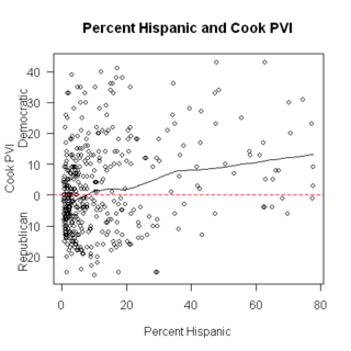
Next, %Hispanic and Cook PVI

A couple things to note: First, although (as with the graph above) the relationship is positive (i.e. districts with more Latinos tend to vote more Democratic) the slope of the line isn’t as steep, and it is less nonlinear.  I will get into reasons for this in a diary on interactions, but the basic reason is that Hispanic districts in different parts of the country varied a lot.  A lot of the highly Latino districts were in Texas, which is, of course, Bush-country.  The highest concentration of Latinos in any districts are in TX15 and TX28 (each has just over 3/4 Latino) and these districts had Cook PVI of R+1 and D+3, respectively.

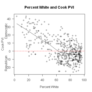
Next, % White and Cook PVI

As we might expect, the direction of the slope is the opposite of both of the above.  But, even among districts with nearly all White populations, the Cook PVI varied.  By the way, the district with the lowest percent White is NY-16, which is the South Bronx.  It’s tied for most Democratic district in the country (D + 43), has the lowest median income ($19,300), has the highest percent in poverty (42.2%), and has the second lowest percentage of veteran (3.9%).

Finally, other race/ethnicity.  Here, I’ve deleted the two Hawaiian districts from the graph, because they are outliers – by far the highest percentage nonWhite is in these districts.

Again, as % ‘other race/ethnicity’ increases, so does Democratic vote.  By the way, and not surprisingly, the four districts (other than HI) with the highest percent ‘other race’ were all in coastal CA.

What to make of all this?

I’m not sure.  But I find it interesting