Regional Differences in the United Kingdom’s 2010 General Election

By: Inoljt, http://mypolitikal.com/

On May 7th of 2010, the United Kingdom held a general election to determine its new prime minister. While the Conservative Party gained a number of seats, this was not enough to ensure a majority. Fears of a hung Parliament subsided, however, when the Conservatives joined with the Liberal Democrats to form a governing coalition.

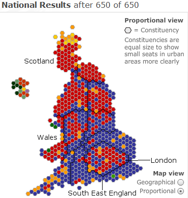
Here is a map of the general election:

Photobucket

This map indicates the number of seats won by each party in the general election. Red – the traditional color for socialism – is the color of the leftist Labour Party; blue the color of the conservative Tories; yellow the color of the Liberal Democrats.

More below.

Like other countries, the United Kingdom does not vote homogeneously. Certain regions are more loyal to one party; other regions to another.

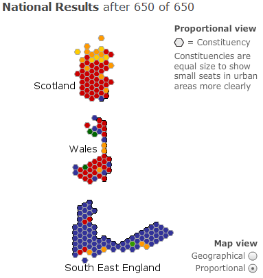
Take, for instance, three distinct parts of Great Britain: Scotland, Wales, and Southeast England. The voting patterns of all three reveal some fascinating things about the country:

Photobucket

As the map above indicates, Labour dominated Scotland, winning a total of 41 seats to the Conservative Party’s paltry single seat.

Several factors lie behind Scotland’s strong pro-Labour vote. There used to be a time when the Tories could rely upon a substantial bloc of Scottish voters, mostly in the rural North. Under Prime Minister Margaret Thatcher’s term, however, pro-market reforms led to the disintegration of Scottish industry – and to this day Scotland remains hostile to the Conservative Party.

Former Prime Minister Gordon Brown’s Scottish heritage also helped him in the region. Indeed, in Scotland Labour did even better than the previous general election, winning 2.5% more of the vote.

A comparison of Labour’s performance in Wales provides evidence of this. Like Scotland, Wales constitutes a Labour stronghold; in 2005 Prime Minister Tony Blair led his party to win 30 seats out of 40 total (the Tories won 3). In 2010, however, the Conservative Party gained five seats in this Labour base. In Scotland support for favorite son Mr. Brown may have boosted Labour fortunes; this was not the case in Wales.

Mr. Brown’s Scottish heritage did not help him everywhere. In the South East England region the Labour Party received a pummeling from the Tories; they lost 13 seats, leaving Labour with a grand total of 4 seats. The Conservatives took 75 seats. Clearly, Mr. Brown’s appeal was limited here; it is possible that his being Scottish had something to do with this.

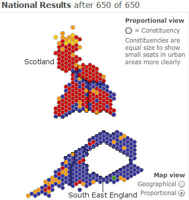
An examination of Southern England reveals yet more regional differences:

Photobucket

This map illustrates the division between Southern and Northern Great Britain. Southern England has always constituted the Tory base; Northern England the Labour stronghold.

A number of fascinating socioeconomic reasons lie behind this. Historically, Southern England was – and still is – the richest, most “snobbish” part of the United Kingdom. Indeed, the South East region constitutes the richest part of the country, apart from London. It is from this region that the Conservative Party draws its main strength.

Northern England, Scotland, and Wales are different. The forces of the Industrial Revolution have influenced their history quite profoundly; for decades their economies relied – too much, in hindsight – upon the factories, steel mills, and coal mines unleashed by industrialization. The death of Anglo-Saxon manufacturing, however, hit this region hard and left it poorer than the South.

The Industrial Revolution also catalyzed conditions ripe for socialism and left-wing politics. It created an urban proletariat – and, indeed, the Labour Party was formed to represent this class. Today these places still vote heavily for the Labour Party.

Indeed, to this day Labour constitutes the party for the working class – despite Mr. Blair’s rebranding of New Labour. This is a role the Democratic Party no longer truly holds, its grasp of the white working class torn apart by racial politics. Great Britain is still homogeneous enough to avoid this. Class still matters in the United Kingdom, far more than it does in the United States.

(Note: All images derived from BBC News.)
Maps of Colorado Elections

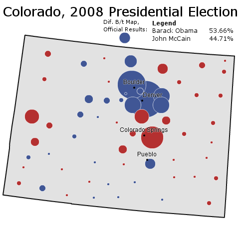
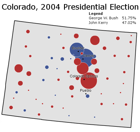
To follow up the series of posts on Colorado, I’ve posted a few recent presidential elections in the state (courtesy of the New York Times). Each map comes with some brief analysis.

Photobucket

Boosted by a Democratic National Convention held in Denver, Senator Barack Obama wins a thorough victory in the ultimate swing state of 2008. The Democratic candidate does especially well in the Republican-leaning suburbs of Denver – winning several outright and dampening margins in Douglas County and Colorado Springs.

More below.

Photobucket

Written off early as a sure Republican victory, Colorado surprises pundits in 2004 with a surprisingly strong Democratic performance. It is one of the few states where Democrats do better than in 2000 as they pick up the 2000 Ralph Nader vote.

______________________________________________________

Photobucket

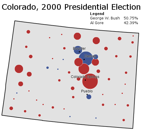
Governor George W. Bush performs well throughout the Rocky Mountains in 2000, and Colorado is no exception. With Green Party candidate Ralph Nader pulling off a substantial bloc of liberal voters, Mr. Bush even cracks the Democratic “C” that composes the Democratic base of Colorado.

______________________________________________________

Photobucket

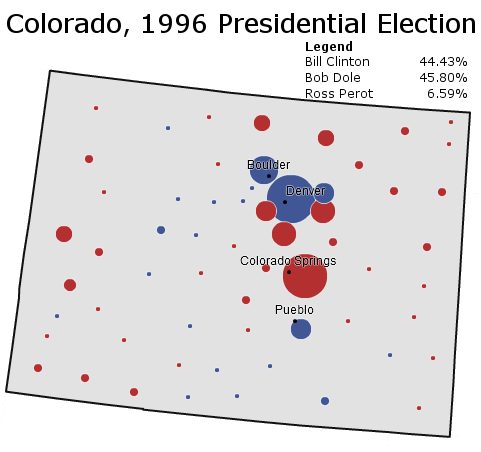
Conservative Colorado returns to form in 1996; President Bill Clinton loses the state by the barest of margins as conservative Ross Perot voters go Republican. Republican Bob Dole wins based off Republican strength in Colorado Springs and rural Colorado.

______________________________________________________

Photobucket

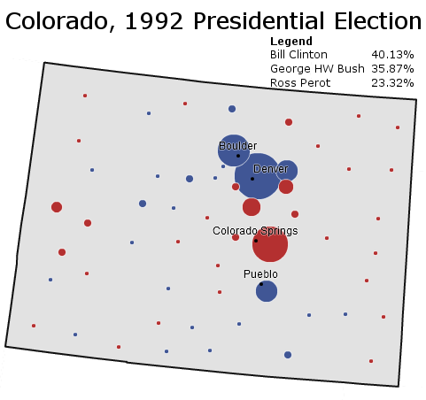
Surprise! – reliably Republican Colorado votes Democratic for the first time in a generation, and for the first time in a competitive race since the days of Harry Truman. To be fair, this map somewhat overstates Democratic strength: Republican margins are dampened by Ross Perot’s strength amongst conservatives.

–Inoljt, http://mypolitikal.com/  

Race and Modern-Day Political Advertising

By: Inoljt, http://mypolitikal.com/

In the world of campaign commercials, race seems to be invoked in an increasingly and worryingly explicit way.

Let’s take a look at some old commercials and compare them to contemporary ones.

Here, for instance, is the famous “Willie Horton” commercial, which doomed Governor Mike Dukakis’s campaign for president:

More below.

This commercial is often the first thing people think about when talking about “racist” political ads. The story goes that the “death penalty” constituted a code word for race-baiting, and that the use of Willie Horton – a black man – was intended to arouse racial fears of black violence.

Let’s compare this old ad with a more modern one.

Here is a 2010 ad on undocumented immigrants:

This ad was shown by Republican Senator David Vitter in his 2010 re-election campaign. Mr. Vitter won an easy re-election, campaigning in a conservative state (Louisiana) in a conservative year.

With Mr. Bush’s ad, one has to look pretty hard to see the supposed racism. Only two pictures of a black man are used, and each image is fairly race-neutral by itself.

Mr. Vitter’s ad, on the other hand, is much more explicit. The ad shows endless hordes of brown people breaking through fences, while an announcer spits out “illegals” like a curse word. It’s pretty clear that all the “illegals” are Latino, and that all the victims are white.

On the score of which ad is more racist, Mr. Vitter’s ad – the more modern one – wins hands down.

This is true for other ads as well. Here is an ad on welfare by President Richard Nixon:

Mr. Nixon was accused of running an undercover “racist” campaign, using code words like “welfare” and “law-and-order” to appeal to racial resentments.

Yet out of all four ads, this one is probably the least racist by far. One has to really stretch to “find” racism in this ad (e.g. the construction worker is in the inner-city, which is full of minorities, and so the ad could theoretically be pointing out that inner-city minorities will benefit from welfare).

Now compare this to another contemporary ad:

This ad was run by Democratic Senator Blanche Lincoln against her primary opponent, Lieutenant Governor Bill Halter. Ms. Lincoln went on to barely win the primary, only to lose by a landslide in the general election.

Once again, the more modern ad is much more obvious than Mr. Nixon’s ad in the use of race. Indian foreigners speaking accented English thank Mr. Halter for outsourcing jobs, while “Indian” music plays and stereotypic images of India play in the background.

The political equivalent in 1972 would have been to show black people in the ghetto thanking Democrats for welfare in “ghetto” English.

In 1972 politicians did not dare do this. Yet in 2010 they are more than willing to show Indians and Latinos in quite racist ads.

All in all, Americans – or, more accurately, humans in general – like to think that things are always getting better. Technology is always improving, people are always living longer, and freedom and democracy are always on the rise.

This applies with race relations as well. The dominant narrative is that America’s treatment of its minorities is in a continuous progression upwards, from the low beginnings of slavery to the first black president and onwards. America’s minorities have never been treated as well as they are now, in this view.

Everything that is said above is mostly true – indeed the world is healthier, freer, and more technologically advanced than ever before. And America’s minorities do have more opportunities than ever before.

Nevertheless, in at least one aspect of race relations, America portrays minorities worse than it did two generations ago.

Examining Turn-Out by Race in California

California constitutes one of the most diverse states in the United States. Here is how the Census estimates its population composition:

California’s   Ethnic Composition
Asian 12.7%
Black 6.6%
Hispanic 37.0%
Mixed 2.6%
Native   American 1.2%
Pacific   Islander 0.4%
White 41.7%

(Note that the numbers do not add up to 100, due to the way the Census tracks ethnicity.)

The people who actually vote in California, however, do not reflect this composition.

More below.

California’s electorate in the 2008 presidential election is quite different from its actual ethnic composition:

2008   Electorate: Exit Polls
Asian 6%
Black 10%
Hispanic 18%
Other 3%
White 63%

These numbers were taken from exit polls – and one should be warned that exit polls are very, very inaccurate. The numbers above should not be taken for the truth, but rather as a rough approximation of it.

Nevertheless, one can take something out of the exit polls: blacks and whites punched far above their demographic weight, while Asians and Hispanics punched far below theirs. This pattern isn’t so much a racial one as much as an immigrant versus non-immigrant one.

Since blacks and whites are mainly non-immigrant communities, they vote more often than immigrant communities. Blacks and whites thus are overrepresented in the electorate. There was little racial divide between black and white turn-out, which is quite remarkable, given the lower socioeconomic status of blacks. All in all the percentage of California’s 2008 electorate was about 50% more black and white than California’s overall population.

Hispanics are the ones hurt most by this. The difference between the Hispanic portion of the electorate and the Hispanic portion of the overall population is quite striking: the electorate is just half as Hispanic as the population. Most of this is attributable to the legal status of many Hispanic immigrants, the relative youth of the Hispanic population, the lower socioeconomic status of Hispanics, and the immigrant-heavy nature Hispanic community (this is different from the first factor in that immigrants are inherently less likely to vote even if they are citizens).

It is not Hispanics, however, who are least likely to vote: it is Asians. There are several similarities and differences between the two groups. Unlike Hispanics, the Asian population is not skewed downwards, and Asians generally have a high socioeconomic status. On the other hand, Asians are much more of an immigrant community than Hispanics: a remarkable four out of five adult Asians in California constituted immigrants, according to a 2002 study. Only 59% of adult Asians were citizens (who can vote), according to the study.

The low voting rates of Hispanics and Asians naturally reduce their political power. Hispanics, at around one-fifth of the California electorate, are influential – but imagine how much more influential the Hispanic vote would be if they voted their numbers. As for Asians, their low turn-out makes their community almost a non-factor in California politics.

This will probably change, of course. A century ago one could have written the exact same words about another immigrant-heavy group that did not vote: Irish-Americans.

–Inoljt, http://mypolitikal.com/

The Keys to President Barack Obama’s Re-election Chances

By: Inoljt, http://mypolitikal.com/

The recent mid-terms were, by all accounts, very bad for Democrats. They lost 63 seats in the House of Representatives and 6 seats in the Senate. In many ways things were worse than in 1994, when Republicans won landslide victory.

There is another analogy to 1994, however, which will probably make Democrats happier. President Bill Clinton, after devastating mid-term losses, went on to win a comfortable re-election campaign. Can Mr. Obama do the same?

The book “The Keys to the White House,” by Professor Allan J. Lichtman provides a fascinating answer. Mr. Lichtman argues that the results of a presidential election can be predicted months or years beforehand by a series of thirteen “keys.” According to this theory, if the incumbent party or current president captures a certain number of “keys”, it will win the election. Otherwise it will lose.

More below.

This can readily be applied to the 2012 presidential election. Here are Mr. Lichtman’s exact words:

The Keys to the White House are stated as conditions that favor reelection of the incumbent party. When five or fewer statements are false, the incumbent party wins. When six or more are false, the incumbent party loses.

Key 1: Incumbent-party mandate – After the midterms the incumbent party holds more seats in the U.S. House of Representatives than it did after the previous midterm elections.

Key 2: Nomination-contest – There is no serious contest for the incumbent-party nomination.

Key 3: Incumbency – The incumbent-party candidate is the sitting president.

Key 4: Third party – There is no significant third-party or independent campaign.

Key 5:  Short-term economy – The economy is not in recession during the election campaign

Key 6: Long-term economy – Real annual per-capita economic growth during the term equals or exceeds mean growth during the previous two terms.

Key 7: Policy change – The incumbent administration effects major changes in national policy.

Key 8: Social unrest – There is no sustained social unrest during the term.

Key 9: Scandal – The incumbent administration is untainted by major scandal.

Key 10: Foreign or military failure – The incumbent administration suffers no major failure in foreign or military affairs.

Key 11: Foreign or military success – The incumbent administration achieves a major success in foreign or military affairs.

Key 12: Incumbent charisma – The incumbent-party candidate is charismatic or a national hero.

Key 13: Challenger charisma – The challenging-party candidate is not charismatic or a national hero.

A year before the 2008 presidential election, Mr. Lichtman used these keys to confidently predict that Democrats would win the coming election. Seven of the keys – the incumbent-party mandate, the nomination contest, incumbency, policy change, foreign/military failure, foreign/military success, and incumbent charisma – were going against the Republican Party at that point. As the election went on, three other keys turned against them: short-term economy, long-term economy, and challenger charisma. The Republican Party thus went into the 2008 presidential election with ten of the thirteen keys turned against them. In this context, it is not surprising that Senator John McCain lost.

Let’s take a look at how the keys are stacking up in 2012:

Key 1: Incumbent-party mandate – After the midterms the incumbent party holds more seats in the U.S.  House of Representatives than it did after the previous midterm  elections.

Democrats would have had to lose twenty-three or less seats for this statement to be true. That definitely did not happen. This statement is FALSE.

___________________

Key 2: Nomination-contest – There is no serious contest for the incumbent-party nomination.

Nobody has the stature to contest Mr. Obama in the Democratic primary, even with recent liberal unrest over his tax cut deal. This statement is TRUE.

___________________

Key 3: Incumbency – The incumbent-party candidate is the sitting president.

The Democratic candidate is indeed the sitting president. This statement is TRUE.

___________________

Key 4: Third party – There is no significant third-party or independent campaign.

Ralph Nadar and 2000 effectively killed-off third-party candidacies for a generation. At the moment, 2012 isn’t looking any different. This statement is TRUE.

___________________

Key 5:  Short-term economy – The economy is not in recession during the election campaign.

This is a tough one – the economy probably won’t be in recession in 2012, but it certainly could feel like a recession. Given that so much of Democratic troubles stem from the short-term economy, for the moment this statement will be FALSE.

___________________

Key 6: Long-term economy – Real annual per-capita economic growth during the term equals or exceeds mean growth during the previous two terms.

This particular statistic is also tough to find, but we can certainly infer some things from just looking at real GDP. According to my calculations, Mr. Bush averaged 2.0% real GDP growth (the relevant websites are here and here). That’s pretty low, but real GDP growth was – 2.6% in 2009 because of the recession. The first quarter of 2010 was 3.7%. The second quarter was 1.6%. The third is estimated to be 1.5%. So real GDP growth under Mr. Obama has been something like an average – 0.5%. Over the eight quarters left until November 2012, real GDP would have to grow by something like an average 4.2% for Democrats to win this key. That’s just within the conceivable bounds of possibility, although it’s quite unlikely. This statement is UNKNOWN – LEANING FALSE.

___________________

Key 7: Policy change – The incumbent administration effects major changes in national policy.

Health care definitely was a major change in national policy. This statement is TRUE.

___________________

Key 8: Social unrest – There is no sustained social unrest during the term.

Tea Party shenanigans don’t count as “sustained social unrest.” This statement is TRUE.

___________________

Key 9: Scandal – The incumbent administration is untainted by major scandal.

The Obama administration has not yet had a major scandal. This statement is TRUE.

___________________

Key 10: Foreign or military failure – The incumbent administration suffers no major failure in foreign or military affairs.

Likewise, Mr. Obama hasn’t suffered a major failure overseas yet. (Although Afghanistan is not looking too good these days.) This statement is TRUE.

___________________

Key 11: Foreign or military success – The incumbent administration achieves a major success in foreign or military affairs.

But neither has Mr. Obama achieved a major success overseas. This statement is FALSE.

___________________

Key 12: Incumbent charisma – The incumbent-party candidate is charismatic or a national hero.

Mr. Obama certainly fits the definition of “charisma” to the word. This statement is TRUE.

___________________

Key 13: Challenger charisma – The challenging-party candidate is not charismatic or a national hero.

Although this could change, the current crop of Republican candidates doesn’t look very charismatic. This statement is TRUE.

___________________

All in all, the Democrats end up holding nine keys out of thirteen (they need seven to win). Four statements are false or unknown; nine are true. Under Mr. Lichtman’s system, then, Mr. Obama looks set to win re-election in 2012.

Of course things might change and get worse for Democrats. The Republicans might nominate somebody like Senator Scott Brown, who is readily equipped with charisma – winning the “challenger charisma” key. Afghanistan might turn into Mr. Obama’s military failure, making him lose that key. The Obama administration might become engulfed in scandal and lose another key.

On the other hand, things might also get better. The economy might be growing steadily come 2012, for instance winning Democrats that key. Mr. Obama might miraculously create peace between Israel and Palestine, winning another key.

But whatever changes happen, Mr. Lichtman’s system gives Democrats surprisingly bright prospects in the 2012 presidential election. Democrats are quite gloomy nowadays, but come November 2012 their spirits may be a bit brighter.

Solving a Mystery in Philadelphia Voting Patterns

A long time ago, I posted a series of posts analyzing the swing state Pennsylvania. One section of this series focused specifically on the city of Philadelphia. This section analyzed Philadelphia’s vote by precinct results and mapped out the results of several previous elections.

Of particular interest was the difference between the results of the 2008 presidential election and the 2008 Democratic primary, which illustrated a political divide not seen in presidential elections: between Democratic-leaning white Catholics in the northeast and Democratic-voting blacks in the west.

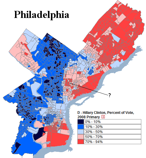
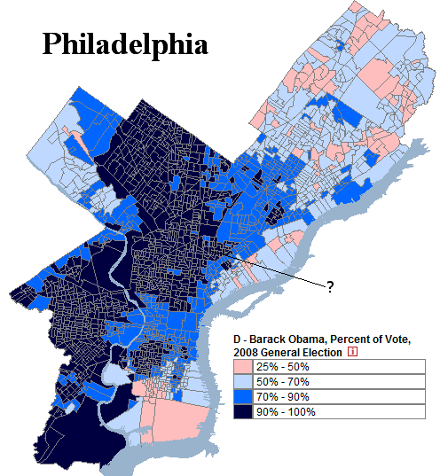
Here is Philadelphia in the 2008 Democratic primary. Take a note at the region the question mark points to, which this post will discuss:

Photobucket

More below.

(Note: Both images are taken from a website which maps historical Philadelphia election results.)

Here is Philadelphia in the 2008 presidential election:

Photobucket

Most of the different voting patterns between these two elections is fairly easy to explain: blacks in west Philadelphia voted for  Barack Obama both times, while white Catholics in the northeast voted strongly for Hillary Clinton in the primary and then lukewarmly Barack Obama in the general election. There is generally a scaling relationship between the two groups: as an area gets more white and less black, its support for Mr. Obama decreases in both elections.

There was, however, a group of precincts in Philadelphia which did not follow this model. These precincts are marked by the question mark in both maps. This group behaved quite strangely. It gave incredibly strong support to Ms. Clinton in the primary and then even stronger support to Mr. Obama in the general election. In the map of the 2008 primary, a number of these precincts cast more than 70% of their ballot to Ms. Clinton. All of them then vote more than 90% Democratic in the general election.

This behavior was quite puzzling, and something that the model did not explain. Initially this author hypothesized that these voters were white liberals in gentrifying areas of Philadelphia and then eventually forgot about the mystery.

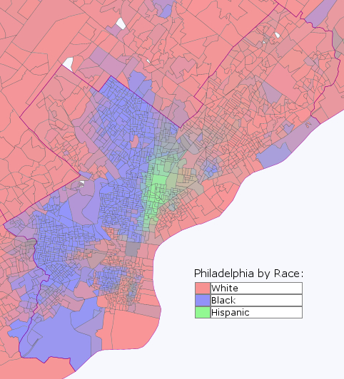
The answer, as it turns out, was not white liberals. Here it is:

Photobucket

The mysterious precincts were Hispanic!

The above image was created using Daves Redistricting Application. Due to the tremendous efforts of David  Bradlee, one can map the ethnic composition of every state in incredibly detail.

This provides some interesting insight into the behavior of Hispanics in inner-cities. If what holds for Philadelphia also holds for other cities (which is not a 100% certainty), inner-city Hispanics strongly supported both Hillary Clinton and then Barack Obama.

It is an insight provided by Daves Application which can be extended to many other areas and groups.

–Inoljt

Don’t Overestimate Rahm Emanuel

By: Inoljt, http://mypolitikal.com/

In little more than a year several months, the great city of Chicago will select its next mayor. Following the retirement of Mayor Richard Daley, the field is wide open.

Enter Rahm Emanuel. A powerful Democrat and President Barack Obama’s former chief-of-staff, Mr. Emanuel currently looks like the front-runner for the office. With many strong candidates declining to run and his potential opposition divided, things look good for Mr. Emanuel.

And yet one shouldn’t overestimate Mr. Emanuel’s chances as media-anointed front-runner. Mr. Emanuel has a number of hidden weaknesses that may combine to badly damage his campaign.

More below.

A strong attack, for instance, could be levied against Mr. Emanuel as a Washington insider who doesn’t care for the little man. This attack is all the more damaging because its first portion is completely true: it is hard to find a politician more immersed in Washington than Mr. Emanuel.

There are other variations on this theme. There is the geography version: Mr. Emanuel is a carpet-bagger who hasn’t lived in Chicago and doesn’t care about it. There is the populist version: the Washington elite may have already declared Mr. Emanuel the winner, but Chicago doesn’t have to listen to what the elite say. There is the class version: Mr. Emanuel is one of the rich elite who don’t understand the concerns of the working-class. There is the race version: Mr. Emanuel is one of the white elite who don’t understand the concerns of Chicago’s minorities.

None of this possibilities has yet been tried out, or turned into a coherent critique of Mr. Emanuel. It is too early in the game for that. But already there are signs that Mr. Emanuel has limited appeal amongst Chicago’s poor and its minorities (who compose a majority of the city’s population).

Mr. Emanuel does have a lot of things going for him, more than for any other single candidate. He has the support of most of Chicago’s machine, the business community, the politically influential North Side, and probably President Barack Obama (although most pundits probably overrate the importance of an Obama endorsement). Other candidates would probably love to be in his position.

On the other hand, Harold Washington had all this interests aligned against him when he campaigned for mayor. Yet Mr. Washington – the first and to date only black mayor of Chicago – still won consecutive elections on the back of minority support.

Chicago has a run-off system, in which if nobody gets more than 50% of the vote, then the first two winners go on to a second-round.  Most experts expect Mr. Emanuel to get in the somewhere in the 40s, if not an outright majority of the vote.

But it’s also quite conceivable that Mr. Emanuel polls in the low 30s come election day, if he fails to attract the working-class and minority votes that he needs to win in a place like Chicago.

The Great Realignment: The 1928 Presidential Election, Part 2

This is the second part of two posts analyzing in more detail the 1928 presidential election.

The Great Realignment

The previous post noted that:

In 1928 the Democratic Party nominated Governor Al Smith of New York. Mr. Smith was nominated as a Catholic Irish-American New Yorker  who directly represented Democratic-voting white ethnics. Mr. Smith’s  Catholicism, however, constituted an affront to Democratic-voting white  Southerners, who at the time were the most important part of the party’s  base.

The 1928 presidential election thus saw a mass movement of white  Southerners away from the Democrats, corresponding with a mass movement  of white ethnics towards the Democrats. This was the beginning of the  great realignment of the South to the Republican Party and the Northeast  to the Democratic Party.

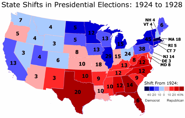
This change can be illustrated with a map detailing the state-by-state shift from the 1924 presidential election to the 1928 presidential election:

Photobucket

There are a number of things that stand out with this map.

More below.

The first, as has been previously noted, is the degree to which the shift replicates the current electoral map.

This is not all, however. Two other things are very, very out-of-whack here. To get a hint at what these are, it is useful to compare the 1924 to 1928 state-by-state voting shift to that of different elections.

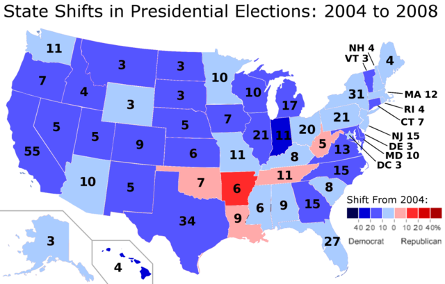
One example is the change from 2004 to 2008.

In 2008 President Barack Obama improved by 9.7% from the performance of the previous Democratic candidate, Senator John Kerry. In 1928 Governor Al Smith improved by 7.8% from the performance of Democratic candidate John Davis. The shift from 1924 to 1928 is therefore roughly comparable to the shift from 2004 to 2008.

Here is a map of that shift:

Photobucket

Although both Democratic candidates improved by roughly the same percentage from the previous election, where and how they improved look completely different.

In 2008, Mr. Obama generally improved everywhere. In only five states does he do worse than Mr. Kerry. This is the famous Appalachian corridor with which Mr. Obama was so weak.

Moreover, the degree of movement is generally modest. Only two states – Hawaii and Indiana – have more than a 20-point shift from how they voted in 2004. No state shifts more than 40 points (although Hawaii certainly comes close, going from a 8.7% Democratic margin to a 45.3% Democratic margin).

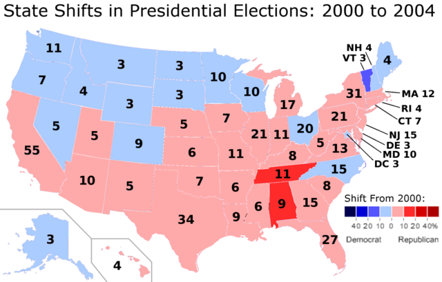
These two patterns: uniform and moderate movement (i.e. when a candidate does better in the popular vote, said candidate does better in almost every state, and states generally do not have wild swings from how they voted from the previous election) are not just confined to 2008. Here is the shift from 2000 to 2004, when President George W. Bush improved by 2.9% from his performance four years earlier:

Photobucket

One again we see that the national shift right brought most of the states with them, and that only three states shifted more than 10% from 2000.

Let’s take another look at 1928 to finish:

Photobucket

Here neither pattern is present. In 1928, the country moved 7.8% more Democratic from 1924. Despite this, Democratic candidate Al Smith did worse in 23 out of 48 states. Three states – Florida, Georgia, and Texas – voted more than 40% more Republican than they did in the previous election. In Texas, Republicans went from 19.8% of the vote in 1924 to 51.8% of the vote in 1928. Fifteen states voted more than 10% more Republican than they did in 1924.

In comparison, in 2008 only one state – Arkansas – voted more than 10% more Republican than it did in 2004 (and it did so by the barest of margins: 10.1%). This was despite Mr. Obama’s improvement from 2004 being roughly equivalent to Mr. Smith’s improvement from 1924.

A lot of interest has gone into Mr. Obama’s weakness in Appalachia. But Mr. Smith’s Southern problem in 1928 (i.e. the fact that he was a Catholic) makes Mr. Obama’s Appalachian problem look puny.

If Mr. Smith improved by 7.8% from the performance of his Democratic predecessor with so much weakness in the South, the shift in the states that voted more Democratic must have been huge. And indeed, the New Yorker gained more than 20-point shifts in nine states. In Massachusetts, Democrats went from 24.9% of the vote in 1924 to 50.2% in 1928.

All in all, the 1928 presidential election was the scene of some enormous movement on a state-by-state basis. In 2008 only two states shifted more than 20 points from 2004, as Mr. Obama did 9.7% better than Mr. Kerry. In 1928, on the other hand, sixteen states shifted more than 20 points from 1928, as Mr. Smith did 7.8% better than the previous Democratic candidate.

This is what a realigning election looks like – extreme movement on from one state to the next, enormous differences by region, and a powerful correlation between which states shift Democratic and which states are voting Democratic almost a century later.

P.S. For those interested, here is a table of the state-by-state voting shift from the 1924 presidential election to the 1928 presidential election:

State 1928 Republican   Margin 1924 Republican   Margin Change
Alabama -2.84% 40.80% 37.96%
Arizona 15.34% 5.79% 9.55%
Arkansas -20.96% -31.93% 10.97%
California 30.50% 48.97% -18.47%
Colorado 30.78% 35.04% -4.26%
Connecticut 8.06% 34.01% -25.95%
Delaware 30.42% 20.90% 9.52%
Florida 16.72% -28.82% 45.54%
Georgia -13.19% -55.77% 42.58%
Idaho 29.30% 30.76% -1.46%
Illinois 14.65% 35.48% -20.83%
Indiana 20.09% 16.56% 3.53%
Iowa 24.20% 38.39% -14.19%
Kansas 44.96% 37.94% 7.02%
Kentucky 18.82% 2.95% 15.87%
Louisiana -52.58% -56.21% 3.63%
Maine 37.66% 50.20% -12.54%
Maryland 14.74% 4.00% 10.74%
Massachusetts -1.09% 37.40% -38.49%
Michigan 41.44% 62.24% -20.80%
Minnesota 16.94% 44.38% -27.44%
Mississippi -64.20% -81.79% 17.59%
Missouri 11.43% 5.79% 5.64%
Montana 17.89% 23.12% -5.23%
Nebraska 27.01% 17.51% 9.50%
Nevada 13.07% 19.81% -6.74%
New Hampshire 17.63% 25.11% -7.48%
New Jersey 19.97% 34.76% -14.79%
New Mexico 18.16% 5.50% 12.66%
New York 2.35% 26.63% -24.28%
North Carolina 9.87% -19.16% 29.03%
North Dakota 10.34% 40.72% -30.38%
Ohio 30.43% 34.63% -4.20%
Oklahoma 28.28% -5.59% 33.87%
Oregon 30.04% 26.83% 3.21%
Pennsylvania 31.35% 46.26% -14.91%
Rhode Island -0.61% 23.17% -23.78%
South Carolina -82.85% -94.35% 11.50%
South Dakota 20.98% 36.34% -15.36%
Tennessee 7.72% -9.21% 16.93%
Texas 3.67% -53.92% 57.59%
Utah 7.72% 19.32% -11.60%
Vermont 34.00% 62.55% -28.55%
Virginia 8.01% -29.69% 37.70%
Washington 35.75% 42.08% -6.33%
West Virginia 17.39% 5.38% 12.01%
Wisconsin 9.24% 28.96% -19.72%
Wyoming 28.31% 36.28% -7.97%
Total 25.22% 17.42% -7.80%

–Inoljt

The Great Realignment: The 1928 Presidential Election, Part 1

This is the first part of two posts analyzing in detail the 1928 presidential election.

The second post can be found here.

The Context

In a previous post, part of a series analyzing the Democratic Party during the 1920s, I spoke of how the 1928 presidential election constituted a realigning election.

The 1928 presidential election marked the beginning of a great shift in American politics. It was when the Democratic Party started changing from a minority and fundamentally conservative organization into the  party that would nominate Senator Barack Obama for president.

In 1928, the Democratic Party nominated Governor Al Smith of New York. Mr. Smith was nominated as a Catholic Irish-American New Yorker who directly represented Democratic-voting white ethnics. Mr. Smith’s Catholicism, however, constituted an affront to Democratic-voting white Southerners, who at the time were the most important part of the party’s base.

The 1928 presidential election thus saw a mass movement of white Southerners away from the Democrats, corresponding with a mass movement of white ethnics towards the Democrats. This was the beginning of the great realignment of the South to the Republican Party and the Northeast to the Democratic Party.

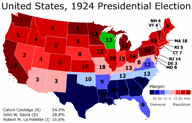
Several maps illustrate this point succinctly. Here is the 1924 presidential election:

Part 2

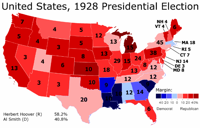
Here is the 1928 presidential election:

Part 3

As one can tell, there is quite a bit of change from the one presidential election to the next. Democratic strength in the Solid South weakens considerably, while the Republican Midwest and Northeast become much less red.

However, it is somewhat difficult to go further into detail just by comparing the two maps. One can sense that a lot is changing, and that certain regions of the country are moving in diametrically opposed directions. But it is all rather vague.

I therefore decided, out of curiosity, to create an actual map of the shift from 1924 to 1928. Here it is:

Photobucket

This is quite the interesting map. One can see the outlines of the current Democratic electoral map here. In some cases the correlation is quite tight. For instance, Indiana is the only state in the Midwest to vote more Republican in 1928 – and what do you know, today Indiana votes the most Republican out of all the states in that region.

In general the relationship is very strong in the eastern half of the country. The only “wrong” states are today’s Democratic strongholds of Maryland and Delaware. Also, the degree of shift does not perfectly correlate to Republican strength in some of the Southern states. But these are small details; in the East, states that moved Democratic in 1928 vote Democratic today, while states that moved Republican in 1928 vote Republican today.

West of Minnesota, however, the relationship breaks down. In more than a third of the states in the West, the way they shifted in 1928 is opposite of how they vote today. The most obvious outlier is Utah, today a rock-solid Republican stronghold that moved sharply Democratic in 1928.

There are two other very interesting and strange things that are happening in this map. They will be the subject of the next post.

–Inoljt

A Regional Party Limited to the South: The Democrats in the 1920s, Part 3

This is the last part of three posts analyzing the Democratic Party’s  struggles  during the 1920s, when it lost three consecutive presidential  elections  by landslide margins. This will focus upon the 1928  presidential election, when the  Democratic Party began to change into what it is today.

The 1928 Presidential Election

The 1928 presidential election marked the beginning of a great shift in American politics. It was when the Democratic Party started changing from a minority and fundamentally conservative organization into the party that would nominate Senator Barack Obama for president.

Part 3

More below.

All this was quite far off in 1928, however. All Democrats knew was that they had just lost two landslide elections. In 1920 and 1924, the Democratic Party had won the votes of white Southerners – and nobody else. Their last candidate had won barely more than one-fourth of the vote.

In 1928 the Democratic Party tried a different strategy. It nominated Governor Al Smith of New York, the candidate of its white ethnic constituency. In the 1920 and 1924 these voters had sat out the first election, and then voted for a third-party candidate. Mr. Smith was a Tammany Hall-bred politician and a life-long New Yorker who identified as an Irish-American.

There was just one problem: Mr. Smith was not a Christian. Rather, he was a Roman Catholic who many feared would take orders from the Pope himself.

White ethnics had abandoned the Democratic Party in the two previous presidential elections. This time it was the turn of white Southerners, who voted Republican in unprecedented numbers:

Part 2

White Southerners may have been willing to vote for a yellow dog for  president, but many drew the line at voting for a Catholic (especially  one who wanted to condemn the Klu Klux Klan and supported anti-lynching  legislation).

It was Republican candidate Herbert Hoover who benefited from this. Riding a strong economy and a wave of personal popularity, Mr. Hoover defeated Mr. Smith by 17.2% – a landslide on par with President Ronald Reagan’s pummeling of Democratic candidate Walter Mondale, or Mr. Hoover’s own defeat four years later.

The Transformation of the Democratic Party

The 1928 presidential election was the first time white Southerners had abandoned the Democratic Party since the Civil War, and it signaled the beginning of a sea change in American politics.

Amidst all the Republican celebration of a third massive Republican landslide, there was one disquieting sign: Democrats won more than 50% of the vote in Massachusetts, for the first time in history. Irish-American support also gained Mr. Smith more than 50% in Rhode Island (for the first time since 1852). In New York Democrats lost by less than three percent.

Thus, while white Southerners voted more Republican than ever before in the history of the Republican Party, white ethnics in the Northeast and Midwest supported their fellow Catholic in unprecedented numbers. In 1928, both Mississippi and Massachusetts voted Democratic, as the party lost by a landslide.

In the ensuing decades, the Democratic Party’s power base would shift in a slow but sure tide towards Massachusetts and away from Mississippi. 1928 was the first time Democrats relinquished much of the White Southerner vote, but it would not be the last. President Franklin D. Roosevelt stopped the trend for a generation, but after him it would resume. Democrats would become the party of Massachusetts, not the party of Mississippi.

This trend started in 1928. A comparison of the 1924 and 1928 presidential elections is revealing. In 1924, Democrats still held a lock on the South, while Republicans held a lock everywhere else:

Part 2

In 1928 this began changing. Democratic strength began to move away from the South, and towards the Northeast and Midwest:

Part 3

This change continues to this very day.

Conclusions

In 1928, one could be forgiven for thinking that the Democrats were consigned to permanent minority status. They had just lost three presidential landslide elections in a row. They had not controlled a House of Congress for more than a decade.

Indeed, aside from 1912 (when two Republicans split the vote), the Democratic Party had won exactly one presidential election since 1892. They had won more than 50% of the vote just one time since the Civil War; Republicans had done so nine times during the same period.

In 1928, the Democratic Party really did seem trapped as a regional-based party which had great trouble competing outside the South. Again and again, Democratic candidates were pummeled outside the former Confederacy. When they had attempted to reach out to white ethnics in 1928, White Southerners had refused to go along.

It was a terrible Catch-22, a problem Democrats had failed to surmount for almost two generations. In the end, it would take a Great Depression for them to do so.

–Inoljt, http://mypolitikal.com/