Analyzing the Florida Gubernatorial Election

This is a part of a series of posts analyzing the 2010 midterm elections. This post will discuss the 2010 Florida gubernatorial election, which Republican candidate Rick Scott won in an extremely close contest.

Florida’s Gubernatorial Election

On November 2010, Democrat Alex Sink faced an extremely flawed Republican opponent: multimillionaire Rick Scott, a businessman accused of heading the biggest fraud in Medicare history.

Ms. Sink still lost, running in a Republican leaning state in a very Republican environment. Here is what happened:

Photobucket

More below.

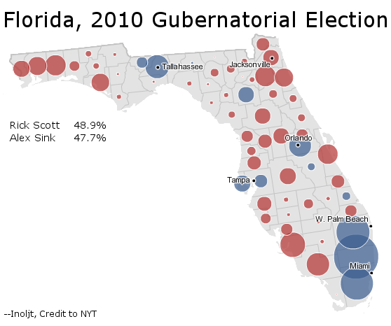
This constitutes a classic map of a close race in Florida. Ms. Sink wins the counties that she needs to win in the I-4 central corridor. For a Democrat, she performs relatively strongly in conservative northern Florida.

Turn-Out

What kills Ms. Sink, however, is Democratic turn-out.

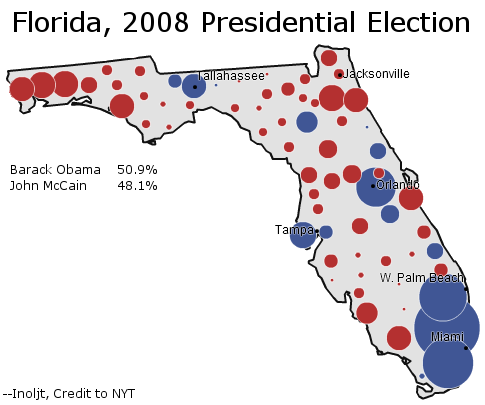
To gain some perspective on this, let’s compare Ms. Sink’s performance with that of President Barack Obama’s:

Photobucket

Note that the circles depicted here are not equivalent. In 2008 8.4 million people voted; in 2010 only 5.3 million did. So the absolute margins of 2008 – regardless of whether Mr. Obama won or lost the county – are much bigger.

Nevertheless, one can see that Mr. Obama gets quite a bit more mileage out of the counties he wins than Ms. Sink does. This is especially true along the Democratic, minority-heavy strongholds of Orlando and South Florida.

In 2008 these places composed a greater share of the Florida electorate than they did in 2010; minority and Democratic turn-out fell disproportionately in the mid-term. In 2008 Orlando and South Florida (i.e. Broward, Miami-Dade, Orange, and Palm Beach counties) composed 31.6% of the electorate; in 2010 they composed 29.2% of the electorate. This does not seem like much, but it makes a difference when the margin of victory is 1.2%.

On a county-by-county basis, Mr. Scott’s margin would be cut from 61,550 to 15,226 in the 2008 electorate, even if his share of each county’s vote does not change (only the number of voters in each county does). I suspect that if you adjust this on a precinct level – if you give each precinct the same number of voters it had in 2008, without changing the percent of the vote Ms. Sink and Mr. Scott got in that precinct – Ms. Sink would have won outright.

Turn-Out

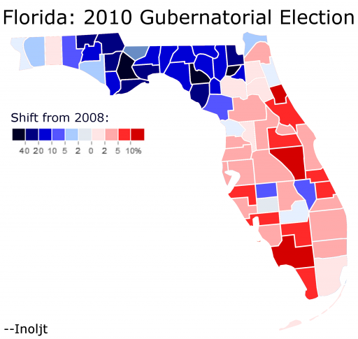
There is one part of Florida, however, in which Ms. Sink did much better than Mr. Obama. It’s hard see this in the previous maps, due to the low population of this region. Here is a better illustration:

Photobucket

As the map indicates, Northern Florida moved quite strongly towards Ms. Sink, although not strongly enough to offset her losses elsewhere.

There are a variety of explanations for why this might be. The rural, poor, Southern voters there might have been turned off a wealthy businessman as a Republican candidate. Ms. Sink might have overperformed amongst Republicans.

It is also true that Mr. Obama did quite poorly amongst these voters, losing many of these counties by 40+ margins. Partly this had to do with his status as a big-city Chicago liberal. Mostly, however, Mr. Obama did poorly because he was black.

Half a century ago northern Florida was the most Democratic part of the state, back in the days of the Solid South. Since then the Democratic Party has moved away from these voters (see: John Kerry, Barack Obama); it gets progressively harder each election for a Democrat to win them, although some still do. Ms. Sink’s improvement over Mr. Obama, then, might have been the last gasp of a dying breed: white Dixie Democrats.

Conclusions

In the dying days of Florida’s gubernatorial campaign, Democratic candidate Alex Sink was accused of cheating during the gubernatorial debate. The scandal broke during the final days of the campaign, derailing a crucial time for any campaign. Pundits will point to the scandal as responsible for the 1.2% margin by which Ms. Sink lost.

Yet it may have been another event, seemingly unrelated, that truly undid Ms. Sink. During the campaign’s final days, Independent Charlie Crist – running for Florida’s Senate seat – mounted a concerted effort to get Democrat Kendrick  Meek to drop-out. The coverage dominated national news, blackened the image of both participants, and demoralized Democrats everywhere in Florida.

It may have also led to Ms. Sink’s defeat. In many ways the candidate did what she had to do – she won the right places and improved on Mr. Obama in the most Republican part of Florida. I remember looking at her northern Florida numbers on election day and feeling somewhat optimistic about her chances. With the vote in at 50%, Ms. Sink stood behind by 5% – but the Democratic Gold Coast hadn’t started reporting. She could close things once the Democratic strongholds Palm Beach, Broward, and Miami-Dade counties came in.

But Ms. Sink never did fully close the gap. Democratic turn-out killed Ms. Sink, as it did with many others in 2010.

–Inoljt

P.S. Here is a table I created, some of whose information is used in this post.

Republican Margin: Change   from 2008 to 2010 2010 County Percent of Vote 2008 County Percent of Vote Change in Turn-Out Sink Under 2008 Electorate County
0.11% 1.38% 1.50% -0.12% -26919 Alachua
-29.35% 0.15% 0.13% 0.02% 3091 Baker
-2.73% 1.03% 0.97% 0.06% 30805 Bay
-17.09% 0.15% 0.14% 0.01% 2706 Bradford
2.87% 3.66% 3.43% 0.23% 38254 Brevard
3.50% 7.83% 8.74% -0.90% -229201 Broward
-32.24% 0.08% 0.07% 0.01% 504 Calhoun
6.87% 1.11% 1.02% 0.09% 12047 Charlotte
-0.81% 1.02% 0.91% 0.11% 11629 Citrus
0.12% 1.19% 1.13% 0.06% 40617 Clay
10.14% 1.92% 1.69% 0.23% 46331 Collier
-12.40% 0.35% 0.34% 0.02% 6001 Columbia
-1.01% 0.13% 0.12% 0.01% 1146 Desoto
-30.47% 0.10% 0.09% 0.01% 1047 Dixie
3.81% 4.88% 4.95% -0.07% 23793 Duval
-0.78% 1.79% 1.84% -0.05% 28636 Escambia
11.39% 0.62% 0.59% 0.04% 4833 Flagler
-28.01% 0.08% 0.07% 0.00% -10 Franklin
-7.45% 0.31% 0.27% 0.04% -10451 Gadsden
-18.49% 0.10% 0.09% 0.01% 2214 Gilchrist
-0.63% 0.05% 0.05% 0.00% 832 Glades
-15.77% 0.09% 0.09% 0.01% 1693 Gulf
-13.24% 0.07% 0.07% 0.01% 75 Hamilton
-5.83% 0.10% 0.09% 0.01% 1761 Hardee
5.24% 0.12% 0.13% -0.01% 1354 Hendry
4.90% 1.09% 1.05% 0.04% 7458 Hernando
2.20% 0.56% 0.53% 0.02% 9074 Highlands
3.79% 5.93% 6.12% -0.19% -17133 Hillsborough
-24.68% 0.11% 0.10% 0.01% 3460 Holmes
6.92% 0.88% 0.84% 0.04% 15364 Indian River
-24.48% 0.28% 0.26% 0.02% 754 Jackson
-14.85% 0.12% 0.09% 0.02% -1476 Jefferson
-43.33% 0.05% 0.04% 0.01% 574 Lafayette
2.61% 1.90% 1.75% 0.15% 23697 Lake
11.33% 3.39% 3.21% 0.19% 58504 Lee
-11.04% 1.86% 1.77% 0.09% -52485 Leon
-5.68% 0.24% 0.22% 0.01% 3976 Levy
-45.26% 0.04% 0.04% 0.00% -43 Liberty
-10.71% 0.12% 0.11% 0.01% -680 Madison
5.42% 1.98% 1.81% 0.17% 18952 Manatee
2.02% 2.13% 1.93% 0.20% 22073 Marion
2.07% 1.01% 0.93% 0.08% 12257 Martin
1.82% 9.11% 10.28% -1.17% -123556 Miami-Dade
5.01% 0.49% 0.48% 0.01% 48 Monroe
-4.23% 0.50% 0.46% 0.04% 15161 Nassau
0.69% 1.14% 1.14% 0.00% 43580 Okaloosa
-5.99% 0.15% 0.15% 0.00% 1684 Okeechobee
7.48% 5.07% 5.50% -0.43% -51546 Orange
13.29% 1.00% 1.20% -0.20% -6459 Osceola
4.16% 7.15% 7.03% 0.12% -110658 Palm Beach
4.88% 2.55% 2.56% -0.01% 18217 Pasco
2.55% 5.66% 5.53% 0.13% -26374 Pinellas
4.83% 2.99% 2.92% 0.07% 26880 Polk
0.37% 0.40% 0.40% 0.00% 6523 Putnam
-3.26% 0.93% 0.91% 0.02% 34011 Santa Rosa
4.40% 2.71% 2.47% 0.24% 9360 Sarasota
4.00% 2.46% 2.45% 0.01% 13996 Seminole
-1.39% 1.40% 1.26% 0.13% 31952 St. Johns
7.18% 1.41% 1.44% -0.03% -5928 St. Lucie
1.21% 0.78% 0.58% 0.20% 13803 Sumter
-13.75% 0.25% 0.21% 0.04% 5189 Suwannee
-17.01% 0.12% 0.11% 0.01% 2058 Taylor
-46.53% 0.07% 0.06% 0.00% 169 Union
7.74% 2.94% 2.91% 0.03% 5093 Volusia
-21.92% 0.21% 0.17% 0.03% 415 Wakulla
-5.00% 0.35% 0.32% 0.03% 11029 Walton
-16.60% 0.15% 0.13% 0.02% 3462 Washington
3.97% 100.00% 100.00% 0.00% 15226 Total

The Future of the Asian-American Vote

Asians are one of the most ignored constituencies in American politics. When most politicians think about the Asian vote, they don’t.

Yet the Asian-American population is increasing, both in absolute terms and relative ones. By 2050, the Census estimates that Asians will compose 7.8% of the American population. Although their voting rates will still fall far short of this, the population is becoming more influential. Predicting their future voting path therefore has some utility.

In previous posts, this blogger has argued that the Latino vote will likely trend Republican, as Latinos follow the path of previous immigrants and become more assimilated.

Will the same happen for Asian-Americans?

More below.

Probably not:

Photobucket

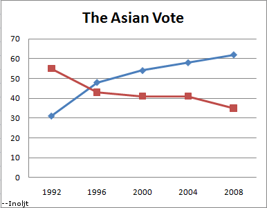
As the graph above shows, the Asian vote has steadily moved Democratic, in quite a significant manner. In 1992 Republican President George H.W. Bush won 55% of the Asian vote while losing the popular vote. 12 years later, his son won only 41% of Asians, despite winning the popular vote.

The trend also does not look bright for the Republican Party. Asian-Americans who have been born in the United States are, if anything, more Democratic than those who immigrated into the country (to be fair, the latter group dominates the Asian population and will continue to do so unless immigration is drastically curtailed).

Take, for instance, the Vietnamese-American population – strong supporters of the Republican Party. The Asian American Legal Defense and Education Fund, after conducting an extensive exit poll of Asians (perhaps the only detailed exit poll of the group in the country), found that:

Vietnamese American voters gave McCain the strongest support of all Asian ethnic groups at 67%. However, further analysis of Vietnamese American voters revealed 69% of those born in the U.S. and 60% of those 18-29 years old voted for Obama. Among Vietnamese American respondents, 15% were born in the U.S. and 25% were between the ages of 18 and 29.

The analysis goes on to conclude that:

AALDEF’s exit poll data shows that younger, U.S.-born, more recently naturalized, and English proficient Asian American citizens voted for Barack Obama for President by wide margins. Older, foreign-born citizens with limited English proficiency and who had been naturalized more than ten years ago voted in greater proportions for McCain.

There are several explanations for why this is happening. One quite plausible argument is that immigration has shifted the Asian-American population from Orange County anti-communists to Silicon Valley liberals.

Another revealing insight can be gained by comparing Asians to another very Democratic group: Jews. In many ways the two have a startling amount in common. Both groups are highly educated; both are primarily located in urban metropolitan areas; both have achieved substantial success in American society; and both have encountered quite similar types of discrimination. Even the stereotypes are similar.

Given these similarities, it is very conceivable that Asians could end up voting like Jews – one of the most liberal-minded groups in the nation.

–Inoljt, http://mypolitikal.com/

Republican House Targets for 2012

The key difficulty in drawing up target lists of potentially vulnerable House Republicans is, of course, redistricting. It’s simply hard for us to know what most districts will look like come 2012. But some seats simply can’t or won’t change too much, whether by virtue of geography, politics, law or custom. I’m thinking, for instance, that the 2012 edition of Charlie Bass’s NH-02 is unlikely to look very different from the 2010 version – and that Bass will be his usual weaksauce self, all but inviting a top-tier challenge. And Bass’s next-door neighbor, the corrupt Frank Guinta, will probably wind up in the same boat.

These can’t be the only two guys to make our early lists, though. Who else do you think will have a pretty stable district, and ought to face some trouble?

The Worst Republican Senate Candidates of 2010, Part 1

This is the first part of two posts analyzing patterns in the 2010 Senate midterm elections. The second part can be found here.

The 2010 congressional midterm elections constituted, by and large, a victory for the Republican Party. In the Senate Republicans gained six seats. While this was somewhat below expectations, it was much better than Republican hopes just after 2008 – when many expected the party to actually lose seats.

The Senate results provide some interesting fodder for analysis. The table below indicates which Republicans Senate candidates did the worst in 2008. It does so by taking the Republican margin of victory or defeat in a given state and subtracting this by the Cook PVI of the state (the Cook PVI is how a state would be expected to vote in a presidential election in the event of an exact tie nationwide). Given that Republicans won the nationwide vote this year, the average Republican candidate would be expected to do better than the state’s PVI. A bad Republican candidate would actually do worse than the state’s PVI.

Let’s take a look at this table below the flip.

State Republican Margin Cook PVI Republican Overperformance
South Dakota 100.00% 8.9% 91.10%
North Dakota 53.91% 10.4% 43.51%
Kansas 43.72% 11.5% 32.22%
Iowa 31.05% -1.0% 32.05%
Idaho 46.25% 17.4% 28.85%
Oklahoma 44.50% 16.9% 27.60%
Florida 28.69% 1.8% 26.89%
South Carolina 33.83% 7.8% 26.03%
New Hampshire 23.22% -1.6% 24.82%
Arizona 24.14% 6.1% 18.04%
Alabama 30.47% 13.2% 17.27%
Ohio 17.44% 0.7% 16.74%
Georgia 19.31% 6.8% 12.51%
Arkansas 20.96% 8.8% 12.16%
Missouri 13.60% 3.1% 10.50%
Illinois 1.60% -7.7% 9.30%
Louisiana 18.88% 9.7% 9.18%
Utah 28.79% 20.2% 8.59%
Indiana 14.58% 6.2% 8.38%
North Carolina 11.77% 4.3% 7.47%
Wisconsin 4.84% -2.4% 7.24%
Pennsylvania 2.02% -2.0% 4.02%
Kentucky 11.47% 10.4% 1.07%
Washington -4.73% -5.0% 0.27%
Alaska 11.94% 13.4% -1.46%
Colorado -1.63% 0.2% -1.83%
California -10.01% -7.4% -2.61%
Nevada -5.74% -1.3% -4.44%
Connecticut -11.94% -7.1% -4.84%
Delaware -16.58% -7.0% -9.58%
Oregon -17.98% -4.0% -13.98%
New York (S) -27.84% -10.2% -17.64%
Maryland -26.44% -8.5% -17.94%
West Virginia -10.07% 7.9% -17.97%
Vermont -33.41% -13.4% -20.01%
New York -34.10% -10.2% -23.90%
Hawaii -53.24% -12.5% -40.74%
Total/Average 5.54% 2.3% 8.08%

(Note: The data in Alaska and Florida refer to the official candidates nominated by the parties, not the independent candidates – Senator Lisa Murkowski and Governor Charlie Crist – who ran in the respective states).

This table reveals some fascinating trends. There is a very clear pattern: the worst Republican candidates ran in the bluest states – and the bluer the state, the more the Republican underperformed. This does not just mean that these Republicans lost, but that they lost by more than the average Republican was supposed to in the state. Republican candidates did worse than the state’s PVI in thirteen states; nine of these states had a Democratic PVI.

There seems to be a PVI tipping point at which Republicans start underperforming: when a state is more than 5% Democratic than the nation (PVI D+5). Only one Republican in the nine states that fit this category overperformed the state PVI (Senator Mark Kirk of Illinois ).

Something is puzzling about this pattern. It is true that states like Connecticut or Maryland will probably vote Democratic even in Republican victories. The Cook PVI predicts that Democrats will win by X% in the event of a national tie in the popular vote. One would thus have expected Republican candidates to do better than this in 2010, given that 2010 was the strongest Republican performance in a generation.

Yet this did not happen. In a lot of blue states Democrats actually did better than the Cook PVI would project them to do – that is, said blue states behaved like the Democrats had actually won the popular vote, which they certainly did not in 2010. The bluer the state, the stronger this pattern.

There are a couple of reasons why this might be. The first thing that comes to mind is the money and recruiting game. The Republican Party, reasonably enough, does not expect its candidates to win in places like New York and Maryland . So it puts less effort into Republican candidates in those states. They get less money – and therefore less advertising, less ground game, and so on. Nobody had any idea who the Republican candidate in Vermont was, for instance. That probably contributes to Republican underperformance in deep-blue states.

The second factor might be a flaw in the model the table uses. Democratic and Republican strongholds, for whatever reason, behave differently from “uniform swing” models. In almost all the counties President Barack Obama won, for instance, he improved upon President Bill Clinton 1992 and 1996 performance – despite the fact that Mr. Clinton won by similar margins in the popular vote. This holds true from San Francisco to rural Mississippi . In the 2010 Massachusetts special Senate election, the most Democratic areas of Massachusetts swung least towards Republican Senator Scott Brown. The fact that the worst Republican candidates ran in the bluest states fits the pattern.

The table presents another startling pattern, which will be discussed in the next post: there are surprisingly few Republicans who did worse than they were supposed to in red states.

–Inoljt

Maps of Colorado Elections

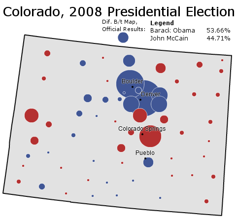
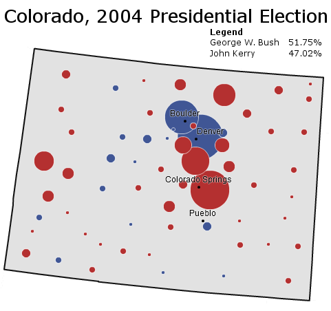
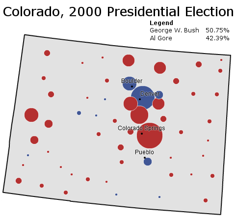
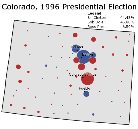
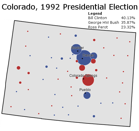
To follow up the series of posts on Colorado, I’ve posted a few recent presidential elections in the state (courtesy of the New York Times). Each map comes with some brief analysis.

Photobucket

Boosted by a Democratic National Convention held in Denver, Senator Barack Obama wins a thorough victory in the ultimate swing state of 2008. The Democratic candidate does especially well in the Republican-leaning suburbs of Denver – winning several outright and dampening margins in Douglas County and Colorado Springs.

More below.

Photobucket

Written off early as a sure Republican victory, Colorado surprises pundits in 2004 with a surprisingly strong Democratic performance. It is one of the few states where Democrats do better than in 2000 as they pick up the 2000 Ralph Nader vote.

______________________________________________________

Photobucket

Governor George W. Bush performs well throughout the Rocky Mountains in 2000, and Colorado is no exception. With Green Party candidate Ralph Nader pulling off a substantial bloc of liberal voters, Mr. Bush even cracks the Democratic “C” that composes the Democratic base of Colorado.

______________________________________________________

Photobucket

Conservative Colorado returns to form in 1996; President Bill Clinton loses the state by the barest of margins as conservative Ross Perot voters go Republican. Republican Bob Dole wins based off Republican strength in Colorado Springs and rural Colorado.

______________________________________________________

Photobucket

Surprise! – reliably Republican Colorado votes Democratic for the first time in a generation, and for the first time in a competitive race since the days of Harry Truman. To be fair, this map somewhat overstates Democratic strength: Republican margins are dampened by Ross Perot’s strength amongst conservatives.

–Inoljt, http://mypolitikal.com/  

Race and Modern-Day Political Advertising

By: Inoljt, http://mypolitikal.com/

In the world of campaign commercials, race seems to be invoked in an increasingly and worryingly explicit way.

Let’s take a look at some old commercials and compare them to contemporary ones.

Here, for instance, is the famous “Willie Horton” commercial, which doomed Governor Mike Dukakis’s campaign for president:

More below.

This commercial is often the first thing people think about when talking about “racist” political ads. The story goes that the “death penalty” constituted a code word for race-baiting, and that the use of Willie Horton – a black man – was intended to arouse racial fears of black violence.

Let’s compare this old ad with a more modern one.

Here is a 2010 ad on undocumented immigrants:

This ad was shown by Republican Senator David Vitter in his 2010 re-election campaign. Mr. Vitter won an easy re-election, campaigning in a conservative state (Louisiana) in a conservative year.

With Mr. Bush’s ad, one has to look pretty hard to see the supposed racism. Only two pictures of a black man are used, and each image is fairly race-neutral by itself.

Mr. Vitter’s ad, on the other hand, is much more explicit. The ad shows endless hordes of brown people breaking through fences, while an announcer spits out “illegals” like a curse word. It’s pretty clear that all the “illegals” are Latino, and that all the victims are white.

On the score of which ad is more racist, Mr. Vitter’s ad – the more modern one – wins hands down.

This is true for other ads as well. Here is an ad on welfare by President Richard Nixon:

Mr. Nixon was accused of running an undercover “racist” campaign, using code words like “welfare” and “law-and-order” to appeal to racial resentments.

Yet out of all four ads, this one is probably the least racist by far. One has to really stretch to “find” racism in this ad (e.g. the construction worker is in the inner-city, which is full of minorities, and so the ad could theoretically be pointing out that inner-city minorities will benefit from welfare).

Now compare this to another contemporary ad:

This ad was run by Democratic Senator Blanche Lincoln against her primary opponent, Lieutenant Governor Bill Halter. Ms. Lincoln went on to barely win the primary, only to lose by a landslide in the general election.

Once again, the more modern ad is much more obvious than Mr. Nixon’s ad in the use of race. Indian foreigners speaking accented English thank Mr. Halter for outsourcing jobs, while “Indian” music plays and stereotypic images of India play in the background.

The political equivalent in 1972 would have been to show black people in the ghetto thanking Democrats for welfare in “ghetto” English.

In 1972 politicians did not dare do this. Yet in 2010 they are more than willing to show Indians and Latinos in quite racist ads.

All in all, Americans – or, more accurately, humans in general – like to think that things are always getting better. Technology is always improving, people are always living longer, and freedom and democracy are always on the rise.

This applies with race relations as well. The dominant narrative is that America’s treatment of its minorities is in a continuous progression upwards, from the low beginnings of slavery to the first black president and onwards. America’s minorities have never been treated as well as they are now, in this view.

Everything that is said above is mostly true – indeed the world is healthier, freer, and more technologically advanced than ever before. And America’s minorities do have more opportunities than ever before.

Nevertheless, in at least one aspect of race relations, America portrays minorities worse than it did two generations ago.

The Keys to President Barack Obama’s Re-election Chances

By: Inoljt, http://mypolitikal.com/

The recent mid-terms were, by all accounts, very bad for Democrats. They lost 63 seats in the House of Representatives and 6 seats in the Senate. In many ways things were worse than in 1994, when Republicans won landslide victory.

There is another analogy to 1994, however, which will probably make Democrats happier. President Bill Clinton, after devastating mid-term losses, went on to win a comfortable re-election campaign. Can Mr. Obama do the same?

The book “The Keys to the White House,” by Professor Allan J. Lichtman provides a fascinating answer. Mr. Lichtman argues that the results of a presidential election can be predicted months or years beforehand by a series of thirteen “keys.” According to this theory, if the incumbent party or current president captures a certain number of “keys”, it will win the election. Otherwise it will lose.

More below.

This can readily be applied to the 2012 presidential election. Here are Mr. Lichtman’s exact words:

The Keys to the White House are stated as conditions that favor reelection of the incumbent party. When five or fewer statements are false, the incumbent party wins. When six or more are false, the incumbent party loses.

Key 1: Incumbent-party mandate – After the midterms the incumbent party holds more seats in the U.S. House of Representatives than it did after the previous midterm elections.

Key 2: Nomination-contest – There is no serious contest for the incumbent-party nomination.

Key 3: Incumbency – The incumbent-party candidate is the sitting president.

Key 4: Third party – There is no significant third-party or independent campaign.

Key 5:  Short-term economy – The economy is not in recession during the election campaign

Key 6: Long-term economy – Real annual per-capita economic growth during the term equals or exceeds mean growth during the previous two terms.

Key 7: Policy change – The incumbent administration effects major changes in national policy.

Key 8: Social unrest – There is no sustained social unrest during the term.

Key 9: Scandal – The incumbent administration is untainted by major scandal.

Key 10: Foreign or military failure – The incumbent administration suffers no major failure in foreign or military affairs.

Key 11: Foreign or military success – The incumbent administration achieves a major success in foreign or military affairs.

Key 12: Incumbent charisma – The incumbent-party candidate is charismatic or a national hero.

Key 13: Challenger charisma – The challenging-party candidate is not charismatic or a national hero.

A year before the 2008 presidential election, Mr. Lichtman used these keys to confidently predict that Democrats would win the coming election. Seven of the keys – the incumbent-party mandate, the nomination contest, incumbency, policy change, foreign/military failure, foreign/military success, and incumbent charisma – were going against the Republican Party at that point. As the election went on, three other keys turned against them: short-term economy, long-term economy, and challenger charisma. The Republican Party thus went into the 2008 presidential election with ten of the thirteen keys turned against them. In this context, it is not surprising that Senator John McCain lost.

Let’s take a look at how the keys are stacking up in 2012:

Key 1: Incumbent-party mandate – After the midterms the incumbent party holds more seats in the U.S.  House of Representatives than it did after the previous midterm  elections.

Democrats would have had to lose twenty-three or less seats for this statement to be true. That definitely did not happen. This statement is FALSE.

___________________

Key 2: Nomination-contest – There is no serious contest for the incumbent-party nomination.

Nobody has the stature to contest Mr. Obama in the Democratic primary, even with recent liberal unrest over his tax cut deal. This statement is TRUE.

___________________

Key 3: Incumbency – The incumbent-party candidate is the sitting president.

The Democratic candidate is indeed the sitting president. This statement is TRUE.

___________________

Key 4: Third party – There is no significant third-party or independent campaign.

Ralph Nadar and 2000 effectively killed-off third-party candidacies for a generation. At the moment, 2012 isn’t looking any different. This statement is TRUE.

___________________

Key 5:  Short-term economy – The economy is not in recession during the election campaign.

This is a tough one – the economy probably won’t be in recession in 2012, but it certainly could feel like a recession. Given that so much of Democratic troubles stem from the short-term economy, for the moment this statement will be FALSE.

___________________

Key 6: Long-term economy – Real annual per-capita economic growth during the term equals or exceeds mean growth during the previous two terms.

This particular statistic is also tough to find, but we can certainly infer some things from just looking at real GDP. According to my calculations, Mr. Bush averaged 2.0% real GDP growth (the relevant websites are here and here). That’s pretty low, but real GDP growth was – 2.6% in 2009 because of the recession. The first quarter of 2010 was 3.7%. The second quarter was 1.6%. The third is estimated to be 1.5%. So real GDP growth under Mr. Obama has been something like an average – 0.5%. Over the eight quarters left until November 2012, real GDP would have to grow by something like an average 4.2% for Democrats to win this key. That’s just within the conceivable bounds of possibility, although it’s quite unlikely. This statement is UNKNOWN – LEANING FALSE.

___________________

Key 7: Policy change – The incumbent administration effects major changes in national policy.

Health care definitely was a major change in national policy. This statement is TRUE.

___________________

Key 8: Social unrest – There is no sustained social unrest during the term.

Tea Party shenanigans don’t count as “sustained social unrest.” This statement is TRUE.

___________________

Key 9: Scandal – The incumbent administration is untainted by major scandal.

The Obama administration has not yet had a major scandal. This statement is TRUE.

___________________

Key 10: Foreign or military failure – The incumbent administration suffers no major failure in foreign or military affairs.

Likewise, Mr. Obama hasn’t suffered a major failure overseas yet. (Although Afghanistan is not looking too good these days.) This statement is TRUE.

___________________

Key 11: Foreign or military success – The incumbent administration achieves a major success in foreign or military affairs.

But neither has Mr. Obama achieved a major success overseas. This statement is FALSE.

___________________

Key 12: Incumbent charisma – The incumbent-party candidate is charismatic or a national hero.

Mr. Obama certainly fits the definition of “charisma” to the word. This statement is TRUE.

___________________

Key 13: Challenger charisma – The challenging-party candidate is not charismatic or a national hero.

Although this could change, the current crop of Republican candidates doesn’t look very charismatic. This statement is TRUE.

___________________

All in all, the Democrats end up holding nine keys out of thirteen (they need seven to win). Four statements are false or unknown; nine are true. Under Mr. Lichtman’s system, then, Mr. Obama looks set to win re-election in 2012.

Of course things might change and get worse for Democrats. The Republicans might nominate somebody like Senator Scott Brown, who is readily equipped with charisma – winning the “challenger charisma” key. Afghanistan might turn into Mr. Obama’s military failure, making him lose that key. The Obama administration might become engulfed in scandal and lose another key.

On the other hand, things might also get better. The economy might be growing steadily come 2012, for instance winning Democrats that key. Mr. Obama might miraculously create peace between Israel and Palestine, winning another key.

But whatever changes happen, Mr. Lichtman’s system gives Democrats surprisingly bright prospects in the 2012 presidential election. Democrats are quite gloomy nowadays, but come November 2012 their spirits may be a bit brighter.

Solving a Mystery in Philadelphia Voting Patterns

A long time ago, I posted a series of posts analyzing the swing state Pennsylvania. One section of this series focused specifically on the city of Philadelphia. This section analyzed Philadelphia’s vote by precinct results and mapped out the results of several previous elections.

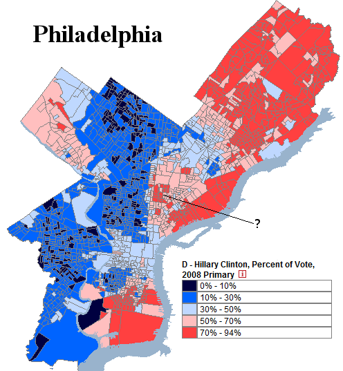
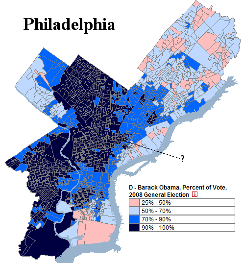
Of particular interest was the difference between the results of the 2008 presidential election and the 2008 Democratic primary, which illustrated a political divide not seen in presidential elections: between Democratic-leaning white Catholics in the northeast and Democratic-voting blacks in the west.

Here is Philadelphia in the 2008 Democratic primary. Take a note at the region the question mark points to, which this post will discuss:

Photobucket

More below.

(Note: Both images are taken from a website which maps historical Philadelphia election results.)

Here is Philadelphia in the 2008 presidential election:

Photobucket

Most of the different voting patterns between these two elections is fairly easy to explain: blacks in west Philadelphia voted for  Barack Obama both times, while white Catholics in the northeast voted strongly for Hillary Clinton in the primary and then lukewarmly Barack Obama in the general election. There is generally a scaling relationship between the two groups: as an area gets more white and less black, its support for Mr. Obama decreases in both elections.

There was, however, a group of precincts in Philadelphia which did not follow this model. These precincts are marked by the question mark in both maps. This group behaved quite strangely. It gave incredibly strong support to Ms. Clinton in the primary and then even stronger support to Mr. Obama in the general election. In the map of the 2008 primary, a number of these precincts cast more than 70% of their ballot to Ms. Clinton. All of them then vote more than 90% Democratic in the general election.

This behavior was quite puzzling, and something that the model did not explain. Initially this author hypothesized that these voters were white liberals in gentrifying areas of Philadelphia and then eventually forgot about the mystery.

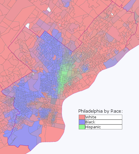
The answer, as it turns out, was not white liberals. Here it is:

Photobucket

The mysterious precincts were Hispanic!

The above image was created using Daves Redistricting Application. Due to the tremendous efforts of David  Bradlee, one can map the ethnic composition of every state in incredibly detail.

This provides some interesting insight into the behavior of Hispanics in inner-cities. If what holds for Philadelphia also holds for other cities (which is not a 100% certainty), inner-city Hispanics strongly supported both Hillary Clinton and then Barack Obama.

It is an insight provided by Daves Application which can be extended to many other areas and groups.

–Inoljt

The Great Realignment: The 1928 Presidential Election, Part 2

This is the second part of two posts analyzing in more detail the 1928 presidential election.

The Great Realignment

The previous post noted that:

In 1928 the Democratic Party nominated Governor Al Smith of New York. Mr. Smith was nominated as a Catholic Irish-American New Yorker  who directly represented Democratic-voting white ethnics. Mr. Smith’s  Catholicism, however, constituted an affront to Democratic-voting white  Southerners, who at the time were the most important part of the party’s  base.

The 1928 presidential election thus saw a mass movement of white  Southerners away from the Democrats, corresponding with a mass movement  of white ethnics towards the Democrats. This was the beginning of the  great realignment of the South to the Republican Party and the Northeast  to the Democratic Party.

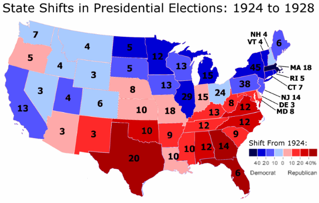
This change can be illustrated with a map detailing the state-by-state shift from the 1924 presidential election to the 1928 presidential election:

Photobucket

There are a number of things that stand out with this map.

More below.

The first, as has been previously noted, is the degree to which the shift replicates the current electoral map.

This is not all, however. Two other things are very, very out-of-whack here. To get a hint at what these are, it is useful to compare the 1924 to 1928 state-by-state voting shift to that of different elections.

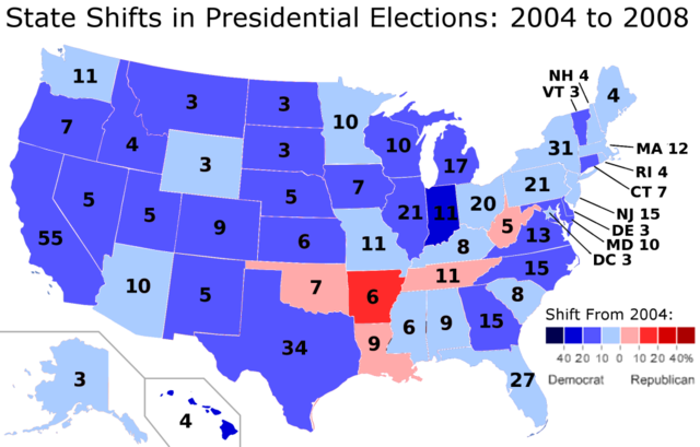
One example is the change from 2004 to 2008.

In 2008 President Barack Obama improved by 9.7% from the performance of the previous Democratic candidate, Senator John Kerry. In 1928 Governor Al Smith improved by 7.8% from the performance of Democratic candidate John Davis. The shift from 1924 to 1928 is therefore roughly comparable to the shift from 2004 to 2008.

Here is a map of that shift:

Photobucket

Although both Democratic candidates improved by roughly the same percentage from the previous election, where and how they improved look completely different.

In 2008, Mr. Obama generally improved everywhere. In only five states does he do worse than Mr. Kerry. This is the famous Appalachian corridor with which Mr. Obama was so weak.

Moreover, the degree of movement is generally modest. Only two states – Hawaii and Indiana – have more than a 20-point shift from how they voted in 2004. No state shifts more than 40 points (although Hawaii certainly comes close, going from a 8.7% Democratic margin to a 45.3% Democratic margin).

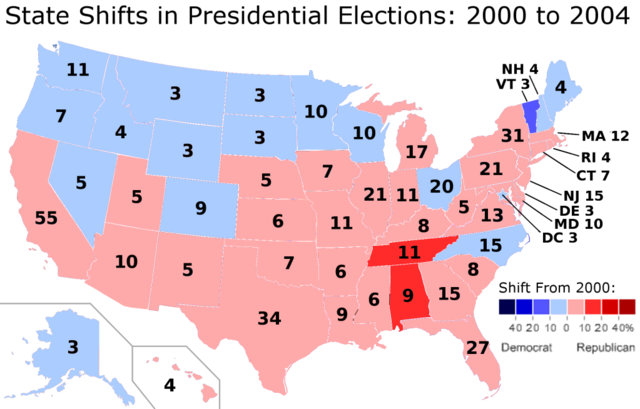
These two patterns: uniform and moderate movement (i.e. when a candidate does better in the popular vote, said candidate does better in almost every state, and states generally do not have wild swings from how they voted from the previous election) are not just confined to 2008. Here is the shift from 2000 to 2004, when President George W. Bush improved by 2.9% from his performance four years earlier:

Photobucket

One again we see that the national shift right brought most of the states with them, and that only three states shifted more than 10% from 2000.

Let’s take another look at 1928 to finish:

Photobucket

Here neither pattern is present. In 1928, the country moved 7.8% more Democratic from 1924. Despite this, Democratic candidate Al Smith did worse in 23 out of 48 states. Three states – Florida, Georgia, and Texas – voted more than 40% more Republican than they did in the previous election. In Texas, Republicans went from 19.8% of the vote in 1924 to 51.8% of the vote in 1928. Fifteen states voted more than 10% more Republican than they did in 1924.

In comparison, in 2008 only one state – Arkansas – voted more than 10% more Republican than it did in 2004 (and it did so by the barest of margins: 10.1%). This was despite Mr. Obama’s improvement from 2004 being roughly equivalent to Mr. Smith’s improvement from 1924.

A lot of interest has gone into Mr. Obama’s weakness in Appalachia. But Mr. Smith’s Southern problem in 1928 (i.e. the fact that he was a Catholic) makes Mr. Obama’s Appalachian problem look puny.

If Mr. Smith improved by 7.8% from the performance of his Democratic predecessor with so much weakness in the South, the shift in the states that voted more Democratic must have been huge. And indeed, the New Yorker gained more than 20-point shifts in nine states. In Massachusetts, Democrats went from 24.9% of the vote in 1924 to 50.2% in 1928.

All in all, the 1928 presidential election was the scene of some enormous movement on a state-by-state basis. In 2008 only two states shifted more than 20 points from 2004, as Mr. Obama did 9.7% better than Mr. Kerry. In 1928, on the other hand, sixteen states shifted more than 20 points from 1928, as Mr. Smith did 7.8% better than the previous Democratic candidate.

This is what a realigning election looks like – extreme movement on from one state to the next, enormous differences by region, and a powerful correlation between which states shift Democratic and which states are voting Democratic almost a century later.

P.S. For those interested, here is a table of the state-by-state voting shift from the 1924 presidential election to the 1928 presidential election:

State 1928 Republican   Margin 1924 Republican   Margin Change
Alabama -2.84% 40.80% 37.96%
Arizona 15.34% 5.79% 9.55%
Arkansas -20.96% -31.93% 10.97%
California 30.50% 48.97% -18.47%
Colorado 30.78% 35.04% -4.26%
Connecticut 8.06% 34.01% -25.95%
Delaware 30.42% 20.90% 9.52%
Florida 16.72% -28.82% 45.54%
Georgia -13.19% -55.77% 42.58%
Idaho 29.30% 30.76% -1.46%
Illinois 14.65% 35.48% -20.83%
Indiana 20.09% 16.56% 3.53%
Iowa 24.20% 38.39% -14.19%
Kansas 44.96% 37.94% 7.02%
Kentucky 18.82% 2.95% 15.87%
Louisiana -52.58% -56.21% 3.63%
Maine 37.66% 50.20% -12.54%
Maryland 14.74% 4.00% 10.74%
Massachusetts -1.09% 37.40% -38.49%
Michigan 41.44% 62.24% -20.80%
Minnesota 16.94% 44.38% -27.44%
Mississippi -64.20% -81.79% 17.59%
Missouri 11.43% 5.79% 5.64%
Montana 17.89% 23.12% -5.23%
Nebraska 27.01% 17.51% 9.50%
Nevada 13.07% 19.81% -6.74%
New Hampshire 17.63% 25.11% -7.48%
New Jersey 19.97% 34.76% -14.79%
New Mexico 18.16% 5.50% 12.66%
New York 2.35% 26.63% -24.28%
North Carolina 9.87% -19.16% 29.03%
North Dakota 10.34% 40.72% -30.38%
Ohio 30.43% 34.63% -4.20%
Oklahoma 28.28% -5.59% 33.87%
Oregon 30.04% 26.83% 3.21%
Pennsylvania 31.35% 46.26% -14.91%
Rhode Island -0.61% 23.17% -23.78%
South Carolina -82.85% -94.35% 11.50%
South Dakota 20.98% 36.34% -15.36%
Tennessee 7.72% -9.21% 16.93%
Texas 3.67% -53.92% 57.59%
Utah 7.72% 19.32% -11.60%
Vermont 34.00% 62.55% -28.55%
Virginia 8.01% -29.69% 37.70%
Washington 35.75% 42.08% -6.33%
West Virginia 17.39% 5.38% 12.01%
Wisconsin 9.24% 28.96% -19.72%
Wyoming 28.31% 36.28% -7.97%
Total 25.22% 17.42% -7.80%

–Inoljt

The Great Realignment: The 1928 Presidential Election, Part 1

This is the first part of two posts analyzing in detail the 1928 presidential election.

The second post can be found here.

The Context

In a previous post, part of a series analyzing the Democratic Party during the 1920s, I spoke of how the 1928 presidential election constituted a realigning election.

The 1928 presidential election marked the beginning of a great shift in American politics. It was when the Democratic Party started changing from a minority and fundamentally conservative organization into the  party that would nominate Senator Barack Obama for president.

In 1928, the Democratic Party nominated Governor Al Smith of New York. Mr. Smith was nominated as a Catholic Irish-American New Yorker who directly represented Democratic-voting white ethnics. Mr. Smith’s Catholicism, however, constituted an affront to Democratic-voting white Southerners, who at the time were the most important part of the party’s base.

The 1928 presidential election thus saw a mass movement of white Southerners away from the Democrats, corresponding with a mass movement of white ethnics towards the Democrats. This was the beginning of the great realignment of the South to the Republican Party and the Northeast to the Democratic Party.

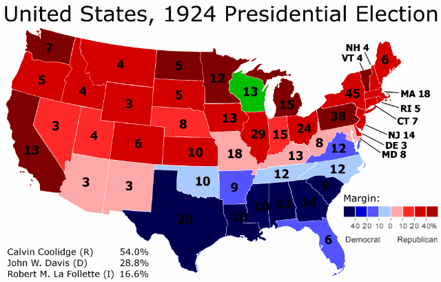
Several maps illustrate this point succinctly. Here is the 1924 presidential election:

Part 2

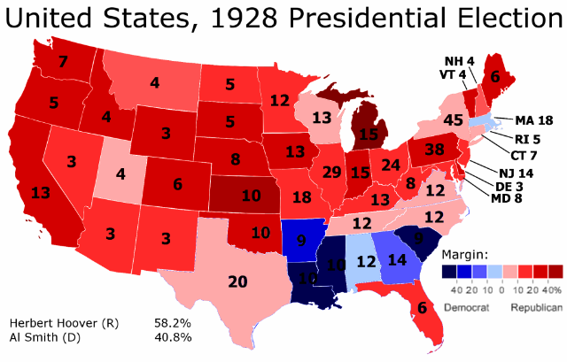
Here is the 1928 presidential election:

Part 3

As one can tell, there is quite a bit of change from the one presidential election to the next. Democratic strength in the Solid South weakens considerably, while the Republican Midwest and Northeast become much less red.

However, it is somewhat difficult to go further into detail just by comparing the two maps. One can sense that a lot is changing, and that certain regions of the country are moving in diametrically opposed directions. But it is all rather vague.

I therefore decided, out of curiosity, to create an actual map of the shift from 1924 to 1928. Here it is:

Photobucket

This is quite the interesting map. One can see the outlines of the current Democratic electoral map here. In some cases the correlation is quite tight. For instance, Indiana is the only state in the Midwest to vote more Republican in 1928 – and what do you know, today Indiana votes the most Republican out of all the states in that region.

In general the relationship is very strong in the eastern half of the country. The only “wrong” states are today’s Democratic strongholds of Maryland and Delaware. Also, the degree of shift does not perfectly correlate to Republican strength in some of the Southern states. But these are small details; in the East, states that moved Democratic in 1928 vote Democratic today, while states that moved Republican in 1928 vote Republican today.

West of Minnesota, however, the relationship breaks down. In more than a third of the states in the West, the way they shifted in 1928 is opposite of how they vote today. The most obvious outlier is Utah, today a rock-solid Republican stronghold that moved sharply Democratic in 1928.

There are two other very interesting and strange things that are happening in this map. They will be the subject of the next post.

–Inoljt