14-4 Illinois Map: Second Attempt

The partisan data is still not in the Application.  Nevertheless, I wanted to post this DRAFT map now that the Census numbers are out.

I feel that my first attempt 15-3 map was perhaps too ambitious, but I feel confident that 14-4 is VERY doable in Illinois — ofcourse, the lines will have to be ugly like this “Texas-style” map.

I had several goals:

1.) Keep all 3 black seats intact; not easy considering hundreds of thousands of blacks have left Chicago over the last decade.

2.) Create two Hispanic seats — ones that would be guaranteed to elect Hispanic representatives.

3.) Keep all currently Democratic-held seats at very high Democratic levels (this includes the minority-majority seats, ofcourse, as well as IL-3, IL-5, IL-9, and IL-12).

4.) Create seats where the incumbent Democrat would keep as much of his or her current constituents as possible.

5.) Create a map whereby there are only 4 Republican seats, the newly created Democratic seats must be at relatively high Democratic levels – ideally around 65% Obama or higher in the Chicago area and around 60% Obama or higher in downstate and/or 5 points more Democratic than the existing seat.

6.) As a finishing touch, create a map whereby Aaron Schock and Adam Kinzinger will basically not have a seat to run in.

Here’s the map:

Photobucket

Photobucket

Photobucket

Goal 1:  Preserving African-American seats – under this map, virtually all black-majority precincts in the Chicago area become parts of the 3 black-majority districts.  The reason the black percentage goes down in all 3 seats is because hundreds of thousands of blacks have left the area over the last decade.

New IL-1 is 51.3 black, 38.7 white (18+ pop. is 51.5 black, 40.1 white) – Rush gets to keep 53% of his current constituents, including 75% of his current black constituents.

New IL-2 is 51.8 black, 37.2 white (18+ pop. is 50.1 black, 40.5 white) – Jackson gets to keep 80% of his current constituents, including 83% of his current black constituents.

New IL-7 is 51.8 black, 34.8 white (18+ pop. is 50.1 black, 37.5 white) – Davis gets to keep 59% of his current constituents, including 90% of his current black constituents.

Goal 2:  Two Effective Hispanic seats

New IL-4 is 56.0 hispanic, 33.2 white (18+ pop. is 50.4 hispanic, 38.9 white) – these percentages are enough to elect a Hispanic Representative as IL-4 encompasses the mostly Puerto Rican-descent areas on the north side of Chicago where the Hispanics are all citizens.  It makes sense to me that Gutierrez would run here.

New IL-6 is 64.1 hispanic, 25.1 white (18+ pop. is 58.5 hispanic, 30.1 white) – this area encompasses the mostly Mexican-descent areas on the south side of Chicago where there’s a higher proportion of non-citizens, so I made the Hispanic percentage here noticeably higher in order to make sure that a Hispanic Representative is elected.

Goal 3:  Make sure all currently Democratic-held seats are safely Democratic.

My estimate is that the 3 new black-majority seats and the 2 new hispanic seats above are all in the 75-79 Obama range (ofcourse, there’s currently only one hispanic seat but I’m classifying IL-4 and IL-6 as “Dem-held” as Gutierrez currently represents roughly half of each district) …

For the other currently Democratic-held seats the partisan numbers (ESTIMATED Obama as a percentage of the 2-party vote) are as follows:

New IL-3 is 62.3 Obama (current district is 64.4 Obama)

New IL-5 is 68.3 Obama (current district is 73.9 Obama)

New IL-9 is 70.2 Obama (current district is 73.2 Obama)

New IL-12 is 60.9 Obama (current district is 56.4 Obama)

Goal 4:  Incumbent-protection

I already discussed above what percentage of their constituents the Democrats in the minority-majority seats would keep.  For the other Democratic incumbents the numbers are as follows:

New IL-3: Lipinski gets to keep 33% of his current constituents (that’s the lowest percentage of all incumbent Democrats but a good chunk of the new Hispanic-majority IL-6 comes out of territory that’s currently a part of IL-3).

New IL-5: Quigley gets to keep 70% of his current constituents

New IL-9: Schakowsky gets to keep 75% of her current constituents

New IL-12: Costello gets to keep 63% of his current constituents

Goal 5:  Get rid of 7 of the current 11 GOP members through re-drawing of lines.

– As already mentioned, IL-6 goes from a suburban GOP district to a Hispanic-majority Democratic district based in Chicago (ofcourse, Roskam can run in the new IL-16 which becomes sort of a Chicago-area GOP vote sink).

– New IL-8 is 65.1 Obama (current district is 56.5 Obama), so Walsh is history (or he can run in the new IL-16).  The new IL-8 should be friendly to Bean if she wants to make a comeback.

– New IL-10 is 65.3 Obama (current district is 61.5 Obama), plus the district has a lot of new territory, including the entire Lake Michigan shoreline — so Dold is history.

– New IL-11 is 59.2 Obama (current district is 54.2 Obama).  Only 19% of Kinzinger’s current constituents remain in IL-11 under the new lines, so his base basically disappears with this map.  Also, the new IL-11 includes 3 major university towns.  It’s likely that this district would flip back to the Democratic side in 2012.

– New IL-14 is 62.4 Obama (current district is 55.6 Obama).  Hultgren won here over Foster by 51-45 (with the Green candidate at 4%) in a major GOP year, so the 7-point Democratic increase should more than do the job.  (Hultgren can run in the new IL-16 ofcourse.)

– New IL-17 is 60.8 Obama (current district is 57.2 Obama).  The lines are scrambled here considerably (less than half of the population of the new IL-17 comes out of Schilling’s current constituency) and most of Rockford is now included.  I really believe that almost any Democrat other than Hare would have no trouble here in 2012.

– IL-19 no longer exists, so that’s also one less Republican (although Shimkus may want to run in the new IL-18 — see below).

By my estimate, John Kerry would have won all of the 14 Democratic seats created by this map.

The four GOP seats that remain:

– IL-13: now transferred to the southern reaches of the state but without an incumbent.  Although Republican, less so than the other 3 GOP seats, so perhaps a possibility that a moderate to conservative Democrat could win here.

– IL-15: Johnson gets to keep 67% of his current constituents under the new lines.

– IL-16: The most likely Republicans to run here include Manzullo, Walsh, Hultgren, Roskam and Biggert (not necessarily in that order) — yes, the map packs these 5 into one district, with a few Dold precincts also included !

– IL-18: designed more for Shimkus than for Schock — 29% of the new district’s population comes out of Shimkus’ current district, while only 20% comes out of Schock’s … which brings me to the last goal …

Goal 6:  Make it hard for Kinzinger and Schock

I already discussed Kinzinger a bit above.  Basically, the current IL-11 gets split as follows: 19% of Kinzinger’s constituents remain in IL-11; 30% go into the new IL-2; 22% into IL-1; 18% into IL-3; 6% into IL-15; and 5% into IL-18.

As far as Schock, his current district is likewise torn apart; the highest proportion of his current constituents (30%) goes to IL-15; the rest is divided among IL-11 (27%); IL-18 (20%); IL-13 (15%); IL-12 (7%); with a sliver going to IL-17.

To briefly sum up my map:

1.) Democratic; black-majority; Rush

2.) Democratic; black-majority; Jackson

3.) Democratic; 62.3 Obama; Lipinski

4.) Democratic; hispanic-majority; Gutierrez

5.) Democratic; 68.3 Obama; Quigley

6.) Democratic; hispanic-majority; new Hispanic representative (?)

7.) Democratic; black-majority; Davis

8.) Democratic; 65.1 Obama; Bean (?)

9.) Democratic; 70.2 Obama; Schakowsky

10.) Democratic; 65.3 Obama; new Dem. representative (?)

11.) Democratic; 59.2 Obama; new Dem. representative (?)

12.) Democratic; 60.9 Obama; Costello

14.) Democratic; 62.4 Obama; Foster (?)

17.) Democratic; 60.8 Obama; new Dem. representative (?)

13.) Republican; new GOP Rep. (?)

15.) Republican; Johnson

16.) Republican; Manzullo, Hultgren or Walsh most likely to win here

18.) Republican; Shimkus

Michigan State House Redistricting, Part I

This is first in a series of diaries looking at redistricting in the Michigan State House. I’m not totally sure how many parts there will be yet. The current diary is focused on Wayne County, home of Detroit, and the county with the worst numerical net loss of population over the last ten years of any in the country — just short of a quarter million.

The upshot here is that Wayne County currently possesses 23 state house districts; with the population loss, it’s going to drop to 20. All three seats loss are Detroit-based.

Michigan has a 110-member state house. In 2010, the Republicans gained nineteen seats while losing none, to take control of the chamber by a 63-47 margin.

I haven’t done a full map yet, so I don’t know for sure where those seats are going, but I have to assume that the loss of three safe seats in Detroit is going to make the task of regaining the chamber even more difficult for the Democrats.

Maps and more after the jump.

Note: ideal district size is now 89,851 people. The allowed deviation is 5%, I believe, which translates to 4492 people.

Old Districts

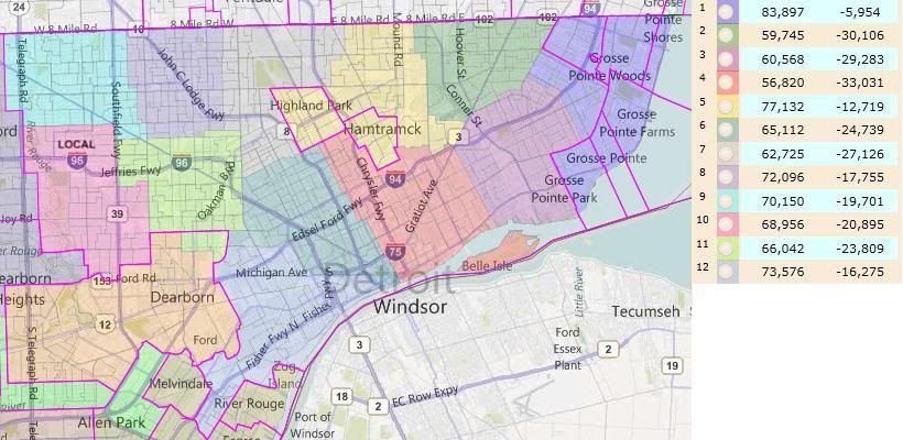
Here’s an approximation of the current districts based solely or partially in Detroit in Dave’s App:

Notice how under-populated the Detroit-based districts are. HD-01 (Grosse Pointes) is majority white; HD-12 (Southern Detroit) is majority Hispanic (total population, just short on VAP); the rest are majority African American. HD-01 is the only competive district, going 54-46 Democratic in 2010. The rest are safely Democratic.

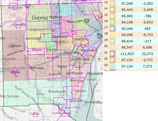
Here’s the approximation of the rest of the county’s districts:

I lightened the colors to make the locality boundaries stand out. This obscures, to my vision, one of the district boundaries. The boundary between HD-14 (Northern Downriver) and HD-22 (Romulus/Taylor) is the Taylor/Allen Park city line.

Surprisingly, to me, there are actually four districts that are overpopulated; three of which are outside the allowable deviation. HD-21 is going to have to be broken up — that’s a really significant positive deviation.

Republicans hold three of these seats: HD-19 (Livonia), HD-20 (Plymouth/Northville), and HD-23 (Southern townships). Of the remaining seats, only HD-21 is competitive. The Democrats held on in 2010 by 51%-49% – about 900 votes. All of these seats should be winnable by the right Democrat in the right environment — I’m pretty sure, for example, that Obama carried every Wayne County district. Also, I’m reasonably certain that HD-20 would have the most Republican PVI, and it was a 2010 pickup for them.

Collectively, the Wayne County districts are 246k underpopulated. The twelve Detroit-based districts account for all but .8k of that shortfall. (That is, the number of non-Detroit-based districts is the same. All of the districts lost in Wayne County will be Detroit-based.)

New Districts

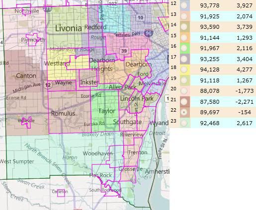
Michigan redistricting standards encourage linedrawers to maintain the integrity of localities where possible. This is the arrangement that I came to while redistributing the eleven non-Detroit-based districts within the limits of that guideline, while trying to protect the three Republican incumbents.

HD-23 (Southern townships) and HD-13 (Southern Downriver) are the only truly clean districts, with Gibraltar having been swapped from the former to the latter.

HD-21 needs to be broken up. Plymouth, Plymouth Twp, Northville, Northville Twp, Canton and Wayne combine to within 4k of the ideal for two districts. A real Republican plan would take into account how best to split Canton to their advantage; my selection of precincts to end up in HD-20 and HD-21 was arbitrary. HD-21, however, should end up more Republican than before: Van Buren Twp and Belleville together are both more Democratic and larger than Wayne.

Livonia and Dearborn are each slightly too large to be single district. I maintained Livonia’s current donation to HD-17, Dearborn ends up donating into HD-14 (Northern Downriver) instead of into Detroit. This is because HD-14 was too large with River Rouge (which therefore ends up in a Detroit-based district) but worked with the donation from Dearborn.

With Van Buren/Belleville bounded on the north by HD-21 and on the south by HD-23, the only place for them to go was into HD-22 to the east. This required Romulus and Taylor to split. I ended up combining Romulus/Van Buren/Belleville with Inkster and enough of Westland to connect them (the portion south of Garden City and east of Merriman Rd), thereby creating an African-American opportunity district. (It’s W 46.8, B 44.9 by total pop; W 50.7, B 42.4 by VAP.) Taylor then combines with the portion of Dearborn Heights south of Ford Road to make HD-16.

The final two districts are then HD-18 (Garden City and the portion of Westland west of Merriman Rd) and HD-17 (Redford, the part of Livonia not in HD-19, the part of Dearborn Heights not in HD-16, and the part of Westland not in HD-18 or HD-22).

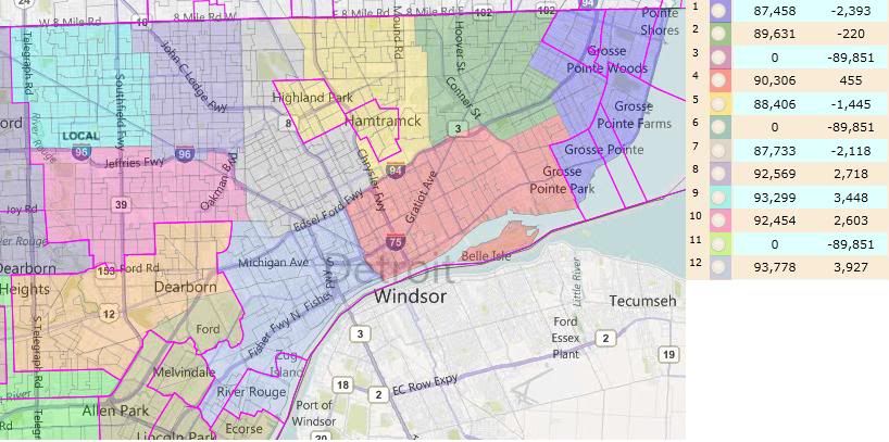
The Detroit-based district here are more representative than predictive. I don’t know enough about the incumbent representatives to know which the Republicans might favor or disfavor through redistricting. But you can see in general terms what Detroit looks like with three fewer districts than before.

HD-01 is still majority white, although slightly less so. (It should therefore become less competive for the Republicans.) HD-12 is no longer majority Hispanic. It previously contained every heavily-Hispanic precinct it could; its necessary growth diluted the Hispanic percentage down to 44.5% by total population and 39.2% plurality by VAP.

Conclusion

Republicans could potentially net as many as four state House seats in Wayne County from their control of the redistricting process: the three that are disappeared from Detroit (depending on where they end up) and HD-21, a competitive seat that will be somewhat less Democratic than before.

A Closer Look at the 25 Fastest-Growing Districts

Yesterday I created lists of the biggest gainers and losers among congressional districts over the period of 2000-10, but only hinted at the changes in racial composition that were underlying the overall population changes. A longer post about the racial composition (analogous to this one I did a year and a half ago) changes is in the works, but as part of that I conceived of this table… which really would have worked better with yesterday’s piece, so I’m giving it its own home here. It shows the numeric change in each district, broken down by the numeric change among each race in each district.

What should stand out here is that among the 25 biggest gainers, in most of the districts, the combined non-white gains exceeded the (non-Hispanic) white gains. Among the few that didn’t, some are districts that are either heavy on retirees (AZ-02, FL-05), some have a large Mormon population (AZ-06, UT-03), with a few a little harder to classify (GA-09 is sort of the exurban white flight receptacle from the rest of the Atlanta area, and ID-01 is a mix of a lot of Mormons and a lot of white flight from southern California). As always, as I’ve cautioned many times before, these districts aren’t an immediate panacea for Democrats and look to stay fairly red for the short term; with most of these districts full of kids (kids who aren’t likely to grow up to be Republicans, though!), gains at the ballot box are going to unfold slooooowly.

District Rep. Total
change
White
change
Black
change
Asian
change
Hispanic
change
NV-03 Heck (R) 378,510 108,587 40,011 71,132 136,127
AZ-02 Franks (R) 331,404 171,702 20,194 14,194 110,853
AZ-06 Flake (R) 330,373 183,522 18,103 23,727 89,920
TX-10 McCaul (R) 329,844 81,819 49,129 31,182 159,747
FL-05 Nugent (R) 289,814 178,699 27,165 10,496 65,238
CA-45 Bono Mack (R) 275,656 56,706 17,886 22,645 170,850
GA-07 Woodall (R) 272,680 10,327 123,993 47,477 80,659
TX-26 Burgess (R) 263,279 112,403 20,457 21,450 100,522
TX-22 Olson (R) 259,220 10,994 66,263 64,288 112,521
TX-31 Carter (R) 250,233 108,700 24,991 16,193 89,632
NC-09 Myrick (R) 232,672 96,914 62,615 15,404 47,784
VA-10 Wolf (R) 225,723 58,443 19,165 65,737 71,862
UT-03 Chaffetz (R) 221,687 116,807 4,236 7,233 79,400
FL-14 Mack (R) 219,658 99,639 23,344 7,121 85,608
AZ-07 Grijalva (D) 214,773 31,852 14,353 7,048 154,255
NC-04 Price (D) 207,446 95,066 30,678 30,282 43,656
CA-44 Calvert (R) 205,748 15,323 8,961 36,006 142,532
CA-25 McKeon (R) 205,552 – 11,603 33,418 23,554 156,518
TX-21 Smith (R) 205,024 69,035 13,983 15,086 102,114
FL-12 Ross (R) 202,103 38,827 46,963 8,079 101,630
TX-28 Cuellar (D) 200,565 25,648 3,741 3,060 166,375
TX-23 Canseco (R) 196,502 36,500 8,704 8,756 139,265
TX-04 Hall (R) 194,642 93,402 19,450 12,972 60,583
GA-09 Graves (R) 193,905 116,666 8,550 9,842 53,801
ID-01 Labrador (R) 193,008 141,065 2,289 3,448 39,020

NC Independent Redistricting: UPDATED

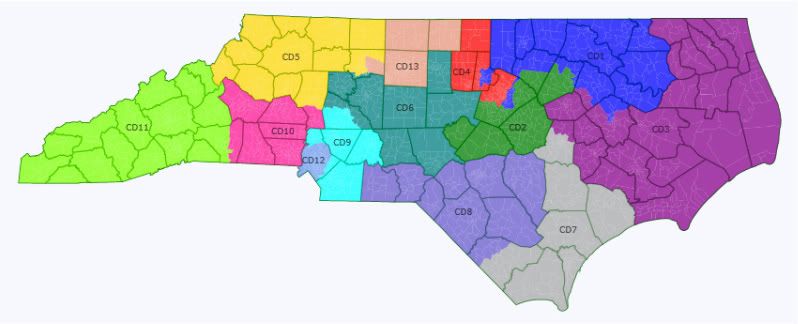
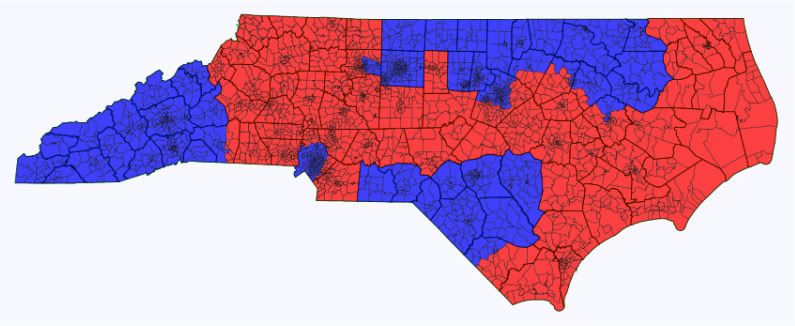
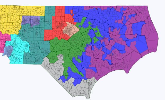
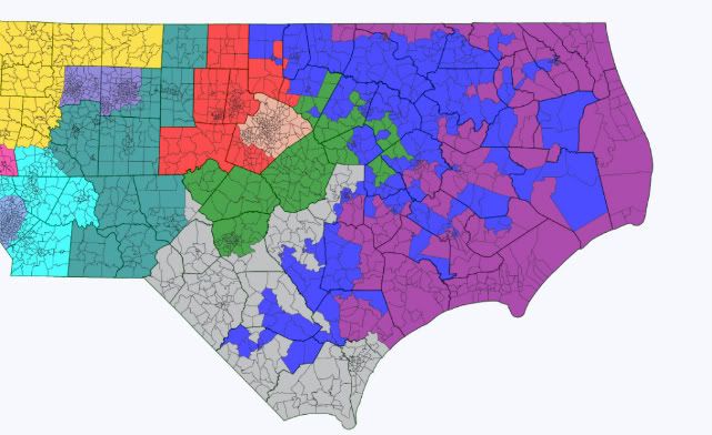
The following map was drawn to resemble the potential product of a possible non-partisan independent redistricting commission which has been proposed but unlikely to be implemented in North Carolina.  The goals I had for drawing the districts consisted of geographic compactness, relevant communities of interest without regard to incumbency, and maintaining a VRA-protected black majority district in northern/eastern NC.  Only 13 counties were split, 6 of which were done to draw a VRA district, and I tried to avoid splitting towns where possible.

Photobucket

Photobucket

Photobucket

NC-01 (Blue)     (Open)

70.2% Obama     50.0% Black, 38.8% White

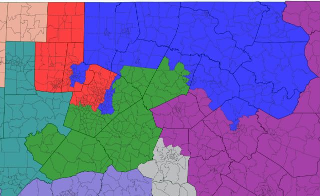
The first district is VRA protected and hence was my starting point since it needed to gain around 100,000 people from its current configuration.  The major change is that the 1st now includes the heavily black portions of Durham and Raleigh and recedes from the coast to avoid splitting counties.  The black voting age population could likely be increased a couple percentage points with precinct level data since the Wake county voting districts are quite large.  This was also the only district which required double-crossing counties, but it is still far more compact than the current version.

Politically, this district is still very heavily Democratic, and although it no longer contains G.K. Butterfield’s home of Wilson he would probably run here.

Safe Democratic

NC-02 (Green)     Renee Ellmers (R-Dunn)

55.2% McCain     70.9% White

The second district becomes much more compact by shredding its arms into Fayetteville and Sampson County and settling around suburban Wake County.  Ellmers would probably like this district since it’s much more Republican, however she is representing a large amount of new territory.  Suburban Wake County was also home to a large amount of the region’s explosive growth as people moved into North Carolina, and the district will likely experience substantial change over 10 years. The same disclaimer for NC-01 goes here though: the Wake County voting districts contain very large amounts of people so precinct data would make the 2nd Whiter since it could trade black population to the 1st.

Safe Republican

NC-03 (Purple)      Walter Jones (R-Farmville) / G.K. Butterfield (D-Wilson)

54.1% McCain     68.6% White, 24.6% Black

As the second part of the map I drew, the 3rd is essentially a complement to the 1st by absorbing its tendrils towards the coast.  The most major changes to the 3rd are that it no longer includes Onslow County and Camp Lejeune while including New Bern and Wilson since it is intended to be a district for the northeastern coast and Outer Banks.  While both Jones and Butterfield live here, Jones would be heavily favored and fairly lucky that he didn’t get drawn into NC-01.  While moderate-to-conservative white Democrats have historically done well in eastern NC, the Democratic primary would contain a large minority voting base which could increase the chances of nominating a minority candidate or someone viewed as too liberal.  Furthermore, Jones has a fair amount of crossover support, likely due to his father’s long tenure as a Democratic rep and his own somewhat heterodox positions.  Lastly, state Dems suffered heavy losses here in 2010, which could signal the rise of more party polarization among whites.

Safe Republican

NC-04 (Red)     David Price (D-Chapel Hill) / Brad Miller (D-Raleigh)

61.1% Obama     70.4% White, 14.2% Black

The 4th district trades large amounts of Wake County among neighboring districts so that it contains the rest of Raleigh and Durham, in addition to Chapel Hill and most of Cary.  Like the 2nd, this district contains some of the highest-growth parts of the state, but unlike the second would have a very large proportion of white liberals.  A Democrat is virtually guaranteed to win here, but since both Price and Miller have a large part of their base in the district it would be interesting to see who would emerge from a primary, although it is possible that Price would retire instead.

Safe Democratic

NC-05 (Yellow)     Virginia Foxx (R-Banner Elk)

59.1% McCain     84.1% White

The 5th is largely unchanged from the current district but on the whole moves slightly westward to accommodate the changes to the 10th.  It still contains about half of Winston-Salem which only makes up a fifth of the total district.  Unfortunately, this means that Virginia Foxx could and would win here.

Safe Republican

NC-06 (Teal)     Larry Kissell (D-Biscoe)

60.6% McCain     79.2% White

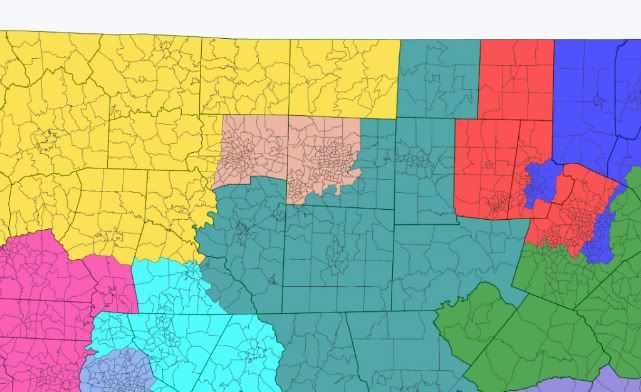
The 6th was drawn to constitute represent small town/rural central NC and therefore loses its large portions of Guilford County.  The largest city in the new 6th is now Burlington with 50,000 people and the next two largest cities are around half that size.  While Kissell is drawn into the district, it’s much more likely that he would run in the neighboring 8th if he ran at all and that Howard Coble would run here since it contains a decent portion of his current district.  In the event that Coble retired, a Republican would have little trouble holding this seat.

Safe Republican

NC-07 (Gray)     (Open)

54.7% McCain     72.4% White, 17.6% Black

The new 7th was drawn to include the southernmost portion of the NC coast and as a result contains Wilmington, Jacksonville, and then Goldsboro at the northern end since I thought it more appropriately belonged to eastern NC than to a Raleigh metro area district.  Mike McIntyre might consider running here since he already represents Wilmington and over half the total district. Like the 3rd, this district contains areas which have been friendly to conservative white Democrats, so McIntyre wouldn’t be completely screwed, but would still be facing a very difficult challenge.

Likely Republican

NC-08 (Slate)     Mike McIntyre (D-Lumberton)

55.8% Obama     48.2% White, 32.3% Black, 8.8% Native, 7.3% Hispanic

The 8th district changes significantly by losing Charlotte and becoming anchored around Fayetteville and Robeson County, which contains McIntyre’s home of Lumberton.  This district forms a better community of interest for inland southeastern NC and also has a significant minority presence due to a large black and Native American population.  Mike McIntyre wouldn’t stand a chance here though since he’s far too conservative for a 56% Obama district and would likely face a challenge from a minority/liberal Democrat.  Larry Kissell on the other hand might be able to win here since it contains a majority of the current 8th and Kissell probably has more credibility to move to the left than McIntyre would.  Regardless of who wins the eventual primary barring a Coakley repeat, Democrats would be heavily favored.

Safe Democratic

NC-09 (Cyan)     (Open)

59.6% McCain     77.5% White

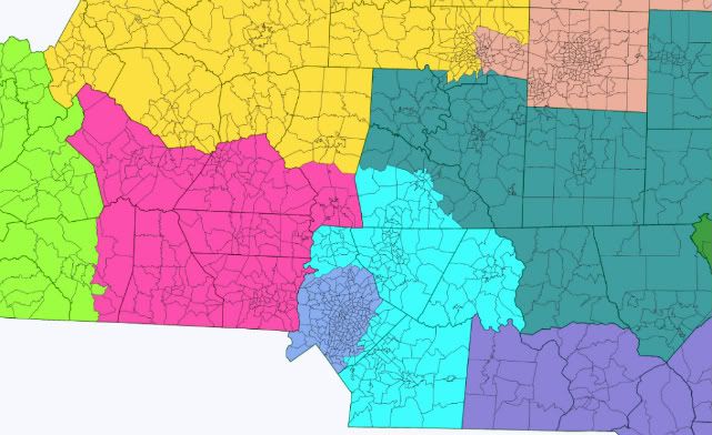
The 9th changes significantly by moving out of almost all of Charlotte proper and instead forms around the suburbs and exurbs to the east and north of the city.  As drawn, this district had the most growth of any over the past 10 years and will probably continue to see significant growth as the Charlotte metro area grows.  Sue Myrick technically lives in Charlotte, but she would probably have no trouble running and winning here despite half the territory being new.

Safe Republican

NC-10 (Magenta)     Patrick McHenry (R-Cherryville)

62.3% McCain     81.9% White

The biggest change to the 10th is that it now includes all of Gastonia and Appalachian territory to the 5th and 11th.  The core of the district is a bit more southwestern Piedmont NC now than Appalachian, but still contains elements of both.  Like with Virginia Foxx, McHenry is essentially still representing his own seat due to geographic constraints.

Safe Republican

NC-11 (Chartreuse)     Heath Shuler (D-Waynesville)

52.2% McCain     88.9% White

The 11th undergoes the least change of all the districts since it is tucked into a corner.  The only changes include the addition of Mitchell County and more of Rutherford County.  As a result, this district stays fairly swingy, but Shuler should have a strong advantage due to his incumbency and conservatism.

Likely D with Shuler

Tossup/Tilt R if Open

NC-12 (Steel Blue)     Mel Watt (D-Charlotte) / Sue Myrick (R-Charlotte)

66.4% Obama     48.1% White, 33.5% Black, 11.7% Hispanic

Nearly everyone who’s learned of gerrymandering in civics class in the last 20 years knows of the infamous NC-12 (though usually in the context of it helping Democrats… yeah, I’m not sure how that still happens either).  Well fear no more, the arm up I-85 is gone!  The 12th is not a legally mandated VRA district and thus can avoid worrying about retrogression.  The district now contains almost all of Charlotte proper in addition to the western edge of Mecklenburg County.  It’s still majority minority, but plurality white.  However, this district grew significantly from 2000-2010 and went from 55.9% to 44.2% white by total population.  Anyway, Mel Watt should be pretty well situated to win here if he can avoid a primary challenge; only 1/3rd of the district is currently in the 12th, but it consists mostly of black Democrats who form Watt’s base.

Safe Democratic

NC-13 (Salmon)     Howard Coble (R-Summerfield)

57.6% Obama     58.3% White, 31.0% Black, 6.5% Hispanic

The 13th is essentially a different district, and here it gives the Triad its own district since the 12th is now removed.  Since I wanted to make the 5th and 6th as compact as I could without having them surround the 13th, I ended up splitting Winston-Salem and giving the more minority heavy parts to the 13th.  An alternative drawing places all of Winston, High Point, and Greensboro in the 13th and has the 5th and 6th readjust to take in Rockingham and Caswell counties plus rural/suburban Guilford, but I felt that this was too much of a gerrymander and it also splits another county.  In any event, Coble stands no chance here and probably calls it quits, but since he has supposedly forsworn his House pension and retirement benefits, he might run in the 6th instead.  Democrats should easily hold this version of the 13th.

Safe Democratic

Alternate NC-5/6/13:

NC-05 62.3% McCain

NC-06 60.2% McCain

NC-13 60.3% Obama

Photobucket

The likely result:  5D – 7R – 1(Shuler)

Photobucket

Summary:

Overall the district lines have become much cleaner, especially in eastern NC.  All but 3 of the seats are practically safe for the incumbent party, and the likely partisan change in the near-term results in Republicans picking up the 7th district.  From a compactness standpoint, the districts correlate fairly clearly to distinct communities of interest, especially in Eastern NC, and Charlotte and the Triad get their ‘own’ seats.  Again, the black % of the 1st can be increased with a more precise mapping tool since the Wake County voting districts are huge.

What I really liked about this map was the division of southeastern and coastal NC since they constitute pretty coherent communities of interest.  Additionally, both the 7th and 3rd contain areas where moderate to conservative Democrats performed fairly well, although Dems lost several statehouse seats there in 2008, but the partisan numbers for Obama/McCain are somewhat misleading since he significantly underperformed Kay Hagan in 2008.  Therefore, Dems would have a decent chance to win the 7th with a strong moderate candidate in the right environment, but barring a McIntyre upset in 2012, and thus continued incumbency, would still be the definite underdogs.  Regardless, the coastal area is likely a region where Democrats are losing their influence due to increasing ideological and race-based voting polarization.

Lastly, this map goes to show how even an independent or non-partisan map still has its obvious downside since it’s very easy to pack in Democrats in urban areas, and is among other reasons why I think it’s preferable to have some mix of proportional representation.  An independent commission wouldn’t pass the General Assembly either since Republicans now have full control of the process, but it is nonetheless interesting to create a theoretically commission-drawn map.

UPDATE:

Per suggestions by user displacedyankdem I redrew the map to feature a rural NC-01 that doesn’t include any of Raleigh or Durham… and it ends up being pretty ridiculous, which leads me to think that it would have to contain either Durham or Raleigh.  But here it is with two different configurations for Fayetteville:

Photobucket

Photobucket

In both versions the 4th is now a Chapel Hill, Durham, Chatham County/Southern Wake County district, while the 13th is Raleigh and Cary.  The Triad is now the 8th due to that district being eliminated.  The 1st also meanders down the entire eastern interior of the state to find black voters, and it’s still only 50% VAP black.  The 3rd is now the entire coast north of Wilmington.  For these districts, the major change is that the 3rd becomes significantly whiter and more Republican while the Dem friendly district based in the southeast moves to form a third Dem district further north.

The variation between these two maps comes from Fayetteville; I had wanted to draw the 7th as a New Hanover, Robeson, and Cumberland County based district, but Fayetteville had too much population for that so in the first version it’s split while in the second it’s all given to the 2nd district.  The split version makes the 7th 51.7% Obama and the 2nd 58.8% McCain, while the second version the 7th is 53.7% McCain and the 2nd is 52.1% McCain.  Mike McIntyre would probably be all right in the version where his district contains Fayetteville, but would likely have a tough time in the other version.

Anyway, this all goes to show how difficult it is to draw a VRA district without including one of the major cities since North Carolina’s black population is so diffuse.

By what margin will Bob Shamansky win?

View Results

Loading ... Loading ...

A Less Competitive New Hampshire

New Hampshire currently has two districts that have changed hands a total of four times in the last five years. Whilst it is probably a good thing to have competitive districts, a question we could ask about New Hampshire is what might the map look like if there was bipartisan agreement to split the congressional districts between the parties?

CD 1 (Blue): 48.9% Obama

CD 2 (Green): 60.5% Obama

Population Change by CD and by County

With the Census Bureau having completed its gradual rollout of data from all the states last week, I’ve finally gotten around to assembling data from all the various congressional districts into one place. While the actual population gain or loss in each district isn’t as important a number, for SSP purposes, as the number of people each district will need to shed or gain as part of the redistricting process (which you can see in the various posts we did as each state’s data came out), the overall gain and loss is an important part in the overall picture of where people are moving to and from (and where they’re being born). Just the numbers of people moving in or out isn’t as helpful as knowing who exactly these people are, and we’ll delve a little more deeply into the changing racial compositions of the CDs in the next day or two… but for now, here are the overall population change numbers.

You’re probably noticing, “Wow, that’s a lot of Republican districts.” That’s certainly true, but these are also districts that (as we’ll see when we talk about changing racial composition), for the most part, aren’t becoming more Republican; people tend to bring their values with them rather than undergoing some magical David Brooksian conversion experience once they move in from the city, the inner-ring suburbs, or another country. Some of these districts are ones where much of the gains are Hispanic (like NV-03 or TX-10, or just about any California district on the list); in the case of GA-07, it’s becoming more African-American. That isn’t to say that these are all on the verge of becoming blue, of course; with much of these districts’ non-white populations under 18, it’ll be a gradual process. And redistricting is likely to de-diversify at least some of these districts, with some of the closer-in suburban portions of these districts (note that many of these districts are the ones right on the cusp of suburb and exurb) to be given to lower-population urban districts that need to expand outward, with the remaining parts of the districts staying red. (GA-07, again, is a case in point; the innermost parts of Gwinnett County, which are pretty diverse today, probably will need to get added on to underpopulated GA-05, leaving the rest of the district in very Republican-friendly condition.)

You may recall I did this same thing a year and a half ago when the 2008 estimates came out; there’s been very little change to the list since then, although with some swapping of places. Despite its position at the absolute epicenter of the housing bubble, NV-03 moved up from 4th to 1st place, past the two Arizona districts and TX-10. Districts that fell out of the top 25 in 2008 include GA-06, TX-03, CO-06, FL-25, IL-14, and FL-06, replaced by VA-10, FL-12, TX-28, TX-23, TX-04, and ID-01.

District Rep. 2000 2010 Change
NV-03 Heck (R) 665,345 1,043,855 378,510
AZ-02 Franks (R) 641,435 972,839 331,404
AZ-06 Flake (R) 641,360 971,733 330,373
TX-10 McCaul (R) 651,523 981,367 329,844
FL-05 Nugent (R) 639,719 929,533 289,814
CA-45 Bono Mack (R) 638,553 914,209 275,656
GA-07 Woodall (R) 630,511 903,191 272,680
TX-26 Burgess (R) 651,858 915,137 263,279
TX-22 Olson (R) 651,657 910,877 259,220
TX-31 Carter (R) 651,868 902,101 250,233
NC-09 Myrick (R) 619,705 852,377 232,672
VA-10 Wolf (R) 643,714 869,437 225,723
UT-03 Chaffetz (R) 744,545 966,232 221,687
FL-14 Mack (R) 639,298 858,956 219,658
AZ-07 Grijalva (D) 640,996 855,769 214,773
NC-04 Price (D) 619,432 826,878 207,446
CA-44 Calvert (R) 639,008 844,756 205,748
CA-25 McKeon (R) 638,768 844,320 205,552
TX-21 Smith (R) 651,930 856,954 205,024
FL-12 Ross (R) 640,096 842,199 202,103
TX-28 Cuellar (D) 651,259 851,824 200,565
TX-23 Canseco (R) 651,149 847,651 196,502
TX-04 Hall (R) 651,500 846,142 194,642
GA-09 Graves (R) 629,678 823,583 193,905
ID-01 Labrador (R) 648,922 841,930 193,008

And here are the biggest losers, looking every bit as heavily Democratic as the list of gainers is Republican. However, if you go through the list line by line, you’ll notice that very few of these districts are even remotely-considered as being on the chopping block. That’s partly because many of these are VRA seats, or otherwise set up by Republican legislatures as Democratic vote sinks (PA-14, for example). The most obvious exceptions up for elimination are PA-12, which almost everyone concedes is gone with the wind, OH-10, which is set to get mashed with OH-13, and possibly IL-17, ironically one of the few GOP-held seats on the list (although it might instead wind up getting turned into a significantly bluer district by the now-Dem-controlled Illinois legislature). Instead, as I mentioned earlier, many of these districts are going to wind up reaching out further into the suburbs… in many cases, expanding to follow the same constituents who just moved out of the city (for instance, all the Detroit residents who moved across 8 Mile into MI-12).

District Rep. 2000 2010 Change
LA-02 Richmond (D) 639,048 493,352 – 145,696
MI-13 Clarke (D) 662,844 519,570 – 143,274
MI-14 Conyers (D) 662,468 550,465 – 112,003
OH-11 Fudge (D) 630,668 540,432 – 90,236
IL-01 Rush (D) 654,203 587,596 – 66,607
PA-14 Doyle (D) 645,809 584,493 – 61,316
IL-04 Gutierrez (D) 653,654 601,156 – 52,498
IL-02 Jackson (D) 654,078 602,758 – 51,320
MS-02 Thompson (D) 710,996 668,263 – 42,733
NY-28 Slaughter (D) 654,464 611,838 – 42,626
MO-01 Clay (D) 621,497 587,069 – 34,428
PA-12 Critz (D) 646,419 612,384 – 34,035
AL-07 Sewell (D) 635,631 603,352 – 32,279
OH-01 Chabot (R) 630,545 598,699 – 31,846
OH-10 Kucinich (D) 631,003 599,205 – 31,798
OH-17 Ryan (D) 630,316 600,111 – 30,205
CA-31 Becerra (D) 639,248 611,336 – 27,912
MI-05 Kildee (D) 662,584 635,129 – 27,455
MI-12 Levin (D) 662,559 636,601 – 25,958
NY-27 Higgins (D) 654,200 629,271 – 24,929
IL-09 Schakowsky (D) 653,117 628,859 – 24,258
NY-11 Clarke (D) 654,134 632,408 – 21,726
TN-09 Cohen (D) 631,740 610,823 – 20,917
IL-17 Schilling (R) 653,531 634,792 – 18,739
PA-02 Fattah (D) 647,350 630,277 – 17,073

Much more over the flip…

Now, let’s switch over to counties. Counties are a unit of analysis that don’t get talked about at SSP as much as congressional districts, despite the fact that they’re more useful for talking about historical trends because their boundaries (almost) never change over the decades; the rationale, I suppose, is that much of the nation’s population lives in huge counties that contain multiple (or in the case of Los Angeles County, more than a dozen) CDs, so in many cases it’s not as granular a sort (and conversely, counties turn into too-granular a sort if you’re interested in, say, Kansas or west Texas).

Still, looking at which counties gained the most population in raw numbers, it provides an interesting counterpoint to the biggest-gaining CDs. While you’d get the impression of impending utter Republican dominance by looking at the party IDs of which CDs have excess population to shed, looking at the nation’s largest counties shows that, when you balance out the parts and pieces that make up the various CDs, many of the counties have very swingy results at the presidential level. I was also planning to look at changes in racial composition by county as well as by CD in the coming days, so it’ll also become quite evident (if you hadn’t already mentally extrapolated from which CDs are in which counties) that much of the growth coming in these fastest-growing counties is coming from non-whites.

County 08 Results 2000 2010 Change
Maricopa, AZ 44/54 3,072,149 3,817,117 744,968
Harris, TX 50/49 3,400,578 4,092,459 691,881
Riverside, CA 50/48 1,541,387 2,189,641 644,254
Clark, NV 58/39 1,375,765 1,951,269 575,504
Tarrant, TX 44/55 1,466,219 1,809,034 362,815
San Bernardino, CA 52/46 1,709,434 2,035,210 325,776
Bexar, TX 52/47 1,392,931 1,714,773 321,842
Los Angeles, CA 69/29 9,519,338 9,818,605 299,267
Collin, TX 37/62 491,675 782,341 290,666
San Diego, CA 54/44 2,813,833 3,095,313 281,480
Wake, NC 57/42 627,846 900,993 273,147
Orange, FL 59/40 896,344 1,145,956 249,612
Miami-Dade, FL 58/42 2,253,362 2,496,435 243,073
Fort Bend, TX 48/51 354,452 585,375 230,923
Hillsborough, FL 53/46 998,948 1,229,226 230,278
Denton, TX 37/62 432,976 662,614 229,638
Mecklenburg, NC 62/37 695,454 919,628 224,174
Gwinnett, GA 44/55 588,448 805,321 216,873
Travis, TX 64/34 812,280 1,024,266 211,986
Hidalgo, TX 69/30 569,463 774,769 205,306
Pinal, AZ 42/56 179,727 375,770 196,043
Sacramento, CA 58/39 1,223,499 1,418,788 195,289
King, WA 70/28 1,737,034 1,931,249 194,215
Palm Beach, FL 61/38 1,131,184 1,320,134 188,950
Kern, CA 40/58 661,645 839,631 177,986

The counties with the biggest numeric loss, on the other hand, are almost all Democratic ones with a few exceptions from the New Orleans suburbs. Some are Dem strongholds that are just intensifying (like Cook County, home of Chicago, whose blueness we kind of take for granted these days… Mike Dukakis won it only 56-43). Others are onetime solid Dem counties that have turned swingy as older ex-unionists die off and educated young voters book their tickets elsewhere (like the western Pennsylvania and West Virginia counties).

County 08 Results 2000 2010 Change
Wayne, MI 74/25 2,061,162 1,820,584 – 240,578
Cook, IL 76/23 5,376,741 5,194,675 – 182,066
Orleans, LA 79/19 484,674 343,829 – 140,845
Cuyahoga, OH 69/30 1,393,978 1,280,122 – 113,856
Allegheny, PA 57/42 1,281,666 1,223,348 – 58,318
Hamilton, OH 53/46 845,303 802,374 – 42,929
St. Bernard, LA 26/71 67,229 35,897 – 31,332
Erie, NY 58/40 950,265 919,040 – 31,225
Baltimore city, MD 87/12 651,154 620,961 – 30,193
St. Louis city, MO 84/16 348,189 319,294 – 28,895
Montgomery, OH 52/46 559,062 535,153 – 23,909
Jefferson, LA 36/62 455,466 432,552 – 22,914
Mahoning, OH 62/36 257,555 238,823 – 18,732
St. Louis, MO 60/40 1,016,315 998,954 – 17,361
Trumbull, OH 60/37 225,116 210,312 – 14,804
Lucas, OH 65/33 455,054 441,815 – 13,239
Fayette, PA 49/50 148,644 136,606 – 12,038
Washington, MS 67/32 62,977 51,137 – 11,840
Beaver, PA 48/50 181,412 170,539 – 10,873
Genesee, MI 65/33 436,141 425,790 – 10,351
Saginaw, MI 58/40 210,039 200,169 – 9,870
Essex, NJ 76/23 793,633 783,969 – 9,664
Hampton city, VA 69/30 146,437 137,436 – 9,001
Cambria, PA 49/48 152,598 143,679 – 8,919
Kanawha, WV 49/49 200,073 193,063 – 7,010

While looking at congressional districts by percentage of change isn’t that interesting (as they all start from a very similar baseline, giving you almost the same results as raw numeric change), it’s worth a deeper look with counties, because counties come in a wide variety of sizes and the fastest-gainers by population don’t dovetail much with the fastest-gainers by percentage. The percentage gainers tend to smaller counties that are poised at the very edge of metropolitan growth, making the transition from rural to exurban. Case in point: #1 Kendall County, which is where you wind up if you find already-exurban Kane County and then head south, to where Chicagoland meets the prairie. The bigger-name counties on this list, like Loudoun County, Virginia, Douglas County, Colorado, and Collin and Fort Bend Counties, Texas, are some of the archetypal exurbs of decades past, which are starting to diversify and make the stylistic transition from exurb to outer-ring suburb… and their voting patterns are starting to change too, with Loudoun turning light-blue and Douglas and Collin still pretty red but making sharp moves in 2008.

County 08 Results 2000 2010 Change
Factor
Kendall, IL 53/46 54,544 114,736 2.10
Pinal, AZ 42/56 179,727 375,770 2.09
Flagler, FL 50/49 49,832 95,696 1.92
Lincoln, SD 42/57 24,131 44,828 1.86
Loudoun, VA 54/45 169,599 312,311 1.84
Rockwall, TX 26/73 43,080 78,337 1.82
Forsyth, GA 20/78 98,407 175,511 1.78
Sumter, FL 36/63 53,345 93,420 1.75
Paulding, GA 30/69 81,678 142,324 1.74
Sublette, WY 21/76 5,920 10,247 1.73
Henry, GA 46/53 119,341 203,922 1.71
Teton, ID 49/49 5,999 10,170 1.70
Williamson, TX 43/55 249,967 422,679 1.69
Fort Bend, TX 48/51 354,452 585,375 1.65
Union, NC 36/63 123,677 201,292 1.63
Douglas, CO 41/58 175,766 285,465 1.62
Dallas, IA 46/52 40,750 66,135 1.62
Newton, GA 50/49 62,001 99,958 1.61
Hays, TX 48/50 97,589 157,107 1.61
Collin, TX 37/62 491,675 782,341 1.59
Franklin, WA 37/61 49,347 78,163 1.58
Delaware, OH 40/59 109,989 174,214 1.58
Forest, PA 42/55 4,946 7,716 1.56
Osceola, FL 59/40 172,493 268,685 1.56
Montgomery, TX 23/76 293,768 455,746 1.55

Finally, here are the biggest losing counties by percentage. Unfortunately, beyond the obvious Orleans Parish (and several other smaller Louisiana parishes obliterated by hurricanes), it’s a bunch of counties that you’ve probably never heard of, most of which are very tiny. Beyond that, it tells us that blindingly-red western Kansas and western North Dakota are losing population, as well as the Texas and Oklahoma Panhandles… and also dark-blue, mostly-black rural counties in the Mississippi Delta, which was seen in MS-02’s population loss. The list continues on like that ad nauseam; the next county with a population over 100,000 is all the way down at #148: Wayne County, MI, which is 88% of its 2000 size. St. Louis city and Cuyahoga County, OH follow along at 92%.

County 08 Results 2000 2010 Change
Factor
St. Bernard, LA 26/71 67,229 35,897 0.53
Issaquena, MS 61/38 2,274 1,406 0.62
Cameron, LA 16/81 9,991 6,839 0.68
Orleans, LA 79/19 484,674 343,829 0.71
Sharkey, MS 68/31 6,580 4,916 0.75
Chattahoochee, GA 50/49 14,882 11,267 0.76
Sheridan, ND 29/69 1,710 1,321 0.77
Kiowa, KS 18/80 3,278 2,553 0.78
Towner, ND 52/45 2,876 2,246 0.78
Cimarron, OK 12/88 3,148 2,475 0.79
Cottle, TX 27/72 1,904 1,505 0.79
Jefferson, MS 87/12 9,740 7,726 0.79
Tensas, LA 54/45 6,618 5,252 0.79
Monroe, AR 47/51 10,254 8,149 0.79
King, TX 5/93 356 286 0.80
Culberson, TX 65/34 2,975 2,398 0.81
Esmeralda, NV 24/69 971 783 0.81
McDowell, WV 53/45 27,329 22,113 0.81
Jewell, KS 20/78 3,791 3,077 0.81
Claiborne, MS 86/14 11,831 9,604 0.81
Washington, MS 67/32 62,977 51,137 0.81
Lane, KS 19/79 2,155 1,750 0.81
Quitman, MS 67/32 10,117 8,223 0.81
Greeley, KS 20/79 1,534 1,247 0.81
Swift, MN 55/42 11,956 9,783 0.82

The Land of Lincoln: The Land of Huge Swings; or why I doubt a 14-4 is at all realistic

Illinois is one of the few prizes for Democrats going into the 2010 round of redistricting.  Republicans currently control the delegation, having swung four sitting Democratic congressmen out of office in 2010.  There are only eight Democrats currently to 11 Republicans in the delegation, which must shrink by one.  But as luck would have it, Governor Quinn managed to narrowly become elected to a full first term, and Democrats managed to hold onto their majorities in both chambers of the state legislature.  Thus, Democrats get to draw the map and it will likely be a savage map toward the GOP.

Okay this much is known, and many people have drawn Democratic gerrymanders; indeed I am currently working on a 12-5-1 map myself that will be posted in a week or two once I tabulate all the precinct data (which is taking forever!).  

This, however, is a more focused diary.  It argues that Illinois is a land of massive swings between 2004, 2008, and 2010 and that only by drawing a map that survives these three cycles can one be really sure that they are drawing a Democratic map versus a dummymander.  Our base got energized in 2008 but did not turn out in 2010, and that was most pronounced in the suburbs where many of us want to draw new Democratic seats.  It is not that the GOP vote went up much, but rather that our vote plummeted, and plummeted more than probably elsewhere in the country given the home-state effect in 2008.  Kerry’s vote in 2004, although dated, shows us a neutral year and it should be read also as cautionary regarding the vote pluralities a Democratic candidate can expect.

One more thing: although I include Alexi numbers here, Illinois is a state without party registration and a state full of moderates and independents.  Really to be truly safe in a 2010 style election, I believe you must look in the weeds and look down-ballot at which lever voters were pulling for Congress rather than which one they were pulling for governor or senator.  Certainly I would imagine that politicians who have to win elections are doing just this thing right now as they contemplate how they want to carve up the state.  

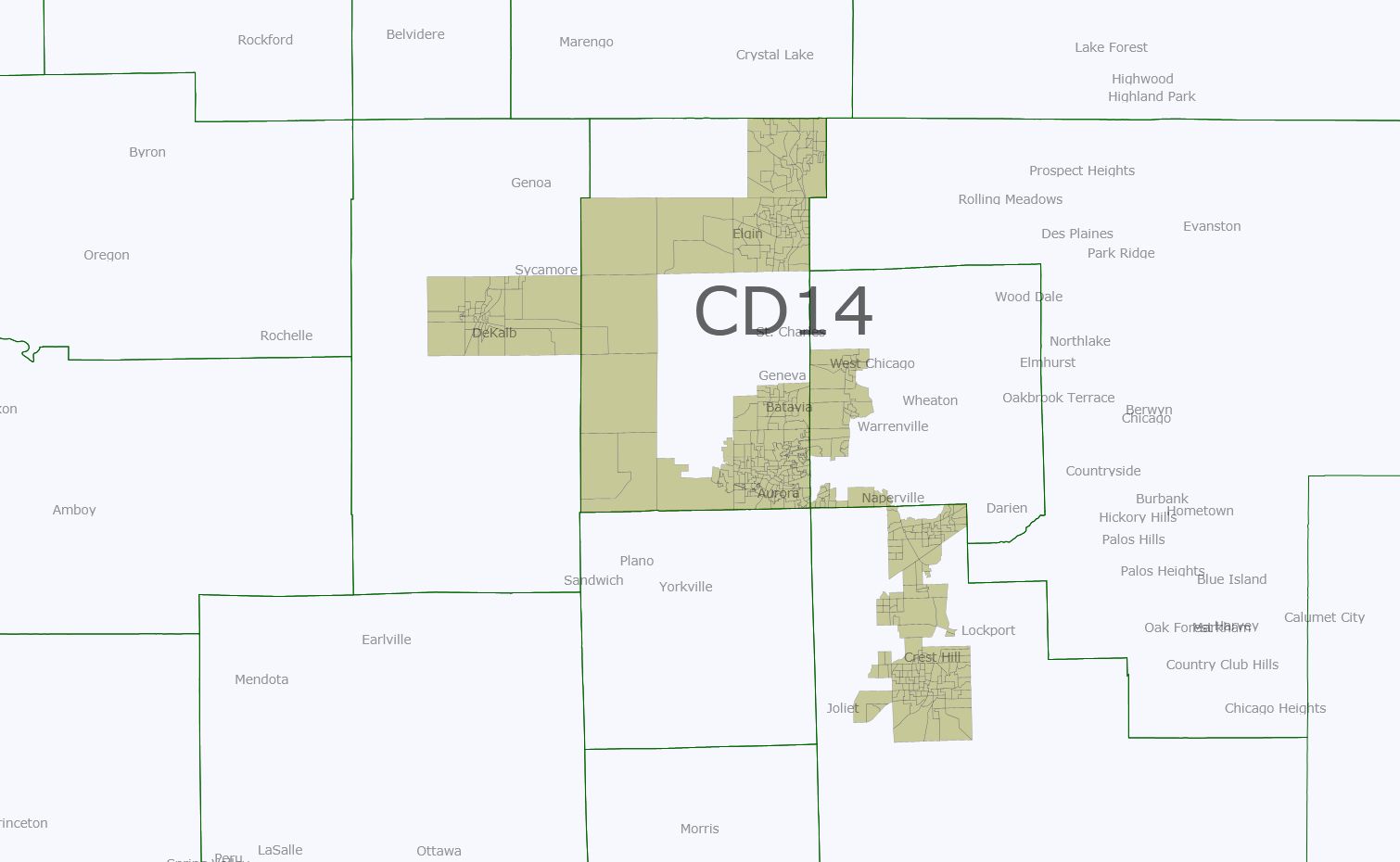
To make these points, I look into the weeds of one district in my budding map, a new Democratic-leaning 14th to elect Bill Foster back into Congress, connecting Aurora, and Joliet along with Elgin and Dekalb.  I imagine that Lake County/northern Cook will show a similar pattern when I get there, as will Rockford, Peoria, Springfield, etc.  But for now let’s look at the new 14th that I am hoping will get drawn.

Photobucket

New District 14th (Hultgren is being drawn, along with Roskam and Biggert, into a super Republican vote sink starting in Republican areas of Kane and snaking through Dupage and ending in super Republican areas of Will).  Foster lives in Batavia so this would be “his” district unless a Joliet politician primaried him.

Racial data: 49.3% white, 33.5% Hispanic, 11.1% Black, 4.4% Asian, thus technically “majority-minority” which was unintended but fortuitous all the same.  Illinois just amended its redistricting statute to emphasize, wherever possible and consistent with the VRA, the creation of coalition districts.  Also, the more I think it through, and the politics of it, I find it hard to convince myself that Democrats in Springfield will actually draw a second Hispanic seat, or that doing so would be required.  Hispanics still don’t vote in any sizable numbers in Chicago (look at the wards that Gutierrez has now if you doubt this), so would 65% and 57% districts really give Hispanics sufficient VRA protection to be able to select a candidate of their choice?  I am increasingly dubious.  So, draw a coalition district like this, plus one probably for Lipinski and you have something that is a compromise.

2010 congressional ballot (aggregating Foster, Harper, and Halvorson votes for areas pulled from the current 14th, 13th, and 11th, assuming for the sake of argument that a Democratic vote for congressman/woman in one district is a generic Democratic vote in another).

Generic Dem-Generic Rep: 80,538-67,285 (54.48%)

Some notable areas:

Aurora: 11,932-6,691

Elgin: 10,220-8,767

Dekalb: 5906-4004

Joliet: 12,461-6,331

Alexi does a bit worse but still carries this district slightly 50.74% to 49.26%, so it suggests to me that it would have withstood the 2010 GOP tidal wave (just).  Without knowing at all what the next ten years will bring, but being a bit cautious-minded, this might model well for what a 2014 2nd Obama midterm election (assuming his reelection) might look like, or for that matter 2018.  Our voters are more prone not to show up in off-year elections whereas the GOP’s are; it is a huge problem, and one that that we ought to be very realistic about when we draw our maps.

Okay, let’s look at two years earlier when Obama romped to his 25 point landslide in his home state.

Obama 161,485 – McCain 85,174 (65.47%… look at the swing between the two years)

Notable areas:

Aurora: 21,472-7,444

Elgin: 20,394-9,858

DeKalb: 12,456-4,333

Joliet: 22,748-6,023

Notice an alarming pattern here?  While we carried all four of these reliably Democratic cities in both cycles, the all-crucial pluralities coming out of them simply plummeted.  The less Democratic areas in the seat used to connect the cities did swing from Obama to generic Republican between 2008 and 2010 but this doesn’t account for the swing so much as our voters simply not showing up.  

Now, finally, let’s look at what a 2016 election without an Illinoian at the top of the ticket might look like.  We know what this probably looks like because we have Kerry 2004 to look at.  Again, Kerry would have carried my district, and by a healthy 54-46% margin.  But the Obama 2008 turnout numbers were historic and probably cannot be counted on across an entire decade worth of political cycles.

(Caveat: Will County doesn’t have publicly-available precinct data going back before 2005, much to my annoyance.  What I did, therefore, was estimate what the likely vote share would have been for the part of Will in this district by extrapolating its 2008 numbers back onto 2004…. E.g., if 60% of Obama’s total 2008 vote came from this portion alone, I am assuming that 60% of Kerry’s county-wide total came from this portion as well.  A bit of an if given likely greater turnout in Joliet than elsewhere, but probably not affecting the topline total much).

119,000 Kerry – 101,000 Bush (~54%)

Notable areas:

Aurora: 17,249-13,057

Elgin: 14,359-14,486

DeKalb: 10,118-6,957

Joliet: probably 16-17,000 Kerry, 8-9,000 Bush

Having eyeballed the data for the rest of the state but not actually tallied it up precinct-by-precinct yet beyond some of the Chicagoland seats, I can vouch for this being repeated in loads of other places in the state other than Chicago.  Chicago turned out fine in 2010; it is why Governor Quinn was re-elected.  The rest of the coalition that adds up with Chicago to form 55-57% of the electorate most neutral years did not, and that is why we have Republicans representing Joliet, the Fox Valley, and Rock Island of all places.

Redistricting Arizona U.S. House Districts

AZ-01 (Gosar): 57% White, 21% Native American, 18% Hispanic, 1% Black, 1% Asian – leans Republican but is winnable for Democrats

Photobucket

AZ-02 (Franks): 65% White, 28% Hispanic, 2% Black, 2% Asian, 1% Native American (connects Prescott with Yuma) – Safe Republican

Photobucket

AZ-03 (Quayle): 75% White, 16% Hispanic, 4% Asian, 3% Black, 1% Native American – Safe Republican

Photobucket

AZ-04 (Pastor): 56% Hispanic, 31% White, 6% Black, 3% Asian, 2% Native American (Hispanic VRA district) – Safe Democratic

Photobucket

AZ-05 (Schweikert): 49% White, 35% Hispanic, 6% Black, 4% Asian, 3% Native American (Tempe; connects a small Indian reservation with liberal whites) – Lean to Likely Democratic I think

Photobucket

AZ-06 (Flake): 81% White, 12% Hispanic, 3% Asian, 2% Black, 1% Native American – Safe Republican

Photobucket

AZ-07 (Grijalva): 53% Hispanic, 33% White, 5% Black, 5% Native American, 2% Asian (VRA District) – probably safe Democratic

Photobucket

AZ-08 (Giffords): 66% White, 25% Hispanic, 3% Black, 3% Asian, 1% Native American  – Safe for Giffords if she runs again; if she doesn’t the Republicans have a good chance of picking this seat up

Photobucket

AZ-09 (New Seat): 69% White, 20% Hispanic, 3.5% Black 2.5% Asian, 1% Native American – Safe Republican

Photobucket

Phoenix close-up (AZ-01 – Gray, AZ-02 – Light Pink, AZ-03 – Purple, AZ-04 – Light Gray, AZ-05 – Yellow, AZ-06 – Green, AZ-07 – Blue, AZ-08 – Neon Green, AZ-09 – Rose)

Photobucket

Tucson close-up

Photobucket

Redistricting Arkansas: One map! Two maps! Three Glorious Maps!

Everyone was aghast at the proposed map that came out of one of the houses of the Arkansas legislature recently. The consensus seemed to be that it was a dummymander, as likely to end up with a 4-0 Republican delegation as it was a 3-1 Democratic delegation. I would argue that  2-2 split would be the safest, and sanest, way to draw the map. So I’ve come up with a few maps that would likely give that split.

Map 1: A Bipartisan Compromise

AR-01 (blue) – 65 McCain, 32 Obama

AR-02 (green) – 51 McCain, 48 Obama.

AR-03 (purple) – 64 McCain, 34 Obama.

AR-04 (red) – 56 McCain, 41 Obama.

In this map, AR-01 is ceded to the Republicans, AR-02 is made more of a swing district, AR-03 remains pretty much the same, and AR-04 is made slightly more Democratic.

The problem with this one is that AR-04 remains vulnerable. With Ross exiting the seat in 2014 to run for Governor, it would be a tough seat to hold. On the other hand, AR-02 becomes easier to pick up.

Map 2: Let’s Make the White Democrats Unhappy

This map includes the Fayetteville tentacle from the proposed map. AR-02 is redrawn into a black-heavy Mississippi+Little Rock district. I don’t have numbers on this one handy, unfortunately, but AR-02 easily becomes an Obama district, probably around 55-44 Obama. AR-04 moves slightly to the Democrats, I’d guess it’s about 57-41 McCain.

This would please the black Democrats in the legislature; they’ve been pushing for a district that gives them a shot of electing one of their own to Congress. Of course, the white Democrats would not be happy with this arrangement, as many of them would be shut out of the chance to go to Congress.

Map 3: Let’s Make the Black Democrats Unhappy

AR-01 (blue) – 53 McCain, 45 Obama

AR-02 (green) – 66 McCain, 32 Obama

AR-03 (purple) – 64 McCain, 34 Obama

AR-04 (red) – 53 McCain, 45 Obama

Third and finally is a map designed to elect two Blue Dog type Democrats. In this map, Little Rock is added to Mike Ross’s district (putting Griffin in with him, but Griffin could just move to the safe Republican AR-02), while AR-01 is reconfigured by shedding some of the Crawford-friendly counties to the north and adding some Dem-friendly counties to the south. Ross would probably not be happy with Little Rock in his district, but he’s only got one more primary to get through until he can go run for Governor and be out of our hair. The advantage here is an open AR-04 would not be an almost-automatic flip to the Republicans; the Democrats would have a good shot at retaining the seat.

Now, as the white Democrats got the shaft in the last map, this map gives it to the black Democrats. AR-01’s VAP is only 28% black, and AR-04’s is 23% black, which would make it tough for one of the black legislators to win a primary in either district.

So there you go, three ideas, all of which are, in my opinion, better than the one proposed by the actual legislators.

Washington Redistricting: How About a Majority-Minority District?

Here’s an interesting proposal from some Seattle-area activists: a majority-minority district in the Seattle area.

That could be done, just barely, by combining Southeast Seattle with the suburbs south of the city, where the minority population has exploded over the past decade.

The Win/Win Network, a nonprofit group, drew up the potential “majority people of color” district and plans to submit it to the Washington State Redistricting Commission, the bipartisan panel charged with redrawing the state’s political map this year.

It isn’t as convoluted-looking as you’d think, but it would violate tradition (and usual redistricting commission policy) by splitting Seattle down the middle. (You can see the map at the link.) While north Seattle — maybe the likeliest place outside of Sweden to see a Volvo-on-Volvo traffic accident — is what makes Seattle one of the whitest major cities, south Seattle is very diverse and if you add in its close-in southern suburbs, you literally get to 50.1%. Whether this actually gets forced into being is a big VRA-related puzzle, though; while recent case law (like Bartlett v. Strickland) has dealt with districts where a minority’s share doesn’t reach 50%, I’m not aware of any cases on the issue of creating minority districts where the share tops 50% but it’s a tossed salad of all possible minorities. The implications of that issue could be huge, especially for redistricting California this year.

If you haven’t seen the New York Times’ newest version of its remarkable Census map (now updated with 2010 count data to replace ’05-’09 ACS data), the Seattle example is a neat place to start, especially if you’re having trouble conceiving of the Seattle area as diverse. Go to the dot-based racial distribution map, and find Census tract 281, just north of the airport. This may actually be the most racially balanced tract in the whole nation, more so than anything in Queens or the East Bay, based on my puttering around the map: it’s 26% white, 24% black, 19% Hispanic, and 22% Asian. In fact, here’s a challenge/rainy day activity for you all: if you can find anything more balanced, let us know in comments! (Sorry, no babka.)

This opens up a can of worms in terms of what’s most “balanced,” though, depending on how many races you want to talk about. Tract 919 in Flushing, Queens, is 27% white, 33% Hispanic, and 33% Asian (but only 4% black)… or if you want to go with a 5-way split, check out Tract 9603 (Nanakuli, on the west shore of the island of Oahu), which is 12% white, 18% Hispanic, 17% Asian, 30% multiracial, and 20% Native Hawaiian! I don’t want to limit how you define “balanced,” so feel free to point out any interesting tracts that you find.

UPDATE: I’ve found at least one that seems to beat that Seattle-area tract: it’s Census tract 355108 in Antioch, California (in Contra Costa County): 25% white, 24% black, 24% Hispanic, and 20% Asian.