What to Look For in the Massachusetts Special Election

By: Inoljt, http://mypolitikal.com/

Results are soon pending in the special election to replace Senator Ted Kennedy. Once a guaranteed Democratic victory, the race has become surprisingly competitive due to a bad national environment and a lackluster campaign run by Democrat Martha Coakley. In fact, several polls have put Republican Scott Brown in the lead, striking panic amongst the Democratic establishment.

Interpreting incomplete results can be difficult if one is not familiar with how different areas in a state vote. Senator John McCain, for instance, led the vote in Virginia during much of election night; this was because deep-red rural Virginia reported first. After Democratic strongholds in Northern Virginia began posting, Barack Obama quickly pulled away (he ultimately won by 6.30%). Because Massachusetts is rarely competitive outside of gubernatorial elections, geographic unfamiliarity probably extends to even most politically active folk.

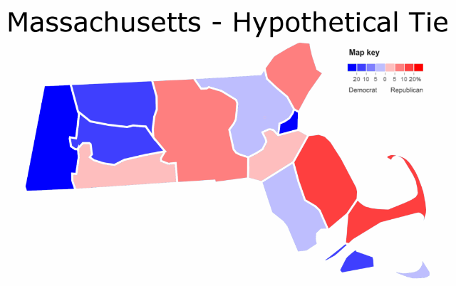
I have therefore created a map indicating what a tied election would probably look like:Photobucket
More below.

Interpreting incomplete results can be difficult if one is not familiar with how different areas in a state vote. Senator John McCain, for instance, led the vote in Virginia during much of election night; this was because deep-red rural Virginia reported first. After Democratic strongholds in Northern Virginia began posting, Barack Obama quickly pulled away (he ultimately won by 6.30%). Because Massachusetts is rarely competitive outside of gubernatorial elections, geographic unfamiliarity probably extends to even most politically active folk.

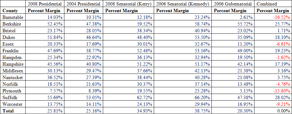
This map takes data from all statewide elections since 2004, derives the electoral lean of each county, and then averages these results to produce the picture. Here is the data by county:

Photobucket

Ironically, Republicans do better in the most populous counties – the opposite case for the nation in general. Republicans are strongest in the state’s suburbs; Scott Brown will need to win all of them to take the state (on the other hand, these wins need not be exceptionally large). On the other hand, Democrats do best in the city Boston and the more rural western reaches of the state.

Thus on election day when the results start coming in, take a look at the above table and compare it to the actual performances each candidate is posting. Whichever candidate is generally outperforming the table will likely win the election. Finally, look at who is winning Hampden and Bristol counties – the two places that vote closest to the state as a whole. If Martha Coakley is winning them, expect a Democratic victory. If Scott Brown is, then a Republican shocker is in the works. If the two are split, it will a nail-biter that goes deep into the night. There have been not many of those lately.

Whatever the case, tomorrow Tuesday ought be an exciting day for politics buffs. There are not many races where the result has been so uncertain – where practically anything can happen and it would not be surprising for the polls to be completely off. It will be quite interesting to watch.
Analyzing Virginia’s 2009 Gubernatorial Election, Part 1

This is the first part of two posts analyzing Virginia’s 2009 gubernatorial election. The second part can be found here.

Photobucket

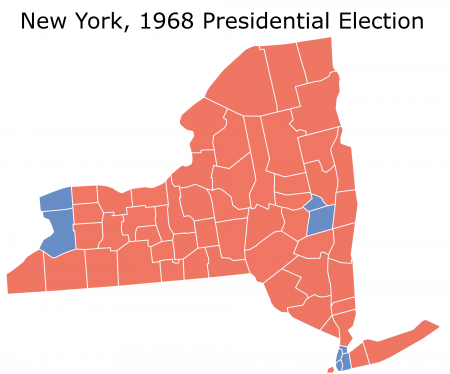
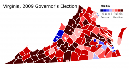
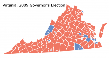
A normal observer might see the above map and naturally conclude that the Democratic candidate lost a landslide election. This is not always the case. In the 1968 presidential election, for instance, the state of New York looked like this:

Photobucket

Although it does not look like it, Democratic candidate Hubert Humphrey won the state: 49.76% to 44.30%.

In November 2009, however, State Senator Creigh Deeds did in fact receive a thorough pummeling from Attorney General Bob McDonnell. An unappealing candidate running in a tough national climate, Mr. Deeds lost the race 41.25% to 58.61%.

More below.

Creigh Deeds only won two types of counties: his home district and Democratic strongholds. The former include the two blue counties along the state’s eastern border. The latter are populated by two Democratic constituencies: firstly, blacks in Virginia’s 3rd congressional district and secondly, wealthy suburbanites south of Washington (Virginia’s 8th congressional district).

Surprisingly (and disturbingly) Mr. Deeds lost Fairfax County, the key to recent Democratic success in Virginia. Rich, diverse, and heavily populated – Northern Virginia suburban voters were largely responsible for Democratic victories by Governor Tim Kaine, Senator Jim Webb and President Barack Obama.

Mr. McDonnell’s victory in Fairfax indicates one of two things. Either the Democratic Party has not entrenched itself in NoVa – or it is moving back to the Republicans. The latter possibility is highly worrisome and not simply confined to Virginia.

There is little more that the above map indicates – one cannot tell much from a map that just shows red counties. Differentiating the mass of red reveals more:

Photobucket

This image maps the results based on degree of support. It shows a substantial east-west divide hidden in the first map. Western Virginia voted Republican with far more intensity; eastern Virginia tended to be more moderate in its support of Mr. McDonnell.

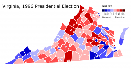
Notice how intensely Republican the western panhandle is voting. These voters – poor, white, rural Appalachian folk – used to vote Democratic based on economic appeals. This trend subsisted even in fairly recent times: John Kerry won a couple counties; Senator Jim Webb took three. Former president Bill Clinton did even better (he lost the state by 1.96%):

Photobucket

Creigh Deeds, a moderate politician representing an Appalachian district, was supposed to appeal to the rural voters populating western Virginia; as the map makes evident, he failed to do so (outside his home districts). I suspect Barack Obama  may have something to do with this; his poor performance amongst Appalachian voters may be affecting Democratic candidates everywhere. Given the many Democratic politicians elected from Appalachia, this – if true – would definitely be a bad thing for Democrats.

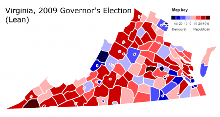
Finally, it is possible to map the results if Mr. Deeds had tied Mr. McDonnell:

Photobucket

This indicates the relative Democratic or Republican lean of each county – a county may vote Republican but still lean Democratic compared to the overall result, and vice versa. Massachusetts, for example, voted Republican in Ronald Reagan’s 1984 landslide – but nobody would accuse it of being a Republican state. It went red, but relative to the rest of the nation was more Democratic.

The next section will compare this map with similar images derived from previous Democratic coalitions.

(Note: All statistics are derived from http://www.uselectionatlas.org/).

–Inoljt, http://mypolitikal.com/

Analyzing Swing States: Pennsylvania, Part 5

This is the fifth part of an analysis of the swing state Pennsylvania. It focuses on the traditionally Republican region between the Democratic strongholds in the southeast and southwest. The last part can be found here.

Photobucket

Pennsyltucky

Outside the Pittsburgh and the Philadelphia metropolis, Pennsylvania is a very different place. Political analysts often label this area “the T,” while others call it Pennsyltucky.

Popular culture mythologizes Pennsyltucky as red-neck capital – a rural region dominated by NASCAR-loving red-necks. Politically, James Carville compared Pennsyltucky to Alabama without the blacks.

In fact, this stereotype is inaccurate on two accounts. Firstly, Pennsyltucky contains far more than so-called rural red-necks; most of its counties are fairly populated (they are far more densely peopled than, say, rural Arkansas). Secondly, many of these supposedly NASCAR-loving red-necks also belong to the local union and vote Democratic on economic issues. The majority may support Republicans, but that majority certainly is below the 88% of Alabama whites that voted for John McCain.

Nevertheless, the “T” does constitute the Republican base in Pennsylvania. Former president George W. Bush pulled 48.42% of the state’s vote in 2004, and he had to get those votes somewhere.

More below.

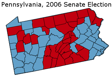
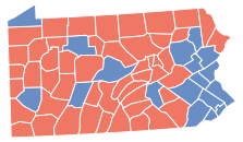
Pennsylvania’s 2006 Senate election provides a geographic illustration of this base. In that election, former Senator Rick Santorum lost by a landslide 17.36% margin; only the reddest counties supported him:

Photobucket

Although they cover a lot of land, not all these counties are rural enclaves of Pennsyltucky (if they were all rural, Senator John Kerry would have won by double-digits in the state). In fact, fast-growing exurbs constitute a substantial source of Republican votes. Located east of the Philadelphia metropolis, these are somewhat wealthy and mostly white. They include Lancaster County (where Bush won 65.80% of the vote) and York County (where he won 63.74%); the former president came out of these two counties with a 121,832 margin, enough to offset Pittsburgh, Erie, and Scranton.

Erie and Scranton both constitute solidly blue areas belonging to “the T.” They give lie to the myth that all Pennsyltucky votes loyally Republican. Like the southwest, Erie and Scranton contain a number of working-class Democrats; unlike the southwest, however, cultural appeals have not swayed these folk into voting Republican.

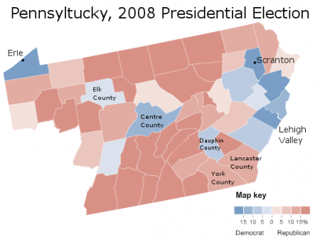
Indeed, Democrats do respectably in many parts of Pennsyltucky. Here is President Barack Obama’s performance:

Photobucket

Mr. Obama did not just win Erie and Scranton; he took several other counties and ran closely elsewhere. These included Centre County, home to Pennsylvania State University, and Dauphin County, which has a relatively high black population. All the Lehigh Valley – somewhat an extension of Philadelphia’s suburbs – voted for the president. More surprisingly, Obama ran very closely in several rural, lily-white regions of the T; one such county (Elk) even gave the president a 4% margin of victory.

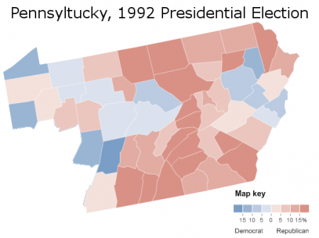
Obama was not the only Democrat to do well in parts of Pennsyltucky. Here is how former president Bill Clinton performed:

Photobucket

Mr. Clinton, of course, was a fellow with immense appeal to so-called “red-necks.” Since his time, much of Pennsyltucky has moved to the right. Yet not all of it is deep-red: while some counties gave Mr. McCain more than 70% of the vote, others – demographically identical – gave him barely more than 50%. These are substantial and curious variations.

While Pennsyltucky as a whole votes strongly Republican, it is wrong to generalize the area. Its most populous regions – the exurbs – constitute a vital part of the Republican coalition, while some rural counties have a fairly weak Republican habit. Finally, a number of places dependent upon industry routinely support Democrats. To stereotype the “T” as a composed solely of Republican-voting red-necks would do injustice to the region’s complexities.

(Note: All statistics come from http://uselectionatlas.org/ . Some pictures modified from the NYT.)

–Inoljt, http://mypolitikal.com/

Where Al Gore Did Better than Barack Obama: What Conventional Wisdom Doesn’t Tell You

By: Inoljt, http://mypolitikal.com/

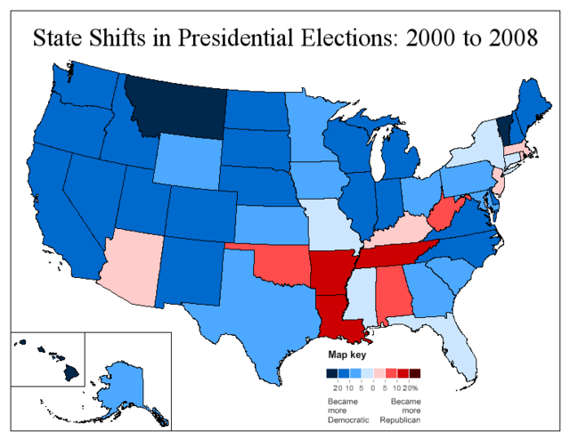
Several days after the 2008 presidential election, the New York Times produced a famous map of voting shifts since 2004.  Most politics buffs have seen this map; according to it, Appalachia “voted more Republican, while the rest of the nation shifted more Democratic.”

Photobucket

There is something else occurring here, however, which the map hides – and which almost nobody has perceived. This trend goes strongly, strongly against conventional wisdom.

To unearth this trend, let’s move back one election – to former Vice President Al Gore’s 2000 tie with former President George W. Bush. Before going below the fold, I invite you to guess – which states did Mr. Gore do better than President Barack Obama?

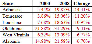
Here are the states he performed best relative to President Barack Obama. In all these, Mr. Gore did at least five percent better than Mr. Obama.

Photobucket

By and large, these states are what one would expect. All are located in the midst of Appalachia or the Deep South, regions rapidly trending Republican. All were fairly unenthused by Obama’s themes sounding change and hope.

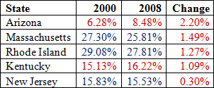
Here are the remaining states in which Gore improved upon Obama:

Photobucket

This result is something quite different. Arizona – Senator John McCain’s home state – is not surprising, nor is Appalachian Kentucky.

Massachusetts, Rhode Island, and New Jersey, on the other hand – these constitute core Democratic strongholds. The vast majority of pundits would characterize them as becoming more Democratic, if anything at all. Indeed, there has been much ballyhoo about the Northeast’s Democratic shift – how Republicanism is dead in the region, how every single New England congressman is a Democrat, how Obama lost only a single county in New England.

That Al Gore performed more strongly than Barack Obama in Massachusetts, Rhode Island, and New Jersey runs strongly against this hypothesis. Remember, too, that Obama won the popular vote by 7.3% while Gore did so by only 0.5%. If the two had ran evenly, this trend would have been far more pronounced. The state in which Obama improved least upon Gore, for instance, was not Alaska or Mississippi – but New York, where Gore did only 1.88% worse than Obama. The map below indicates this:

Photobucket

Much of the movement derives from the Republican candidates in 2000 and 2008. George Bush was a terrible fit for northeastern voters, with his lack of intellectual depth and cowboy persona. John McCain, on the other hand, was a man many northeasterners admired – he had a strong brand of independence and moderation, which the campaign tarnished but did not destroy. McCain was a person New England Republicans could feel comfortable voting for – and they did. (Fortunately for Democrats, there are not too many Republicans left in the Northeast.)

All in all, the Northeast’s relative movement right constitutes a very surprising trend. Few people would anticipate that Al Gore did better than Barack Obama in Massachusetts, Rhode Island, and New Jersey. It defies conventional wisdom and the common red-blue state dynamic, which holds that the northeast is permanently Democratic. Finally, given increasing political polarization, this relative trend the other way probably is a good thing for the country.

Analyzing Swing States: Pennsylvania, Part 4

This is the fourth part of an analysis of the swing state Pennsylvania. It focuses on the industrial southwest, a once deep-blue region rapidly trending Republican. Part five can be found here.


Pittsburgh and the Southwest

Pennsylvania’s southwest has much in common with West Virginia and Southeast Ohio, the northern end of Appalachia. Electoral change in the region is best understood by grouping these three areas together as a whole.

Socially conservative (the region is famously supportive of the NRA) but economically liberal, the industrial southwest voters typify white working-class Democrats. These voters can be found in unexpected places: Catholics in Rhode Island and Massachusetts, loggers along the Washington coast, rust-belt workers in Duluth, Minnesota and Buffalo, New York.

It was President Franklin D. Roosevelt and the New Deal that brought the working-class to the Democratic Party; before his time, the party constituted a regional force confined mainly to the South. In Pennsylvania, a Republican stronghold that had voted for President Herbert Hoover, Mr. Roosevelt laid the foundations for a lasting Democratic coalition.

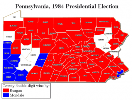
For decades, voters in southwest Pennsylvania constituted this coalition’s foundation. Take, for instance, Democratic nominee Walter Mondale:

Photobucket

In 1984, the industrial southwest, badly hurting from a receding recession, cast a strong ballot for Mr. Mondale. It did so again for Governor Mike Dukakis, and twice for President Bill Clinton.

Ironically, it was during the presidency of Mr. Clinton – a man much liked by Appalachia – that the Democrats became regarded as the party of the coasts and the elite. Ever since his time, Pennsylvania’s industrial southwest has been in a bad way for Democrats.

More below.

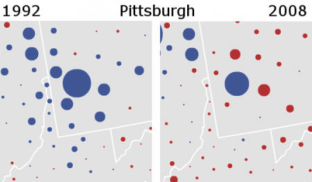
Thus, whilst metropolitan Philadelphia has been moving steadily left, Pittsburgh and the industrial southwest have been marching in the opposite direction.

To get a sense of the movement in this region, compare these two maps:

Photobucket

In less than a generation’s span, one sees Democratic strength in northern Appalachia utterly vanish.

In a state where things have been going badly for Republicans, southwest Pennsylvania provides some consolation. Were it not for the southwest’s rightward trend, Pennsylvania would today be a fairly solid Democratic state.

Nevertheless, if I were to choose between Pittsburgh and the industrial southwest or Philadelphia and the suburban southeast, I would much prefer the latter. While Philadelphia itself is in declining, its metropolitan area as a whole has experienced rapid growth. The southwest’s population, on the other hand, remains basically stagnant, suffering the effects of economic decline.

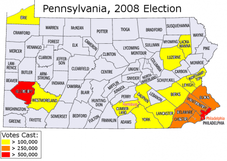
In absolute terms, moreover, eastern Pennsylvania holds far more votes:

Photobucket

Republicans might take comfort in Allegheny County’s vote reservoir – were it not consistently blue. Indeed, Democratic strength in Pittsburgh ensures that, as a whole, the southwest will still vote Democratic for some time yet. Although – unique to practically every other major city – Republicans have been improving in Pittsburgh, its substantial black population limits their potential.

The puzzling thing, however, is why Appalachian working-class whites are moving so rapidly right. It cannot be simply race: both Vice President Al Gore and Senator John Kerry were white, after all, yet they still did progressively worse. It cannot be simply elitism, either: Governor Mike Dukakis and Governor Adlai Stevenson were intellectual technocrats, yet they won what Mr. Kerry and Mr. Gore could not.

Finally, it is not as if all the white working-class has suddenly turned Republican: voters in Michigan, northeast Ohio, upstate New York, and Silver Bow and Deer Lodge Montana, amongst other regions, still retain the Democratic habit. In Pennsylvania, working-class strongholds such as Scranton and Erie, surrounded by a sea of Republican counties, also continue to vote deep blue. They will be the topics of the next post.

–Inoljt, http://mypolitikal.com/

Analyzing Swing States: Pennsylvania, Part 3

This is the third part of a series of posts analyzing the swing state Pennsylvania. Part four can be found here.


Philadelphia’s Suburbs

There used to be a time when Republicans could count on Philadelphia’s suburbs to counter Democratic margins from the city. This is Philadelphia, circa 1988:

Photobucket

Not anymore. Philadelphia, 2008:

Photobucket

(Note: Because the Times stopped updating before all absentee/provisional ballots were counted, this map does not fully reflect the actual results. I have corrected the discrepancy.)

Indeed, in 2008 President Barack Obama’s suburban margins were so great that Democrats did not even need Philadelphia to win Pennsylvania.

Philadelphia’s suburbs stretch across four counties: Bucks, Chester, Delaware, and Montgomery. Bucks contains more working-class, Catholic communities. Chester, on the other hand, is more exurban and conservative (in this century, Democrats have only incontrovertibly won the county twice – in 1964 and 2008).

More below.

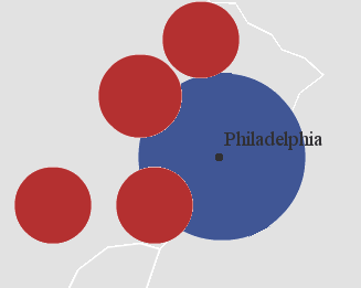
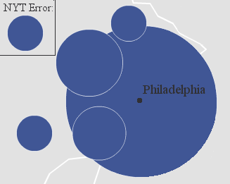
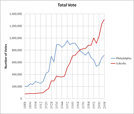
The suburbs hold more importance than implied by the above maps, which tend to exaggerate Philadelphia’s size due to its one-sided voting pattern. While the city’s population continues its long, slow decline, its suburbs have grown at a rapid clip. Today, the number of votes they hold almost doubles the city’s reservoir.

Photobucket

While regional differences exist, Philly’s suburbs do have one thing in common: they compose the wealthiest area in the entire state. Chester, Bucks, and Montgomery Counties rank #1, #2, and #3 in the state’s median household income. They also lack diversity; the census classifies around 90% of Bucks County residents as non-Hispanic whites.

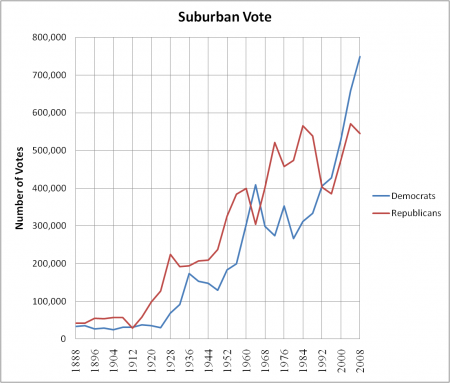
Given these characteristics, one might expect Philly’s suburbs to be rock-hard Republican strongholds. Until recently they did vote strongly Republican; Democrats only won the suburbs twice (in 1964 and – due to TR’s Bull Moose candidacy – 1912) before 1992. It was President Bill Clinton who changed this pattern; in 1992 he barely managed to turn Bucks, Delaware, and Montegomery blue (his greatest margin was 3.4%). Ever since then Democrats have been doing better and better.

Photobucket

This shift does not constitute an anomaly; Democratic candidates since Mr. Clinton have been winning a number of wealthy, white suburban counties that used to go strongly Republican. Before Clinton, Long Island and Westchester consistently gave Republicans double-digit margins; today they’ve voted Democratic for the past four consecutive elections. Detroit’s suburbs – Oakland and Macomb counties – have gone from Reagan Democrat fortresses to regions John Kerry tied. Senator John McCain barely won Orange County, that symbol of suburban Republican might.

Montgomery and Delaware counties are especially Democratic-friendly. They  identify more with the populous, sophisticated northeastern seaboard than the more conservative Midwest. As such, these counties by nature sympathize with liberal sentiment; George W. Bush lost both by double-digits. This does not necessary mean, however, that Montgomery and Delaware constitute bastions of acceptance; products of white flight from Philadelphia, they can at times be fairly hostile to people who are considered different.

Increasing Democratic strength in these well-off suburbs portends great trouble for Republicans. In 2008, Mr. Obama’s performance in Montgomery and Delaware counties eclipsed his suburban strength in practically every other swing state. Only suburbs in places like the Bay Area, Seattle, and New England voted more Democratic.

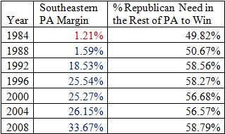
In total, Obama won the Philly suburbs by 15.56%. Combined with his landslide in the city itself, he came out of southeast Pennsylvania with a 682,392 vote margin. This meant that John McCain needed to win the rest of the state by 58.79%.

Photobucket

If Pennsylvania was like Missouri – if the remainder of the state voted strongly Republican – this might just have been possible. But Pennsylvania is not like Missouri; southwestern Pennsylvania used to be unchallenged Democratic territory, while Scranton, Erie, and the Lehigh Valley all lean Democratic. John McCain thus lost the state by double-digits.  His only successes occurred in southwestern Pennsylvania, which is reddening almost as quickly as the southeast is bluing.

–Inoljt, http://mypolitikal.com/

Analyzing Swing States: Pennsylvania, Part 2.5

This is part of an analysis of the swing state Pennsylvania. Part three can be found here.

(A note: There will be a lot of maps in this post.)

Philadelphia: Precinct Results

My first post on the swing state Pennsylvania focused on the city Philadelphia, an incredibly Democratic city. At the time, I looked for detailed ward and precinct results but was unable to find any. Recently, however, I have come across a website which maps Philadelphia precinct results across a whole range of elections; it is a literal gold mine. This offers the opportunity to substantially deepen the previous analysis.

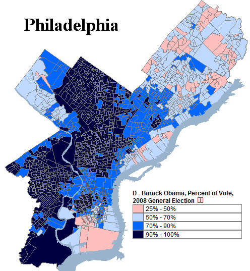
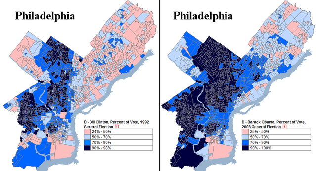
Below is a map, derived from the website, of the 2008 presidential election in Philadelphia (by precinct!)

Photobucket

An analysis of this result below.

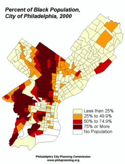
The legend ranges from President Barack Obama’s weakest precinct (25% of the vote) to his strongest (literally every single person voted for him). In total, Mr. Obama won 83.00% of the county’s vote – an amazingly high figure. For reference, below is a map of Philadelphia’s black population.

Photobucket

There is, of course, a distinct parallel between the two demographic maps; blacks vote heavily Democratic and will continue to do so in the foreseeable future.

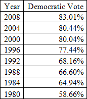
For decades, the city Philadelphia has trended Democratic. In percentage terms, its Democratic vote has increased for the past seven consecutive elections. In 1992, for example, former President Bill Clinton won 68.16% of the county. A comparison to Obama’s performance is revealing:

Photobucket

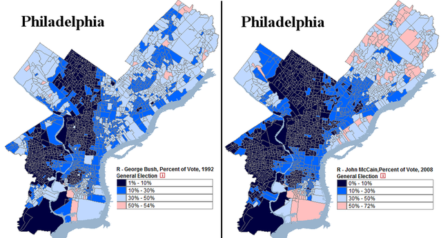
If there is any consolation for Republicans in all this, it is northeast (and parts of south) Philadelphia. Notice that in both maps above, Mr. Clinton and Mr. Obama perform distinctly worse here. This area of the city is populated mostly by white Catholics and Jews, although white flight has weakened their numbers. Nevertheless, northeast Philadelphia remains far whiter than the rest of the city, and as assimilated Catholics lose their traditional Democratic loyalties, Republicans have been gradually improving their percentages. John McCain actually did better than Bush in parts Northeast Philadelphia, supported by voters uncomfortable with Barack Obama’s race.

The above map hides this trend; many northeast Philadelphia voters cast their ballots for Ross Perot in 1992, so the Democratic percentage vote was artificially low that year (minority voters, on the other hand, generally did not vote for Mr. Perot). Comparing the Republican vote is more useful:

Photobucket

In general, Senator John McCain (who won 16.33% of the vote) does worse than former President George H.W. Bush (who won 20.19%). In the northeast, however, the opposite trend occurs. The shift is gradual and slow – not like West Virginia’s rapid red turn – but enough to be noticeable.

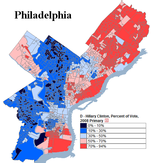
Under perfect conditions, growing Republican strength might result in something like this:

Photobucket

This is Secretary of State Hillary Clinton’s performance during the Pennsylvania primary. The senator won a respectable 34.80% of Philadelphia’s vote, fueled by support amongst white Catholics in the northeast. As evident in the map, the city contained extensive polarization; the majority of precincts gave over 70% of the vote to one candidate. In effect, Philadelphia split into two different blocs.

To be clear, Republicans will have a very difficult time achieving a result like this. It would take a momentous change for white Catholics to cast more than 70% of their ballots for Republicans. If this happened, moreover, winning Philadelphia would be the least of Democratic worries.

The other possibility would be for Republicans to improve their percentage amongst African-Americans. Statistically, 90+% support for any party seems untenable over a long period of time. Republicans, however, do not appear anywhere close to achieving this goal. The fact that they are more likely to reach 60% support amongst white Catholics than 15% support amongst blacks says a lot about the state of the Republican Party (and the state of America, too).

–Inoljt, http://mypolitikal.com/

Electoral Polarization

By: Inoljt, http://mypolitikal.com/

In my previous post, I noted that almost all the counties President Barack Obama won have become more Democratic since 1992, while almost all the counties Senator John McCain won have become more Republican since 1992.

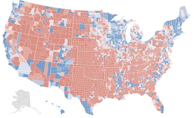
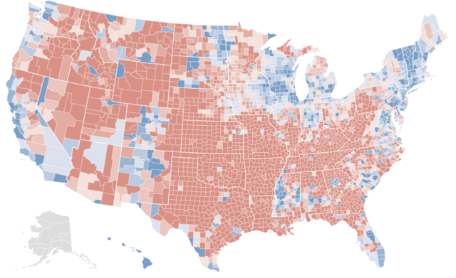
In fact, comparing maps of the 2008 presidential election and the county changes from 1992 indicates a striking correlation.

Here is the 2008 presidential election:

Photobucket

Here are the changes from the 1992 presidential election:

Photobucket

This hints at a disturbing picture of electoral polarization. More analysis below.

On the one hand, all this is somewhat intuitive. If a Democratic candidate does well in a specific place, he or she probably improved on a previous Democrat’s performance there – and vice versa. Moreover, these maps do not imply that all blue regions became more Democratic (nor the opposite); rural Appalachia, in the most famous instance, has trended sharply Republican, while much of suburban American has gone in the opposite direction.

On the other hand, this phenomenon does not constitute a mathematical rule. If a Democratic candidate wins a county, that doesn’t necessarily imply that he or she improved upon a previous Democrat’s performance. He or she could have done worse but still won; the previous Democrat might have overperformed, or the Republican might have encouraged cross-over voting.

Yet by and large, this has not been the case. Obama practically always outperformed former President Bill Clinton in today’s Democratic counties. Mr. McCain practically always overperformed former President George H. W. Bush in today’s Republican counties.

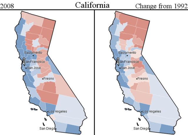
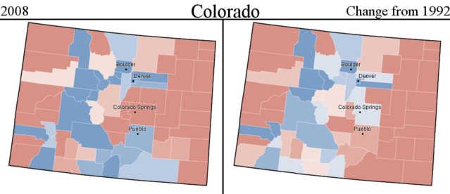
Taking a look at selected states provides a powerful illustration of this fact.

Here is California:

Photobucket

Here is Colorado:

Photobucket

All this implies something rather disturbing: electoral polarization has been steadily increasing. Obama only improved on Mr. Clinton’s performance in the counties Obama won. McCain only improved on Mr. Bush’s performance in the counties McCain won. The almost total lack of cross-over gain suggests that each party has come to depend on deepening their base, rather than widening the electorate and appealing to moderates.

That America is getting more divided has, of course, been known for a fairly long time. In some ways the maps exaggerate the polarization: 1992 Clinton appealed to many Republicans, while Obama’s strength lay amongst the Democratic base. Then there is the Ross Perot effect, which lowered margins in both party strongholds (e.g. New England, the Plains states).

But perhaps a bit of exaggeration is needed. Polarization has rarely been good for any country, and its increasing prevalence bodes poorly for the future of the United States. A map like this provides a potent illustration of polarization in action; indeed, I have never encountered a more striking image of its increase. Such a picture might do us some good.

(Note: Credit for all maps is given to the NYT; some images have been modified.)

Analyzing Swing States: Pennsylvania, Part 2

This is the second part of a series of posts analyzing the swing state Pennsylvania. The next part can be found here.

Photobucket

Like Florida, and unlike Ohio, Pennsylvania’s political geography can be divided into three. The industrial southwest is reddening, the populous southeast is bluing, and Pennsyltucky remains, as James Carville memorably described it, “Alabama without the blacks.” (Actually, Pennsyltucky is a fair bit less conservative.)

The following section will concentrate on Philadelphia, the region upon which Democrats draw the most votes.


Philadelphia the City

Although cities always vote Democratic, different cities contain different political characteristics. Not all big cities are liberal (see Houston, Phoenix), nor are all liberal cities are big (see San Francisco, Boulder).

Fortunately for Democrats, Philadelphia is both America’s sixth largest city and one in which four out of five inhabitants regularly choose the Democrat. It is, moreover, a city which has become bluer for eight straight elections.

(A note: All my statistics are taken from http://www.uselectionatlas.org/)

Photobucket

More below.

Philadelphia’s decades-long movement towards Democrats has corresponded with six decades of population decline; white flight has gradually weeded out Republican voters. Machine politics – characterized by such practices as street money – continues to play a major role in elections.

Demographics underlie Democratic strength in the city (as they do throughout American cities). A full 44.8% of the city’s population is black, a heavily Democratic voting bloc. Latinos (another Democratic voting bloc), while fewer than elsewhere, comprise a solid 11.8% of Philadelphia.

A large majority of Philadelphia’s white voters must vote Democratic, too. In 2008 Obama took 83% of the vote, in a city whose non-Hispanic white population was 39.0% according to the census. Assuming minority turn-out proportional to their actual population, and assuming every single non-white person voted Democratic, then at a minimum, 56.4% of Philadelphia whites supported Obama. Under a more realistic assumption (e.g. 90% non-whites voting Democratic), 72.08% of Philadelphia whites would be supporting Obama. (The equation to get this is simple: 83.01 = 0.90*61.00 + x*39.00).

Philadelphia’s white vote revolves around two factors: liberal whites moving in through gentrification, and long-standing white ethnic communities. The former voting group – often young, single, and gay or gay-friendly – is liberal by orientation; the latter group, a consequence of long-gone anti-Catholic sentiment, still votes Democratic on economic issues but is slowly treading Republican.

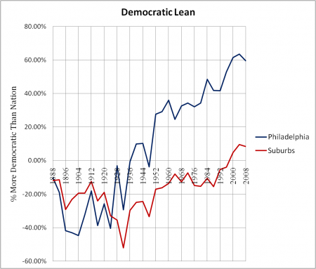
All in all, Philadelphia’s existence constitutes an enormous advantage for Democrats. For the past three presidential elections, it has been around 60% more Democratic than the nation as a whole. If George W. Bush had won 80% of the vote in 2008 (and John Kerry had won 20% of the vote), he still would have lost Philadelphia by 3.60%. That is a shocking (and sad) statistic. As long as Republicans keep on losing the city by 4-1 margins, they’ll have a very difficult time winning Pennsylvania as a whole.

Photobucket

Finally, notice how – for the first time in history – Philadelphia’s suburbs now lean Democratic. That shift, which I will cover next, should disturb even the most confident Republican.

–Inoljt, http://mypolitikal.com/

What Is This Map?

By: Inoljt, http://mypolitikal.com/

This map is not what you think it is. Take a moment to guess what it represents.

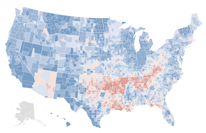
Photobucket

The answer below the flip.

At first glance, it looks a lot like the results of the 2008 presidential election. The northeast and midwest are all blue. Then there’s the west coast – a long line of blue counties. One could be quite easily forgiven if one took this map for a county-by-county map of the 2008 presidential election.

In fact, here are the real election results:

Photobucket

[Note: If you want to better compare the two maps, open two tabs of this (the first map) and

this (the actual results). Then switch between them.]

There is an extremely strong correlation between the two maps. Almost all the same counties are blue or red. Peering closer only cements this impression. Nevada has three blue counties – the exact three Democrats won. In Texas, only the cities and the Hispanic southwest are blue – a precise replication of the real results. One can go on and on, spotting these types of similarities.

Yet there are minor anomalies. Central Indiana and southern Florida are uniformly blue; President Barack Obama generally lost these areas. More significantly, the vast majority of Minnesota shows up red – strange, given that Democrats won the state by double-digits.

Minnesota should provide a clue of what the first map represents. Although the Democratic candidate won the state, it has been trending red for several elections. Before reading more, take a minute to refine your first guess.

.

.

.

If you haven’t figured out what the first map represents by now, here’s a bigger hint: look at Arkansas. Notice how uniformly red it appears in the first map, despite the several counties Mr. Obama won. Try to guess again – you probably can figure it out now.

.

.

.

Here’s the answer: the first map represents voting shifts between the 1992 presidential election and the 2008 presidential election.

As you have seen, there is quite a startling correlation between the two maps. Over the past four elections, the vast majority of counties President Barack Obama won have become more Democratic, while the vast majority of counties Senator John McCain won have become more Republican.

In the next post, I will attempt to analyze the meaning of this.